The network for creativity
Join 1.25M professional creatives like you
Connect with clients, get discovered, and run your business 100% commission-free
Creatives on Contra have earned over $150M and we are just getting started
Back to feedPost
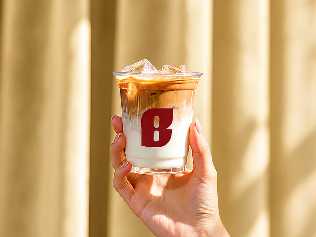
They came in with a logo that was already live — just not landing. Too soft, too rounded, closer to "wellness product" than the bold, premium café they were building.
We refined the wordmark into something sharper, then built the system around it: brand guidelines, packaging, menu, social templates, merch — all timed to a soft launch in Davao City, Philippines.
The name "Borne" is a quiet nod to the founder's mom, who brought the family somewhere better. That story shaped every cut in the typography.
Check it out if you want to see how it came together 😊


Love the thinking behind this. A strong brand always starts with the story.

Thank you! I my current fav from all my projects 😍

Smart play to incorporate small leaf edges on the logo itself to resemble the wellnes industry, I see and like what you did here.


too soft is such a common trap

Really strong brand direction. I especially like how the typography and warm visual language support the story behind the brand without making it feel overly nostalgic. The system feels cohesive, premium, and very intentional. 👏
The network for creativity
Join 1.25M professional creatives like you
Connect with clients, get discovered, and run your business 100% commission-free
Creatives on Contra have earned over $150M and we are just getting started













Related posts


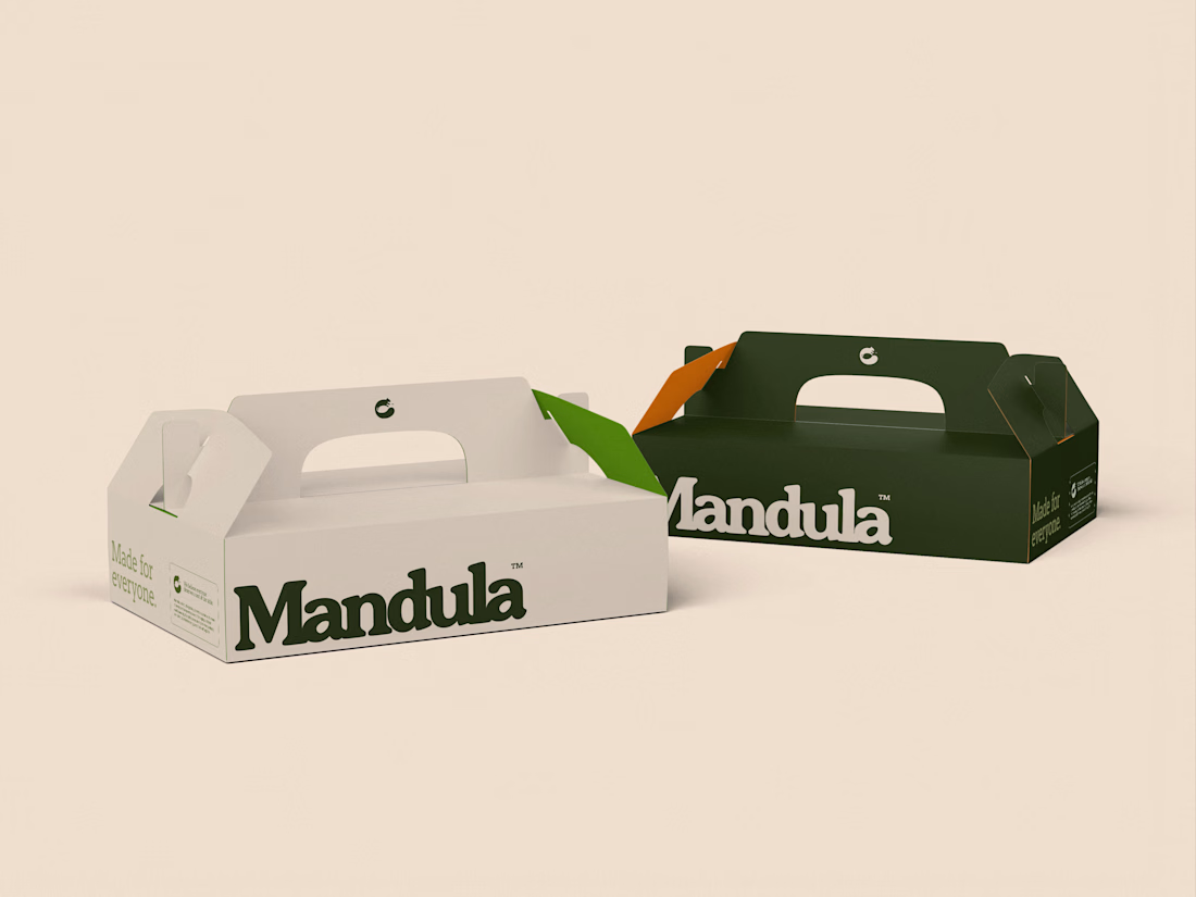
How a squirrel, an almond and Arthur's round table shaped the logo for Mandula, a Manchester gluten-free bakery.
Logo and visual direction by Symbr.

T O P!!

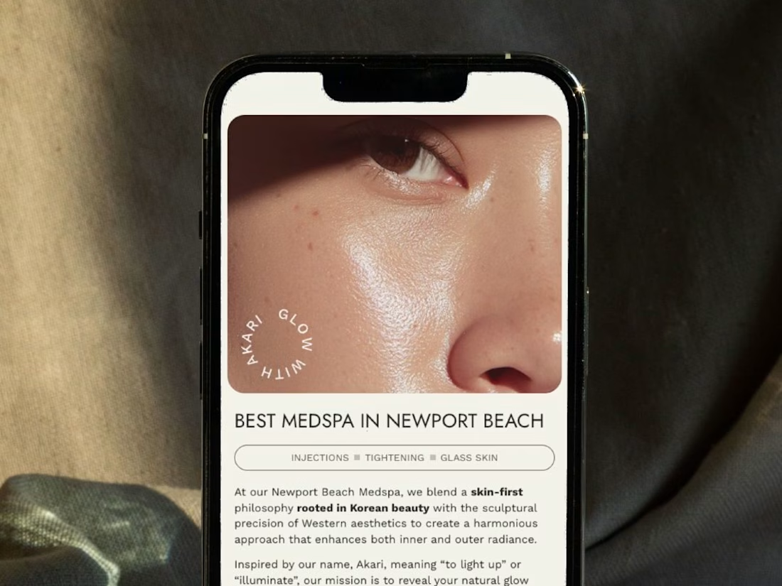
A restructured, clean website for Akari Medspa that turns scattered information into an intuitive experience as precise as the treatments they offer.


Too perfect buddy

Second Serve Club — Exploring Visual Identity Through AI & Design.
For this branding challenge, I created a series of original logo marks in Adobe Illustrator, inspired by vintage tennis culture.
I then explored how these designs could come to life by combining my own typography, monograms and colour identity with AI-generated visuals using ChatGPT.
From the texture of a clay court to embroidered details on tennis balls, the goal was to bring the brand identity into a more tangible, realistic setting.
An exploration of how traditional graphic design and AI can work together to create a cohesive visual world.
Designed by me. Visualised with AI. 🎾
Full brand identity case study coming soon.
#BrandIdentity #VisualIdentity #GraphicDesign #AIDesign #ChatGPT
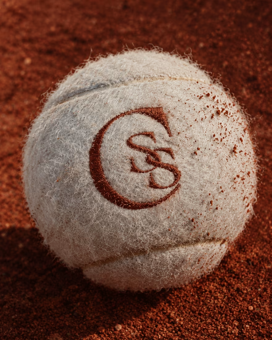
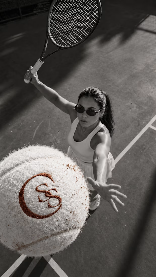
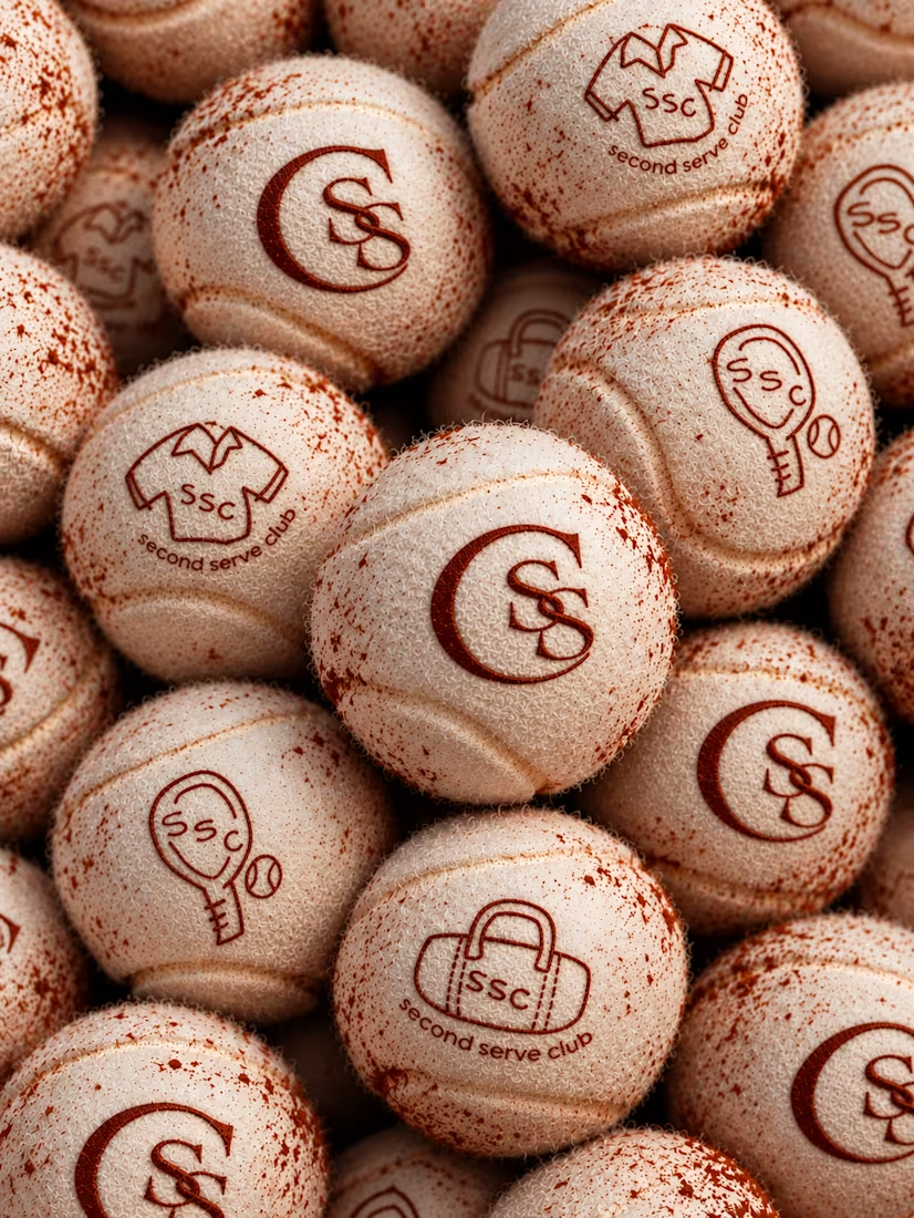

The SS mark stamped into the tennis ball felt is a great detail. Looks very real on the clay court.