Vextro© - Visual Identity
Jeferson Gonçalves

Vextro was not born out of a business plan. It was born out of dissatisfaction with a marketing industry focused on selling itself, not its clients. With the mission to challenge mediocrity and the comfort zone, its visual identity project was conceived as the materialization of this revolt.
The core challenge was to translate values such as rupture and restlessness into a cohesive and functional visual system. Vextro needed an identity that not only set it apart but also acted as a declaration of war against generic, predictable, soulless marketing.
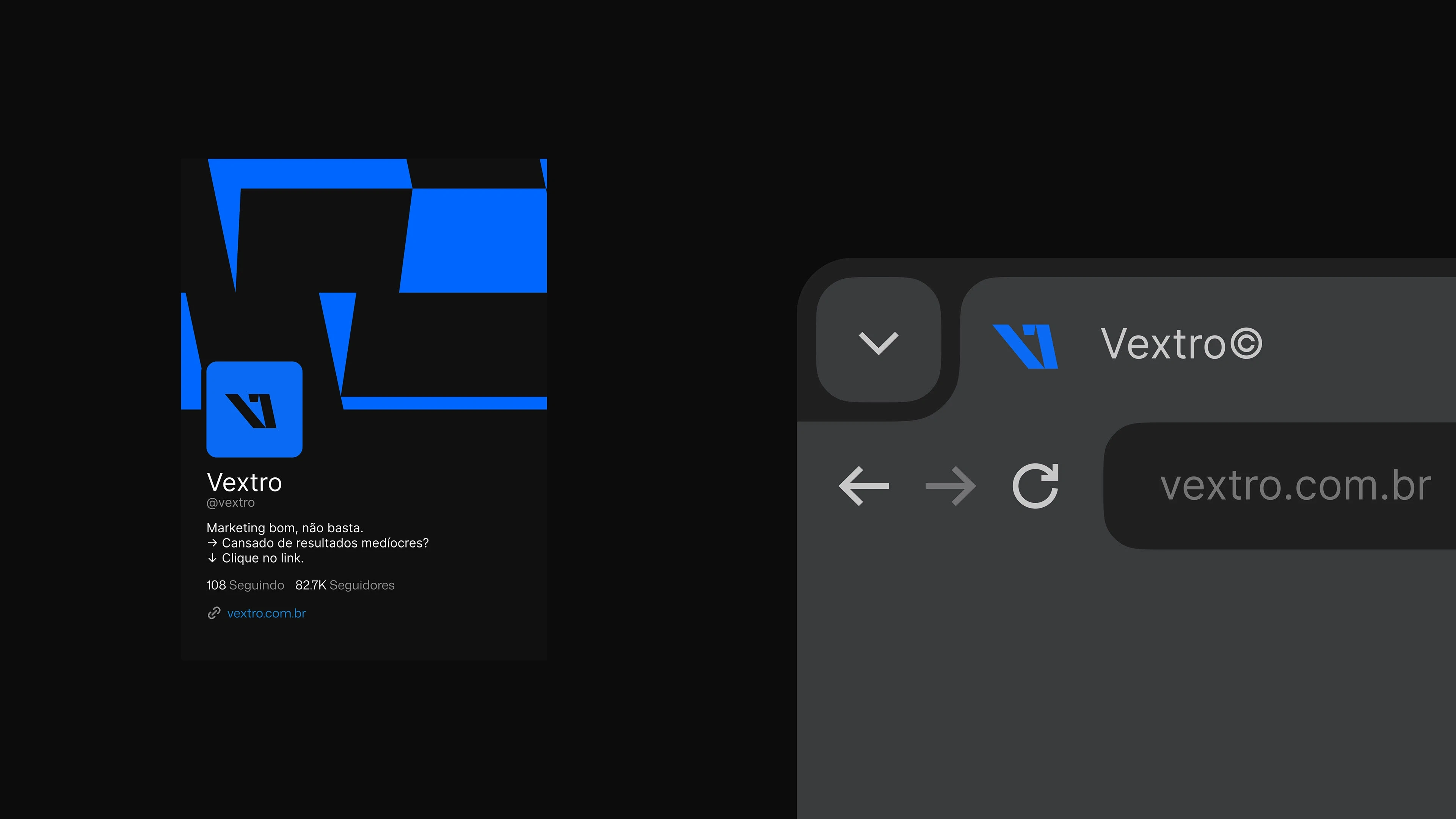
At the center of this identity lies a logo that is, in itself, a manifesto. Its modular and deconstructed structure, with an inverted italic, represents a deliberate movement against the current. It is not just stylized typography; it is the visual embodiment of our philosophy: break the standard to unlock growth.
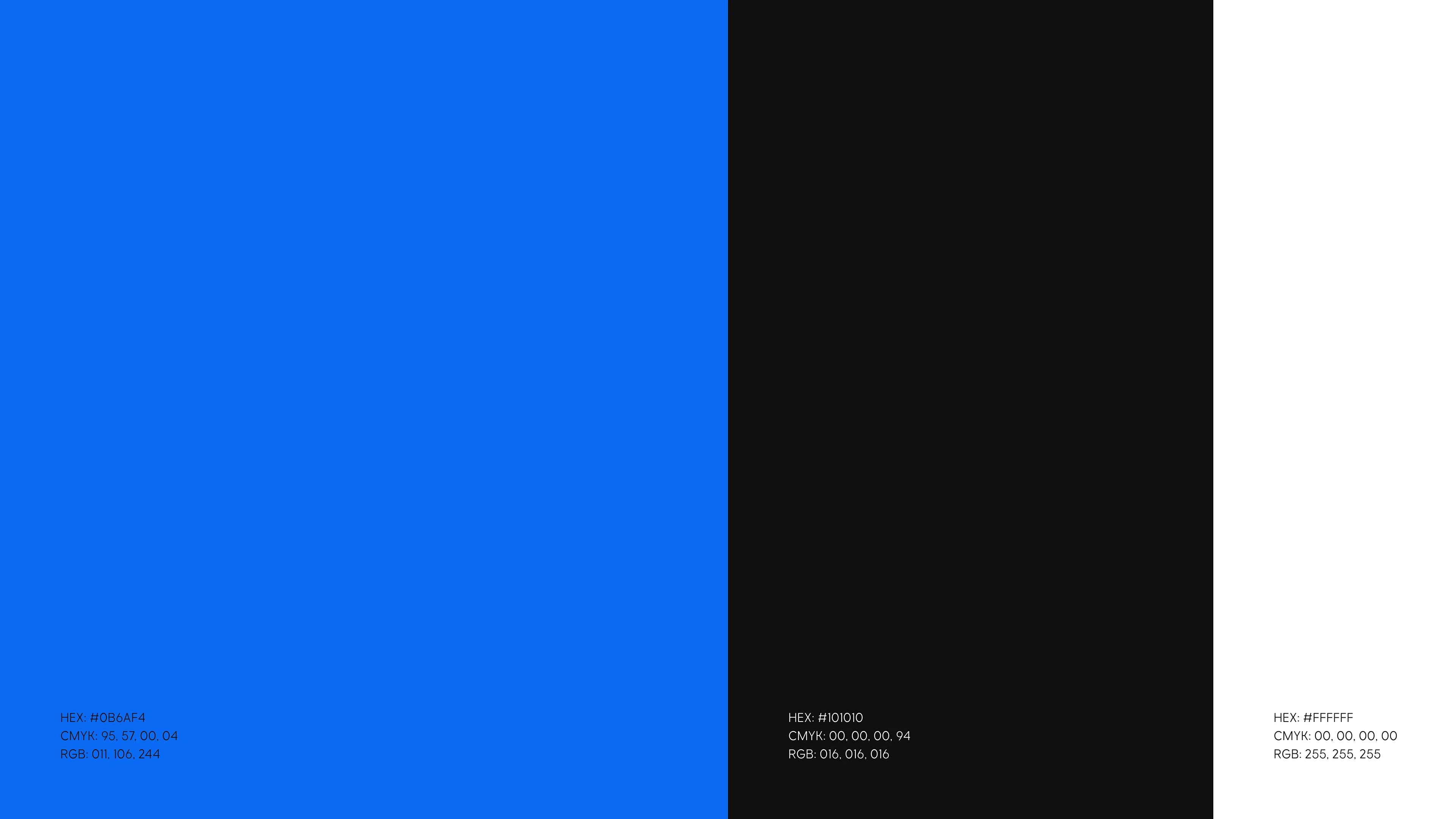
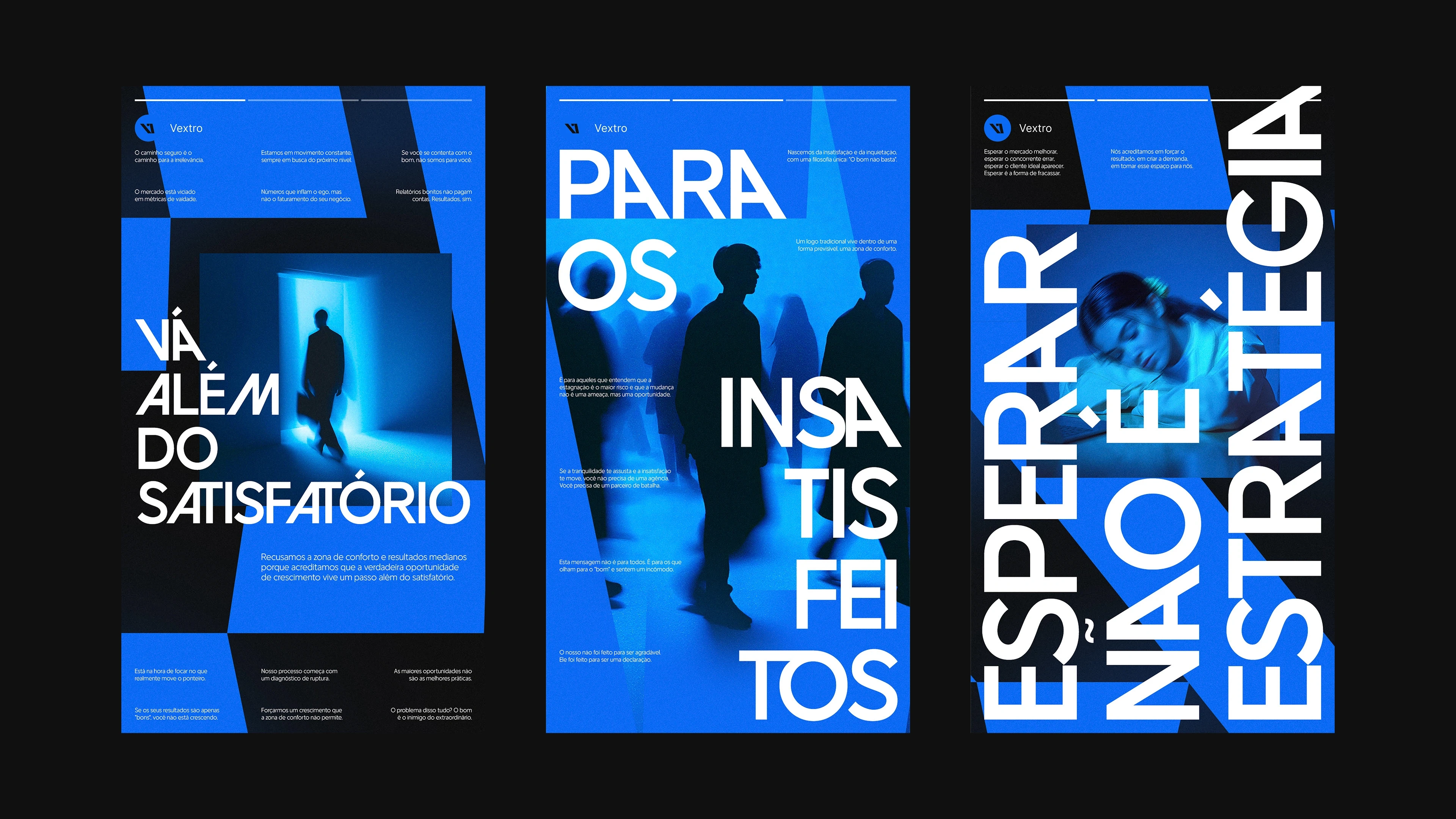
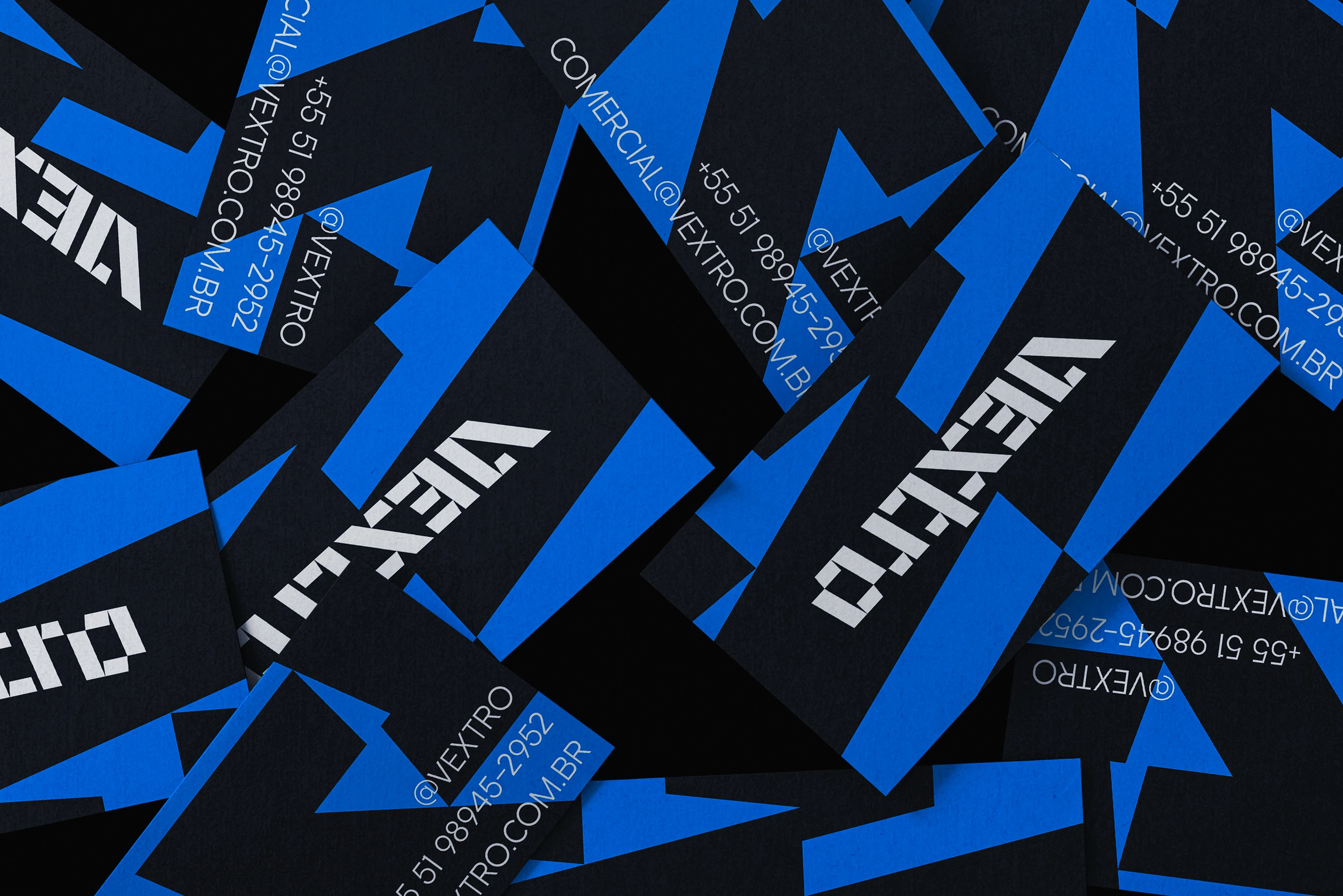
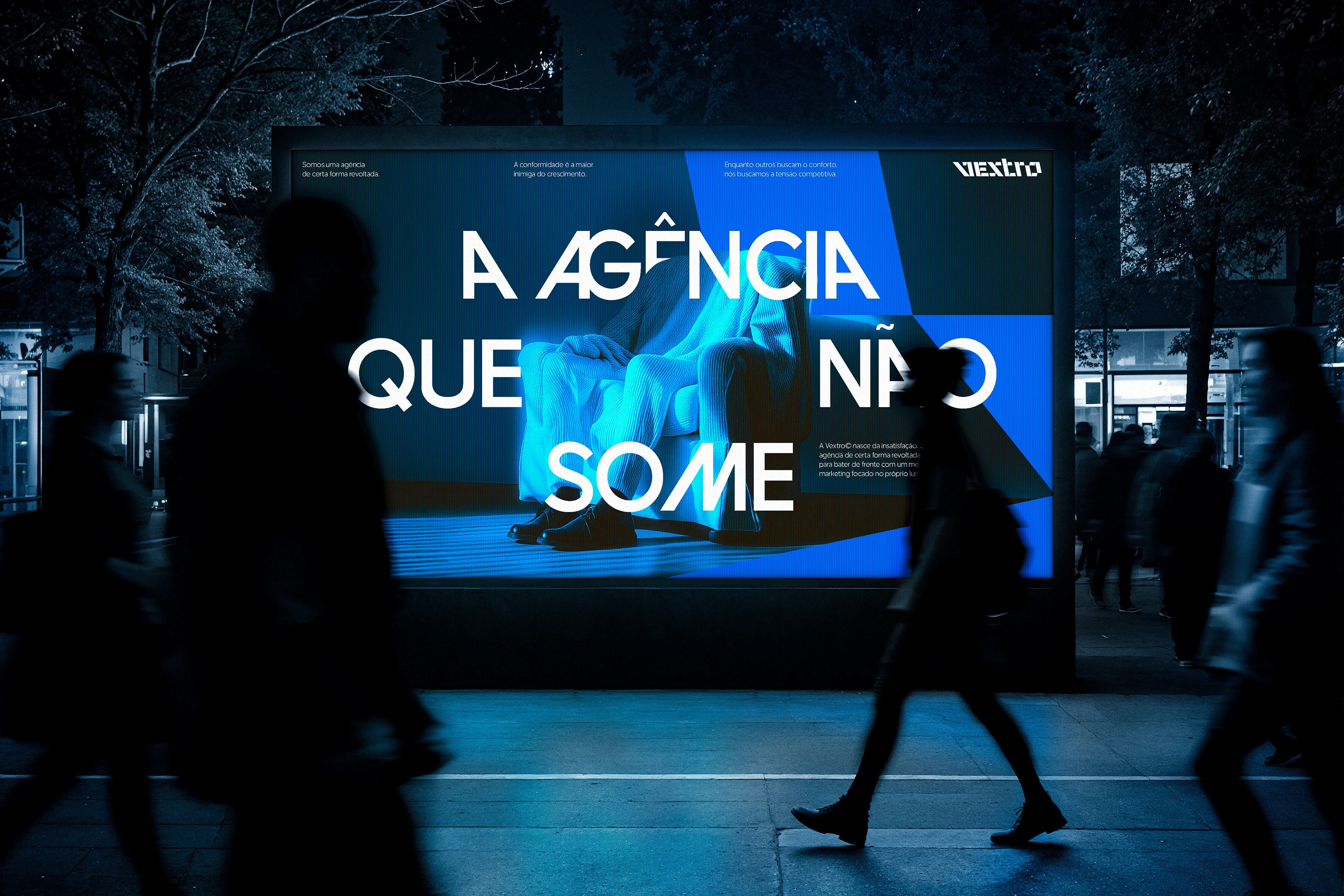
The visual system is built on strategic, not aesthetic, decisions. The color palette is led by blue, chosen as the color of rivalry, standing in direct opposition to the industry’s big players. Black serves as an amplifier, adding weight and authority to the message. The primary typeface, was selected for its ability to create tension, combining stable characters with disruptive alternates that echo the identity of the logo.
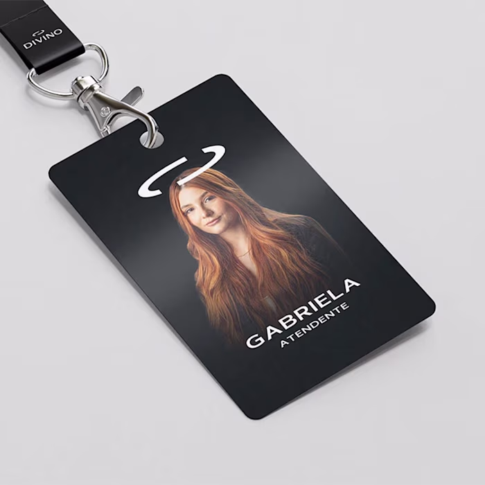
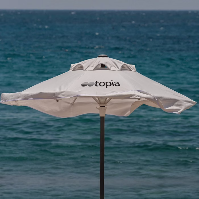
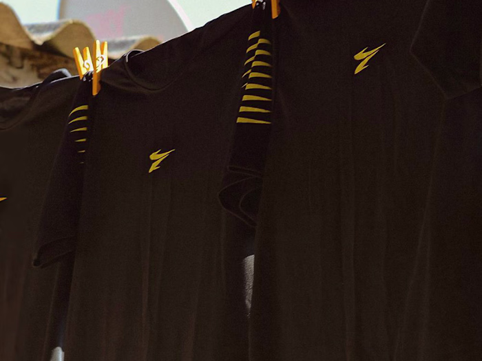
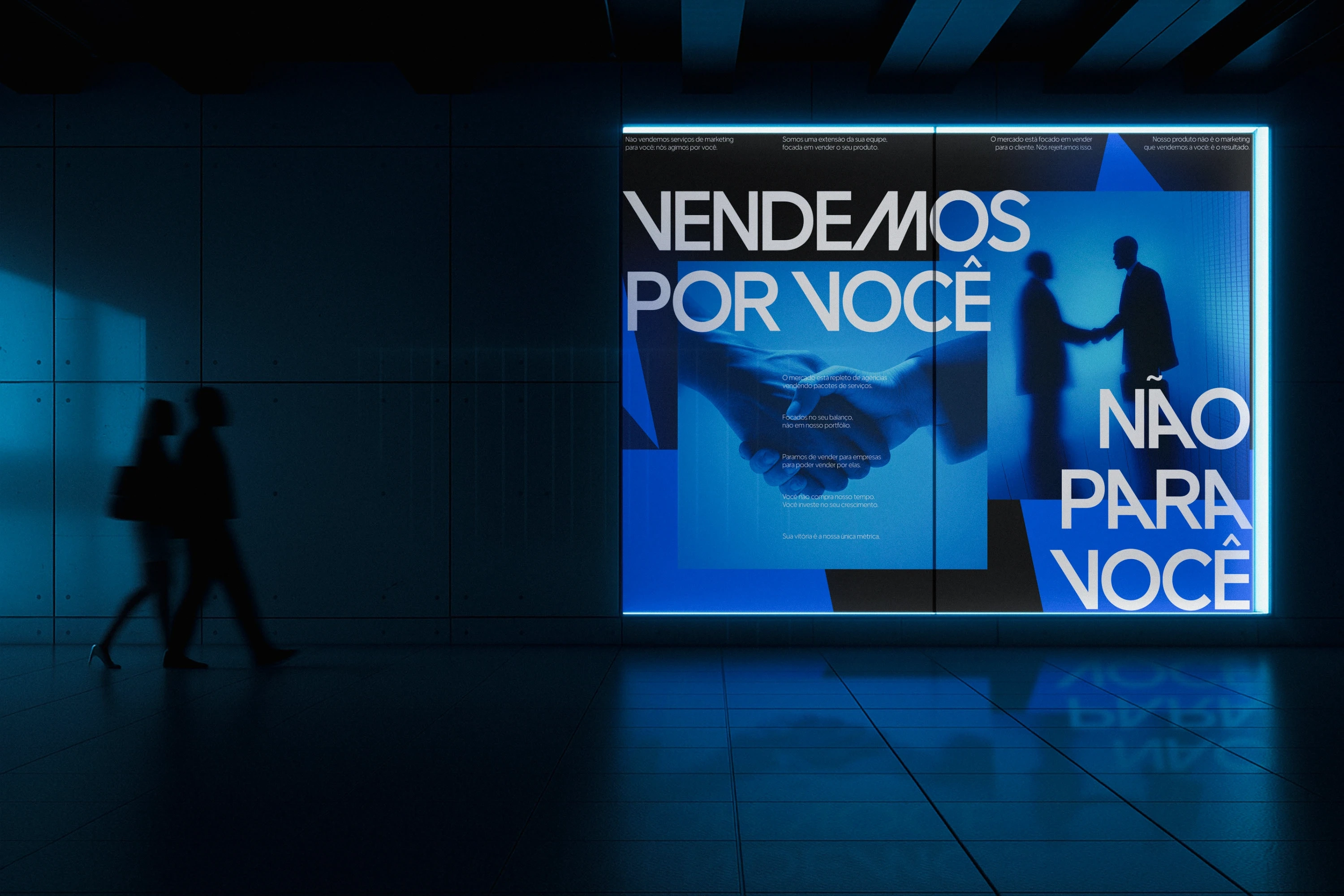
Every supporting element was extracted from the DNA of the logo itself. Graphic assets are deconstructed fragments of its letters, used to command layouts with the same disruptive energy as the brand. The photographic style reinforces this vision, capturing restlessness through dark environments, blue lighting, and intentional motion blur.
This visual identity is not just a set of rules and elements. It is the operating system of a brand built to be a force of provocation. In every detail, Vextro communicates its purpose: to reject “good enough” in the pursuit of the extraordinary.


Like this project
Posted Dec 4, 2025
Developed Vextro's visual identity focusing on bold, disruptive elements.
Likes
0
Views
8
Timeline
Apr 22, 2025 - Sep 4, 2025