The network for creativity
Join 1.25M professional creatives like you
Connect with clients, get discovered, and run your business 100% commission-free
Creatives on Contra have earned over $150M and we are just getting started
Back to feedPost
Taste Test
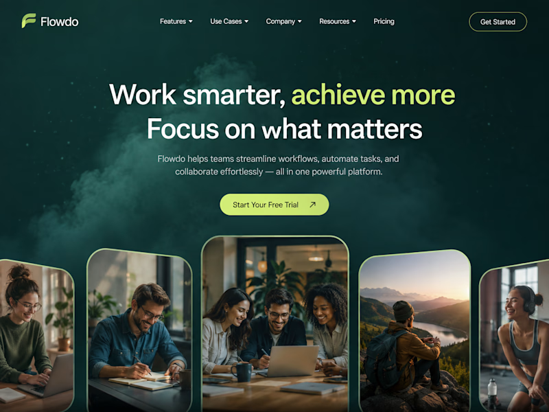
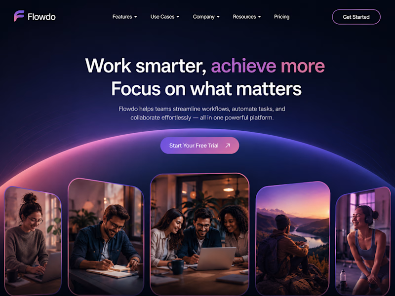
One header, two color stories.
Green: cool tones, feels productive and safe
Purple: gradient glow, feels modern and premium
Same words. Different first impression.
Which one would make you click "Get Started"?

26 voted
59%
18 voted
41%
44 votes
Closed

Went with calm and focused. The copy is literally asking people to focus on what matters, so a header that competes for attention with a glow works against its own message.

Exactly MD Rafee
The design should support the message, not compete with it.

Incredible work
Thank you😍


Superb design !
Thank you

calm and focused
Appreciate your feedback🔥

Thanks for the feedback 🙌

Definitely going with Bold and premium, as the color combination
Appreciate the feedback😍

Definitely the Calm and Focused layout. The earthy tones give the typography and the UI cards so much more room to breathe, making the whole header feel highly professional.
Thanks, Happy the professional feel came through.🙌

The calm version feels like the stronger conversion choice—the quieter palette gives the headline room to lead, while the purple treatment has a little more personality.
Thank you, Really appreciate the detailed take.

Purple is a bold pick for a productivity app. Most SaaS tools go safe with greens and blues, so the gradient glow could actually make it stand out. Voting Bold and Premium on this one.
Appreciate the thoughtful take😍

I’d pick Calm and Focused. It feels balanced and easy on the eyes.
Appreciate your perspective🔥

love both
Means a lot, thanks😍

calm and focused design looks good.
Thanks for your feedback😍

They both look good
Thank you 😍


The purple gradient definitely draws the eye first that glow gives it a high-end, SaaS-ready polish that makes the CTA feel premium. It’s amazing how a simple shift in color temperature changes the perceived value instantly!
Love this observation Abdul🔥
No doubt color can completely shift the perceived value.

i choose bold and premium. probably because i like purple pr maybe the prple vibe gives me a lilely feeling
Glad the purple vibe pulled you in😊

Calm and Focused, because the visual hierarchy is working well here: no distractions, clear heading, CTA, and imagery. It seems more productive and appealing. 👍
Appreciate your take🙌 The clarity was really important here.
The network for creativity
Join 1.25M professional creatives like you
Connect with clients, get discovered, and run your business 100% commission-free
Creatives on Contra have earned over $150M and we are just getting started

Challenges
View all


Related posts

My previous poll showed unexpected results (I am very grateful to everyone who took the time to vote and comment 🤍).
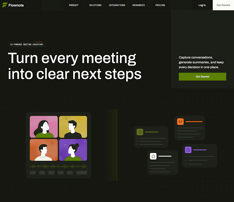
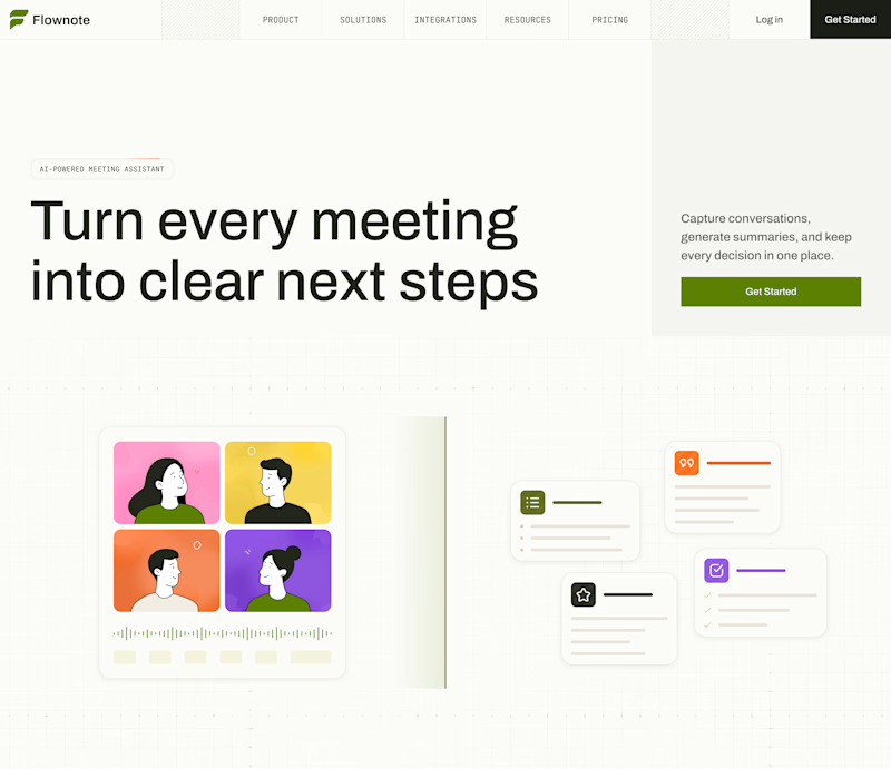
Now I am curious about your opinion on the color mode for this hero section. I definitely like a light theme. What about you?
By the way, I made a nice animation for this design. You can see it on my profile

28 voted
54%
24 voted
46%
52 votes
Closed

To be honest the dark mode looks really good

Which one do you prefer? 👀
Two visual directions for Wanda — a service quote experience built with Rive.
----
Which one would you pick?
Try the live experience :https://rivris-receipt.vercel.app/

9 voted
53%
8 voted
47%
17 votes
Closed

Industrial one feel like a real product, how did you crate that?

Bold, without a doubt. The “Safe” direction feels polished, but the “Bold” approach has more personality, stronger visual tension, and a much better chance of stopping the scroll. It feels more distinctive and memorable while still communicating the skincare message clearly.

Safe or bold, which one actually makes you stop scrolling? 🤔
Sans: the serif, tight tracking, one accent color playbook every skincare brand is running right now.
Bold: the same idea, redesigned with attitude. 💅
25 voted
32%
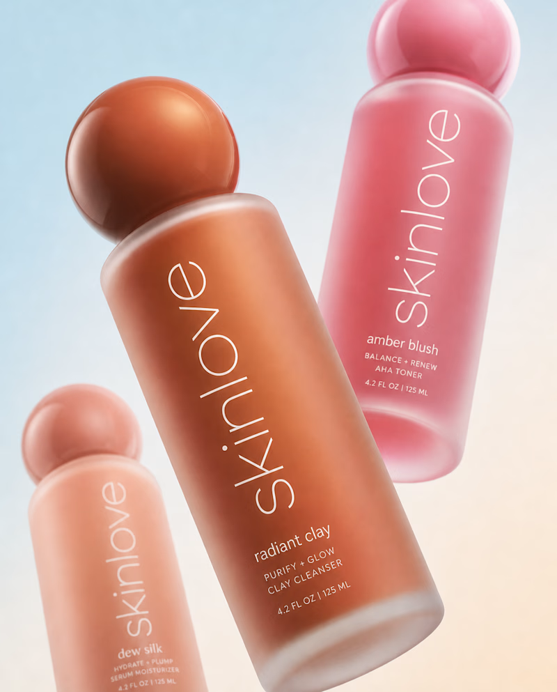
53 voted
68%
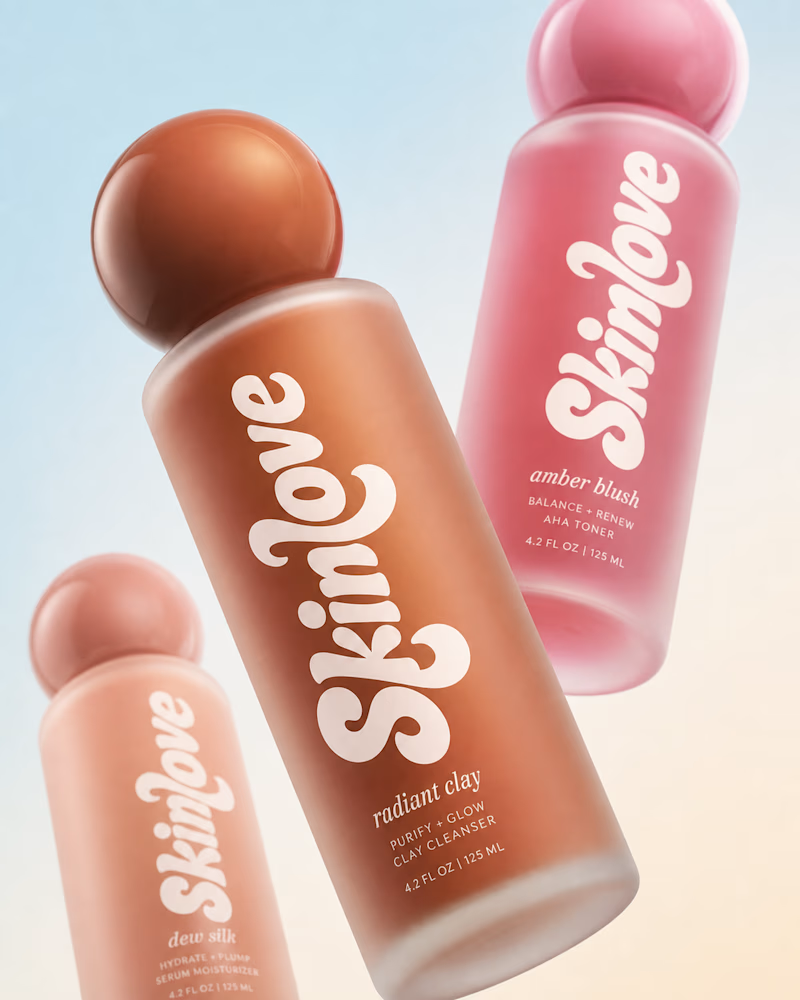
78 votes
Closed


BOLD is better