The network for creativity
Join 1.25M professional creatives like you
Connect with clients, get discovered, and run your business 100% commission-free
Creatives on Contra have earned over $150M and we are just getting started
Back to feedPost
Taste Test


Which one do you prefer? 👀
Two visual directions for Wanda — a service quote experience built with Rive.
----
Which one would you pick?
Try the live experience :https://rivris-receipt.vercel.app/

9 voted
53%
8 voted
47%
17 votes
Closed

Industrial one feel like a real product, how did you crate that?
I get it. I think you perfectly reached your goal. Are you happy with this result?

Industrial

Industrial feels like authentic one. What was your reference/inspiration?
Ok got it. Thanks for the info. 👍

Industrial 🔥

The Refined direction feels especially strong—the softer glow gives the quote flow a warmer, more tactile finish, while the Industrial option has great product clarity. Nice use of Rive to make the choice feel tangible.

I would go for the industrial one. Strictly from UX perspective I believe its the easier to read. You can also compare the font to background contrast ratios agains WCAG accesibility metrics (via online free checkers)


the Wanda name is nice. which side do you like?

Industrial feels stronger to me. It has that raw, printed-receipt character.
The network for creativity
Join 1.25M professional creatives like you
Connect with clients, get discovered, and run your business 100% commission-free
Creatives on Contra have earned over $150M and we are just getting started








Related posts

Hey everyone! 👋
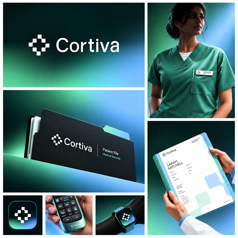
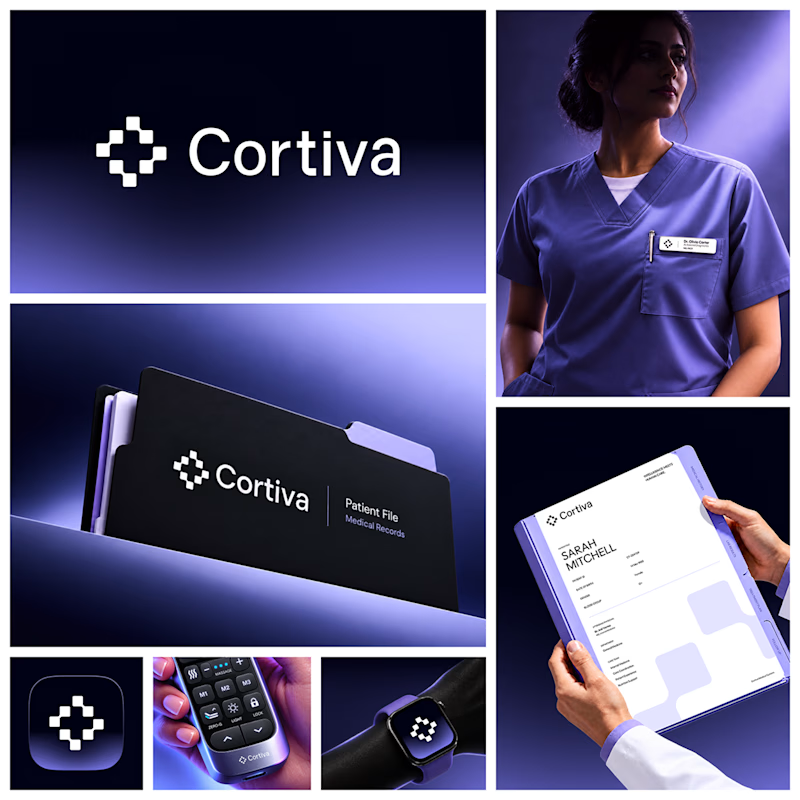
Working on Cortiva, an AI-first hospital branding project.
I've already finalized the color direction, but I thought it would be fun to explore two different moods.
Option 01💚 or Option 02? 💜
Both have their own personality, and I'm curious to see which one you prefer!
Let's see which one wins! 👀
5 voted
33%
10 voted
67%
15 votes
Closed

Both directions are strong, but I'm leaning towards Option 01. The green feels instantly like "care" and trust, which is perfect for a hospital. Option 02 looks more techy and premium. Curious, which mood are you aiming for - clinical and calm, or friendly and modern?


Which Kajabi photography-course design makes you want to explore?
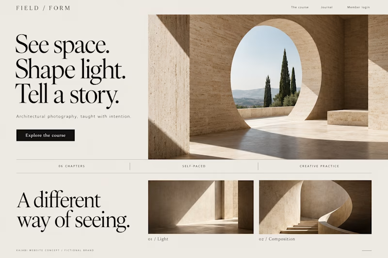
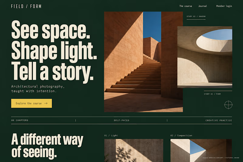
Two original AI-generated concepts for FIELD / FORM, a fictional architectural-photography school. Gallery Study pairs expressive serif type with warm stone and generous space. Field Journal uses forest green, bold condensed type and a layered photo study.
Same course, two directions. Which would you choose, and why?

15 voted
75%
5 voted
25%
20 votes
Closed

Galary study Hits better to me❤️❤️
great job Kraig🔥🔥

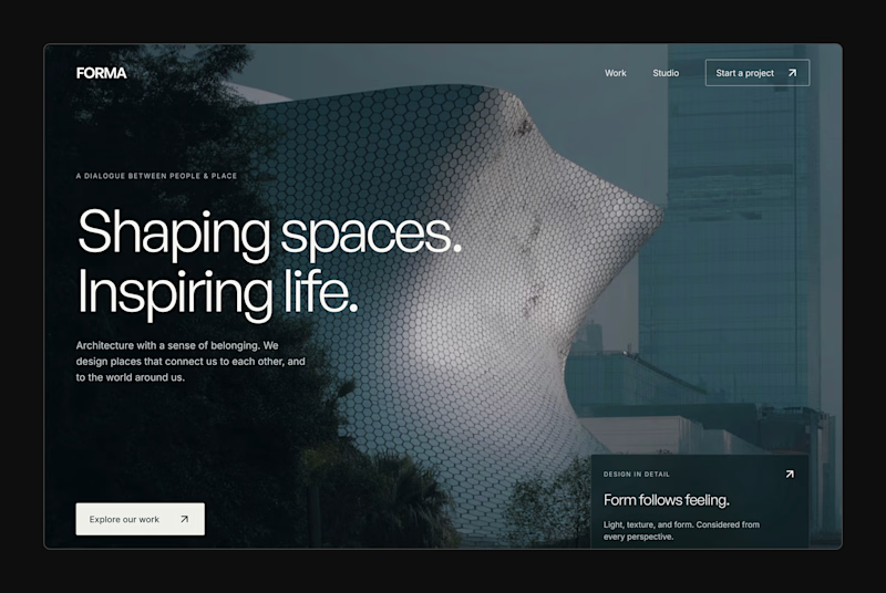
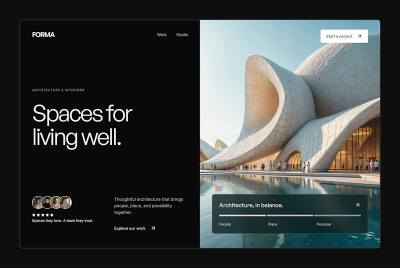
Design Exploration: Hero Section of Architecture Website. Which one do you think much better?


12 voted
43%
16 voted
57%
28 votes
Closed

