The network for creativity
Join 1.25M professional creatives like you
Connect with clients, get discovered, and run your business 100% commission-free
Creatives on Contra have earned over $150M and we are just getting started
Back to feedPost
Taste Test

My previous poll showed unexpected results (I am very grateful to everyone who took the time to vote and comment 🤍).
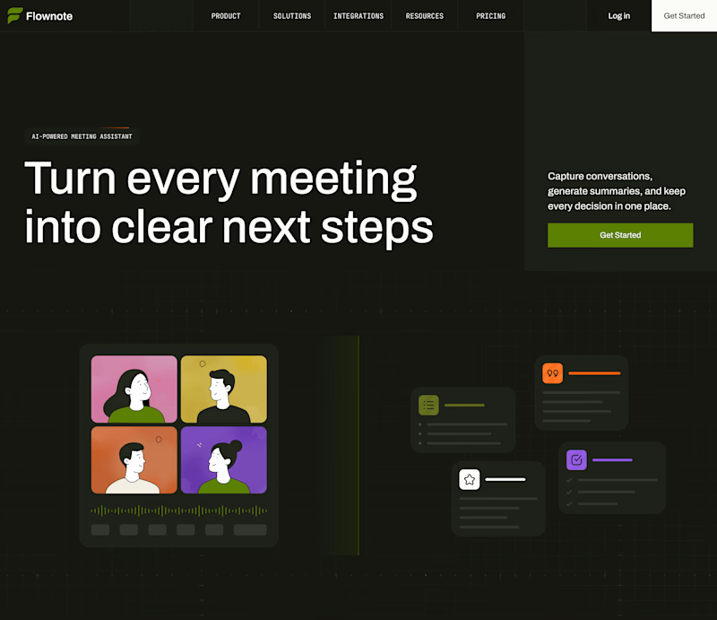
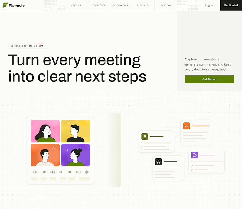
Now I am curious about your opinion on the color mode for this hero section. I definitely like a light theme. What about you?
By the way, I made a nice animation for this design. You can see it on my profile

28 voted
54%
24 voted
46%
52 votes
Closed


Good Work!!!!

The dark/light split makes the hero’s visual system easy to evaluate, and the large headline stays strong in both. The light mode feels especially inviting for a collaboration product, with the restrained green CTA as a nice anchor.

Dark mood is wining here. which one do you prefer here?

Both look great, but I’d go with the dark version. The colorful cards really pop against the darker background🔥


Light mode does it for me, so much warmer! 💯


Dark looks great! ❤️

To be honest the dark mode looks really good


Light works perfect for this color palette

Creative work

As a dark mode loyalist, it actually pains me a bit to say it, but the Light Mode is the absolute winner here! It just feels so much more natural and legible for a daily workspace tool.

Light, for this hero: the avatar grid and the summary cards stay separate. In the dark version those cards flatten into the product screenshot behind them.

i will go with dark mode


dark. the four colour video tiles really pop on it

Definitely light mode here! Looks much more inviting and warm.

Dark mode looks really good, but from a UX perspective, I’d definitely switch it off to fully experience the story you’re telling with your design.

Dark mode looks fantastic
The network for creativity
Join 1.25M professional creatives like you
Connect with clients, get discovered, and run your business 100% commission-free
Creatives on Contra have earned over $150M and we are just getting started











Related posts


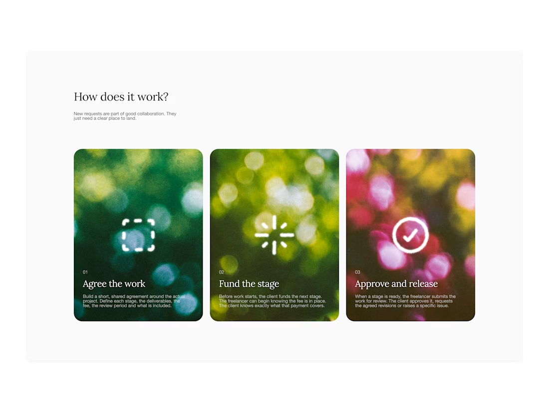

Your web sections always have such strong art direction. Great to see the brand carried right into the layout.

I created a brand identity concept for Velora, an AI productivity platform. I explored the logo, colors, typography, and how the brand could look across a website, mobile app, and everyday products. I wanted everything to feel consistent, modern, and easy to recognize.

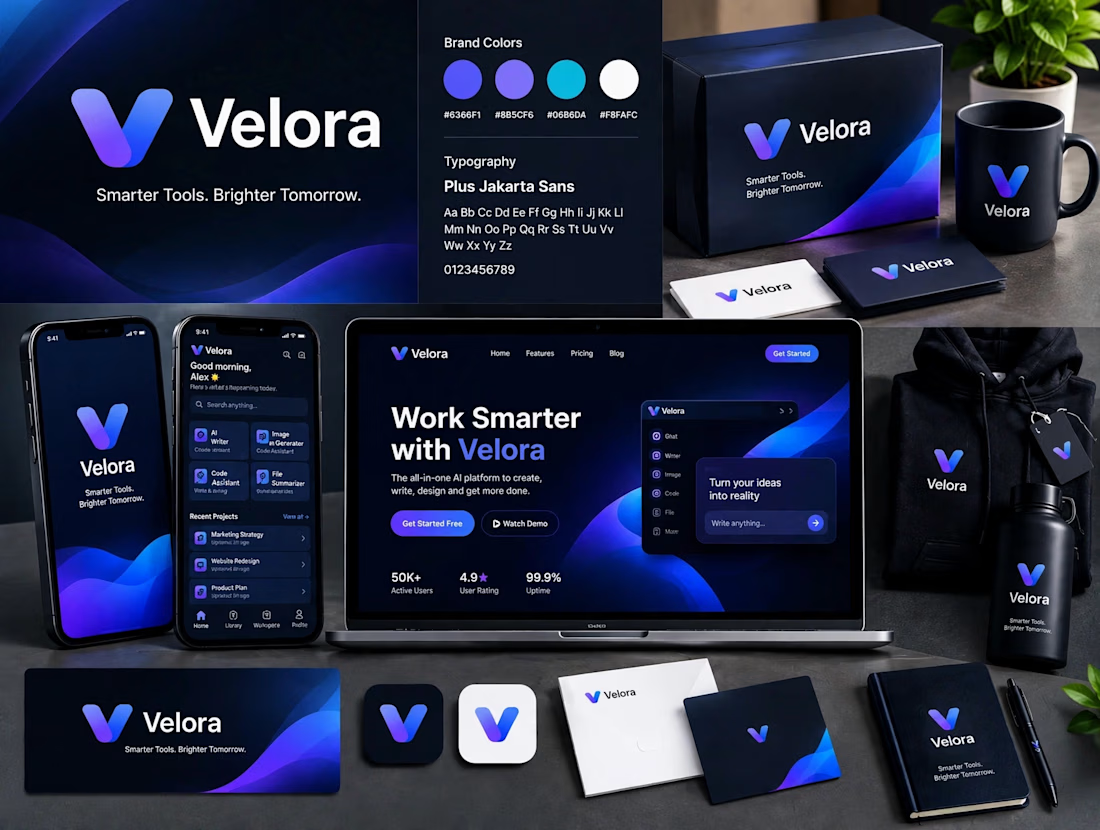

The blue is perfect for this. I’ve seen so many AI brands do boring black/white but this gradient gives it energy. And Plus Jakarta Sans was a great choice, keeps it friendly.

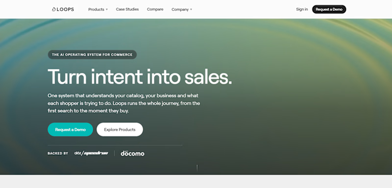
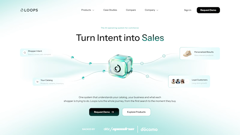
LoopsAI hero redesign
Same headline. Now the product is visible and the CTA stands out.
Independent concept, not affiliated with LoopsAI.
1 voted
17%
5 voted
83%
6 votes
Closed

Great execution....Timeless and Creative Design!