The network for creativity
Join 1.25M professional creatives like you
Connect with clients, get discovered, and run your business 100% commission-free
Creatives on Contra have earned over $150M and we are just getting started
Back to feedPost
Taste Test

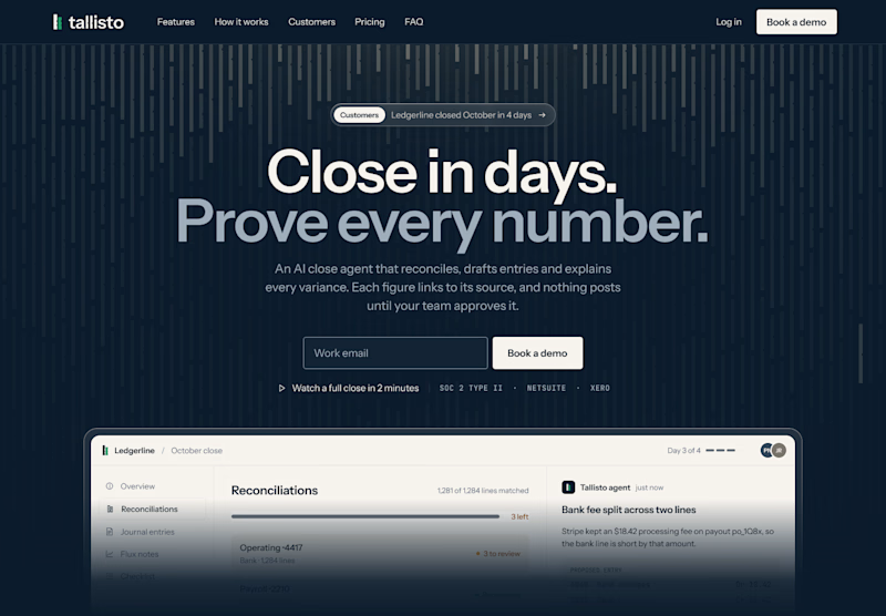
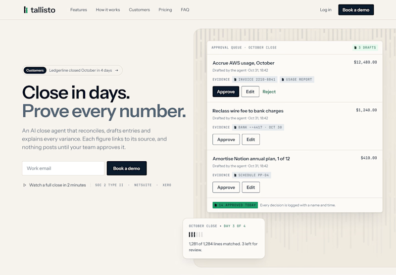
Quick one for SaaS founders and designers: which homepage hero would make you book a demo?
I’m designing the website for Tallisto, a concept AI accounting tool that helps finance teams close the month in days. Both versions use the same copy, so only the layout changes.
A is centred and dark. The headline does the talking, and the product sits right underneath it.
B is a light split layout. You read on the left and see the approval queue on the right, where every entry waits for a person to approve it.
Vote for the one you’d click, and tell me why in the comments. I’m building the winner in Webflow next.


2 votes
Ends in 1d

Split and light for me. The approval queue next to "Prove every number" shows the proof right away, which is what a finance team wants to see. The dark one looks moodier but the product sits low. Will you test the CTA copy too?
That's exactly what I hoped B would do, Ivan, show the proof before anyone has to scroll. And yes, the CTA is next on my list. "Book a demo" is the safe choice, but something that shows the result, like "See a close in 2 minutes", might pull harder for a finance lead. I'll keep the layout the same and only change the button.
The network for creativity
Join 1.25M professional creatives like you
Connect with clients, get discovered, and run your business 100% commission-free
Creatives on Contra have earned over $150M and we are just getting started



Related posts

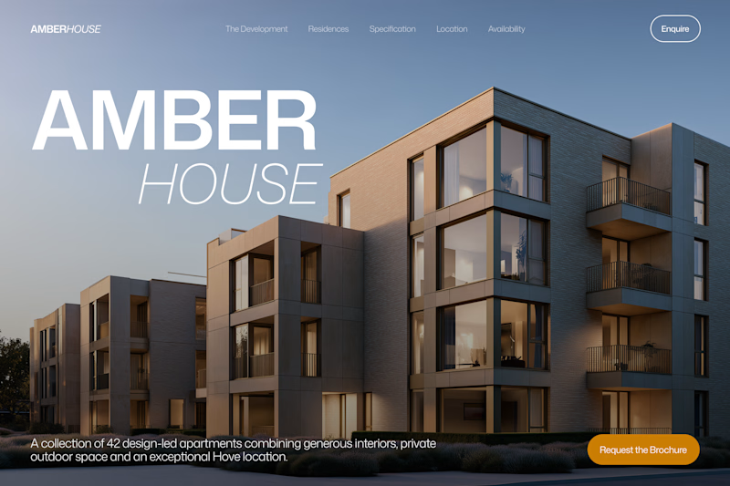
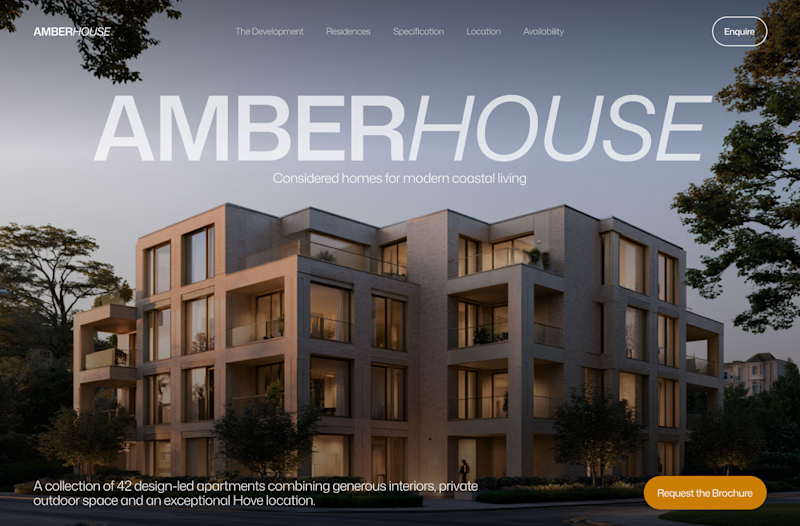
Which hero would you choose — 1 or 2?
Two directions for Amber House, my real estate website template. The first pairs a closer architectural crop with an asymmetric layout. The second gives the building more breathing room, with a wide view and a centered headline.
Same template, two different first impressions. Which feels stronger to you, and why?
24 voted
59%
17 voted
41%
41 votes
Closed

I will go with Bold & Asymmetric!

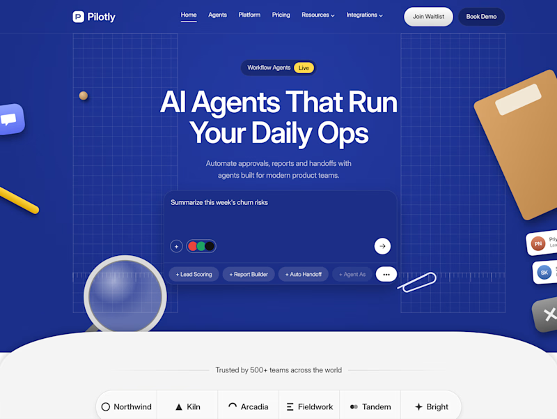
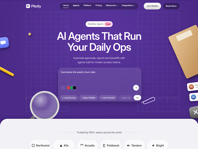
Testing two color directions for Pilotly, an AI agent platform for product teams.
Which direction would you pick for an AI automation product?
3 voted
100%
0 voted
0%
3 votes
Closed
I'd pick Violet Desk. Blue is what every SaaS uses, violet stands out and still says AI, and the orange sticky notes pop more against it. Does the hero chip row under the headline work on mobile?

The first thing I created for LedgerFlow wasn't a screen.
It was a set of questions.
I'm kicking off a new concept project: **LedgerFlow, an accounting and financial management SaaS platform for small businesses, freelancers and independent business owners.
The goal is to design a website that helps visitors understand what the product does, how it helps their business, and why they should book a demo.
But before opening Figma, I needed to understand the business.
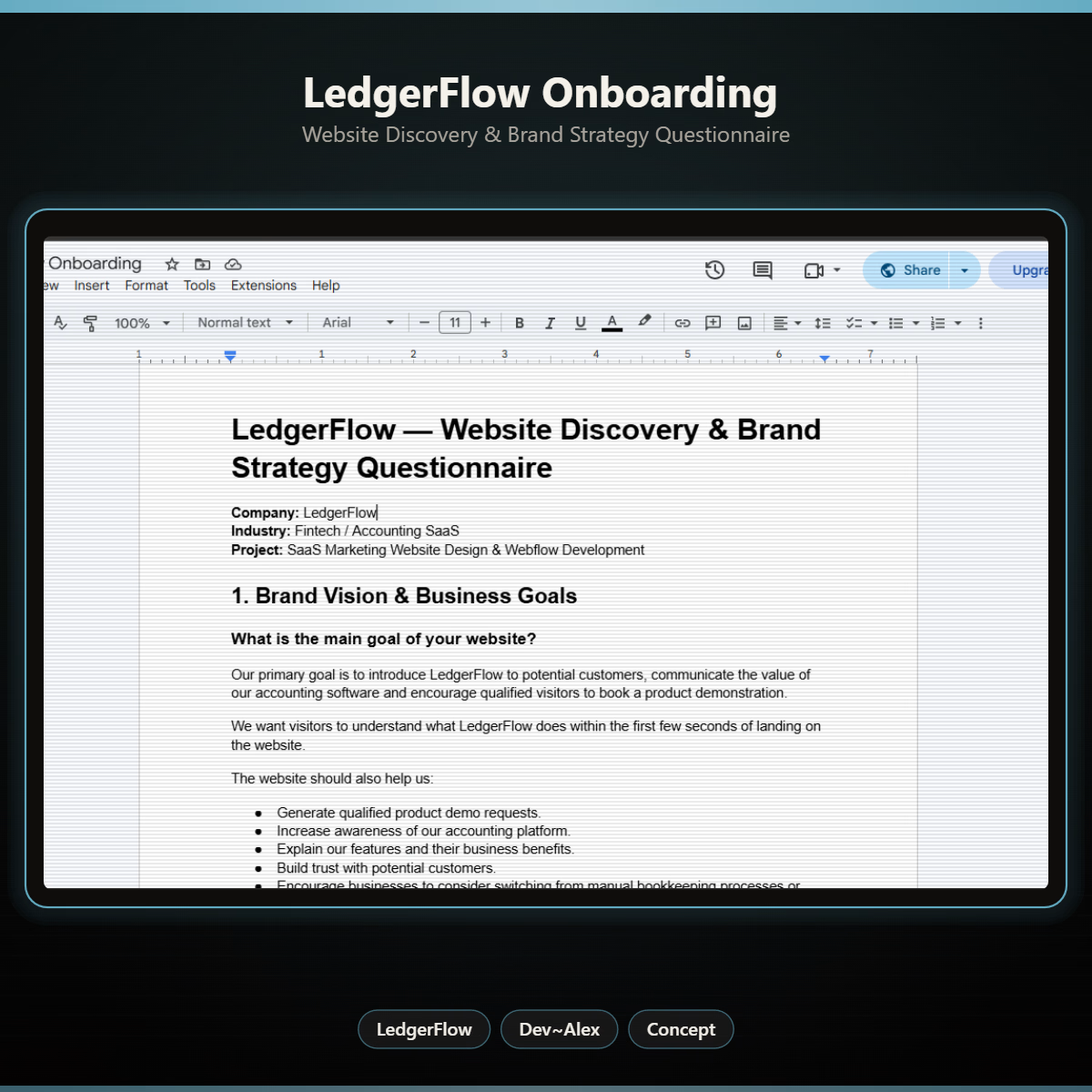
So I created a website discovery and brand strategy questionnaire.
It covers:
→ Brand vision and business goals.
→ Target audience.
→ Website goals and user experience.
→ Branding and visual direction.
→ Services and offers.
→ Project direction and logistics.
I want to understand things like:
Who exactly are we designing for?
What problem does the product solve?
What makes it different from traditional accounting software?
What should visitors understand within the first few seconds?
And what would make them confident enough to book a demo?
Because the answers will influence the website's messaging, content, visual hierarchy and calls to action.
You can't design a clear experience when you don't understand what the business needs to communicate.
LedgerFlow is a concept project, but I'm treating the process like a real client engagement.
I'll be sharing the journey from discovery to website structure, UI design and Webflow development.
And if you're building a SaaS product or need a website that communicates your business value clearly, I'm open to website design and Webflow projects.
Let's talk about what you're building. 🤝
Starting with a discovery questionnaire instead of a screen is how good briefs begin, and "explain what LedgerFlow does in the first seconds" is the right goal to design around. Will the answers become a one page brief?