The network for creativity
Join 1.25M professional creatives like you
Connect with clients, get discovered, and run your business 100% commission-free
Creatives on Contra have earned over $150M and we are just getting started
Back to feedPost
Taste Test

Round 2 👀
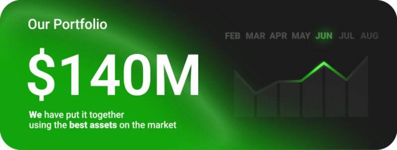
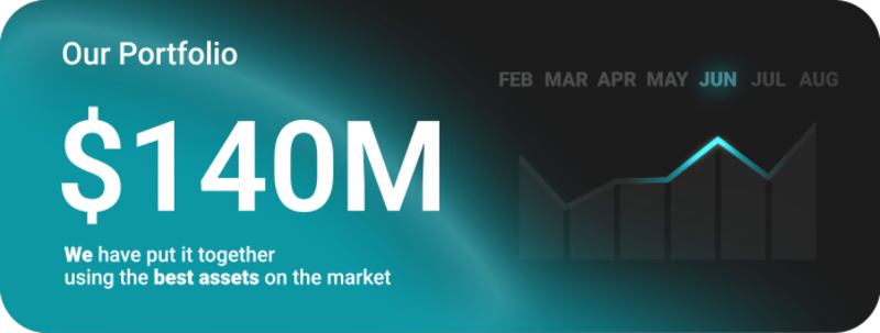
Which visual style is more appealing to you, and what emotions does each design evoke for you?
27 voted
50%
27 voted
50%
54 votes
Closed

Both looks great but left one all the way
thank you man!

Both look nice. Chose the blue because green is so common in finance.
I get a similar feeling from the blue one too =)

Went with the right one 🧃 — that cool teal-to-dark gradient immediately reads as premium and controlled, which for a $140M portfolio widget is exactly the right emotional register. The green on the left is energetic but sits right in "generic fintech" territory, whereas the...
I really appreciate such a detailed review. It's great to hear words like that, and I genuinely appreciate the initiative as well.
I completely agree about the blue color. Soon you'll get to see it all in motion =)

the blue one is really stunning
thank you Amna! 🙌

Left one for me. The green naturally reinforces the financial context, so the $140M immediately felt more connected to growth and value to me.
I appreciate your honest opinion, thank you! 🙌

going for the green one on the left .... Because green signify growth
interesting association, thanks =)

Right one 1️⃣
🧊

Green for me
🍀🍀🍀

green looks better
🍀🍀🍀

It's hard to choose, but now I would choose right one, it looks more premium for me :)
same bro!

Left one looks more professional!
🍀🍀🍀

The green feels visiblilty to me
🍀🍀🍀

I prefer right one, looks more premium
🧊

I like the left on e more. The styling is great.
thanks, bro, I appreciate it! 🙌

Both are really good I guess it's all about preference
thank you so much!

right
🧊

The results left you a tie 😂 can be so frustrating
If you need a decider, it would be blue for me
=)
Thank u mate!
The network for creativity
Join 1.25M professional creatives like you
Connect with clients, get discovered, and run your business 100% commission-free
Creatives on Contra have earned over $150M and we are just getting started
Trending

Claude
Claude has entered the design space. How are you using Claude Design?

Contra University
Learn from expert creatives how to earn more using next-gen AI tools.
creativeaiflow
Creative AI workflows are evolving. What tools do you use, and what are their strengths and weaknesses?
freelancerlife
Freelancer life is wins, pivots, and everything in between. What’s yours right now?








Related posts

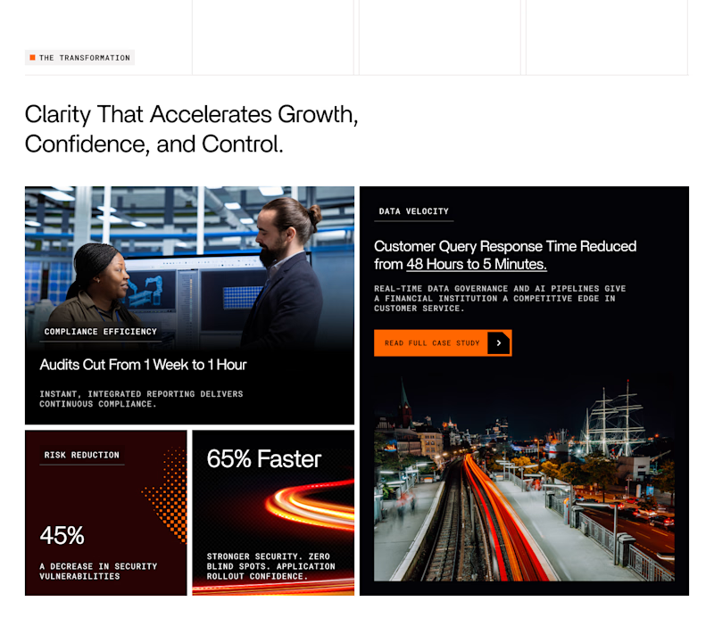
Which layout for Case study highlights grid looks better 🤔


62 voted
67%
31 voted
33%
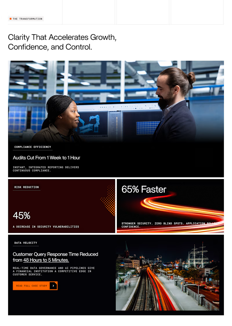
93 votes
Closed


Option one just flows better.
Added some motion to the Marigold concept over the weekend, first time playing with Figma motion as well. Pretty straight forward.
2 more

what if your energy drink mascot was made of the same poured concrete as the building it's climbing? built SLAB's whole identity around that one collision — bolted joints, a wordmark poured like a slab, and a character big enough to hand you a can from twelve stories up
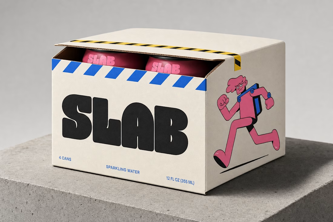


A work that fits my aesthetic and perfect as usual. Really good work and your signature contrast colors once again, executed perfectly.