
Jalal Eddine Maoukil
Framer Developer · Templates & Custom Sites
Ready for work
Jalal Eddine is ready for their next project!
Launching this template this week . . .
1
8
portfolio page hero section for my next template
1
20
call to action section for my next template
1
23
on to @Framer template #3.
1
43
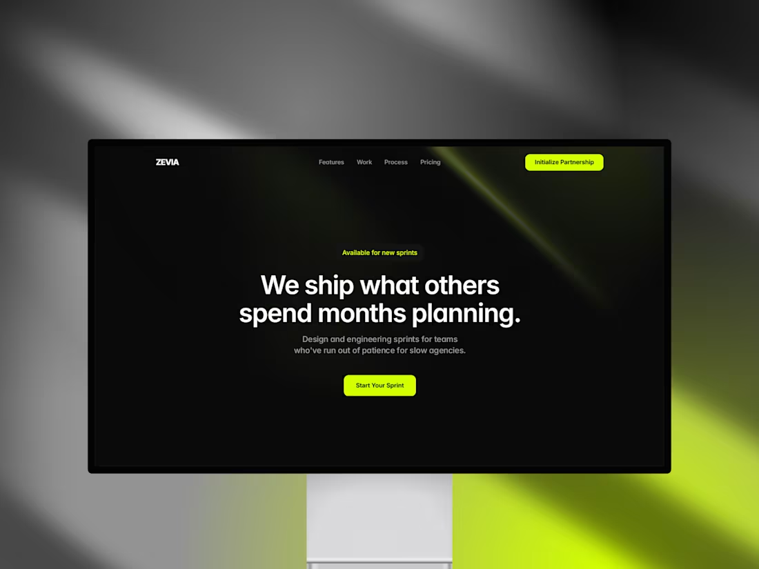
Zevia · Dark Framer Template for Design Studios & Agencies
1
0
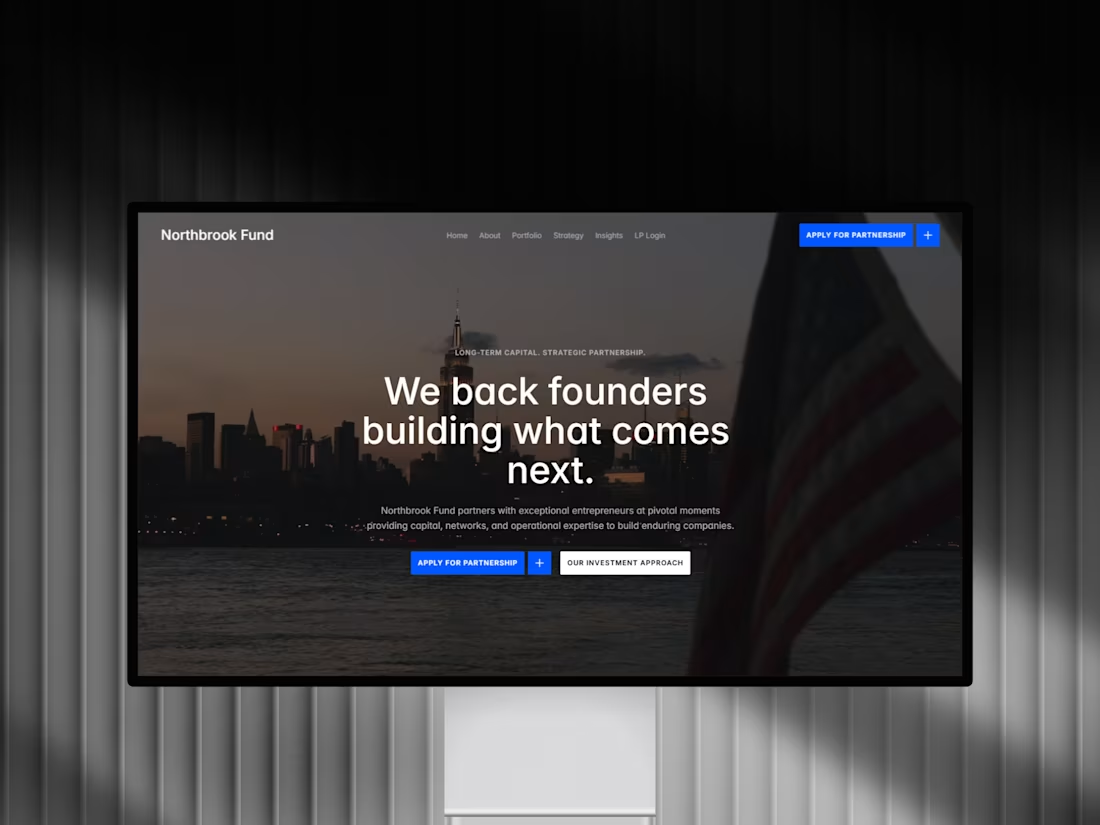
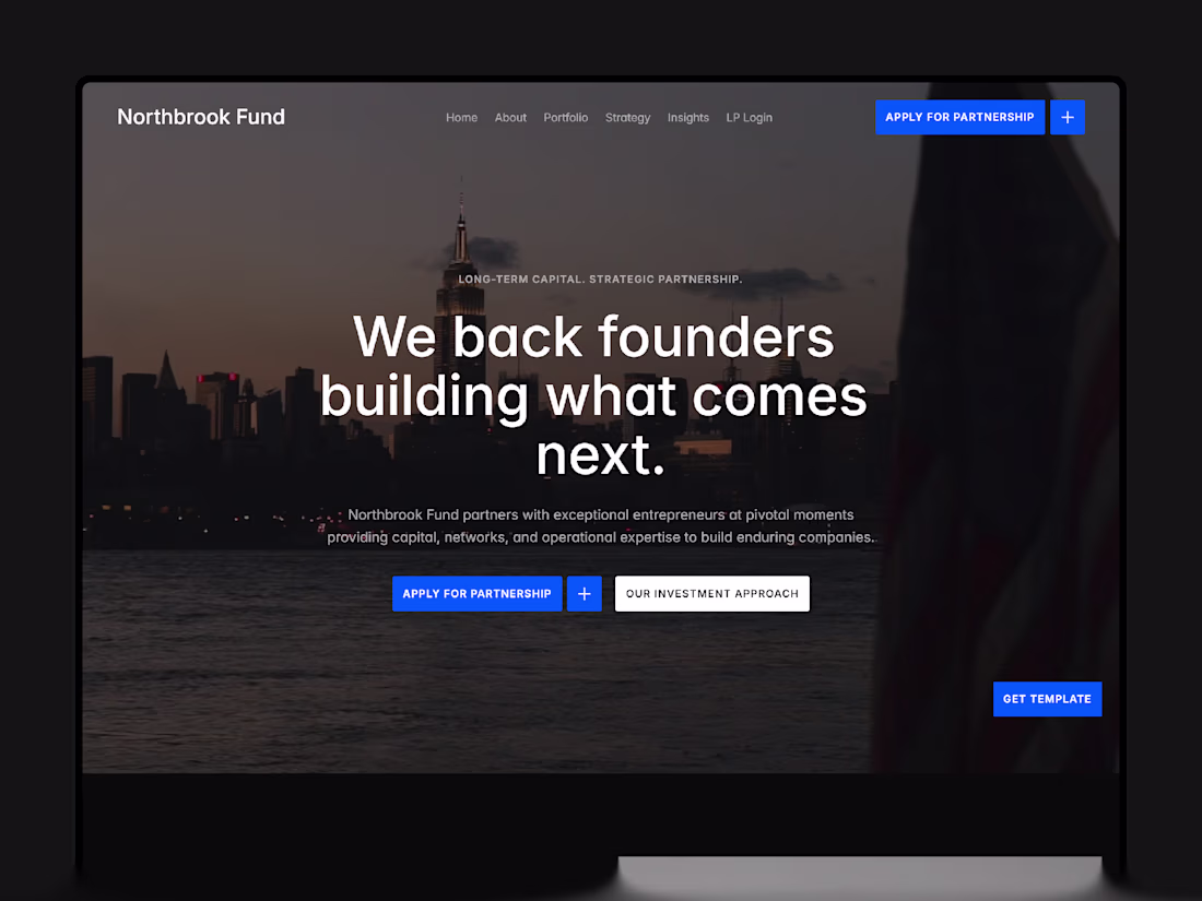
Northbrook · Institutional Finance Framer Template
1
0
Zevia is a premium dark @Framer template built for sprint-based agencies that want to project trust, maturity, and authority from day one.
1
2
106
Meet Northbrook, a premium website for VC and PE funds
built on @framer (https://x.com/framer).
1
1
75
The design language of trust: Why we built Northbrook for emerging funds.
When an emerging manager, micro-VC, or private equity firm launches a new fund, their digital presence is often an afterthought. The focus stays locked on the pitch deck, the legal framework, and investor relationships.
But when a Limited Partner (LP) opens a fund's website to run basic due diligence, the layout tells a story. Most financial web templates force you to choose between looking institutional and being fast to deploy. They pull you toward rigid, hard-coded legacy frameworks or overly flashy creative agency portfolios that feel completely out of place to a sophisticated investor.
Northbrook was built to eliminate that friction. It is a premium, minimal Framer template designed explicitly for the investment sector—venture capital, private equity, and family offices. The entire architecture leans into a sophisticated, premium dark aesthetic that commands digital authority from day one.
Here is the design philosophy behind the implementation:
1. Intentional Portfolio Management via Native CMS
Investment firms live and die by their track record, but updating active investments shouldn't require a web engineer. Northbrook features a structured, intuitive CMS backend. Fund managers can filter, scale, and showcase portfolio companies instantly, ensuring the live data looks production-grade every time an edit is made.
2. Locked Mobile Viewport Integrity
LPs review fund criteria on the move. Most template structures fall apart under aggressive font scaling or broken container paddings when opened on a smartphone screen. We spent weeks refining the typography hierarchies and micro-grid margins inside this template so that your fund retains its strict structural authority on any viewport.
3. Dense Metadata and Editorial Hierarchy
We moved completely away from generic tech-startup landing pages. Every section, line-height, and element in Northbrook is engineered to handle clean corporate reading, investment theses, and team track records cleanly and legibly.
The Execution Scope
Northbrook includes 12 production-ready page layouts—including dedicated spaces for Fund Thesis, Team Bios, Dynamic Portfolios, and Contact routes—complete with step-by-step setup documentation and lifetime product updates.
The template is officially live on the Framer Marketplace today. You can audit the live interactive preview and read the structural breakdown here:
https://www.framer.com/community/marketplace/templates/northbrook/
If your fund requires custom operational modifications, or if you are looking to build a secure enterprise footprint from the ground up, let's connect right here on Contra to map out your project.
2
65
Working on my third Framer template.
The goal isn't to make it louder than everything else.
Just more intentional.
2
3
91
For the past two months, I’ve been designing and selling Framer templates under my personal name.
Today, that changes.
I’m officially migrating everything under a dedicated brand: Pacts Studio (https://pacts.studio/).
Building under a personal name has its limits. To truly serve premium agencies, studios, and funds, it was time to step up and build a real storefront that reflects the quality of the work.
The new webstore is live, completely redesigned to show you exactly how our templates perform before you buy.
Our next template is already in the works and dropping soon.
Pacts Studio is officially open.
1
74
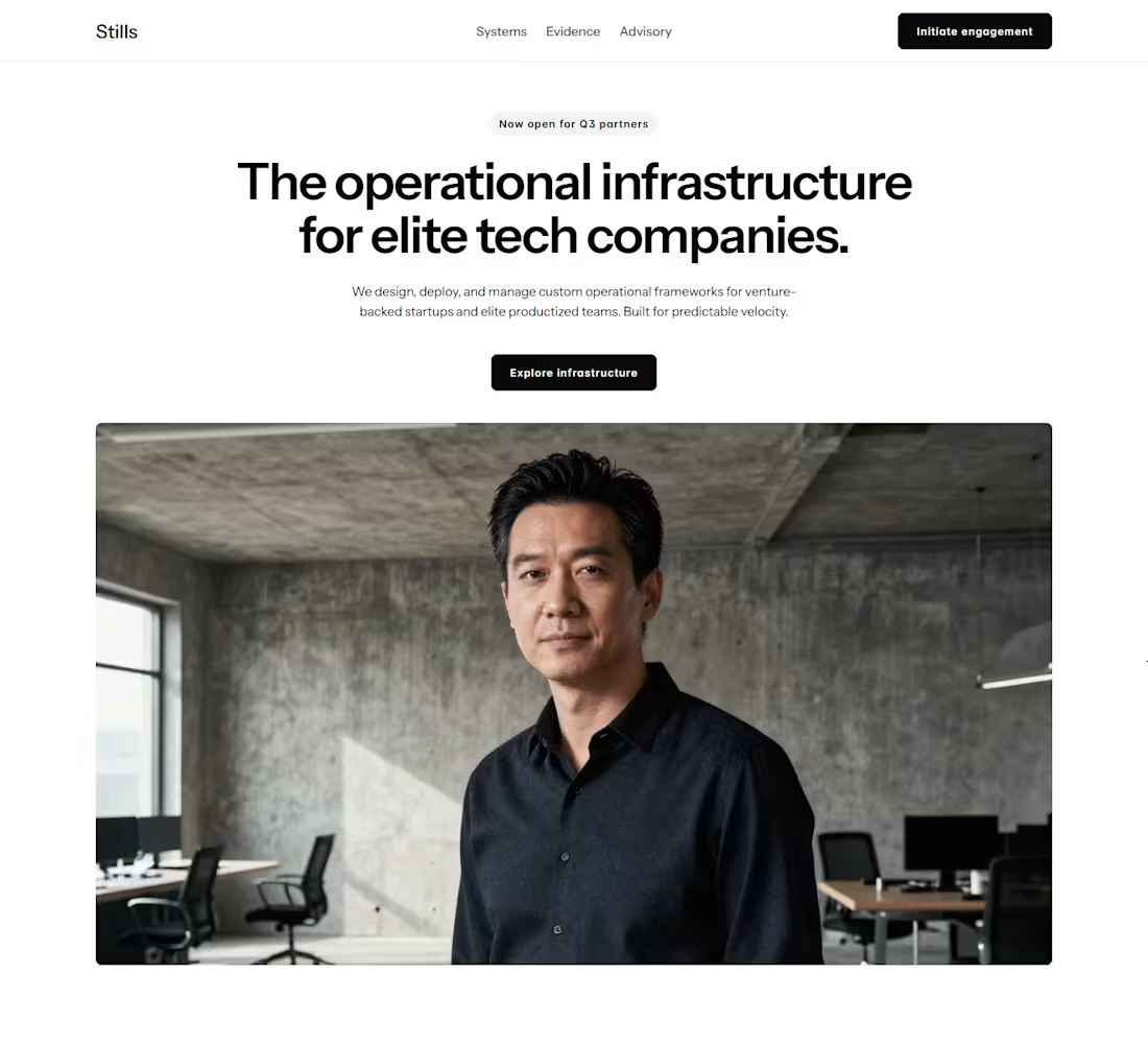
Building high-end web templates for tech companies means focusing entirely on the responsiveness of elements in production.
In this preview of "Stills", you can see how the layout handles the shift from a desktop grid down to a mobile viewport.
Instead of relying on fixed heights or messy hacks, everything is controlled through strict padding and gap variables.
When the layout collapses into a vertical direction on mobile, the content switches to a clean left alignment.
This matches the natural reading rhythm of the phone breakpoint and prevents text wrap clipping.
By keeping the design system strictly organized under the hood, the entire template remains incredibly lightweight, with no layout shifts when loading dynamic CMS data.
The "stills" template release is coming soon.
2
106
Moving my independent design operations under a dedicated brand: Pacts Studio.
My focus remains on building clean, high-converting Framer templates and premium client websites with flawless layout responsiveness.
Both Northbrook and Zevia are fully updated and live on the new storefront today, and have been thoroughly audited using the new Framer 3.0 Agents.
Explore the storefront or reach out for premium projects: pacts.studio (http://pacts.studio)
2
91
High-end agency templates often use too much visual fluff, heavy shadows, massive gradients, and complex animations to look premium.
For my new project, Stills, I wanted to see if I could create a high-ticket aesthetic using just clean layout fundamentals.
The entire build relies entirely on typographic scale, tight vertical padding, and consistent stack gaps to keep things fully fluid.
Here is how the desktop viewport is looking on the live canvas.
Let me know what you think.
2
4
129
Just launched my latest premium template: Zevia.
This layout is built for independent consultants and creative design studios who want a digital presence that reflects elite status.
It comes fully equipped with an interactive pricing matrix toggle, personalized calendar booking configurations, and 4 pre-filled dynamic CMS case study pages. Everything is fully responsive and ready to launch to a custom domain tonight.
Explore the setup: zevia.framer.website (http://zevia.framer.website)
3
174
Most template creators focus entirely on flashy animations. They forget that an agency website has one true job: to turn traffic into paid clients.
When I started building Zevia, I wanted to strip away the noise. I spent days analyzing why high ticket clients leave a website without booking a call. The answer is always friction or a lack of trust.
So I crafted Zevia with a clean, dark editorial aesthetic that instantly feels premium and authoritative.
Instead of adding useless decorations, I focused on building functional pieces that actually matter to business owners:
A seamless calendar booking section right in the footer so visitors never have to leave the page to schedule a call
Parallel pricing lanes designed perfectly for agencies selling fixed timeline sprints
A beautifully structured custom portfolio system to showcase your case studies
If you are a design studio, AI agency, or consultant looking to launch a website that justifies your premium rates, Zevia is officially live today.
You can go live in hours, not weeks. Just drop in your work, update your main brand color variable, and hit publish.
See the live interactive demo here: https://zevia.framer.website
You can also explore my fully updated store for more premium templates: https://jalaleddine.me
4
5
286
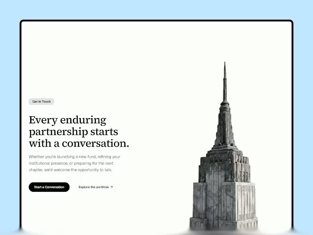
I recently redesigned my website, which presents Framer services and template work, and the process became more technical than visual over time.
The interesting part is that most improvements came from reducing complexity rather than adding more interface elements.
Less motion competing for attention.
More controlled contrast between surfaces.
More intentional spacing behavior between content-heavy sections.
Stronger typography hierarchy instead of relying on decorative visuals.
I’ve been thinking a lot lately about how modern portfolio websites often optimize for immediate visual impact but quietly reduce readability and trust after a few seconds of navigation.
So the goal here became creating something that feels structured and calm, even when the interface becomes dense.
Still refining the system before considering it finished, and would genuinely value critiques from other Framer designers/developers here.
Especially around pacing, hierarchy, and areas where the experience still feels unresolved.
Portfolio Preview (https://jalaleddine.me)
4
3
247
One thing I’ve been noticing while studying finance and consulting websites is how often visual intensity gets mistaken for trust.
Heavy contrast.
Constant emphasis.
Too many competing focal points.
The result is usually a website that feels visually expensive but cognitively exhausting.
While refining Northbrook, I started reducing visual pressure instead of increasing it.
More controlled tonal balance.
Calmer transitions between sections.
Better spacing rhythm for dense content areas.
Softer contrast distribution across components.
Most of the recent work has been structural rather than decorative.
Interesting how small adjustments in pacing and visual weight can completely change perceived credibility.
Still refining the system and would genuinely value critiques from other designers/developers here.
Especially around hierarchy, readability, and areas that still feel unresolved.
Northbrook Preview (https://northbrookfund.framer.website/?utm_source=chatgpt.com)
1
187
Your SaaS landing page is the first thing a potential client judges you by.
Most look like a free theme with a logo slapped on.
I spent weeks building Zevia: a Framer template designed specifically for AI & SaaS founders who want a site that actually builds trust and converts.
Before it goes live on the Framer Marketplace, I'm giving free access to this community.
What you get:
A complete, CMS-powered Framer site. Dark system, high contrast, premium micro-interactions. Structured for real SaaS copy. Responsive across every breakpoint. Swap the content and ship.
Comment below. I'll send the remix link directly at launch.
First-come, first-served.
2
3
249
Jalal Eddine Maoukil - Minimal Professional Web Services Website
2
306
Northbrook Fund - Premium Agency & Consulting Finance Framer Website
2
283