The network for creativity
Join 1.25M professional creatives like you
Connect with clients, get discovered, and run your business 100% commission-free
Creatives on Contra have earned over $150M and we are just getting started
Back to feedPost

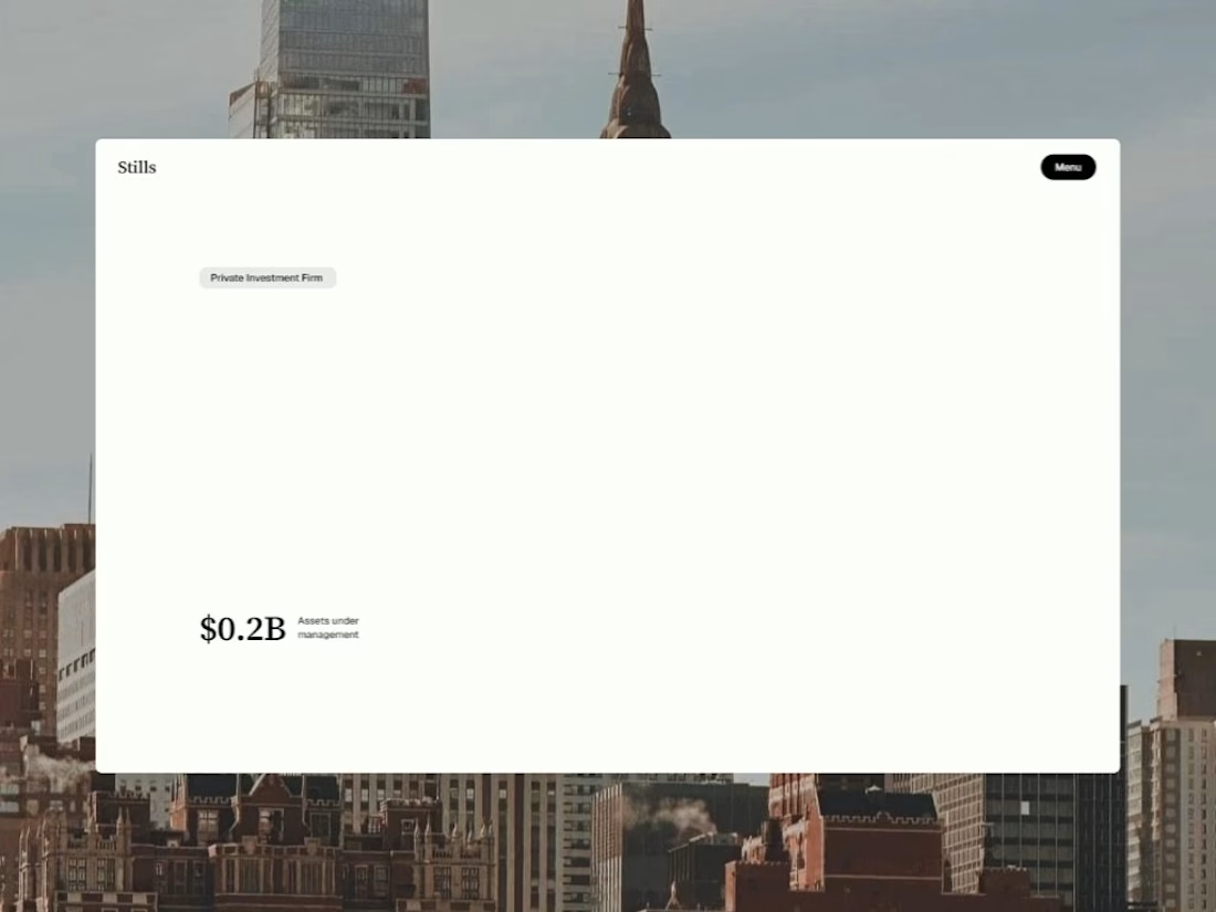
I spent three weeks trying to make a website look boring on purpose
Here's a thing nobody tells you about designing for finance: almost every VC and private equity site looks like it was made by the same person. Dark hero section. Gradient mesh in the background. A stat counter that ticks up when you scroll. A stock photo of four people in a glass conference room, all laughing at something off-camera that clearly wasn't funny.
I know this because I looked at probably 40 of them before I started Stills.
And at some point I stopped taking notes on what to do and started taking notes on what to avoid. That list got long fast. No gradients. No drop shadows. No "trust badges" made of client logos in grayscale. No carousel testimonials with five-star icons, because nobody buying a $50M fund stake needs a Yelp rating to feel confident.
What I kept coming back to was: none of this actually looks like money. It looks like a SaaS company borrowed a suit.
So I asked myself a dumb-sounding question — what does an actual institution's printed material look like? Not their website. Their annual report. Their LP deck. Their internal memo. And the answer was obvious the second I framed it that way: serif headlines, generous whitespace, almost no color, typography doing all the emotional work instead of visual effects. Nobody at a family office is impressed by a hover animation. They're impressed by restraint.
That became the whole design brief. One serif for headings — Source Serif 4, because it reads institutional without reading old. One sans for body — Geist, clean and quiet. Two colors, full stop. Canvas and Ink. Every single hierarchy decision made with opacity instead of a new color, a new shadow, a new border. If I found myself reaching for a gradient to fix a section that felt flat, that was a sign the layout was wrong, not the palette.
The hardest part wasn't building it. It was resisting the urge to add things. Every "just one more effect" instinct I had, I killed. A slideshow here. A cursor trail there. All cut. The version that shipped is the version with the least in it, and that took longer to get to than the version with the most.
I called it Stills — because a still frame doesn't need motion to hold your attention. That was the whole bet.
It's live now. 14 pages, full CMS for portfolio companies, leadership, and research notes, built for VC funds, private equity, family offices, wealth managers — anyone whose website needs to say "we've been doing this since before you were interested in it" without saying it out loud.
If you design in this space, or you're building something in fintech/wealth/institutional finance and every template you've found looks like it's trying too hard — take a look: https://www.framer.com/community/marketplace/templates/stills/
Curious what other designers in here are doing to make finance and institutional sites feel less like generic SaaS. Feels like an underbuilt niche.

The network for creativity
Join 1.25M professional creatives like you
Connect with clients, get discovered, and run your business 100% commission-free
Creatives on Contra have earned over $150M and we are just getting started
Related posts

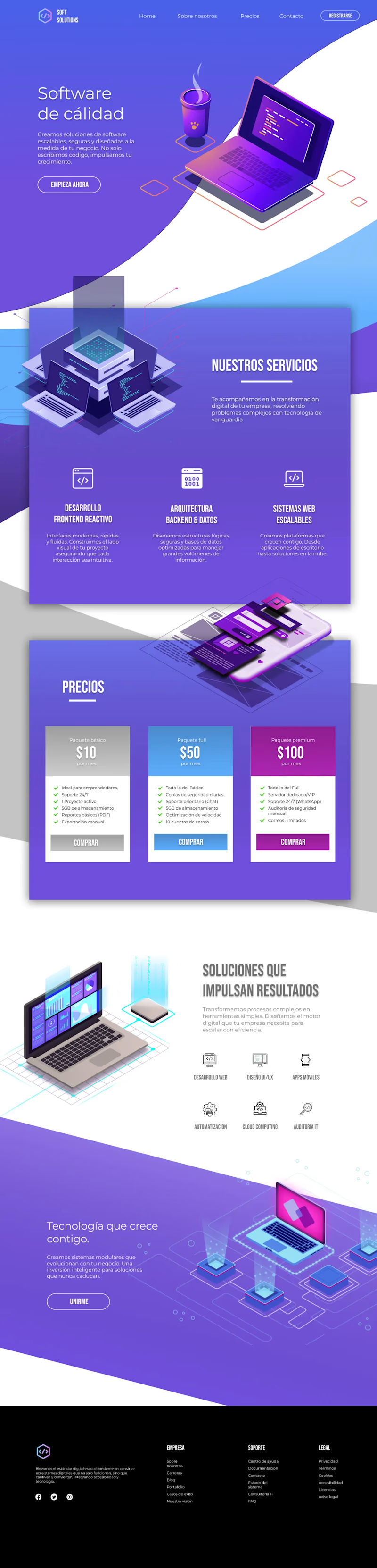
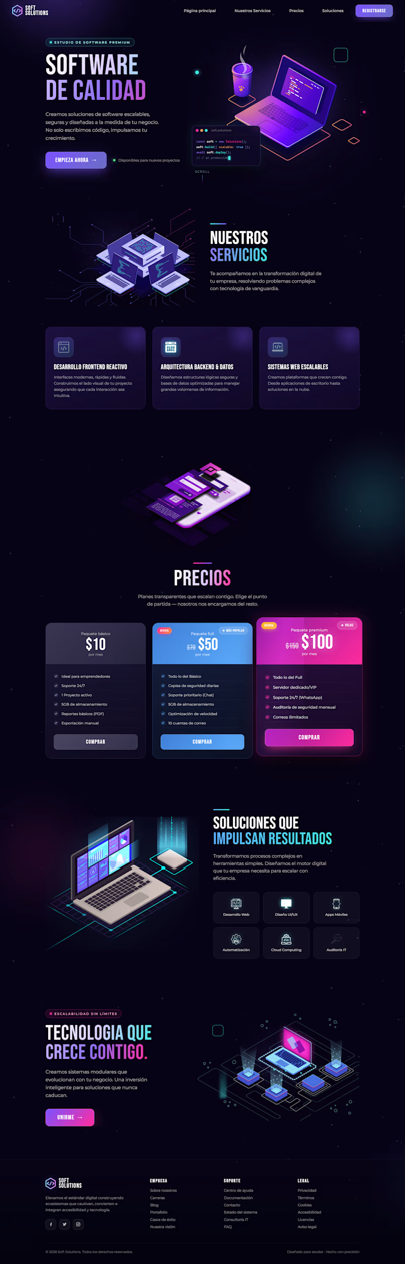
I redesigned the website for this project, keeping its core elements while making it more modern and techy with dark mode by default, eye-catching floating animations, and improved color contrast.
Do you think the redesign I made in Figma is better? Or is the original version better?

19 voted
40%
28 voted
60%
47 votes
Closed

Both of them looks nice but I can clearly see a big mistake on the footer the orig light page footer should be white or blue in color. @Grecia Valero that's why everyone's voted on the dark mode

Designed and developed a modern Framer website for an online learning platform to showcase courses, engage learners, and increase enrolments. I created a responsive, user-friendly experience with intuitive navigation, clear course presentation, strategic calls to action, and a scalable CMS for easy content management. The website was optimized for performance, SEO, and accessibility, helping the platform establish a professional online presence and support long-term growth.


Amazing

Hey Contra Community! 👋
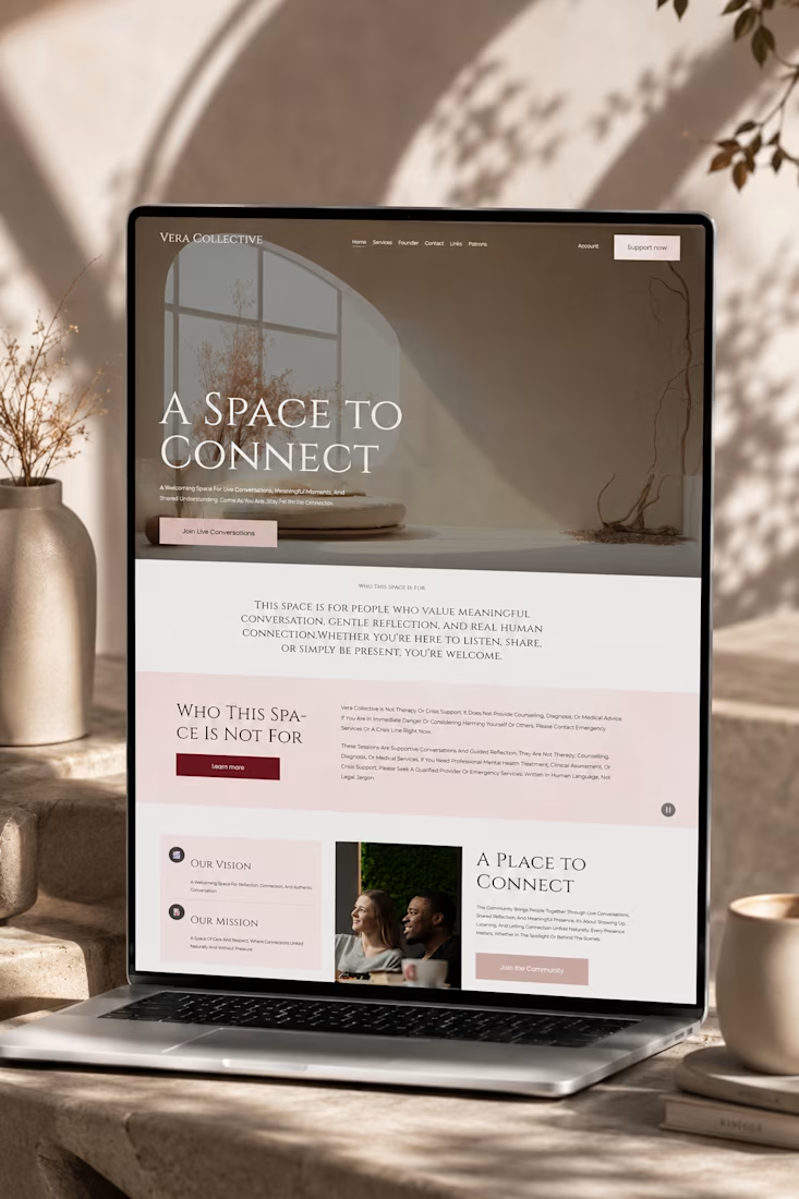
Excited to share my latest Squarespace project, Vera Collective, a unique online space dedicated to fostering meaningful live conversations and genuine human connection. This project was a fantastic opportunity to push the boundaries of Squarespace's design capabilities, especially with the new Finish Layer tools.
The Vision Behind Vera Collective
Vera Collective was born from a desire to create a serene, inviting digital sanctuary where individuals can engage in authentic dialogue and shared understanding. The design needed to reflect this ethos: sophisticated, minimalist, and deeply engaging.
Design Highlights & Finish Layer in Action:
1. Bold, Immersive Aesthetic:
I opted for a striking dark theme with elegant typography to create an immediate sense of depth and focus. This bold choice helps to draw users into the content, emphasizing the intimacy of live conversations.
2. Strategic Use of Block Transforms:
To achieve a dynamic yet refined layout, I extensively utilized Block Transforms. Notice how certain sections, like the prominent "Who This Space Is Not For" area, use subtle transformations to break the grid and add visual interest without compromising readability. This allowed for a more artistic and less conventional presentation of important information.
3. Responsive Stacks for Seamless Experience:
Ensuring a flawless experience across all devices was paramount. I leveraged Stacks to meticulously arrange content blocks, guaranteeing that the site's unique visual hierarchy and interactive elements remain perfectly aligned and accessible, whether viewed on a desktop or a mobile device.
4. Subtle Block Animations for Engagement:
To enhance user engagement and guide their journey through the site, I incorporated Block Animations. These subtle, scroll-triggered effects introduce content gracefully, adding a layer of sophistication and interactivity that keeps the user immersed without being distracting.
5. Custom Typography with Font Uploads:
The brand identity of Vera Collective demanded a distinctive typographic voice. Through Font Uploads, I integrated custom fonts that perfectly complement the site's elegant and thoughtful aesthetic, reinforcing its unique brand personality.
Why Vera Collective Stands Out:
Vera Collective isn't just a website; it's an experience. By combining a bold design vision with the powerful new Finish Layer tools in Squarespace, I was able to craft a platform that is both visually stunning and highly functional, truly embodying its mission of connection and understanding.
I'd love for you to explore Vera Collective yourself and let me know what you think! Your feedback is invaluable.
#squarespacechallenge #webdesign #community #veracollective











Trending

Claude
Claude has entered the design space. How are you using Claude Design?

Contra University
Learn from expert creatives how to earn more using next-gen AI tools.
creativeaiflow
Creative AI workflows are evolving. What tools do you use, and what are their strengths and weaknesses?
freelancerlife
Freelancer life is wins, pivots, and everything in between. What’s yours right now?