The network for creativity
Join 1.25M professional creatives like you
Connect with clients, get discovered, and run your business 100% commission-free
Creatives on Contra have earned over $150M and we are just getting started
Back to feedPost

Hey Contra Community! 👋
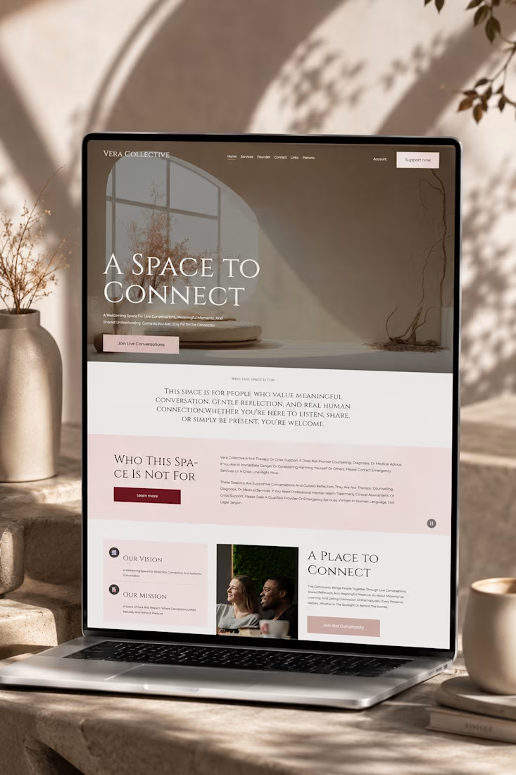
Excited to share my latest Squarespace project, Vera Collective, a unique online space dedicated to fostering meaningful live conversations and genuine human connection. This project was a fantastic opportunity to push the boundaries of Squarespace's design capabilities, especially with the new Finish Layer tools.
The Vision Behind Vera Collective
Vera Collective was born from a desire to create a serene, inviting digital sanctuary where individuals can engage in authentic dialogue and shared understanding. The design needed to reflect this ethos: sophisticated, minimalist, and deeply engaging.
Design Highlights & Finish Layer in Action:
1. Bold, Immersive Aesthetic:
I opted for a striking dark theme with elegant typography to create an immediate sense of depth and focus. This bold choice helps to draw users into the content, emphasizing the intimacy of live conversations.
2. Strategic Use of Block Transforms:
To achieve a dynamic yet refined layout, I extensively utilized Block Transforms. Notice how certain sections, like the prominent "Who This Space Is Not For" area, use subtle transformations to break the grid and add visual interest without compromising readability. This allowed for a more artistic and less conventional presentation of important information.
3. Responsive Stacks for Seamless Experience:
Ensuring a flawless experience across all devices was paramount. I leveraged Stacks to meticulously arrange content blocks, guaranteeing that the site's unique visual hierarchy and interactive elements remain perfectly aligned and accessible, whether viewed on a desktop or a mobile device.
4. Subtle Block Animations for Engagement:
To enhance user engagement and guide their journey through the site, I incorporated Block Animations. These subtle, scroll-triggered effects introduce content gracefully, adding a layer of sophistication and interactivity that keeps the user immersed without being distracting.
5. Custom Typography with Font Uploads:
The brand identity of Vera Collective demanded a distinctive typographic voice. Through Font Uploads, I integrated custom fonts that perfectly complement the site's elegant and thoughtful aesthetic, reinforcing its unique brand personality.
Why Vera Collective Stands Out:
Vera Collective isn't just a website; it's an experience. By combining a bold design vision with the powerful new Finish Layer tools in Squarespace, I was able to craft a platform that is both visually stunning and highly functional, truly embodying its mission of connection and understanding.
I'd love for you to explore Vera Collective yourself and let me know what you think! Your feedback is invaluable.
#squarespacechallenge #webdesign #community #veracollective



Creative work

This connects well

such a clean work
The network for creativity
Join 1.25M professional creatives like you
Connect with clients, get discovered, and run your business 100% commission-free
Creatives on Contra have earned over $150M and we are just getting started

Challenges
View all


Related posts


Engaging website for a New York–based architecture and construction studio, balancing bold typography, immersive imagery and a minimal editorial layout.


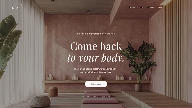
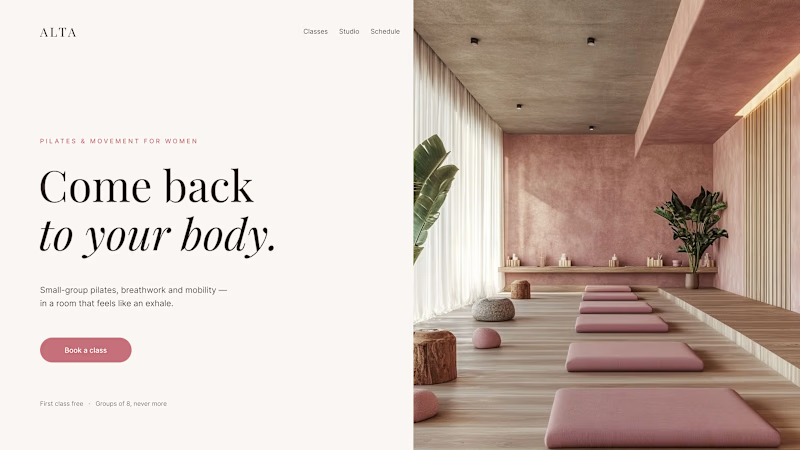
Where should the photo live - behind the words or beside them?
Same pilates studio, same headline.
01 - Photo as the background. Full-bleed atmosphere: the room wraps around the words. Immersive and cinematic, but the text only survives thanks to a darkening overlay laid over the image.
02 - Photo beside the text. A clean split: words on calm ground, the room in its own column. Everything readable at a glance, the trade is a little less drama.
One sells the feeling. The other sells the clarity. Which hero would make you book the class?

80 voted
75%
27 voted
25%
107 votes
Closed
1 nails it

Two case studies, two totally opposite registers.
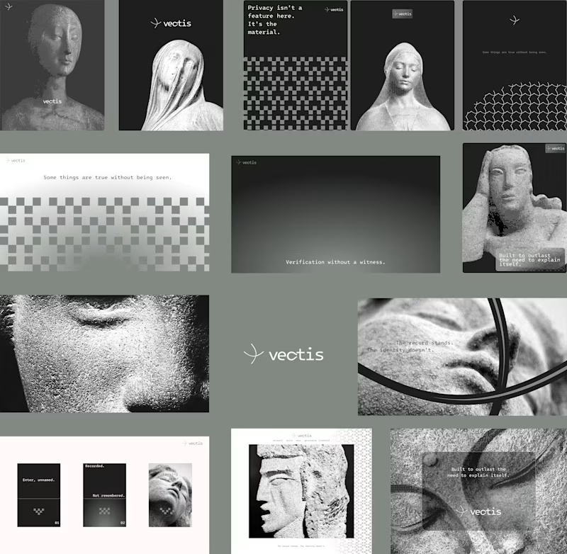
One is carved in stone and says nothing.
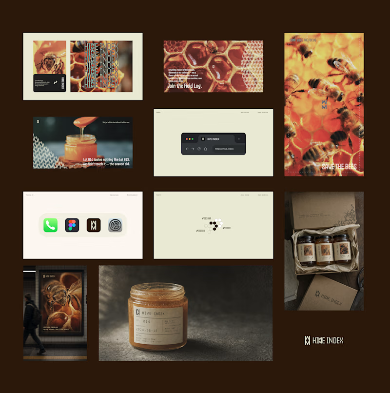
One drips off a spoon and won't shut up about which field it came from.
Which one do you want first?
vectis — zero-knowledge privacy, dithered like a forgotten statue
HIVE INDEX — raw honey with a paper trail. No two lots taste the same, and we don't correct for that.
45 voted
51%
43 voted
49%
88 votes
Closed

Vectis


