The network for creativity
Join 1.25M professional creatives like you
Connect with clients, get discovered, and run your business 100% commission-free
Creatives on Contra have earned over $150M and we are just getting started
Back to feedPost


Engaging website for a New York–based architecture and construction studio, balancing bold typography, immersive imagery and a minimal editorial layout.


Thank you so much Alaa! :)

Bold typography and immersive imagery is such a natural pairing for architecture work. Was the client already on board with going this bold, or did you have to talk them out of something safer first?
We actually prepared three proposals, and this one was considered the safer option of the three 😄 The color choice, however, came after a few more conservative iterations - the client ultimately chose pink/red, which matches the flag of their country of origin!

The restrained editorial layout lets the architecture carry the mood, while the framing interaction adds depth without competing with the typography. Really thoughtful studio presentation.
Thank you so much Rohan!
The network for creativity
Join 1.25M professional creatives like you
Connect with clients, get discovered, and run your business 100% commission-free
Creatives on Contra have earned over $150M and we are just getting started
Trending
retrofuturism
Share your favorite designs from the past exploring the distant future. Or your own take on the aesthetic 🚀
halftone
Dots. Texture. Grain. Let's see your designs using the halftone technique.

Midjourney
Creatives are showing off what they're making with Midjourney.
colorgrade
Video editors sound off: How do you enhance the mood of your video in color grading?


Challenges
View all


Related posts

New work for NY-based Director and DOP, Gage Zanghi! Check it out 😉
Currently available for hire if you are looking to build a bespoke portfolio website!
Portfolio sites for directors have to work almost like a reel and a resume at once. How did Gage react to the first pass, did the video-heavy approach need much convincing?

Dark, bold, and a little futuristic. 💜
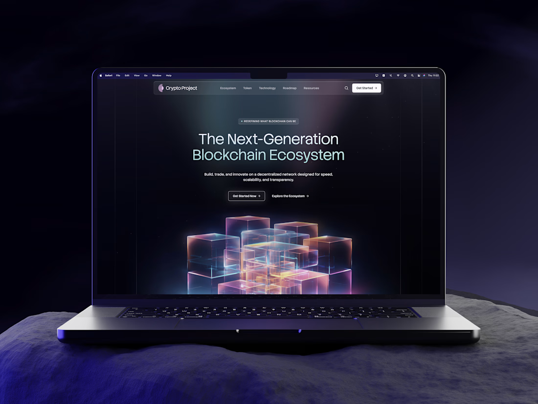
Hey Contra community! Today I want to share something new with you – Crypto Project, a modern Web3 platform concept built around DeFi tools and digital assets.
I really enjoyed playing with the contrast between the dark interface, vibrant lilac and mint accents, and bold typography to give this concept its own distinct character.


I love the overall design hierarchy and futuristic feeling with great gradient visuals. Good work!

🤺 The screen everyone uses and nobody notices
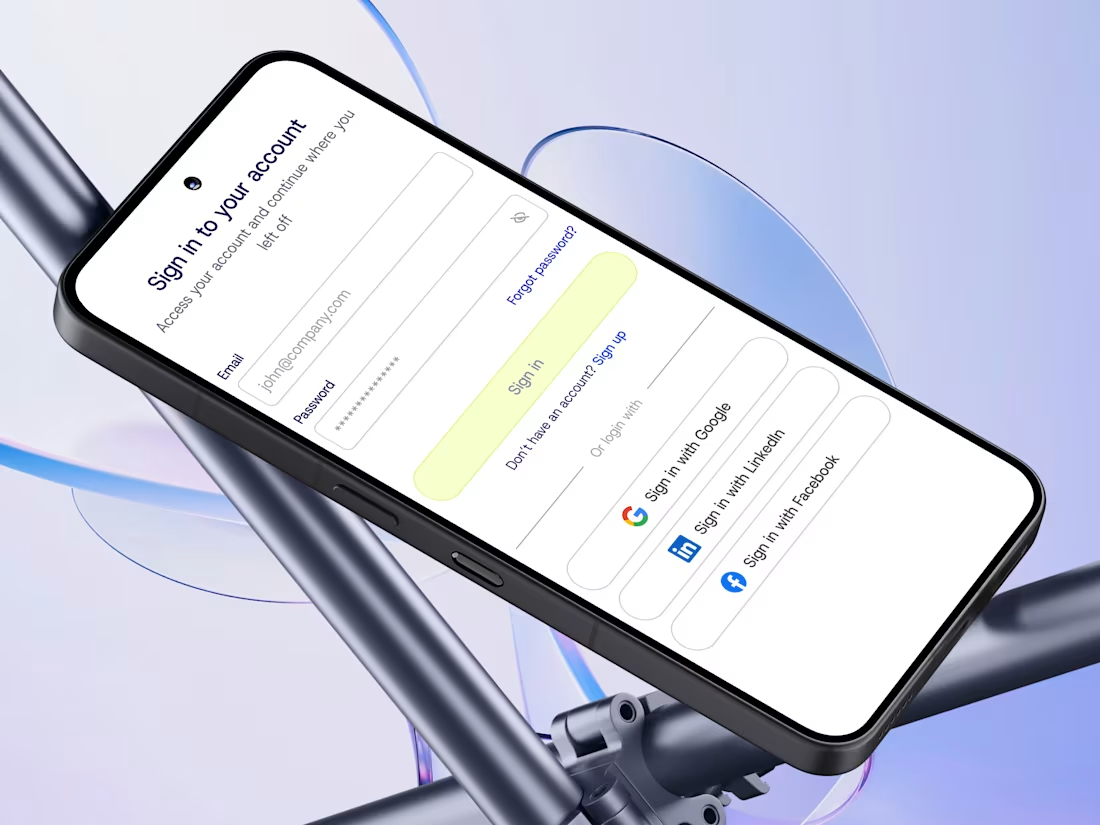
New shot: sign-up and login for a B2B SaaS platform that protects advertising budgets.
Getting in takes three steps, choosing a plan takes one answer and coming back takes a second. Both screens went to development with every state written out.
Have a look ⬇️
Would love to hear what you think!

you did a great tool!