The network for creativity
Join 1.25M professional creatives like you
Connect with clients, get discovered, and run your business 100% commission-free
Creatives on Contra have earned over $150M and we are just getting started
Back to feedPost
Taste Test


Where should the photo live - behind the words or beside them?
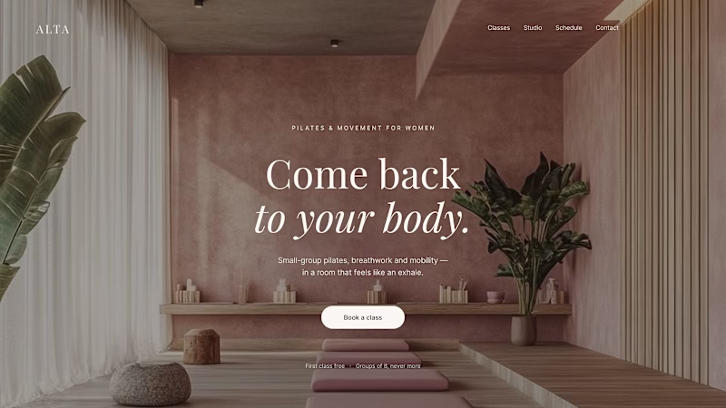
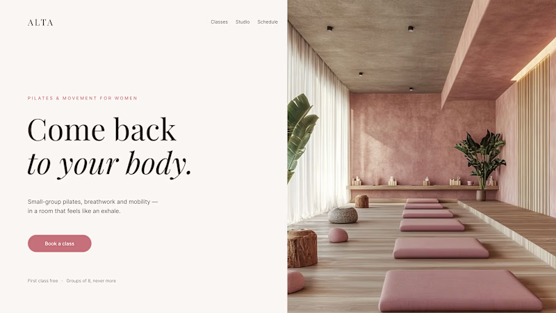
Same pilates studio, same headline.
01 - Photo as the background. Full-bleed atmosphere: the room wraps around the words. Immersive and cinematic, but the text only survives thanks to a darkening overlay laid over the image.
02 - Photo beside the text. A clean split: words on calm ground, the room in its own column. Everything readable at a glance, the trade is a little less drama.
One sells the feeling. The other sells the clarity. Which hero would make you book the class?

44 votes
Ends in 1d


The first hero with photo as the background interprets and supports the hero copy very well

The background treatment makes the comparison feel tangible—the full-bleed version has atmosphere, while the split layout gives the headline more breathing room. I’d lean background for an emotional first beat, then let the next section restore clarity.

I prefer Design 02.
The full image is clearly visible and the overall presentation looks great.

1 nails it

I think 01 feels more cinematic, but 02 will communicate faster and convert better.


The first one.


Both look great, but according to me, 01 wins. I must say, the picture selection is absolutely awesome!

Both are amazing. 1st one got my vote

01. People book pilates for the feeling, not the floor plan, atmosphere sells that better than clarity does here.

Photo as mood vs photo as proof, such a clean way to frame the test. Did your client's gut pick match whichever version ends up converting better, or is that still an open question?

01🔥

01 for the vibe, 02 for conversions. For a pilates studio trying to build a community, that full-bleed shot feels right.
The network for creativity
Join 1.25M professional creatives like you
Connect with clients, get discovered, and run your business 100% commission-free
Creatives on Contra have earned over $150M and we are just getting started
Trending
retrofuturism
Share your favorite designs from the past exploring the distant future. Or your own take on the aesthetic 🚀
halftone
Dots. Texture. Grain. Let's see your designs using the halftone technique.

Midjourney
Creatives are showing off what they're making with Midjourney.
colorgrade
Video editors sound off: How do you enhance the mood of your video in color grading?
Challenges
View all


Related posts

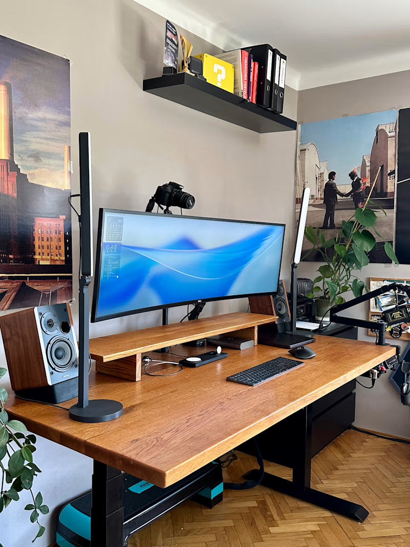
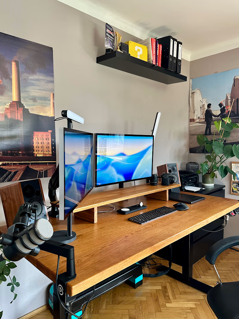
Upgraded my desk from one 49-inch ultrawide to two Studio Displays.
Some days I spend 14 hours here, so I’m calling this an ergonomic decision.
In Poland we say “more equipment than talent.”
English has “all the gear, no idea.”
Both feel accurate.
The setup feels great, though.
18 voted
35%
33 voted
65%
51 votes
Closed
"More equipment than talent" got me rolling 😂

Which background mesh gradient works better for a modern Auth UI: Left or Right? 🎨👇
I’m working on a clean login concept with animated ambient gradients, micro-interactions, and a minimalist form layout.
Design Breakdown:
🟢 Option A (Teal / Emerald):
• Dynamic contrast that instantly catches the eye
• Adds energy to the overall white UI card
• High visual hierarchy for landing/auth pages
⚪ Option B (Monochrome / Slate):
• Subtle, sleek, and dark-mode friendly
• Less visually distracting, higher focus on the form
• Minimalist luxury aesthetic
Which one creates a better user experience for a SaaS onboarding process? Drop your thoughts below!


28 voted
53%
25 voted
47%
53 votes
Closed


Option b would be incredible if you were to match the gradient color on the right panel with the visual color in my opinion, but in this case i will go with a
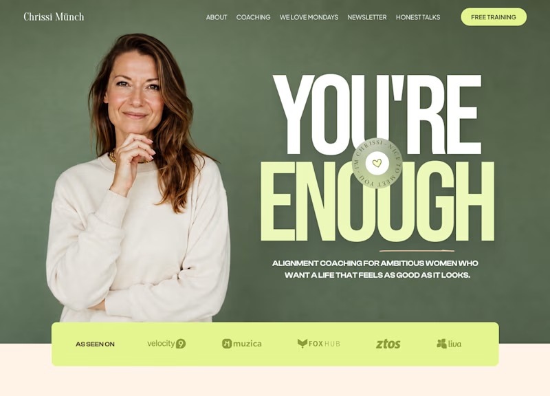
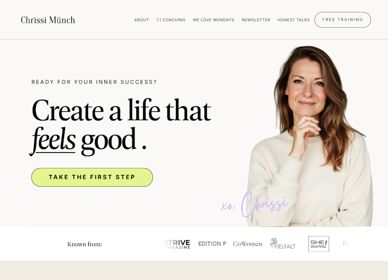
Okay so, one of these designs is mine and the other is another designers work.
The client picked one and rejected the other.
Now I want to know what you would have chosen.
Left or right? And tell me why 👀
7 voted
64%
4 voted
36%
11 votes
Closed

I’d pick A. It has way more personality and makes a stronger first impression🔥