The network for creativity
Join 1.25M professional creatives like you
Connect with clients, get discovered, and run your business 100% commission-free
Creatives on Contra have earned over $150M and we are just getting started
Back to feedPost
Taste Test

Which background mesh gradient works better for a modern Auth UI: Left or Right? 🎨👇
I’m working on a clean login concept with animated ambient gradients, micro-interactions, and a minimalist form layout.
Design Breakdown:
🟢 Option A (Teal / Emerald):
• Dynamic contrast that instantly catches the eye
• Adds energy to the overall white UI card
• High visual hierarchy for landing/auth pages
⚪ Option B (Monochrome / Slate):
• Subtle, sleek, and dark-mode friendly
• Less visually distracting, higher focus on the form
• Minimalist luxury aesthetic
Which one creates a better user experience for a SaaS onboarding process? Drop your thoughts below!


28 voted
53%
25 voted
47%
53 votes
Closed


Option b would be incredible if you were to match the gradient color on the right panel with the visual color in my opinion, but in this case i will go with a

option b


Option B for me 🤩


the teal option A pops. nice work!

option B is good looking

Option B for onboarding specifically — a first-time user is reading form labels and error states, not admiring the card. Save the teal energy for the dashboard they land on after auth succeeds.


Awesome Work

visually appealing is A, but I would love to have same animation to B like A, smooth

B feels softer and more balanced for an auth screen. Option A is nice too but the green pulls a bit more attention than the form. 🙌

Option A🔥

Love Option B 😍

Option "B"

Option B is fav

Going with B here. For onboarding specifically you want the eye landing on the form fields, not the background art. Teal is gorgeous but it's competing with the CTA for attention.

Option A looks better.

b for sure

Option A is the less distracting one!
The network for creativity
Join 1.25M professional creatives like you
Connect with clients, get discovered, and run your business 100% commission-free
Creatives on Contra have earned over $150M and we are just getting started





Related posts

Just created a Framer website preloader with 2 options to choose from. The difference is the sequence of what appears first and the reveal animation. I made two options because I can’t choose which is best lol. What’s your favorite, Option 1 or 2?
BTW if you want this for free (normally $12), like it on the Framer Marketplace (on this link) and comment here so I know, and I’ll send it to your DM.

20 voted
48%
22 voted
52%
42 votes
Closed
Option 1 feels better than Option 2 for me

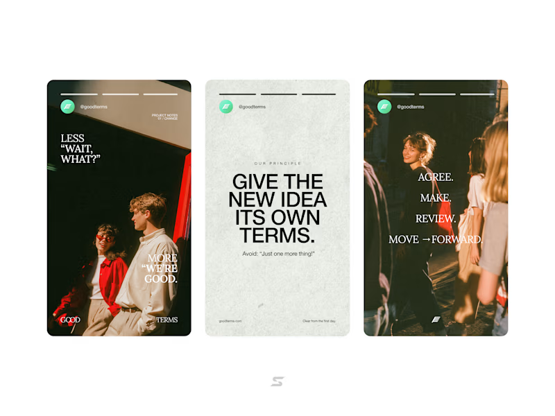
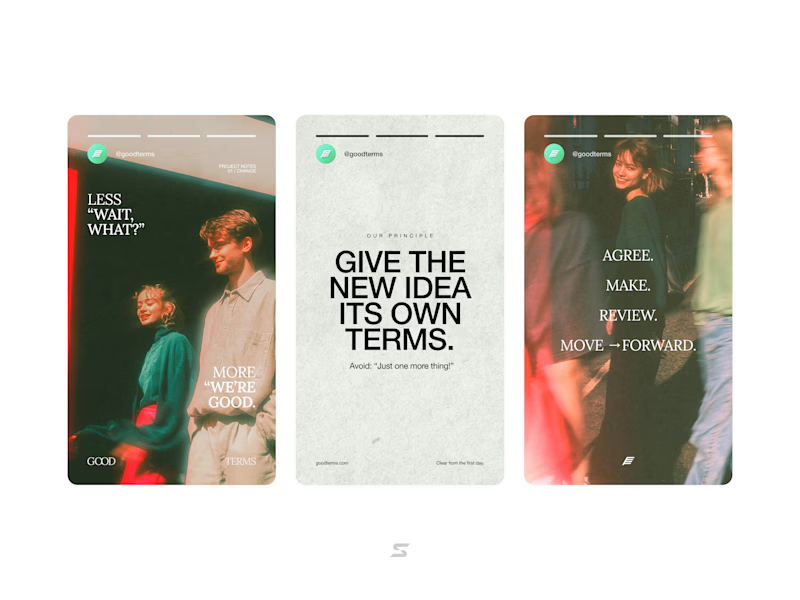
More casual or stylized photography?
20 voted
42%
28 voted
58%
48 votes
Closed


Booking Calendar: Compact or Expanded?
I’m testing two calendar layouts for booking a spa hotel stay.
Version A - Compact. The calendar, selected dates, number of nights, and button remain inside one card.
Version B - Expanded. After the check-in date is selected, a separate booking summary card appears below the calendar.
The functionality is the same - only the presentation and visual hierarchy are different.
Which version feels clearer and easier to use?
17 voted
49%
18 voted
51%
35 votes
Closed

How do you create videos like these?