The network for creativity
Join 1.25M professional creatives like you
Connect with clients, get discovered, and run your business 100% commission-free
Creatives on Contra have earned over $150M and we are just getting started
Back to feedPost

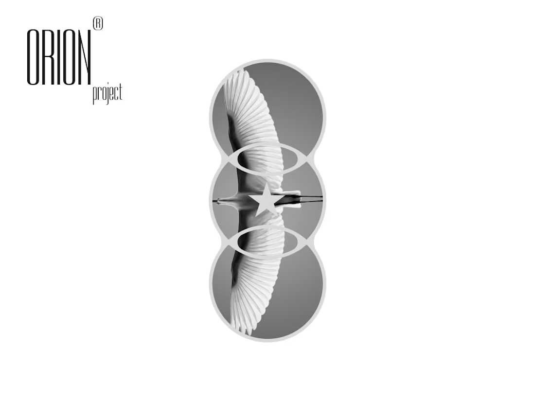
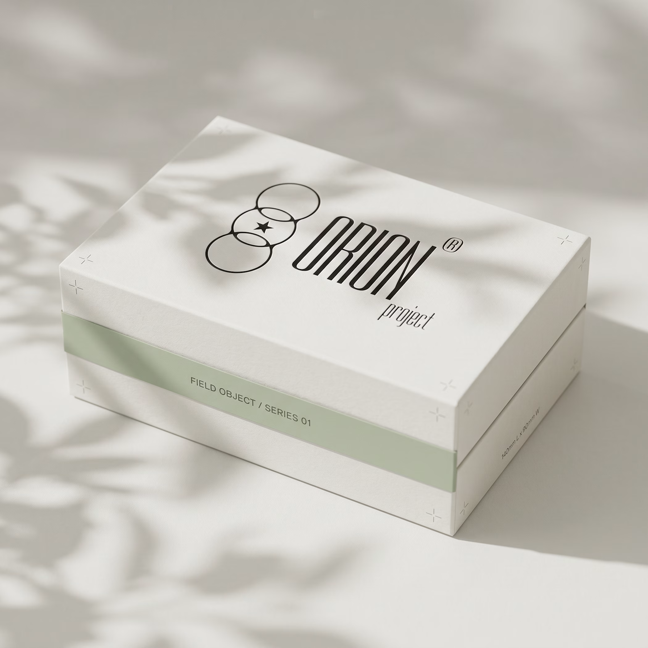
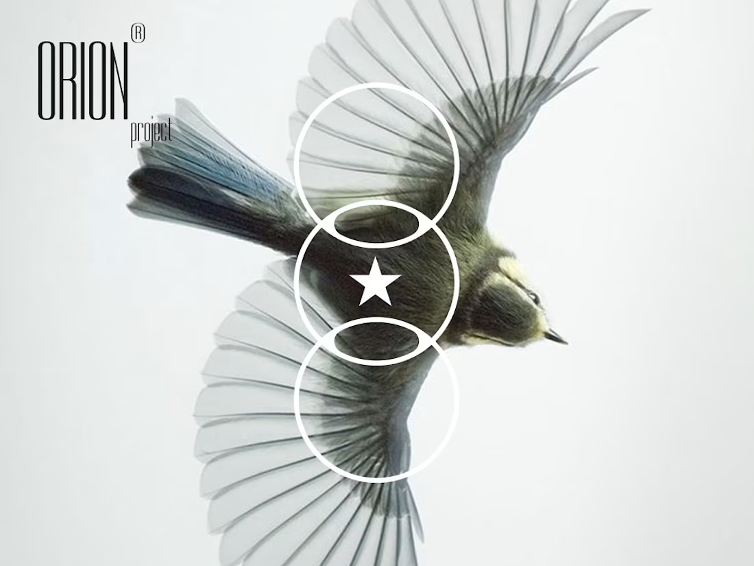
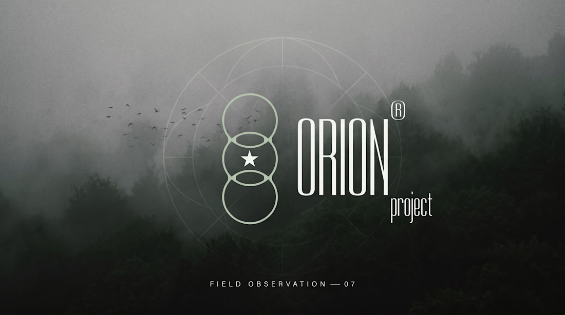
the mark is three circles and a star.
lens / threshold / archive.
every mockup, every object, every type choice came from one question: what does a designer who thinks like a field researcher actually look like.
ORION project — case study out now.


I really like the aesthetic
great branding

Love it!


nice idea leads to nice design
so talented design

This is good

"What would a designer who thinks like a field researcher actually look like" is the kind of prompt that produces actual brand systems, not mood boards. The three-circles-and-a-star mark works as a glyph and as a constellation—semantic doubling that pays off in print, packaging,...

Super!

This is amazing!


Love it!

Branding with an actual point of view, great:)


GOATED

At a glance I remembered the AUDI! Nice job love it.

Nice 👍

Nicely done!


This is dope bro!

Wow

Love it!

Love the concept. Amazing

clean and modern


Wow. so clean!

Supreme work!

Amazing. Love the concept.

Awesome!

AWESOME

Now that's a masterclass. Great work 🙌

Now look at that!

You nailed it!

Clean, and super engaging logo. Well done!

i love this
The network for creativity
Join 1.25M professional creatives like you
Connect with clients, get discovered, and run your business 100% commission-free
Creatives on Contra have earned over $150M and we are just getting started





Related posts

Real Estate Agency Logo
A brand identity concept for a modern real estate agency, designed to create a professional and recognizable presence across digital and physical touchpoints.
The logo system focuses on simplicity, scalability and distinctiveness — allowing the identity to work across property listings, signage, stationery, social media and web applications.
The goal was to create a mark that feels established without falling into familiar real estate branding clichés.
Design focus:
• Logo Design
• Real Estate Branding
• Brand Identity
• Visual Identity
• Brand Applications
• Art Direction
Designed by WaxyWeb.
Brand DesignGraphic DesignAdobe IllustratorAdobe PhotoshoprealestatelogoLogo Designbrandinggraphicdesign


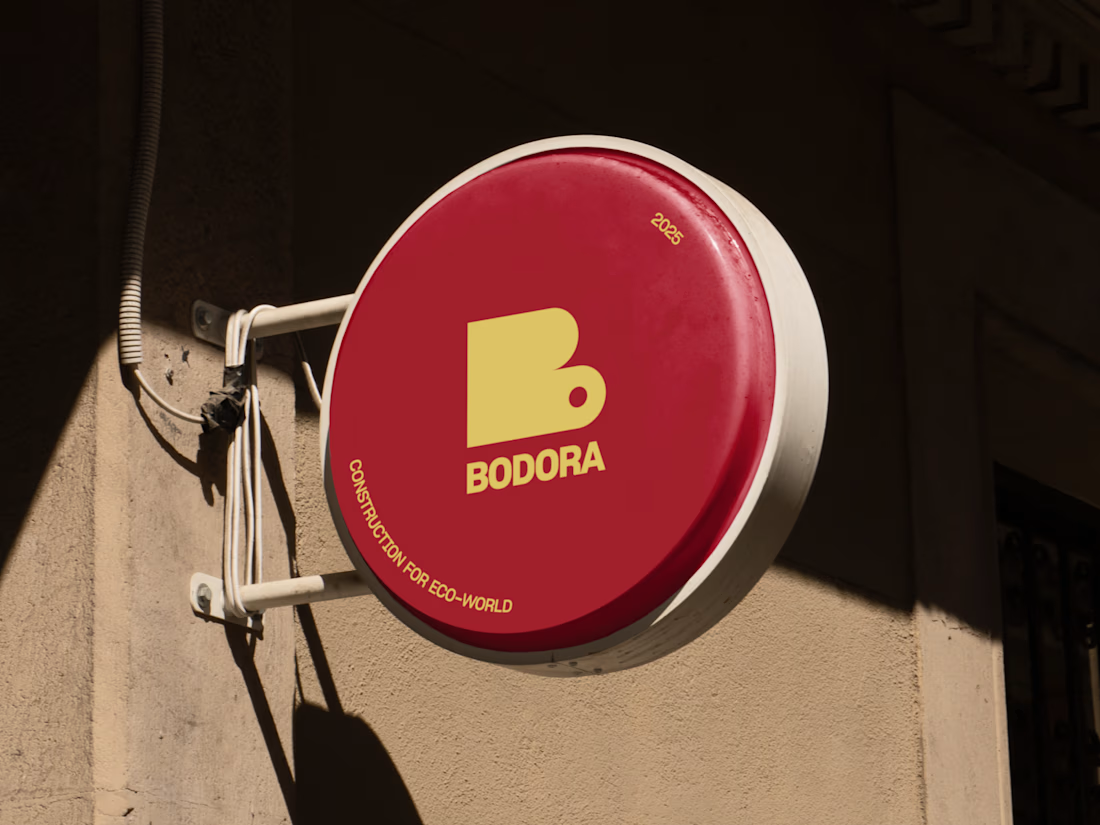

Good!

A little preview of something I’m working on.
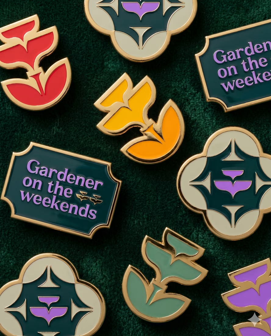
These embroidered patches are a small part of a much larger brand system, but details like this matter. The challenge is making sure the identity still feels distinct and intentional when it moves from screen to something physical you can hold in your hand.
That’s where a strong brand system starts begins to prove itself. More soon :)
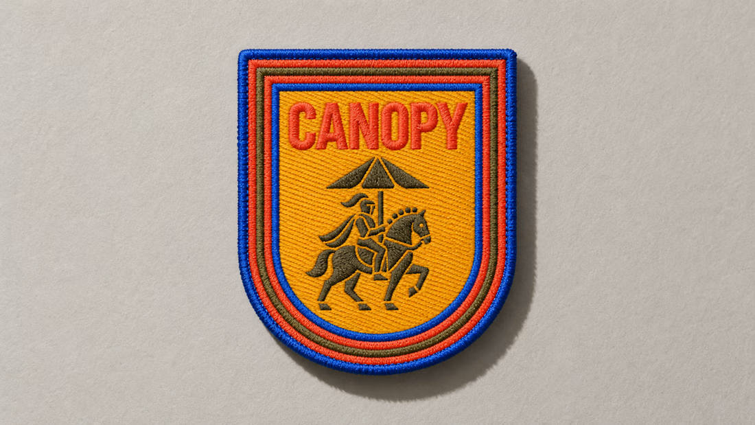
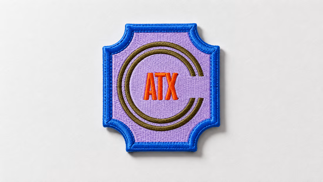
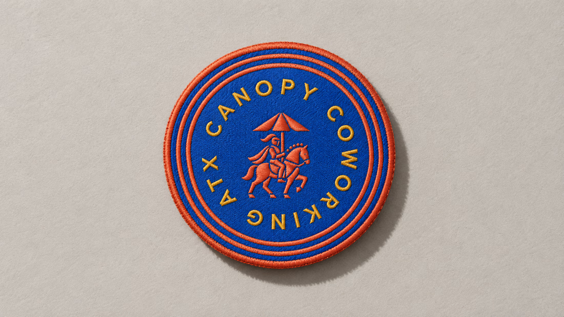
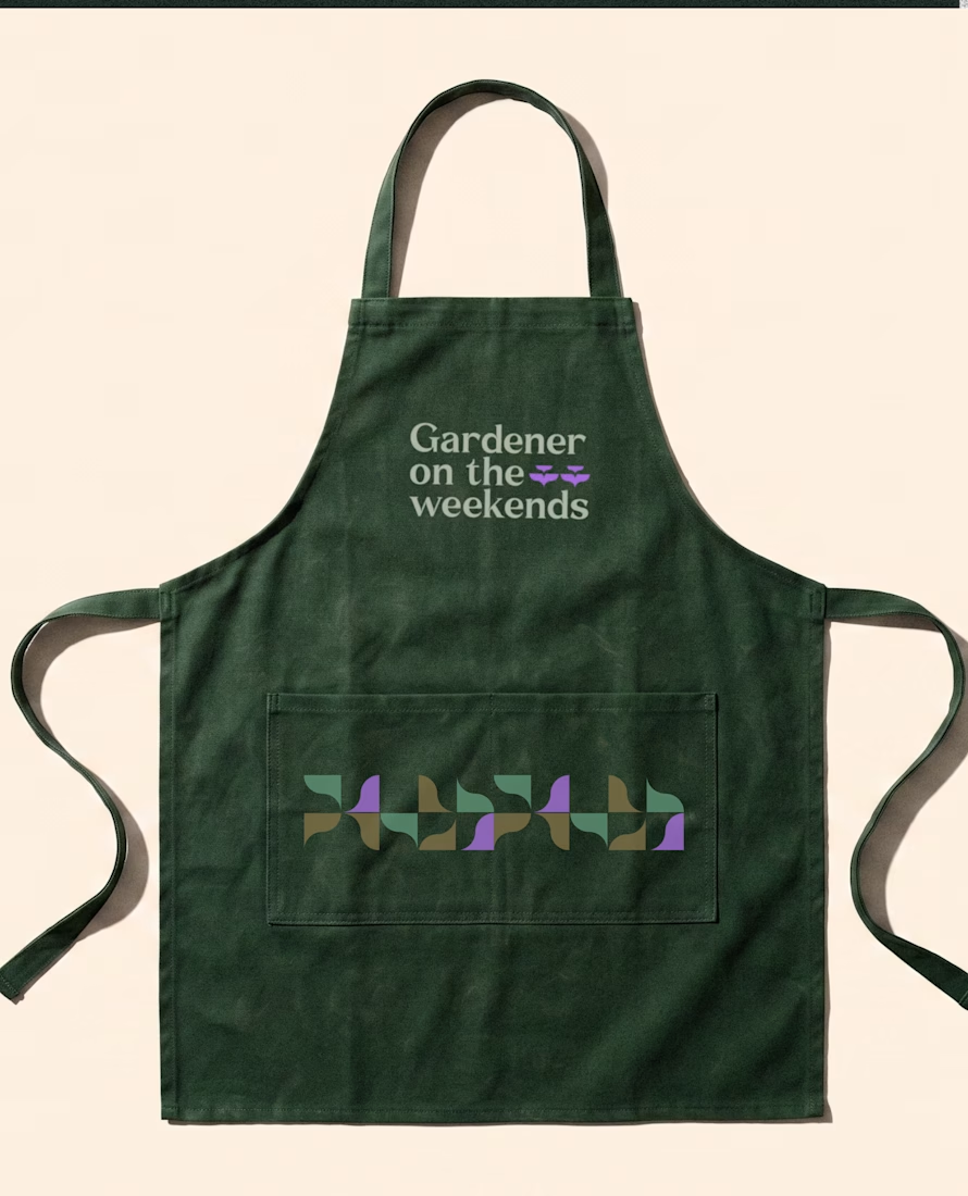
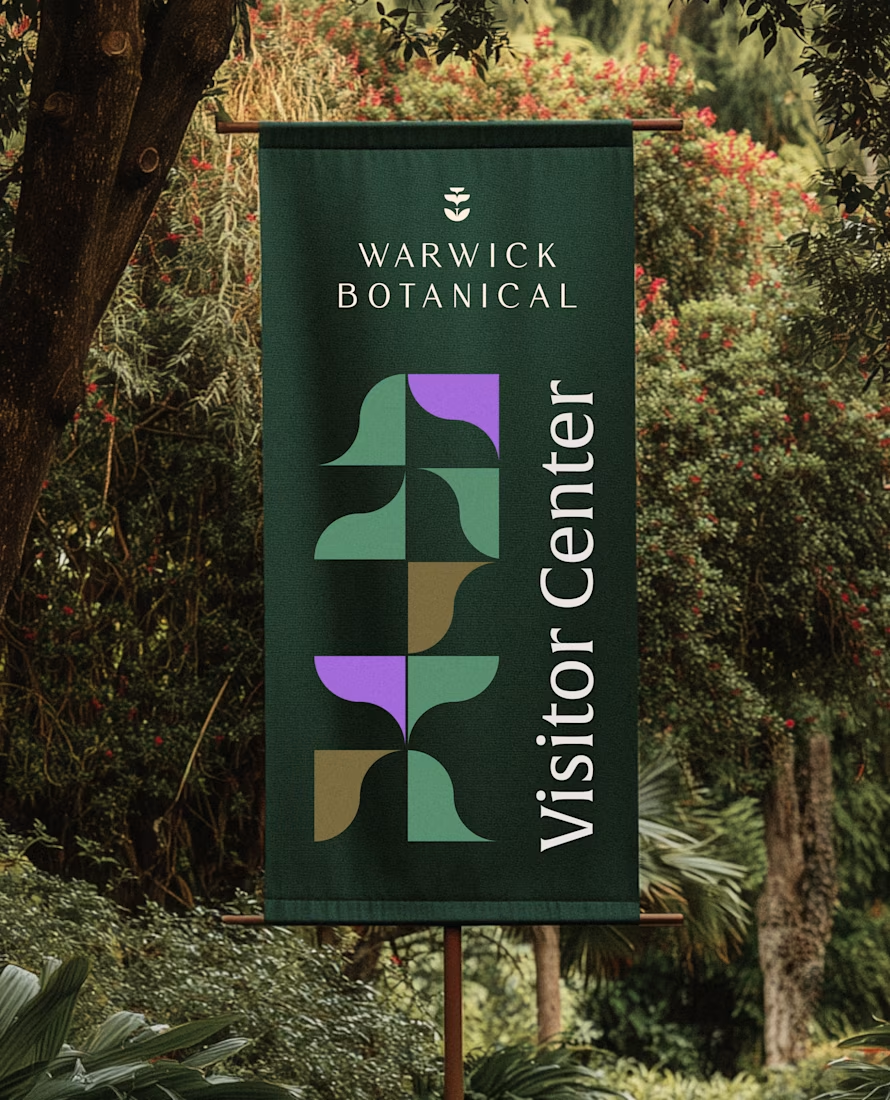
For brand identity, I like to show mockups to test of the identity system: the logo, pattern, and color palette all needed to work at a much larger scale without feeling overdesigned.
That’s where a flexible brand system really starts to prove itself.


Powerful greenish look 👌