The network for creativity
Join 1.25M professional creatives like you
Connect with clients, get discovered, and run your business 100% commission-free
Creatives on Contra have earned over $150M and we are just getting started
Back to feedPost

Who said a logo has to be a vector?
&Walsh just redesigned Insomnia Cookies, and the new logo is literally a photograph of a half-eaten chocolate chip cookie shaped like a crescent moon.
And somehow, it works.
The identity combines bold typography, deep purple, playful illustrations, and product photography that makes the cookies look ridiculously good.
What I find particularly interesting is how they approached the logo. Instead of simplifying everything into another geometric symbol, they made the actual product the hero.
They still created a vector version for smaller applications, but the photographic version carries the personality.
It's a great example of breaking conventional design rules without sacrificing functionality.
Would you use a photographic logo for a brand?

So cool 🔥


A lovely balance of concept and execution.
The network for creativity
Join 1.25M professional creatives like you
Connect with clients, get discovered, and run your business 100% commission-free
Creatives on Contra have earned over $150M and we are just getting started






Related posts

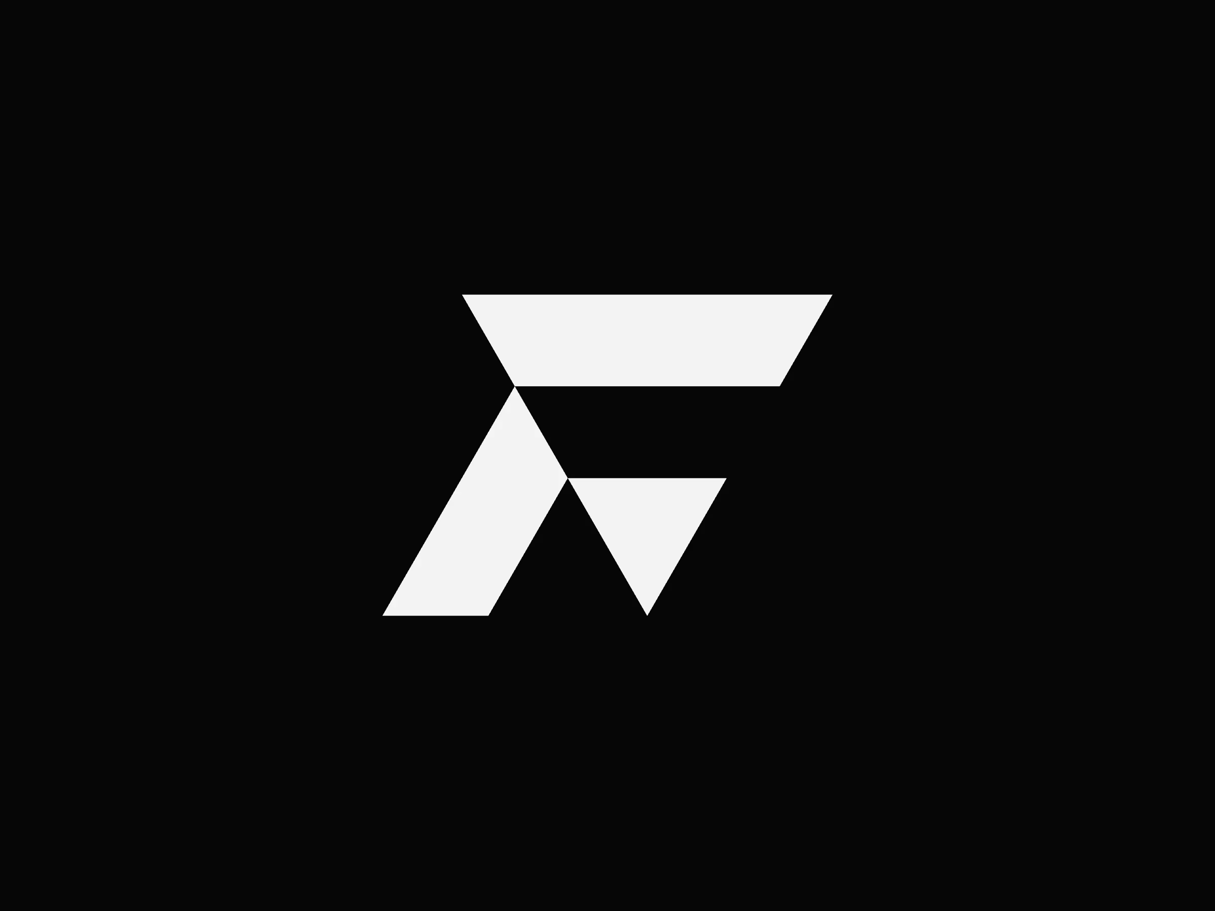
Exclusive premade geometric F logo. One buyer, full copyright transfer.
Built on a precise triangular grid with an upward-pointing triangle in the negative space. Made for tech companies, AI startups, fintech platforms, architecture studios, and engineering firms.
Available now: https://contra.com/products/pi2dEQyk-geometric-f-logo-or-vector-grid-mark
Design by Bohdan Harbaruk // Brandforma Studio


the upward triangle in the negative space gives the mark a nice forward pull. id test it at favicon size too, since that silhouette feels like the real stress test

This is what the start of a logo actually looks like.
Dozens of rough ideas, crescents, stars, shapes that go nowhere. Most of this page won't survive. A few circled ones will.
Messy first, clear later.
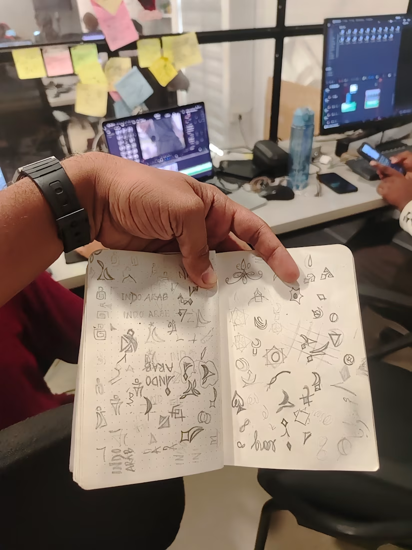

Great to see the full sketch page. The circled ones already stand out.

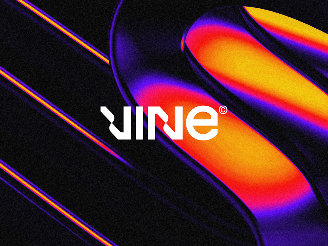

The sharp V pops against that vivid gradient.