
LOGLINE
A botanical skincare brand caught between clinical white and farmhouse kitsch. I answered with an archive: every ingredient numbered, labelled by hand and left unsigned until the very end.
THE BRIEF
Herbarium Hours is a plant-based skin and body care label. The ingredients are real and the formulas are patient, but the shelf it would land on is crowded with two kinds of brand. One speaks in lab coats and percentages. The other speaks in burlap, mason jars and sunsets.
The audience is people who are tired of loud, rushed beauty. They distrust miracle language and perfect-skin photography. They would rather read a specific sentence about where a leaf was gathered than a claim about results.
The tension was simple to say and hard to solve. The brand had to be warm without being rustic, and exact without being cold. I wanted warmth that had a source, and handwriting was the only source I trusted.
WHAT I DID
I handled brand strategy, naming, identity, visual system, packaging, stationery, campaign art direction and landing page art direction.
THE APPROACH
I started with ten directions: a neighbourhood bathhouse, a grandmother’s remedy cabinet, a patch of sunlight on a kitchen floor, a candy counter for feelings, a table set for a slow meal. Nine of them borrowed warmth from nostalgia. The herbarium was the only one where warmth came from attention: someone looked at a plant for a long time and wrote down what they saw.
I collected six references to test it: a lily bud in cross-section, an old-master watercolour of rose, orchid and pansy, a hazelnut photogravure inside a ruled grid, close-ups of unfurling fern and thistle, and an engraved acanthus plate. They share one logic. Every image sits on cream paper with a number, a caption and wide margins.
My first round of mockups failed. I put the logo on dark walnut desks with linen thread, pencil shavings, brass pins and film grain. It looked like every apothecary brand, which was exactly the farmhouse kitsch I had ruled out. I threw it away. The version that worked had a seamless cream-to-sand studio sweep, matte surfaces, one soft shadow falling right, and ornament allowed only inside the engravings.
That pivot gave me the one idea: observation is a form of care. Everything is numbered, captioned and filed, and the brand name is the last thing to appear, like a naturalist initialling a plate after finishing it.
THE WORK
LOGO
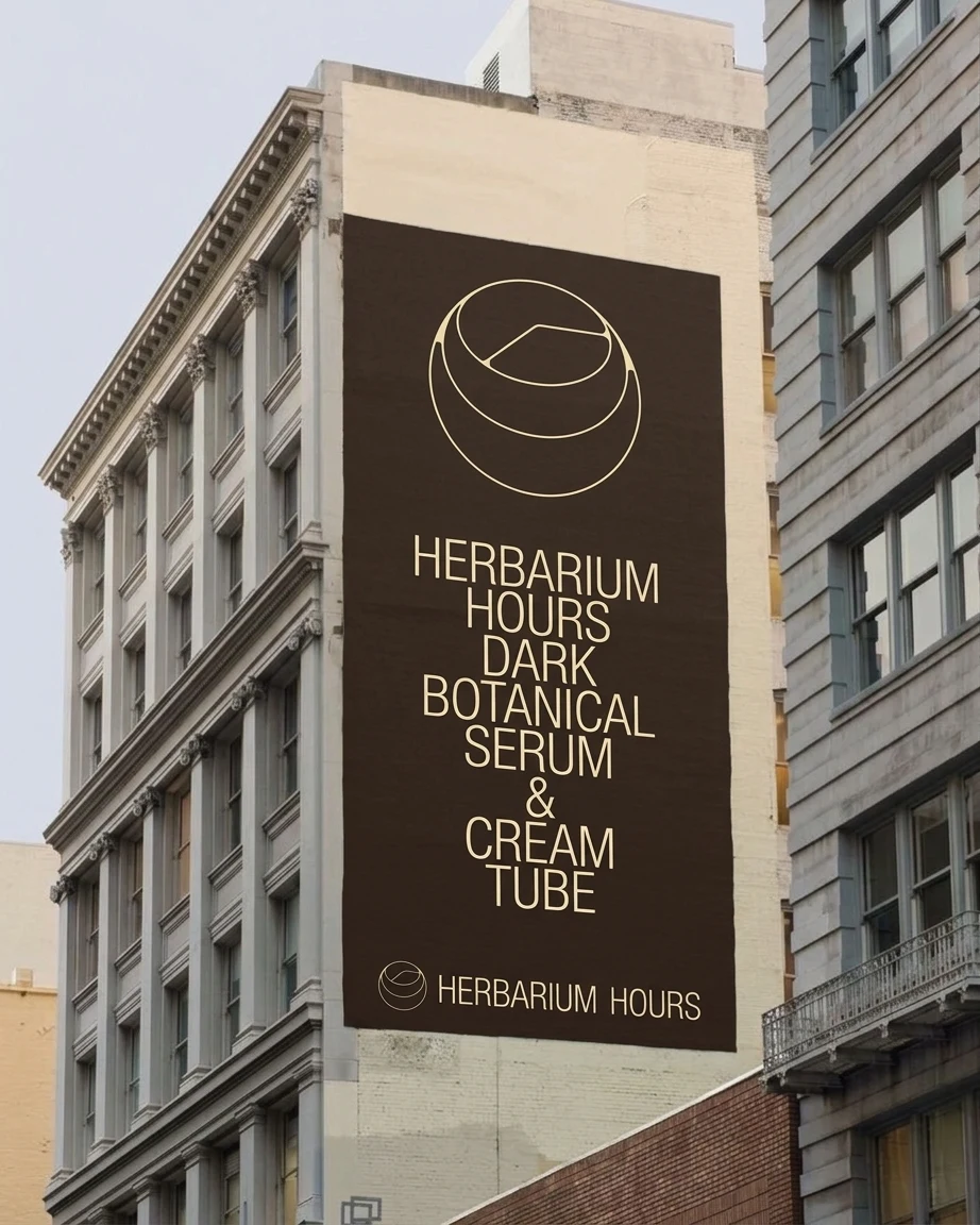
A hairline circular emblem, an orb cut in section, with one straight stroke inside that reads as a clock hand without ever adding a dial. It sits beside a wide monoline wordmark in GulimChe, all caps, with a deliberately generous word space. The emblem’s line weight matches the letter stroke, so the lockup reads as one drawing. On dark grounds it runs in cream, on light grounds in Ink Brown.
COLOR SYSTEM
Paper Parchment
#F2EAD3 carries about 62% of any layout. Ink Brown #3E3128 takes about 22% and replaces black everywhere. Soft Sand #D9C7A8 is the backdrop colour. Pressed Fern #6F7E55 gets about 4%, and Dried Lavender #9A86A8 gets about 1%, never more than one element per screen, like a single pressed petal. No pure white, no pure black, no gradients.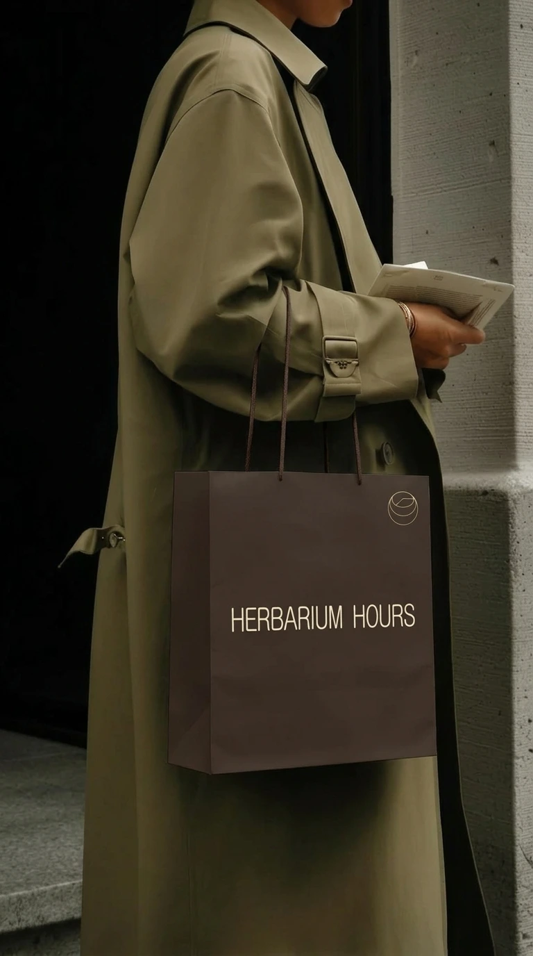
TYPOGRAPHY SYSTEM
GulimChe, regular weight only, for everything: logotype, headlines, body, captions. Captions are 11px uppercase with 0.14em tracking. Body is 15px at 1.7 line-height and 0.04em tracking. A handwriting face, La Belle Aurore, carries field notes at no more than 20% of the text and never beyond two lines. No bold and no italics anywhere, so hierarchy comes from size, case and spacing.
PACKAGING
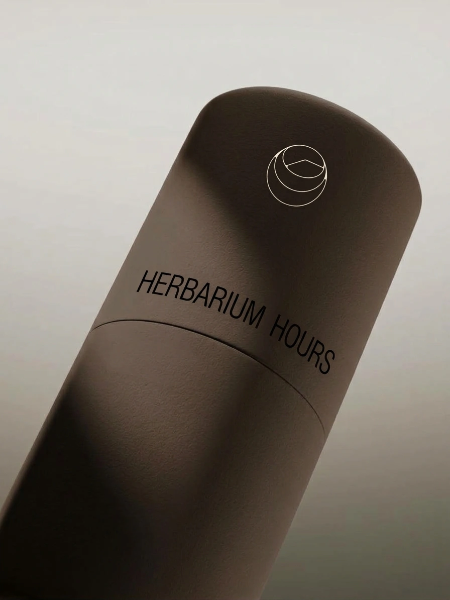
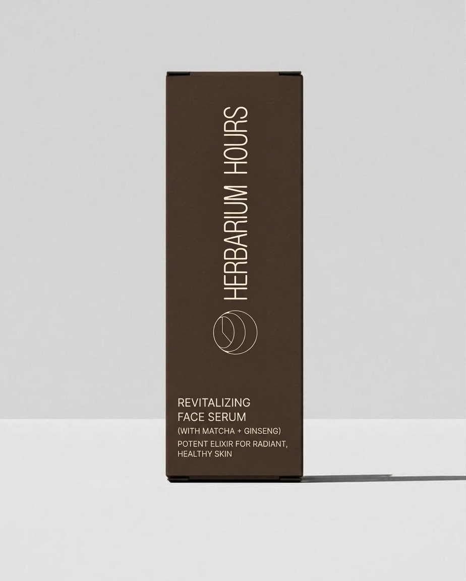
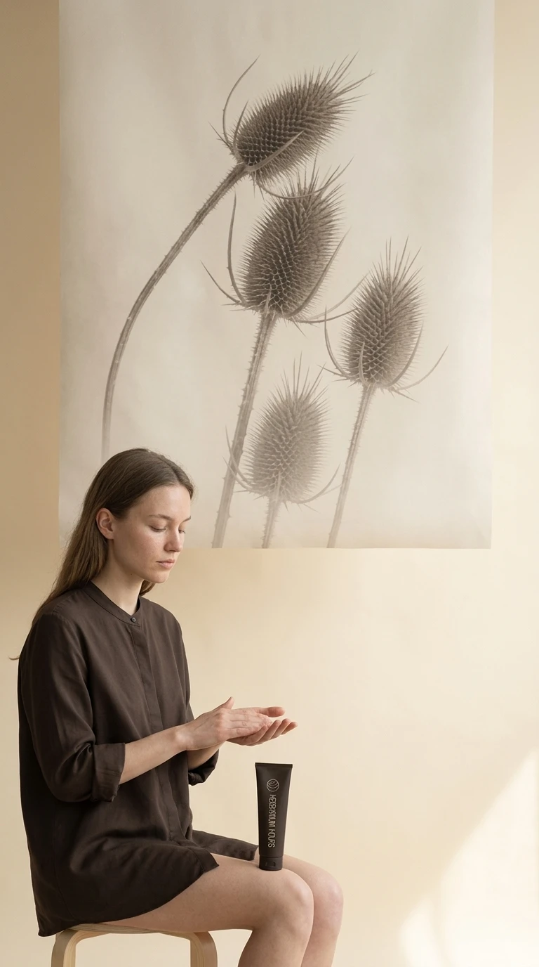
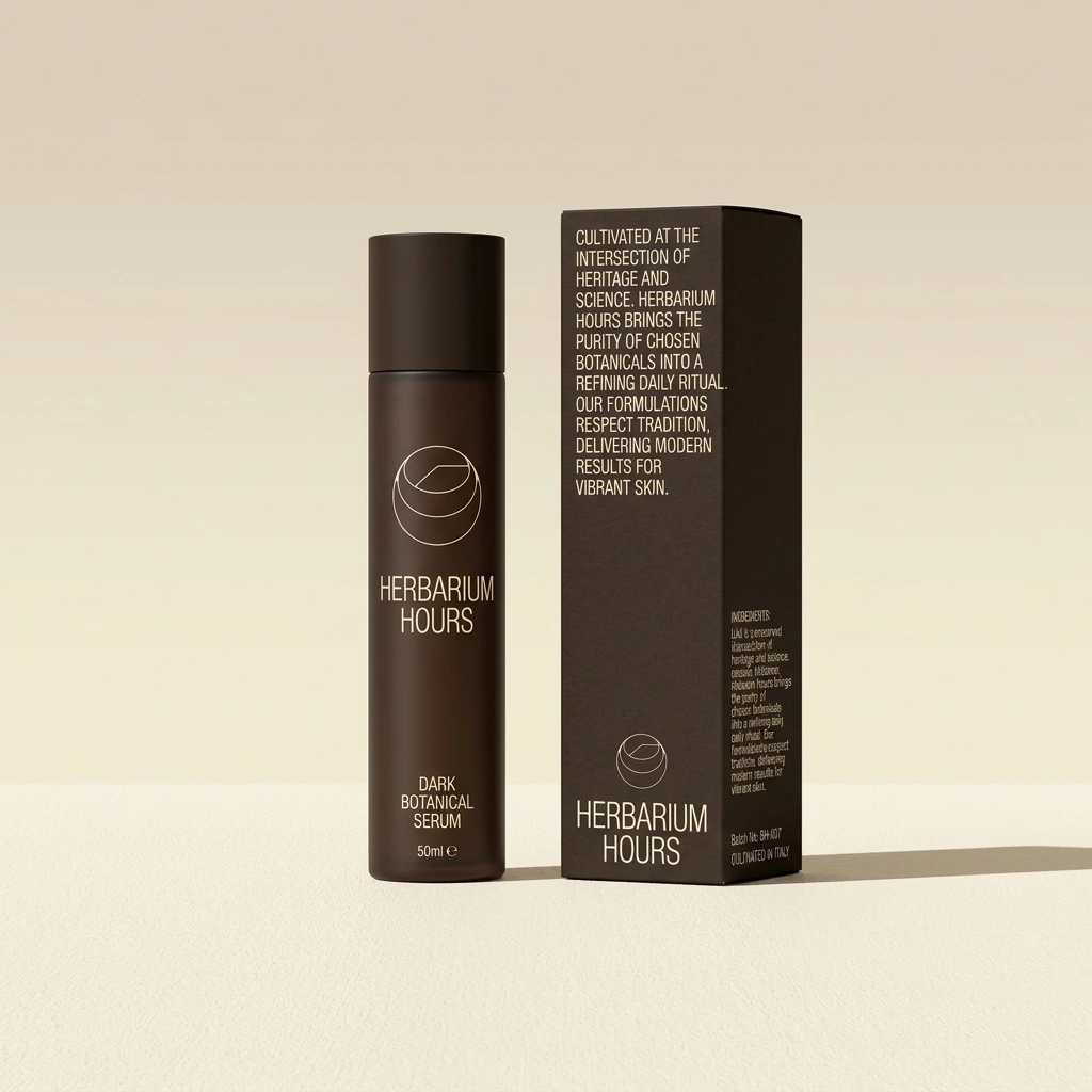
A matte Ink Brown tube for the 75 ml balm, a 50 ml serum bottle with a matching box, and the logo in monoline cream. On the box, the wordmark runs vertically along the face and a single block of copy sits low, with the emblem alone on the cap. Surfaces carry a fine paper tooth and nothing glossy.
STATIONERY
An Ink Brown letterhead with hairline rules top and bottom, a catalogue number top-left, a figure number top-right and a small plant drawn in line at the lower corner. Business cards carry the blind-embossed emblem on one side and the wordmark on the other. A parchment note card holds one handwritten sentence.
CAMPAIGN
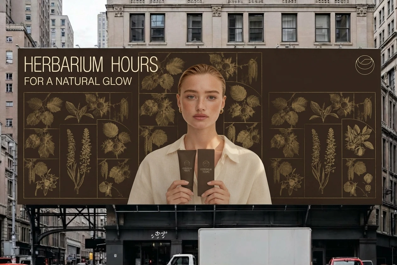
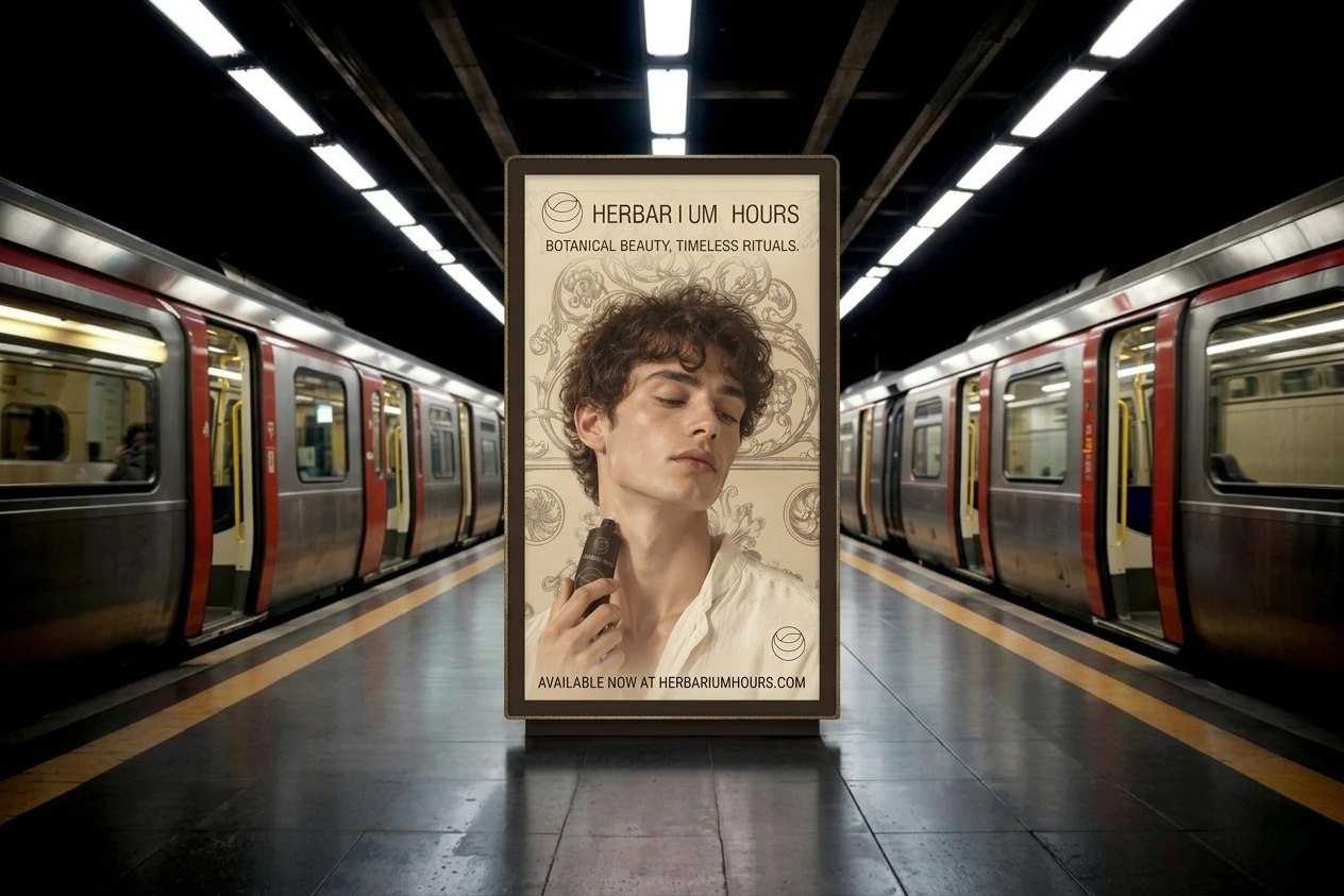
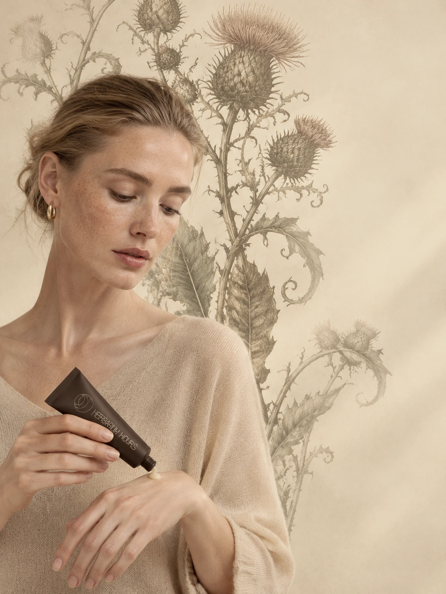
Ten portraits, each with one person in front of a monumental botanical plate hung on the cream-to-sand sweep and softened by haze. The plant changes every time: thistle, fern fiddleheads, hazelnut inside its grid, the old-master bouquet, acanthus scrollwork, a lily section, teasel, rose and pansy, rosette medallions, oak. Models range from their twenties to their sixties, with unretouched skin and unbranded cream, sand or brown clothing. In the lily portrait the plate’s central trefoil sits behind the head like a halo.
LANDING PAGE
Live here
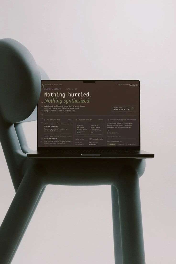
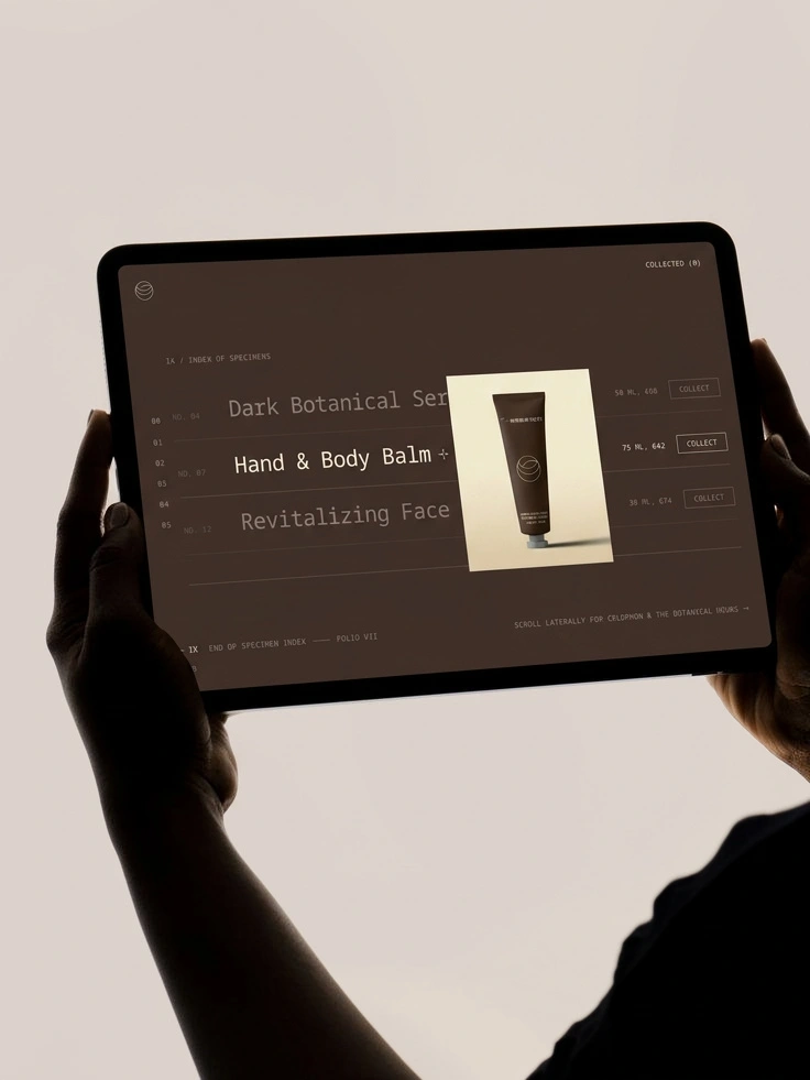
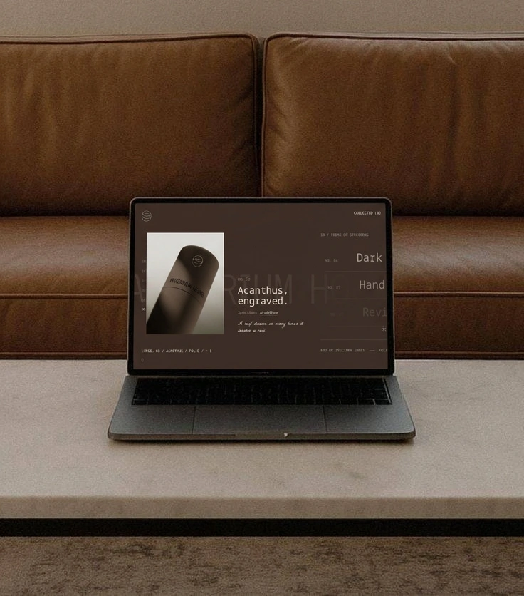
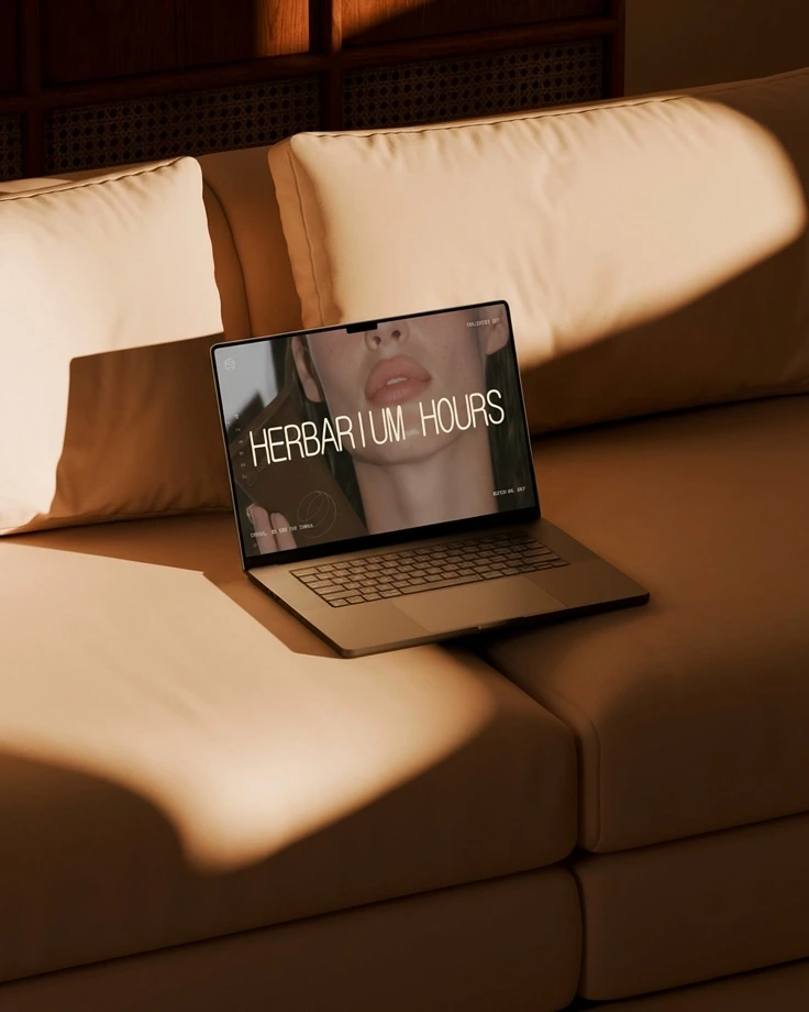
Two directions, both inspired by the restraint of fashion archives. The first, Unsigned, opens on a blank parchment screen with a small portrait video frame that expands to full width as the visitor scrolls. The logo appears large only once, at the end. The second, The Index, is a dark horizontal catalogue with a fixed numbered rail and plates that open upward like drawers. Both use one easing curve, cubic-bezier(0.22, 1, 0.36, 1), and neither uses rotation or particles.
THE RESULT
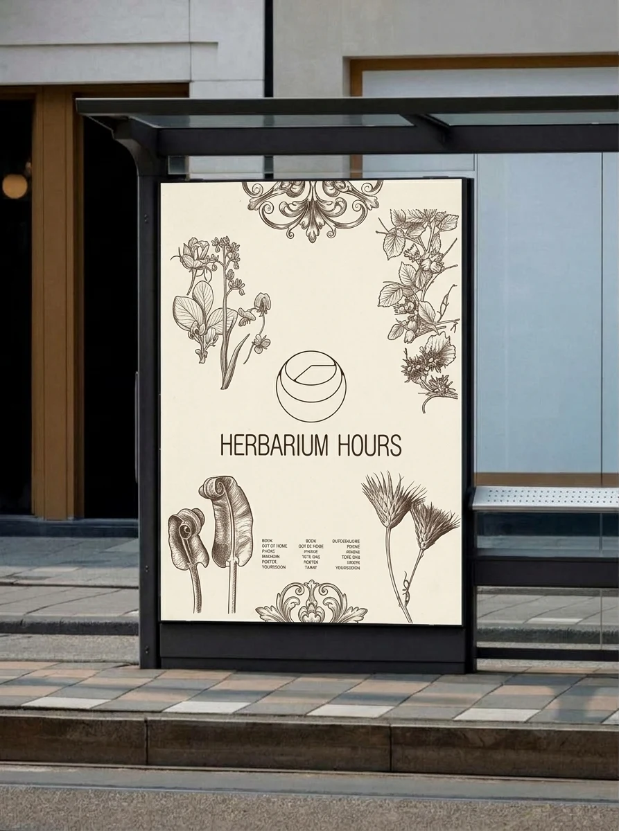
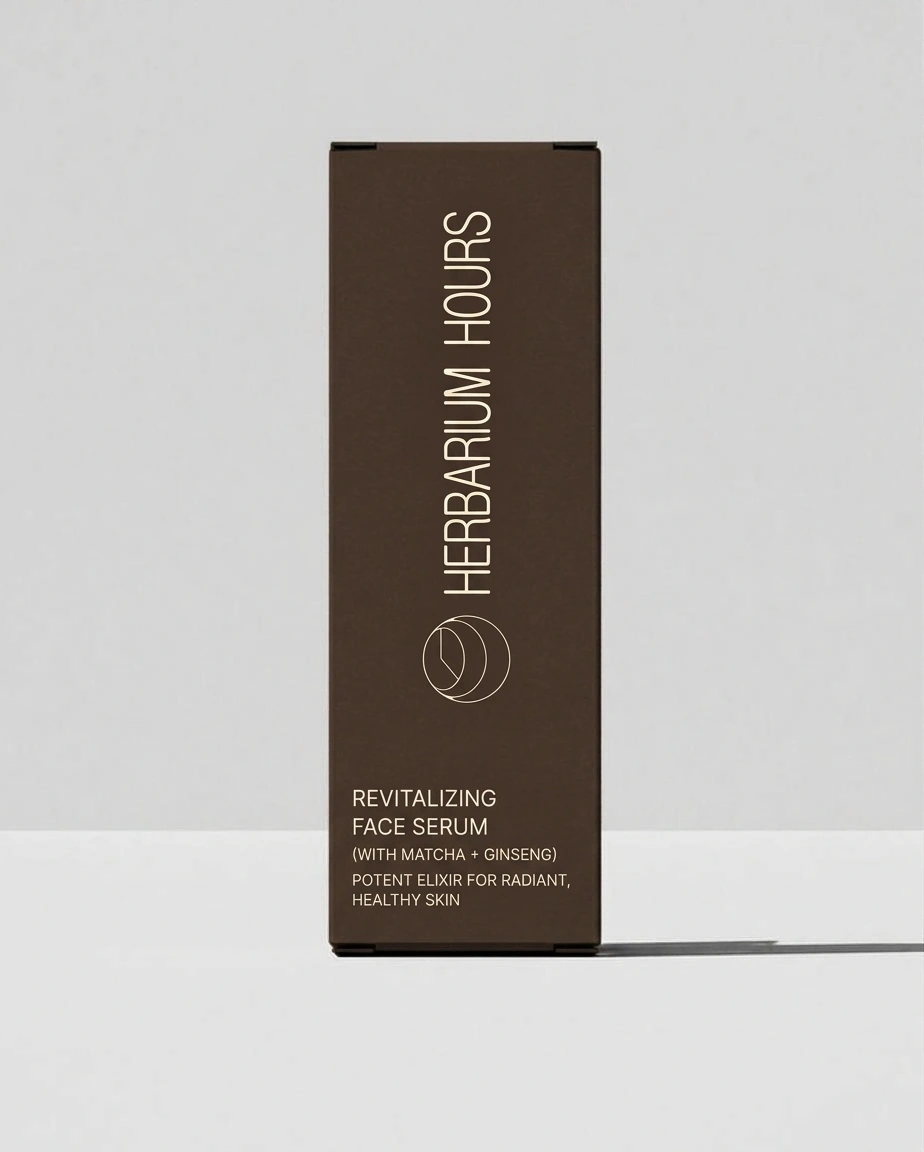
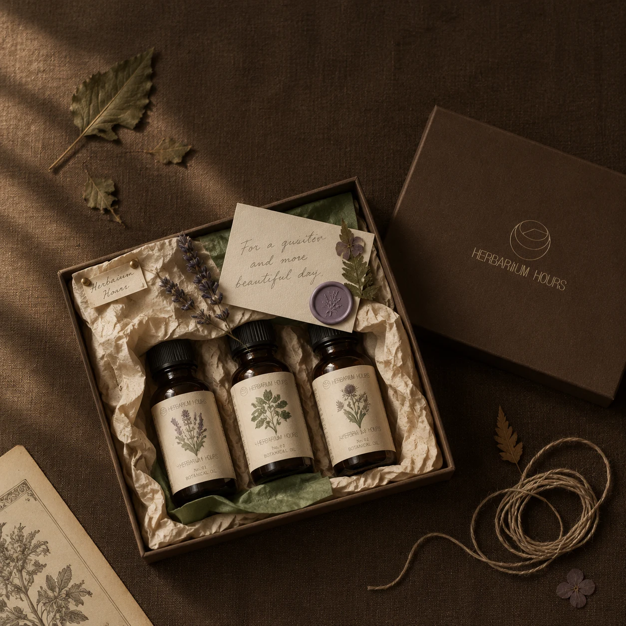
The system holds across surfaces with nothing in common: a 75 ml tube, a letterhead, a hazed portrait, a scrolling page. Each one uses the same three moves: a number, a caption and a hairline. The brand reads as warm because a person is visibly paying attention, and as exact because every object is catalogued.
The project is a concept, so there is no launch or sales data to report. The next step is turning the landing page direction into a working site.
CREDITS
Designer: Révolté (solo freelance designer), revolte.design
Project: Herbarium Hours
Year: 2026
Scope: Brand strategy, naming, identity, visual system, packaging, stationery, campaign art direction, landing page art direction
Industry: Wellness and beauty
See more at revolte.design
0 likes · 0 views · Nov 19, 2026
A botanical skincare identity that files every ingredient like a herbarium specimen, with a clock hand hidden in the logo and nothing shouting from the shelf


