
LOGLINE
A tool maker that needed to feel like a mission, not a catalogue. I borrowed the language of space-race posters, left the ideology behind, and let ink, steel and one serif monogram carry the weight.
THE BRIEF
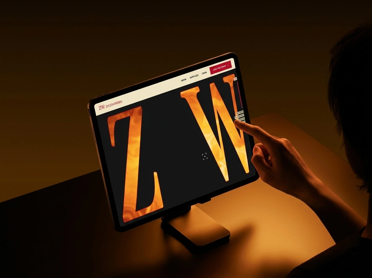
Zvezda Works makes heavy-duty tools, hardware and field systems for welders, riggers, haulers and repair crews. It is a self-initiated brand, which means no client, no deadline and nobody to blame for a weak decision. That turned out to be the hardest constraint I have worked under. “Zvezda” means star, and the name had to carry the whole idea before I drew anything.
The audience works with its hands and distrusts anything that looks like it has never been held. Tool brands usually answer that distrust with chevrons, flames and men squinting at a horizon. I wanted the opposite: a brand that treats an ordinary wrench with the seriousness of a launch.
The tension was in the reference. The visual language of the space race is also the visual language of propaganda. I wanted the scale, the red, the hard diagonals and the heroic low angles. I did not want a single symbol that belongs to someone else’s regime. The brief I wrote myself was to make ordinary work feel like a mission without borrowing anything I could not defend.
WHAT I DID
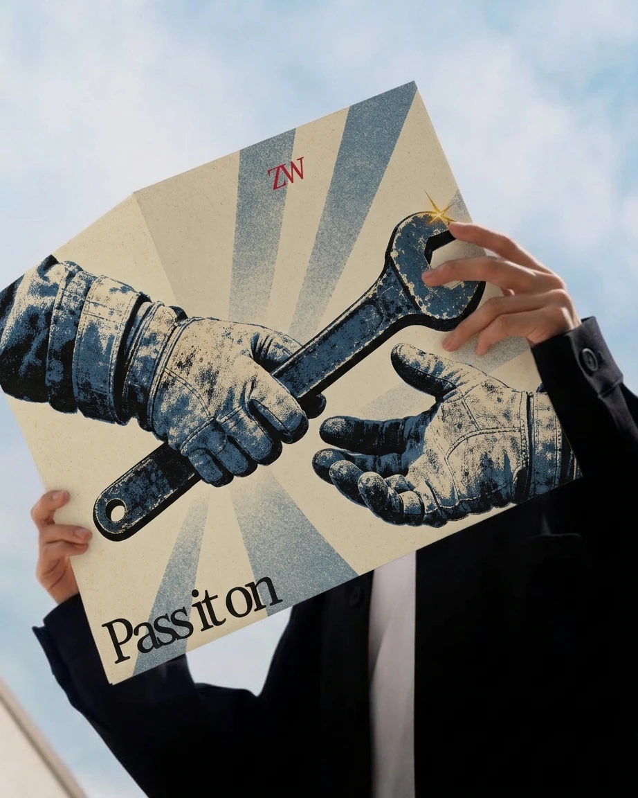
My scope was brand strategy, naming, logo, color and type systems, campaign imagery direction (fifteen frames), copywriting, soundtrack direction, and landing page direction with motion specs in two executions.
THE APPROACH
I started by laying out ten retro futurist directions side by side: a Googie diner, an aqua chrome gadget world, a cassette terminal, a world’s fair pavilion, a plastic pop showroom and five others. Several were more fun than the one I chose. Aqua Chrome and Cassette Futurism both depend on a screen, and this brand needed to feel like paper and metal. I picked Cosmonaut Constructivist because it is the only direction where the medium is part of the idea: a two-plate print, slightly off register, on cream stock.
The first real problem was the star. A red five-pointed star was the obvious mark, and it is also political insignia. I switched to an eight-pointed star, kept it rare, and banned the five-pointed version from every brief I wrote afterward, including the prompts for the imagery.
The second problem was the logo. Everything I had written pointed toward heavy condensed capitals, and a logo in the same voice would have been a shout with nothing underneath it. I set the monogram in Gelasio instead, a serif with the authority of a publisher’s imprint on an engineering manual. That gave the system two registers: a quiet institutional seal, and loud poster headlines around it.
What I kept coming back to was one rule: print, not pixels. Flat color, visible grain, misregistration, no gradients. Every decision after that either obeyed the rule or got cut.
THE WORK
LOGO
A ZW monogram beside a ZVEZDA WORKS logotype, both in Gelasio, with tracking pulled to -10% so the letters sit like type locked in a printer’s chase. Mission Red
#C8102E on Paper Cream #F2E8D0. It is never outlined, shadowed or animated.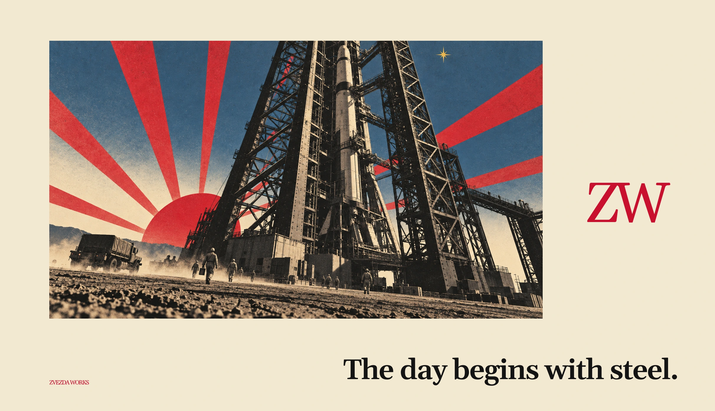
COLOR SYSTEM
Five flat colors. Mission Red
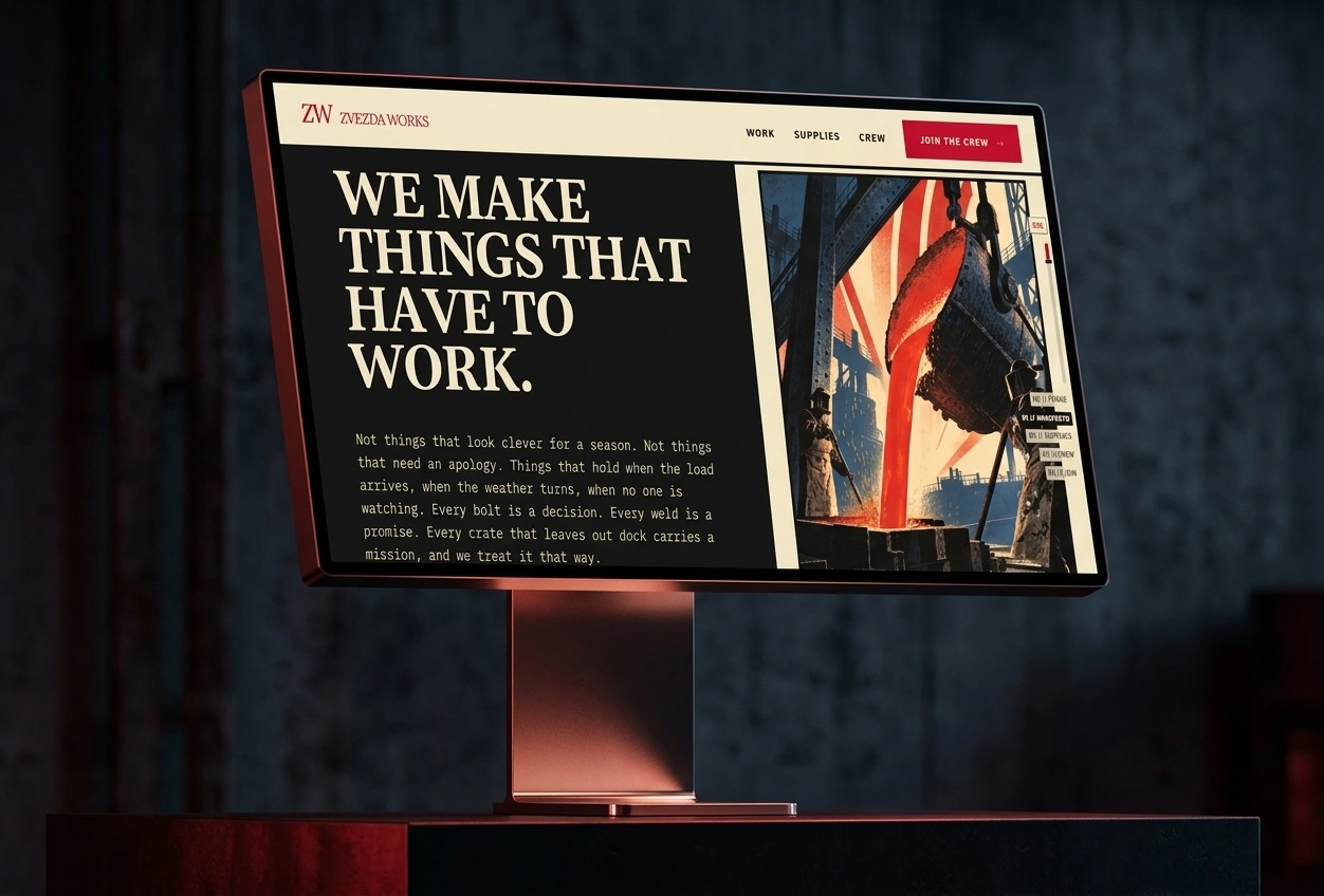
#C8102E covers 30 to 40 percent of any layout. Paper Cream #F2E8D0 is the default ground and is never pure white. Soot Black #141414 carries type and the second print plate. Cold Steel Blue #3E5C76 is the off-duty variant, and red never touches it directly. Sputnik Gold #E0A526 stays under 5 percent, so it reads as earned.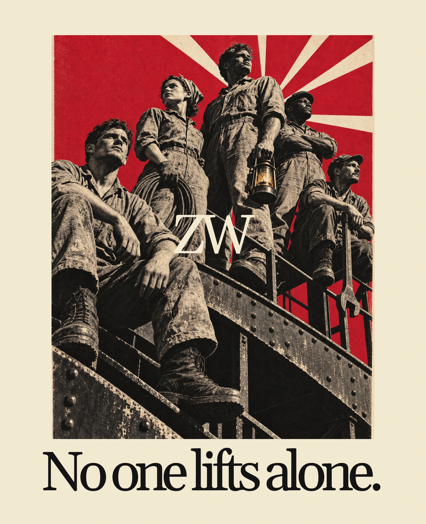
TYPOGRAPHY SYSTEM
Headlines are uppercase condensed grotesque (Anton in the landing page specs), set large, cropped and angled, with one word per layout pushed to the margin. Serials and codes use Saira Stencil One, tracked at 0.14em, for lines like ZW-0042-A / MISSION 07. Body copy is IBM Plex Mono, so a paragraph reads like a mission log.
CAMPAIGN IMAGERY
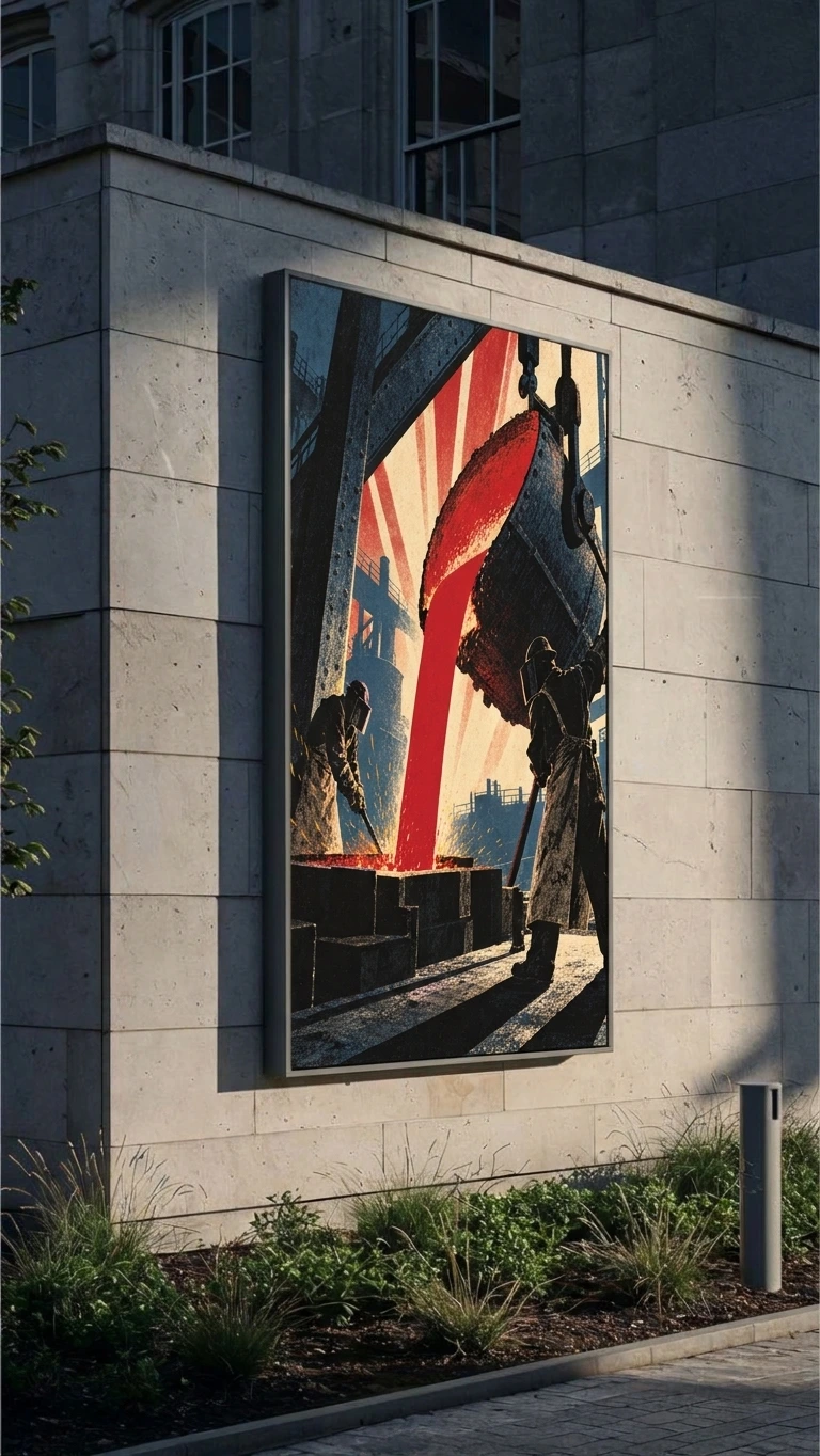
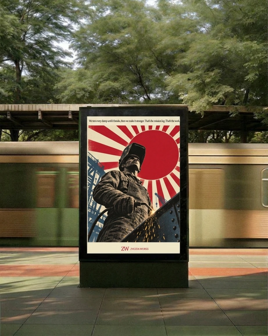
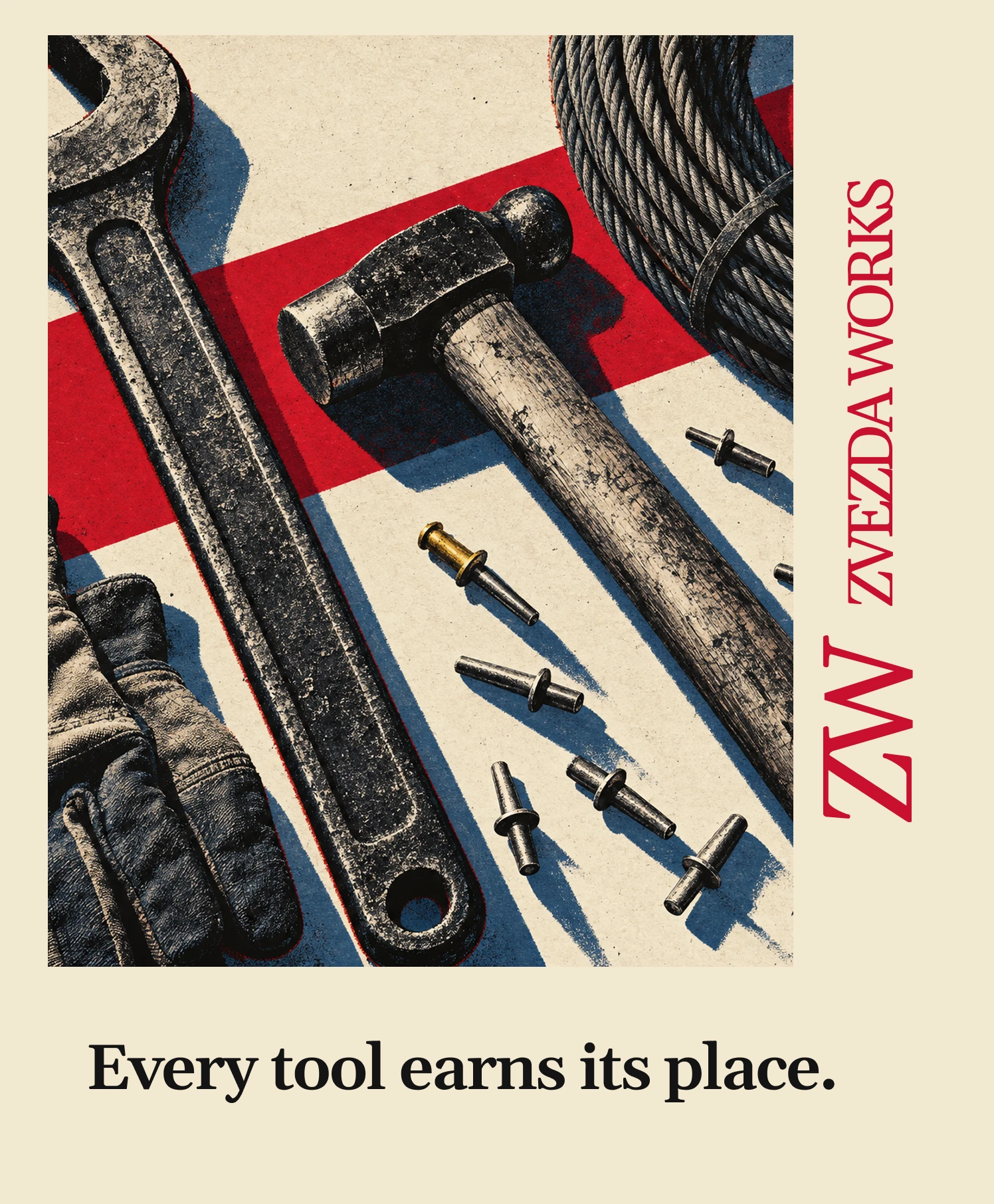
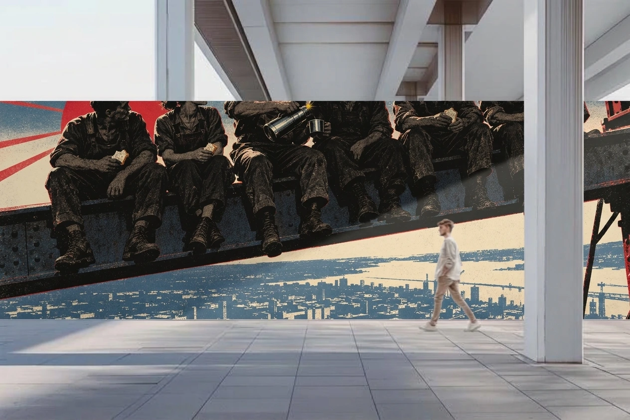
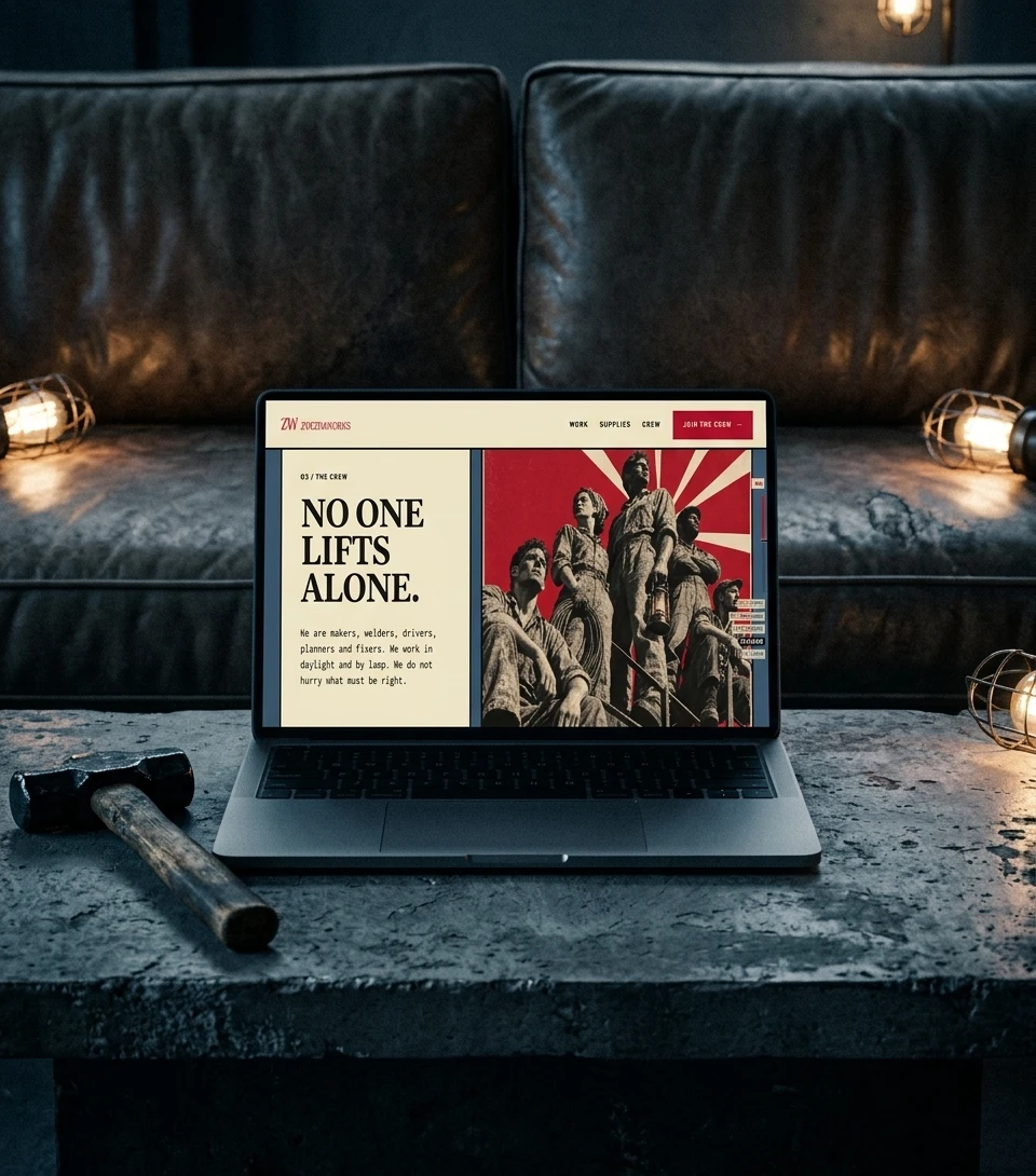
Fifteen frames in three batches: a welder against a red sun, a foundry pour, a crew on a beam at dusk, a hammer standing on an unmarked crate. Every frame uses a low angle, hard light, shadows at 15 to 30 degrees, heavy grain and a slight offset between plates. Two frames switch to a blue and cream duotone. No frame contains lettering, so the type does its own work in layout.
COPY
The line is “Every part has a mission.” Everything else follows short declarative sentences and verbs like forge, lift, hold and ship: “No one lifts alone.” “Strike once, mean it.” “The lamp stays on.” Serial numbers and batch codes work as decoration and as copy. Words like solutions and leverage are banned.
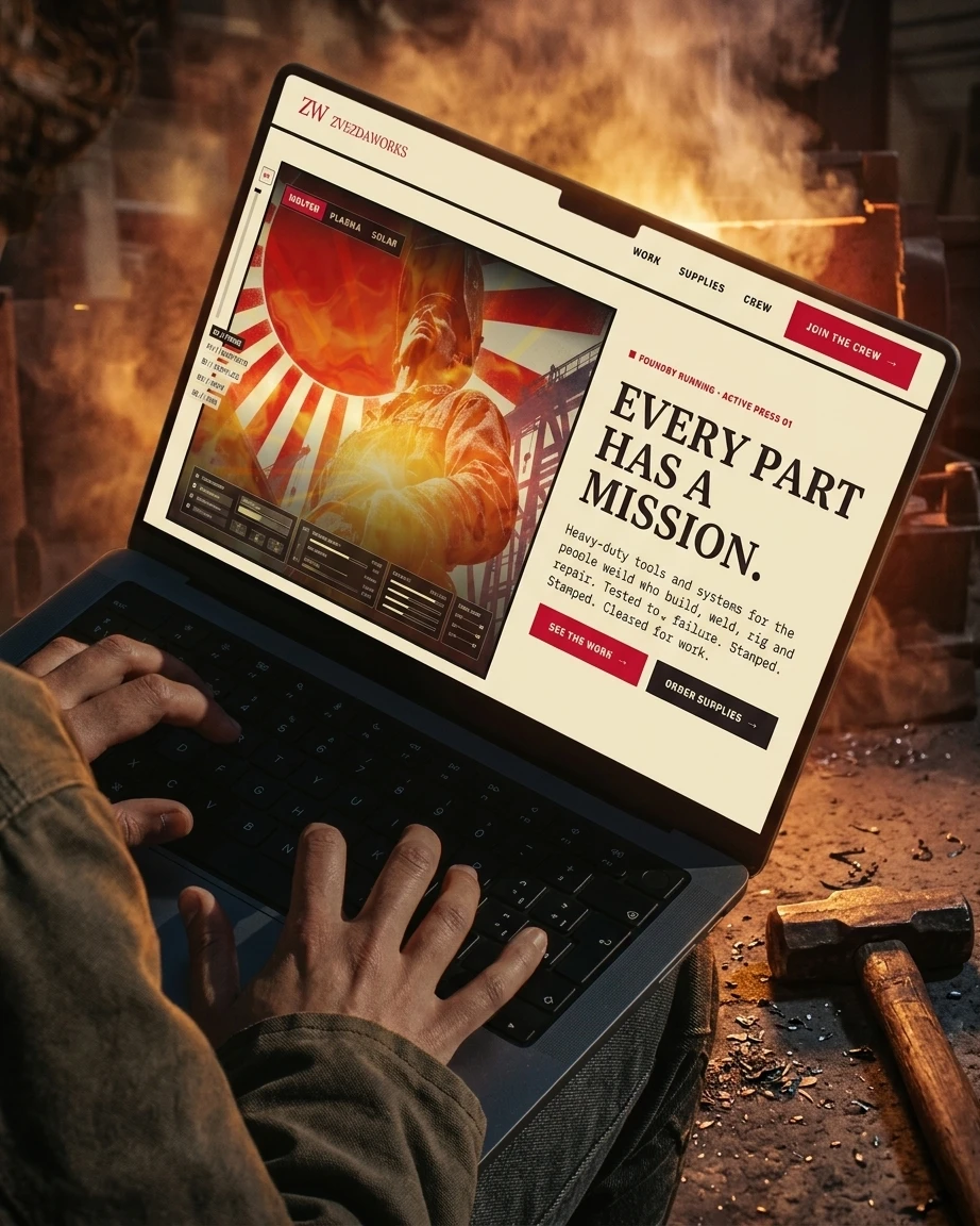
LANDING PAGE DIRECTION
live here
I specified two executions. The Press Run pins a giant poster to the screen, where a red ghost plate and a headline shadow slide into register on scroll, then lock with crosshair marks. The Contact Sheet cuts between three snapped poster stops, then lays out all fifteen frames and pulls one to full-bleed at a time. Both use named easing curves, no rotation and no particles.
SOUND
Six instrumental cues and a three-second sonic logo: analog sequencer, low brass, anvil and steel plate percussion, tape hiss. No vocals, because a choir drifts toward anthem. The sonic logo is two misaligned tones that slide into unison and end on one mechanical click, matching the registration lock on screen.
THE RESULT
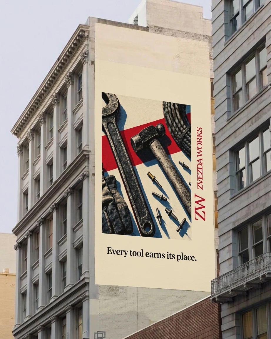
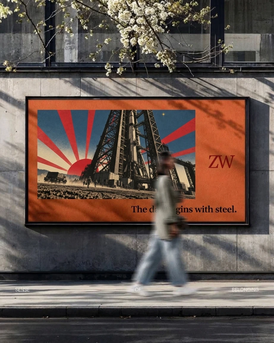
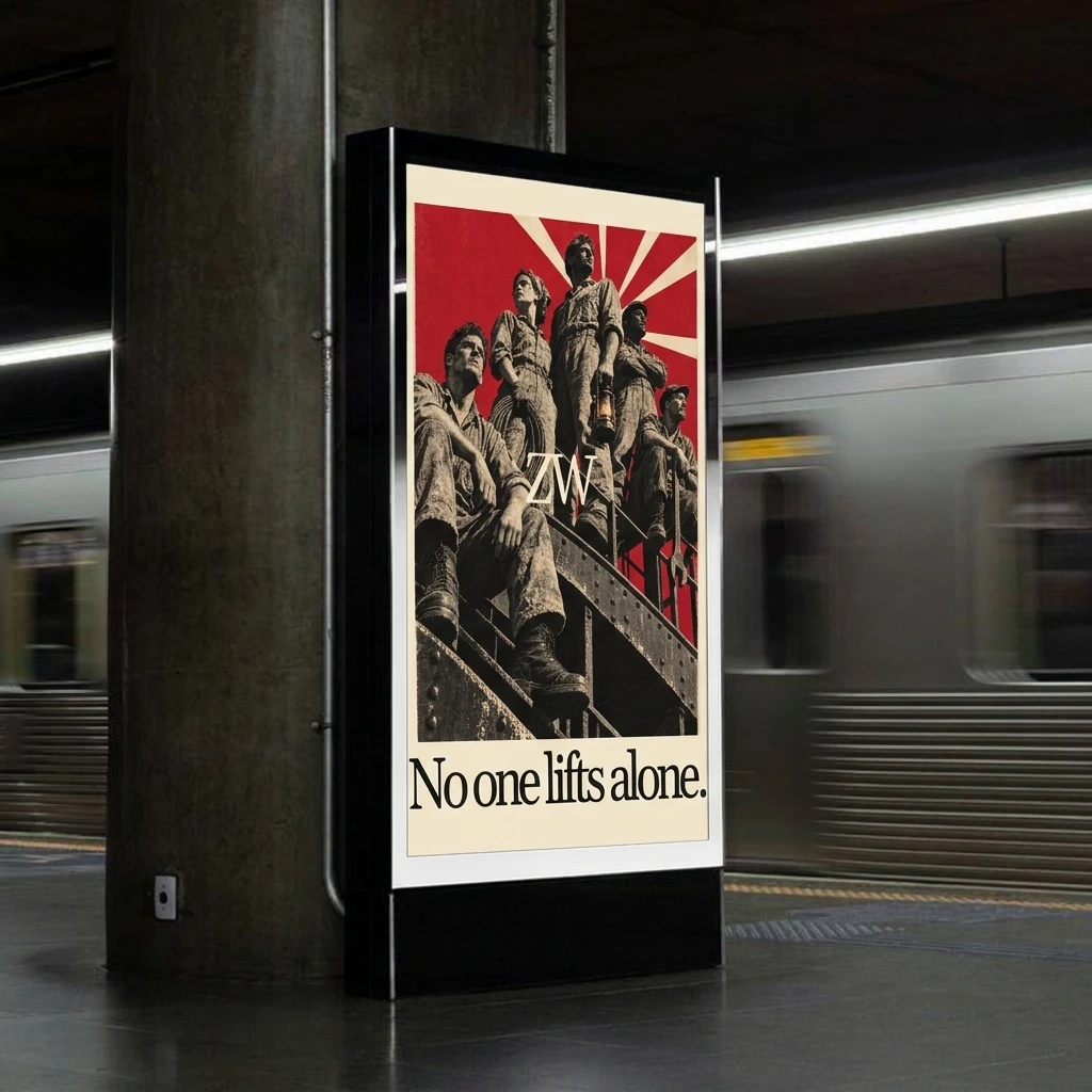
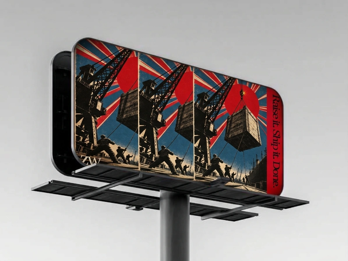
Zvezda Works exists as a complete brand system: a logo, five colors, three typefaces, fifteen campaign frames, a copy bank, two landing page directions and a soundtrack. I wrote the rules before the assets, so each new piece either obeyed them or got cut. The same star, the same colors and the same sentence structure carry across imagery, copy, motion and sound.
The landing page and soundtrack are specified, not live. Next is production.
CREDITS / PROJECT INFO
Designer: Révolté (solo freelance designer), revolte.design
Project: Zvezda Works
Year: 2026
Scope: Brand strategy, naming, logo, color system, typography system, campaign imagery direction, copywriting, soundtrack direction, landing page direction
Industry: Industrial tools and hardware
See more at revolte.design
0 likes · 3 views · Nov 17, 2026
A tool maker run like a space program: constructivist posters, one serif monogram and a rule that every part has a mission


