The network for creativity
Join 1.25M professional creatives like you
Connect with clients, get discovered, and run your business 100% commission-free
Creatives on Contra have earned over $150M and we are just getting started
Back to feedPost

Top 1% of creatives on Contra with a 195 score 🎉 What I'm most excited about is who's showing up because of it: new clients, designers, new conversations, projects I wouldn't have found on my own. Grateful, and ready for more.

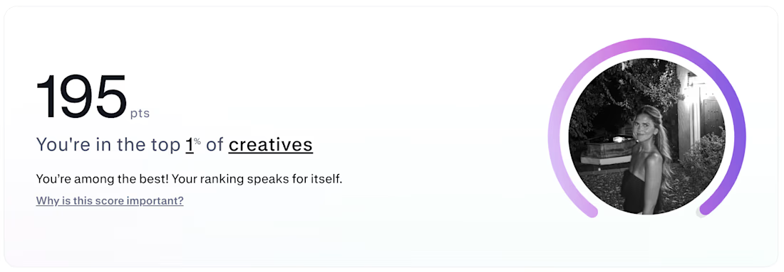

Huge congrats! 🎉 Top 1% is an incredible milestone.
Thank you!!

big time congrats to you!
Thank you Nicolette!!


195, congrats
Thank you Nazar!!

Legendary score nice work 🔥🔥🔥
Thank you!!🙌

Big Congrats Virginia, Top 1% is an amazing achivement. 😍
Thank you Orlerx!!

Congratulations Virginia!! Top 1% is one of the topmost thing on your profile!!
Thanks!

Congratulations!
Thank you!

The more I ride the leaderboard the more it become tough or it is easier?
I agree, i think it becomes tougher!

Huge Congrats Virginia!
Hope to get there Someday
Thank Agu! I'm sure you will🙌

well done👍
Thank you Sahil!


Huge congrats ! 🔥 🎉
Thank you!!

how do you even get up there, so cool. Any tips?
Hi!! Thank you, posting case studies and previous projects + staying consistent! Do you have any previous clients that can give you a review?

Thank you for the tips mentor!

Congratulations!
Thank you!!

huge congrats
Thank you!

Congratulations!
Thank you Akin!!


Congratulations @Virginia Roson
Thank you Nathaniel!

Congrats

Congratulations Virginia
What tip do you have for people starting out on Contra
Hi Micheal! I would say staying consistent and be sure to post your work, jump into challenges if you can and make sure your clients and past clients leave you a review!
Which kind of challenges are you talking about please?
Contra challenges! Right now they have the Rive Halloween Challenge and The invideo Editor Challenge

Congratulationssss!!
Thank you Leena!

Contrats!! 🎉
Thanks Alexis!!


congrats
Thank you!!

Congratulations! 🎉 Reaching the top 1% is a fantastic achievement. Wishing you even more great projects and connections ahead! 🚀
Thank you Shohel!! I appreciate it🎉

Thank you!!

Wow congratulations!
Thank you!!

Congratulations, Virginia!

congratulations Virginia Go for more
Thank you!! that's the goal 💯


Congratulations Virginia Roson
Thank you Stephen!!

winning!

Hi Chan! Remain consistent and post engaging content, and whenever you can jump into the Contra Challenges! Try and get your past clients to leave you reviews on your profile and engage with the others designers! I'm sure they can also give you amazing tips 🙌

This is amazing, Congratulations
The network for creativity
Join 1.25M professional creatives like you
Connect with clients, get discovered, and run your business 100% commission-free
Creatives on Contra have earned over $150M and we are just getting started



Related posts

How do you make a construction brand feel consistent from a business card to a building site?
Brixon’s identity brings angular lettering, an assembled geometric symbol, and a lime, black, and white palette together.
I carried those elements into stationery, brand guidelines, team identification, social graphics, and site signage, then brought the system into motion with Adobe After Effects.
The connecting decision: keep the geometry and layout structure consistent while the logo details, messages, and application previews change within the animated panels.
My contribution covered brand design, graphic design, and motion design.
What draws your attention first: the wordmark, the lime palette, or the rotating symbol?
See the full Brixon case study. If you’re shaping a construction or development brand, I’m available for brand identity and motion projects.

Incomparable work!

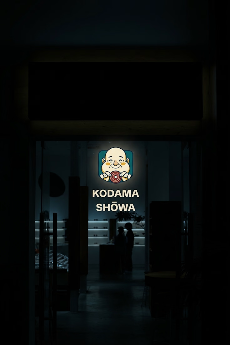
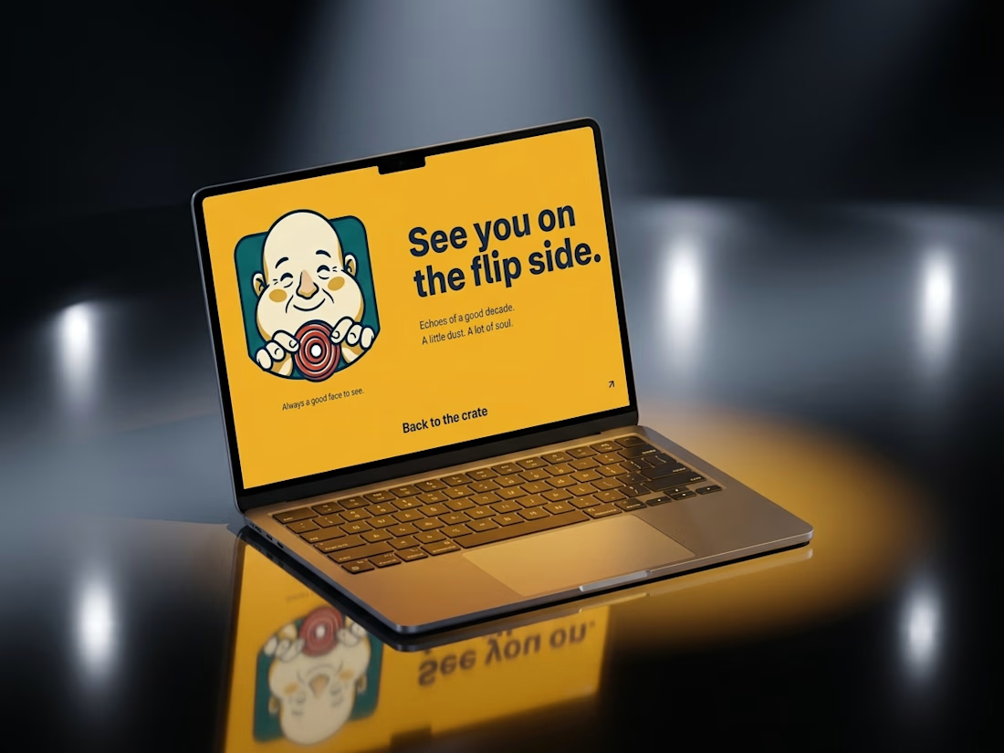
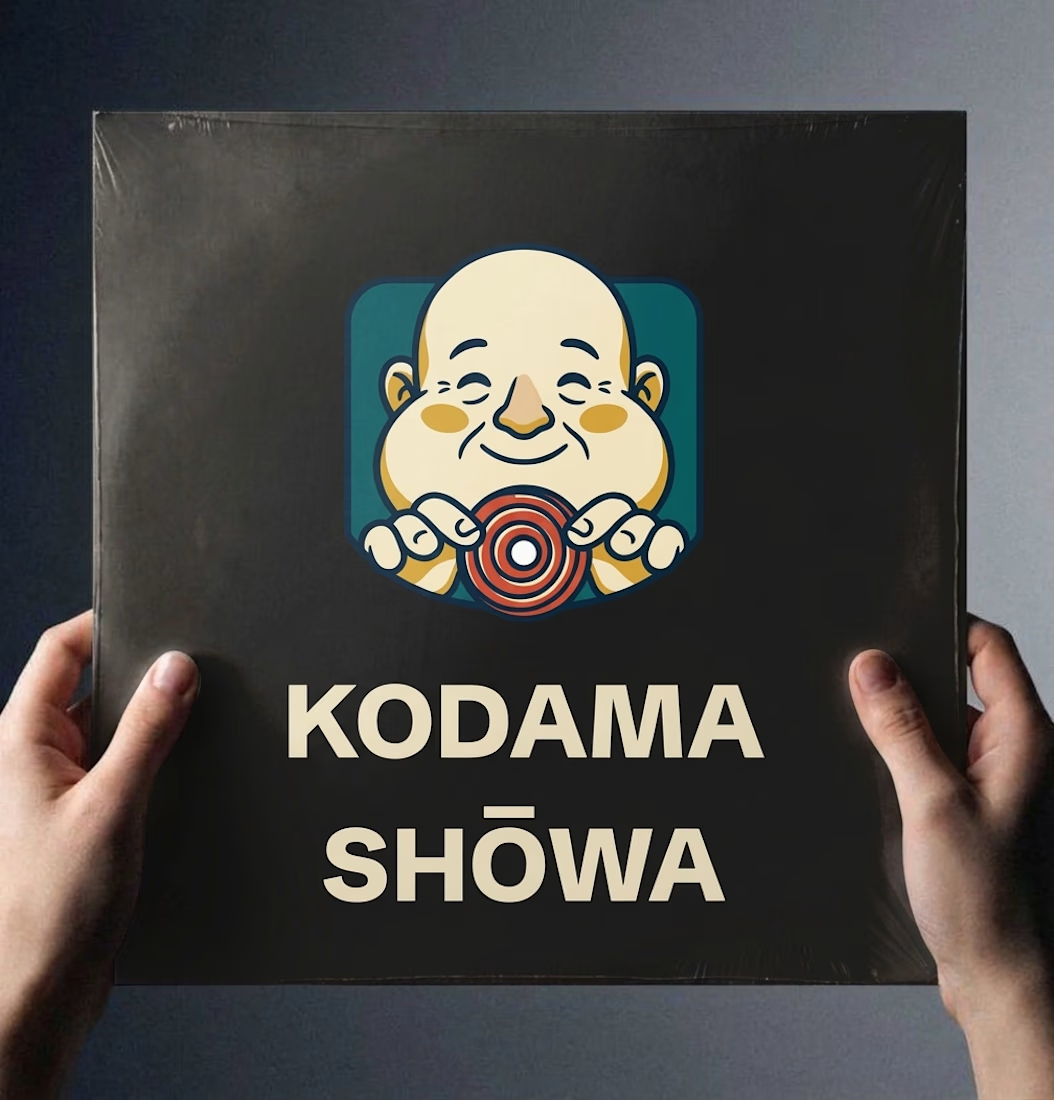
Ever wondered what a 1974 record shop would look like if it had a brand system?
Kodama Shōwa is coming soon: one old shopkeeper, five inks, and a camera at knee height.

Nice!


ESE GIN — Between the Dunes | Visual Identity & Packaging
ESE GIN draws its curves from the dunes. The signature S catches the light in sculpted olive glass and leaves its imprint in wax.


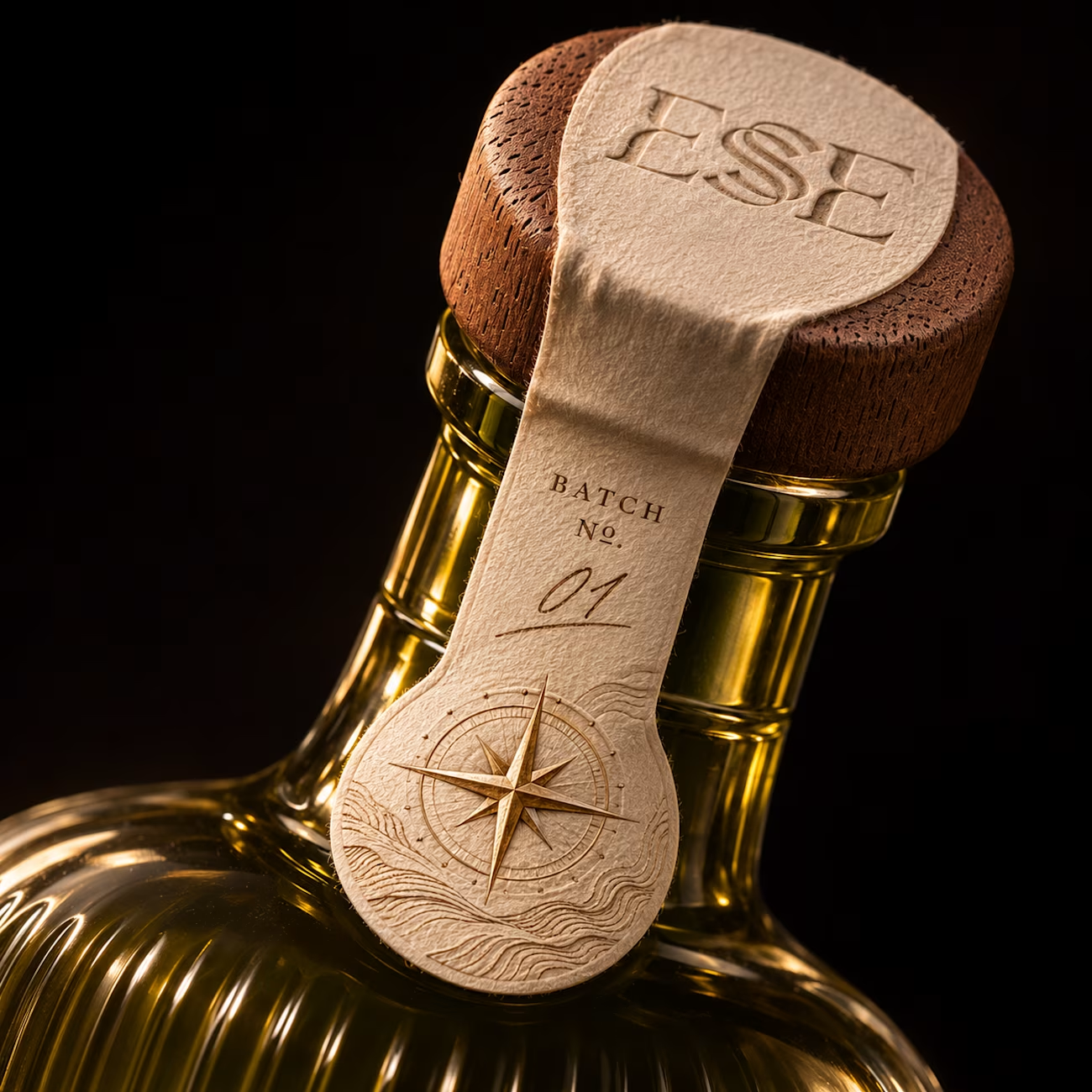
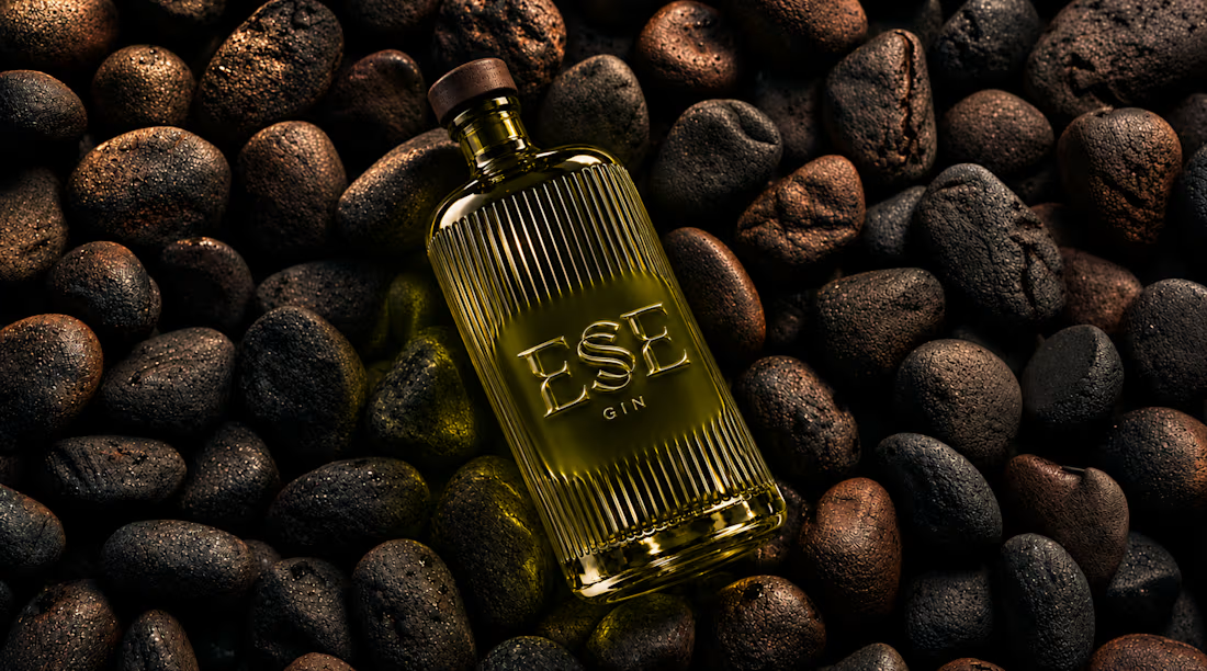
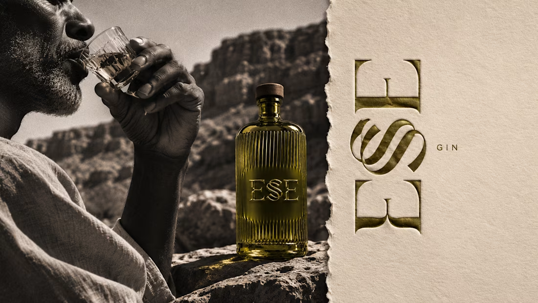
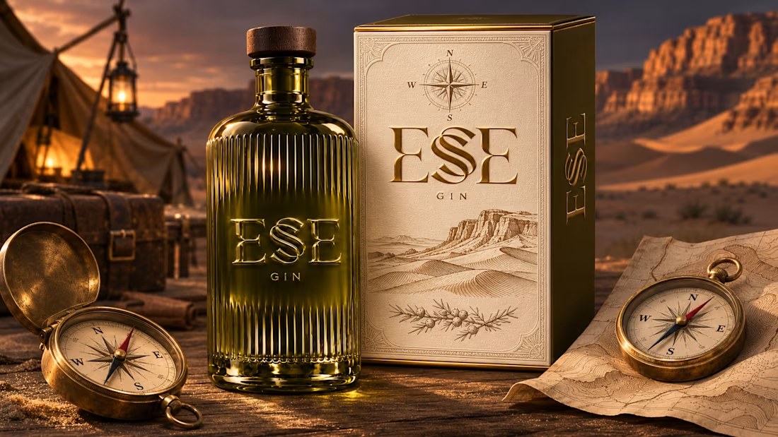

This is gorgeous, Maya — the sculpted olive glass with that S catching the light is such a clever way to carry the dunes into the bottle itself. And the wax seal imprint is a beautiful finishing touch, it gives the whole thing a crafted, almost apothecary feel. Really cohesive...