
pro
Chan Soe
UIUX Web designer | Web development
- 1x
- Hired
- 10
- Followers


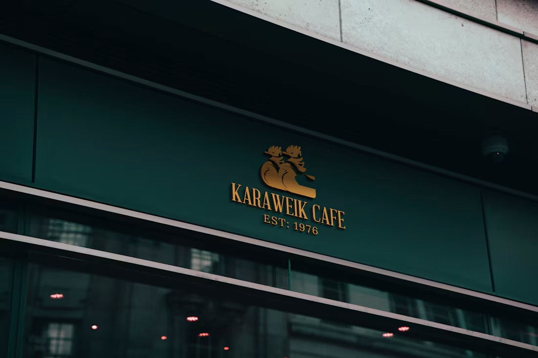
Branding & Logo Design for a Burmese Café
[Rejected Concept]
For this concept, I explored a vintage, premium look with a muted green and gold palette. The logo features an illustration of the Karaweik, directly connecting the design to the café’s name and Burmese heritage.
0
29
Introducing Memoripress
Most of us have thousands of photos on our phones, but rarely do anything with them.
Memoripress helps turn those photos into printed photo books. It's not a new concept, but what we are trying to do is making the experience more user friendly and modern day mobile friendly from creation to printing. I worked on its brand identity, website and web app, including the photo book editor.
The interesting challenge was bringing two things together: a warm, nostalgic brand and a practical tool that makes creating an album feel simple.
I used earthy browns, faded cream and paper textures to give the brand a familiar, tactile feeling. For the editor, I focused on clear steps for uploading photos, arranging layouts and reviewing the finished book.
This project gave me the chance to think through the whole experience, from someone’s first impression of the brand to the book they eventually hold.
2
2
103
Aesthetic Space is a beauty and cosmetics ecommerce website, designed in Figma and developed in WordPress with WooCommerce.
Inspired by clean clinical aesthetics, the design reflects the brand’s focus on cleanliness, wellbeing and personal care. The visual direction brings a sense of freshness and trust to the shopping experience.
2
3
105
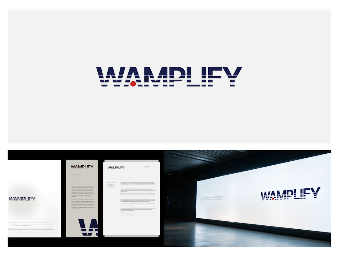
For Wamplify, a group of specialist businesses in wealth and asset management, I designed a logo that balances professional credibility with a distinctive character.
The concept started with the name. “WAM” refers to wealth and asset management, while “plify” draws from amplify. I used horizontal lines in different weights to suggest a signal growing in strength, bringing that meaning into the wordmark itself.
The challenge was keeping the lettering recognisable. Too much distortion could make it difficult to read; too little would leave the concept barely visible. The line treatment gives the logo movement while preserving a strong, structured silhouette.
A restrained colour palette supports the professional tone, with a small red accent adding personality. The result gives Wamplify a clear visual signature that can extend into layouts, imagery and motion.
0
60