
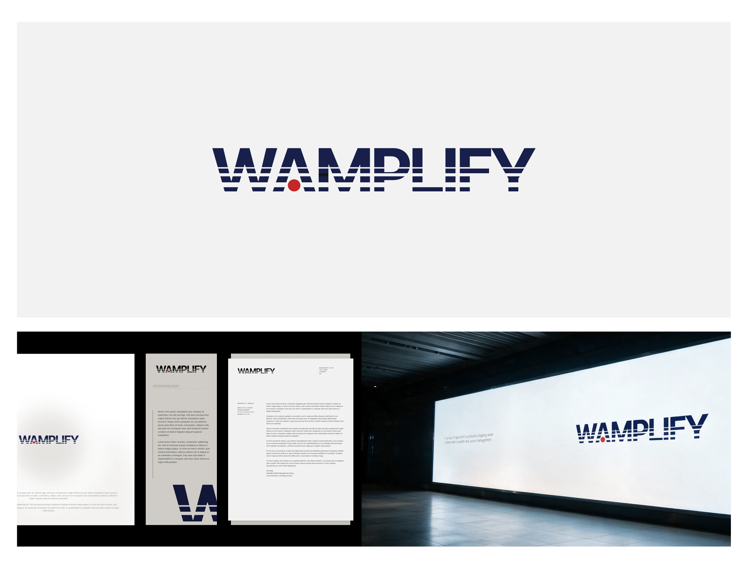
For Wamplify, a group of specialist businesses in wealth and asset management, I designed a logo that balances professional credibility with a distinctive character.
The concept started with the name. “WAM” refers to wealth and asset management, while “plify” draws from amplify. I used horizontal lines in different weights to suggest a signal growing in strength, bringing that meaning into the wordmark itself.
The challenge was keeping the lettering recognisable. Too much distortion could make it difficult to read; too little would leave the concept barely visible. The line treatment gives the logo movement while preserving a strong, structured silhouette.
A restrained colour palette supports the professional tone, with a small red accent adding personality. The result gives Wamplify a clear visual signature that can extend into layouts, imagery and motion.
0 likes · 2 views · Oct 9, 2026
For Wamplify, a group of specialist businesses in wealth and asset management, I designed a logo that balances professional credibility with a distinctive ch...

