The network for creativity
Join 1.25M professional creatives like you
Connect with clients, get discovered, and run your business 100% commission-free
Creatives on Contra have earned over $150M and we are just getting started
Back to feedPost
Taste Test

Guys please help me decide which version is better. I'm working on my own branding "imsparrow" and can't decide. Which do you think looks better?
46 voted
66%
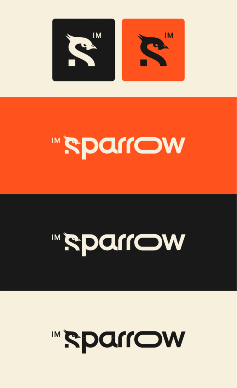
24 voted
34%
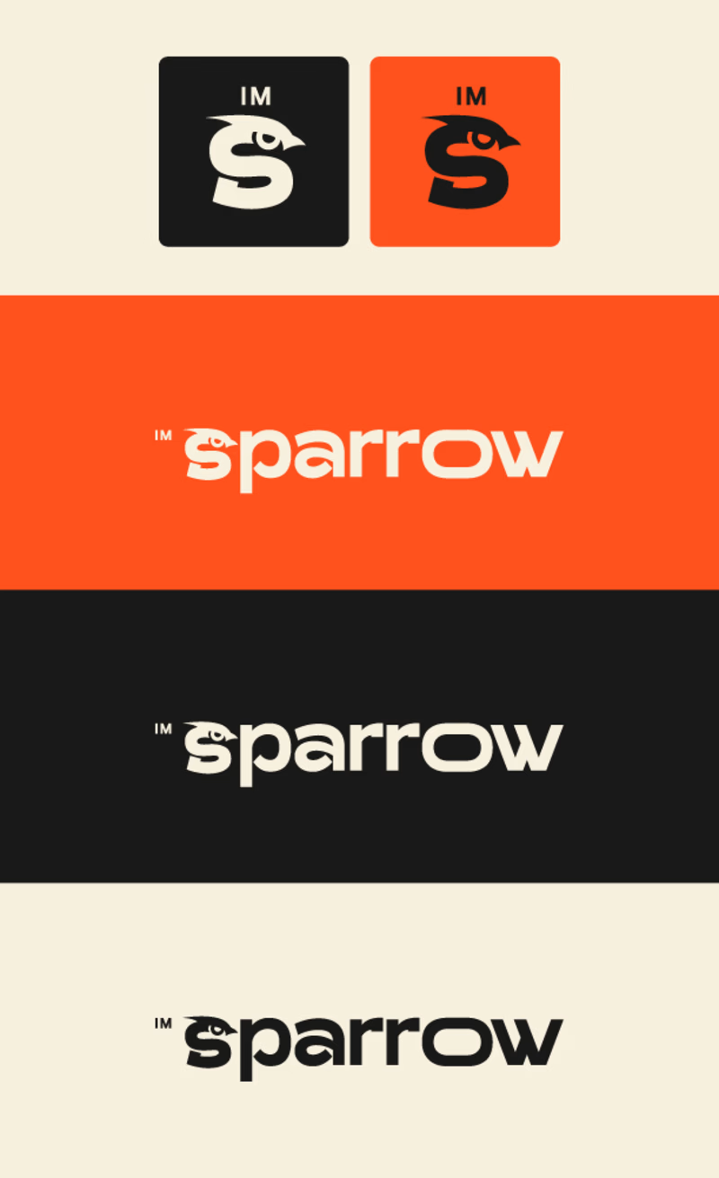
70 votes
Closed

V2 is more visually appealing and easier to understand!
Thanks!

the v2 i better in my oppinion , becasue the font of the text is more clear and attractive than the v1
Thanks!

V1 has a bit more movement that is happening with the text that draws your eyes to it!
Thanks!

Yes that's true, thanks!

The V2 looks better.
Thanks!
You're welcome!

V1 - I like the way you created the "R"
Thanks!

V2 feels complete
the whitespace in the V1 makes it feel something is missing
Great concept in between Michal

none. you still got to decide which is the hero element in the full logo - composed of the wordmark (sparrow) + and the mark (the S-shaped Sparrow illustration). Currently I see the emphasis on the "O" letter and also the "S-shaped" bird.
From the 2 versions, I would keep the...
Thanks for the advice! I will take it into consideration 🧠

Im going with V2 since its easier to read in a quick glance. If you look fast to the first version you read ''parrow''

Great work on both versions! I personally prefer V2 — the cleaner icon style and the updated typography feel more modern and polished. The bold, sans-serif letterforms really make the sparrow motif stand out. Best of luck with your branding!

v1


I prefer Vs 2

I go with V1, looks more professional

V2, readability is everything. V1 is cool, and if it were for a T-shirt or something i could see it, for a logo - V2 99.44%


V1 for me, simpler and interestingly beautiful with the used font, excellent job by the way! 💯 🔥

V1 for Sure if its CALM BRAND
V2 for QUICK AND STRATEGY BRAND


V2 is better 👍

i would vote for V1
The network for creativity
Join 1.25M professional creatives like you
Connect with clients, get discovered, and run your business 100% commission-free
Creatives on Contra have earned over $150M and we are just getting started



Related posts

Proper Form — Social Media Branding System
A flexible social media system created for Proper Form as part of the wider brand identity.
The template system was designed to adapt across different post formats, banners and platforms while maintaining a consistent visual language.
Rather than repeating one rigid layout, the system gives the brand room to vary composition, imagery and content while remaining clearly recognizable.
Created by Lepisov Branding in collaboration with Creative Mints.
Logo design: Ilya Gorchanyuk
Creative direction: Dmitry Lepisov
Brand identity + social system: Lepisov Branding × Creative Mints


This is how a social system should work: strong enough rules that the brand reads at thumbnail size, loose enough that the feed never looks copy-pasted. Do you hand clients a Figma kit for this, or build it in something their team edits themselves?


Celvana brand identity & packaging for a red light therapy brand launching in the US.
The category is crowded with identical, unbranded panels. Celvana sells precision, so the brand had to look like medical equipment you can trust: clinical, exact and professional.
Brand identity case study
Packaging case study

This is high end branding


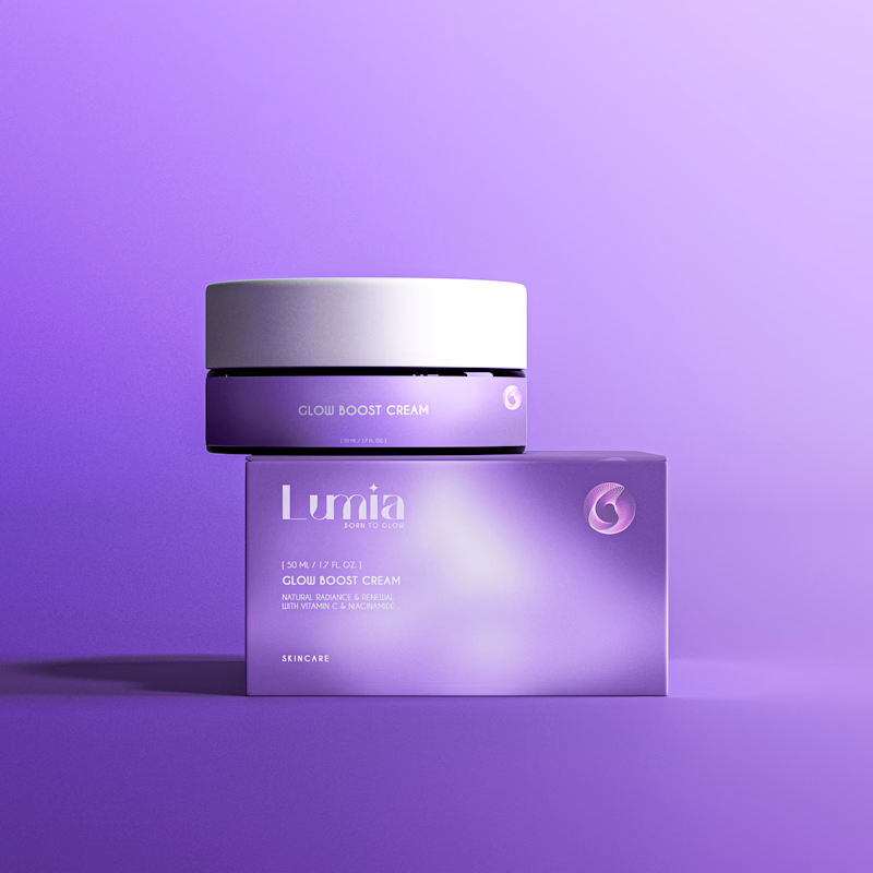
Which packaging design do you prefer?
4 voted
33%
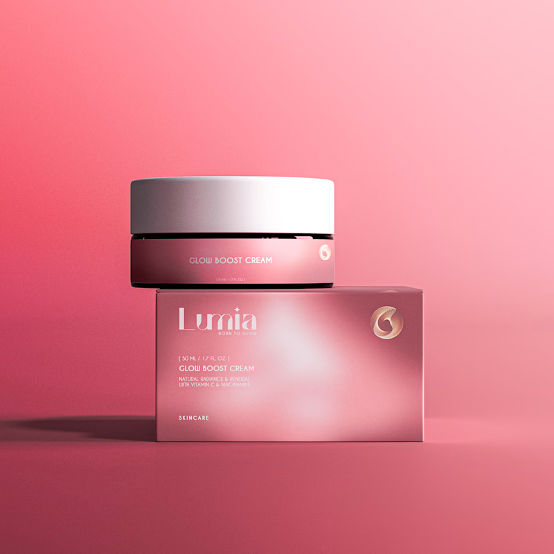
8 voted
67%
12 votes
Closed

Elegant Pink for me. It feels closer to what a skincare shelf actually looks like.