The network for creativity
Join 1.25M professional creatives like you
Connect with clients, get discovered, and run your business 100% commission-free
Creatives on Contra have earned over $150M and we are just getting started
Back to feedPost
Taste Test


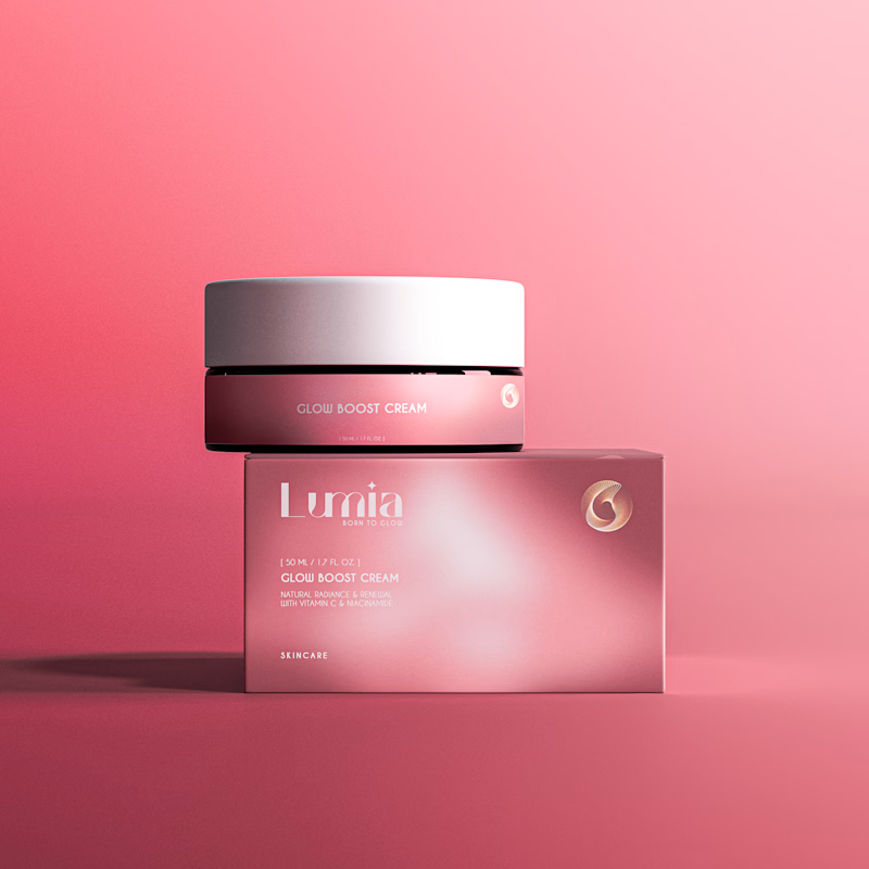
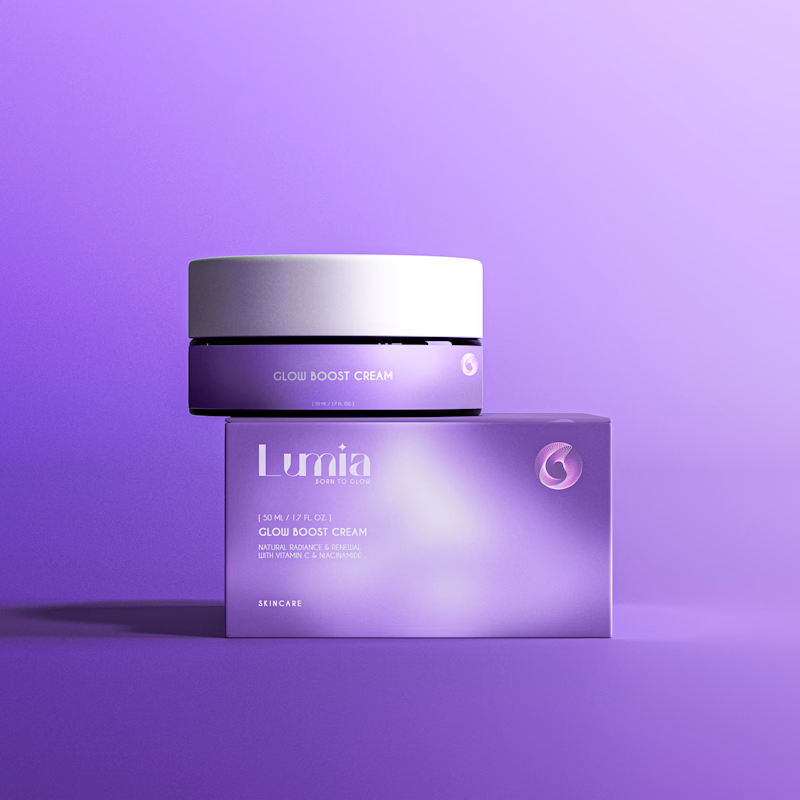


Royal Purple
The network for creativity
Join 1.25M professional creatives like you
Connect with clients, get discovered, and run your business 100% commission-free
Creatives on Contra have earned over $150M and we are just getting started








Related posts


Same brand. Same palette. Two completely different proposals for a real estate developer.
A: An isotype built from blocks. Geometric, precise, the language of construction. It says we build.
B: Custom lettering with movement. Warmer, more editorial. It says we build places you’d want to live in.
36 voted
51%

35 voted
49%

71 votes
Closed

My vote is B, Milagros. Custom lettering with movement has real editorial warmth, which suits a developer selling places people actually want to live in.


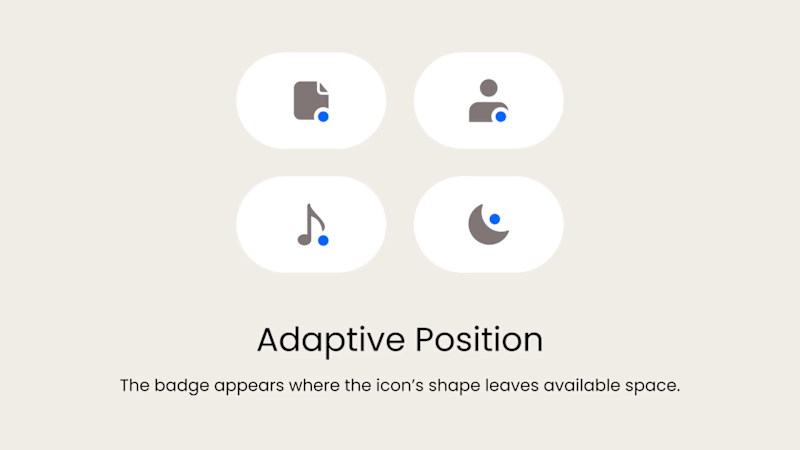
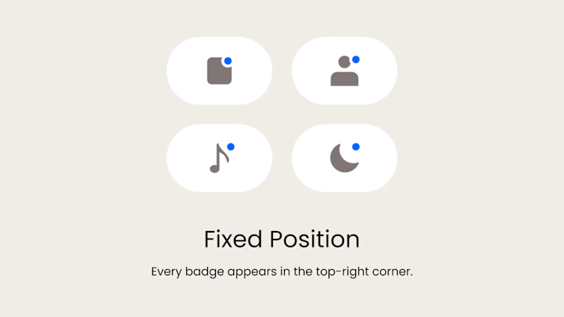
Badge Placement: Consistency or Visual Balance?
Even a small indicator can change how the entire interface feels
Adaptive Position
The badge placement changes depending on the icon’s shape and available space. The result feels more visually balanced but requires individual adjustments.
Fixed Position
The badge always appears in the top-right corner. This creates a consistent and predictable system, but on some icons it may feel disconnected or awkwardly placed.
What matters more in a design system: consistency or optical balance?
17 voted
43%
23 voted
57%
40 votes
Closed

Fixed for me. In a system, people learn where to look. I'd tweak the odd icons before breaking the rule.

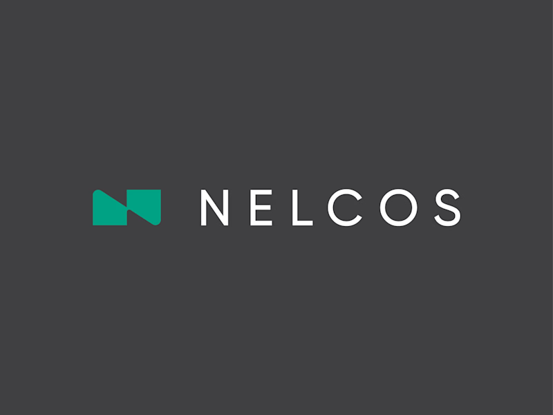
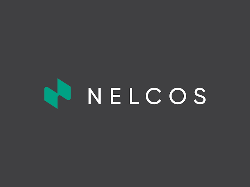
Which N works better? 🗳️
Worked on a logo for Nelcos, a Canadian company that refinishes interiors with architectural film instead of replacing them.
The idea: an unrolled roll of film that turns into the letter N.
The green is there to highlight eco-friendliness: less demolition, less waste.
Two directions for the symbol:
A: rectangular, compact
B: hexagonal, more dynamic
Vote and tell me why in the comments 👇
logodesignlogodesignerbrandidentityLogo DesignBrand DesignGraphic DesignAdobe IllustratorAdobe Photoshop


6 voted
43%
8 voted
57%
14 votes
Closed

Love the concept! The rectangular N feels more architectural and stable, which fits interiors. Hexagonal feels too techy. The unrolled film idea is brilliant - green for eco is perfect. I'd vote rectangular for this brand. Great work! 👏