The network for creativity
Join 1.25M professional creatives like you
Connect with clients, get discovered, and run your business 100% commission-free
Creatives on Contra have earned over $150M and we are just getting started
Back to feedPost
Taste Test

Craft Meets Heritage: Which M0U Packaging Wins?
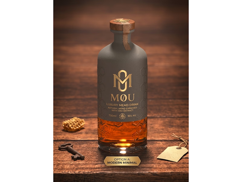
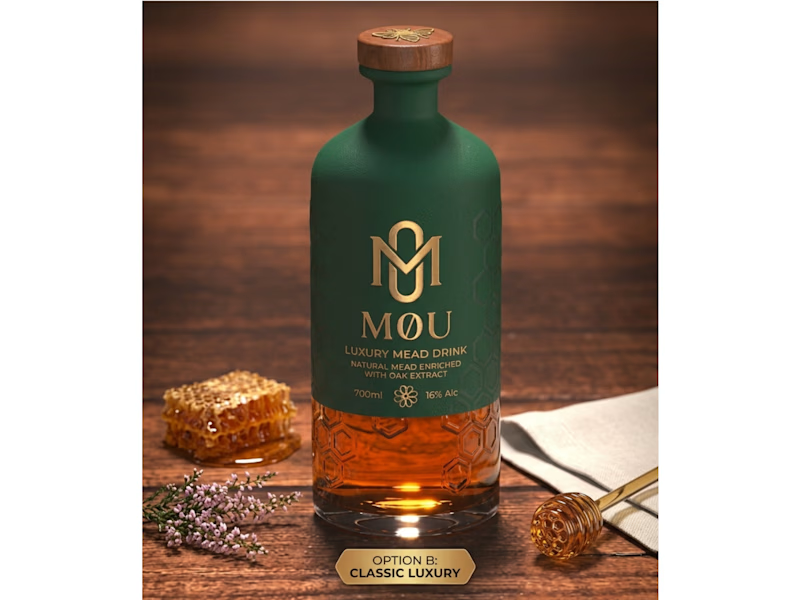
I created two distinct packaging concepts for M0U, a luxury oak-enriched honey mead brand. Both designs keep the custom geometric gold monogram and embossed honeycomb glass intact while testing two different visual directions:
Option A (Modern Minimal): Features a matte slate-grey wrap and a textured neck seal for a contemporary, understated shelf presence.
Option B (Classic Luxury): Uses a deep forest-green finish paired with warm gold foil accents to highlight natural botanical heritage.
Which packaging direction grabs your attention first—A or B? Drop your vote below!
Looking to elevate your brand with custom logo systems and standout packaging design? Let’s connect and bring your vision to life.
3 votes
Ends in 9h

B — the forest green and gold feel luxurious.
The network for creativity
Join 1.25M professional creatives like you
Connect with clients, get discovered, and run your business 100% commission-free
Creatives on Contra have earned over $150M and we are just getting started



Related posts

Working on a Contra project - which one is your go to?
90 voted
52%
82 voted
48%
172 votes
Closed

I will go for A - Spiral

Need a second pair of eyes 👀
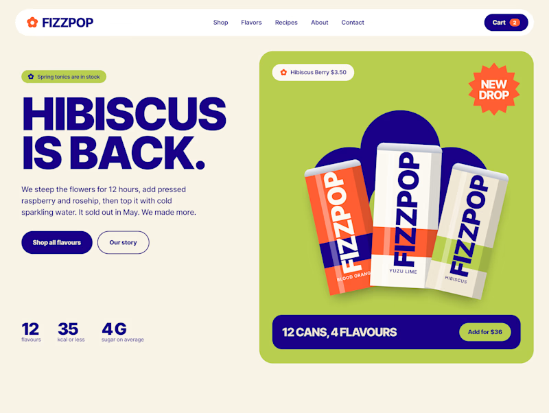
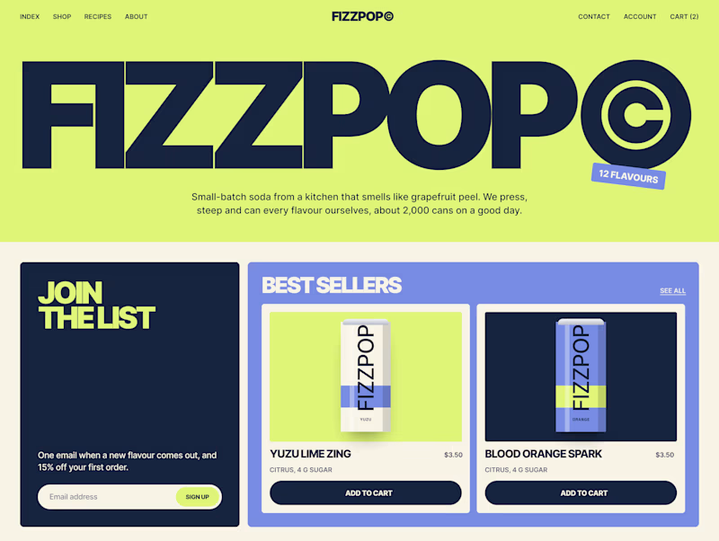
I'm designing the online store for FizzPop, a craft soda brand: all-natural sodas, sparkling waters and botanical tonics.
Flower Fizz(A): eggshell, tiger orange and deep ultramarine, with flower shapes and stacked colour swatches for the flavours
Corner Shop(B): lime, soft blues and navy, editorial layout with a giant wordmark and menu-style flavour tiles

38 voted
44%
48 voted
56%
86 votes
Closed


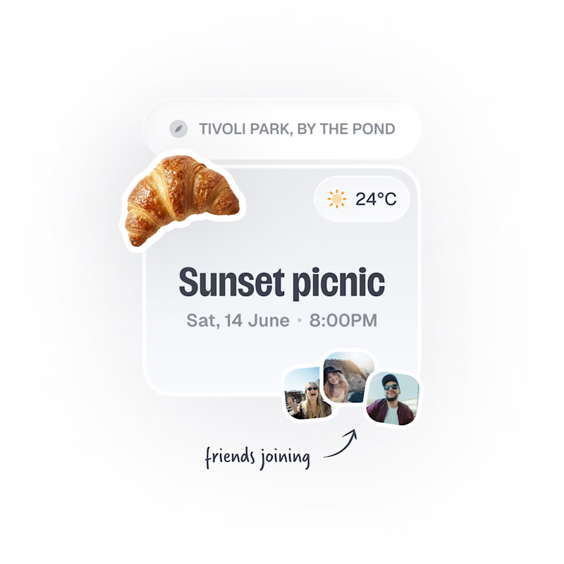
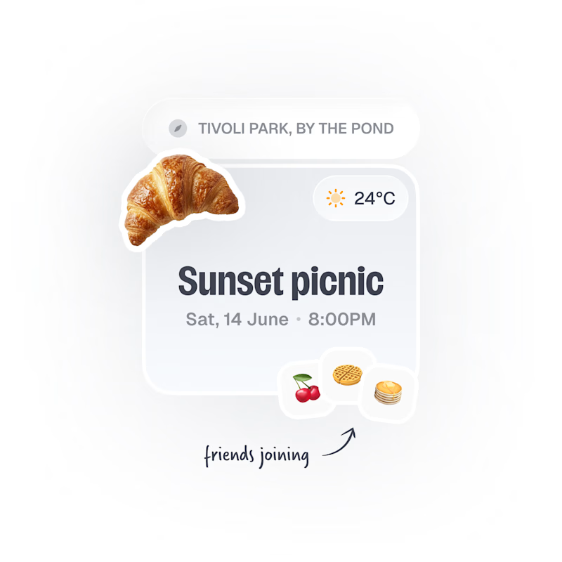
Upcoming card design for a Picnic App 🥞🧺🍎
Do we like the idea of images or predefined avatars more?:)
20 voted
83%
4 voted
17%
24 votes
Closed

Images, with the fruit avatars as the fallback for anyone without a photo. Faces are how you spot your friends at a glance, and the croissant already gives the card plenty of personality.