The network for creativity
Join 1.25M professional creatives like you
Connect with clients, get discovered, and run your business 100% commission-free
Creatives on Contra have earned over $150M and we are just getting started
Back to feedPost
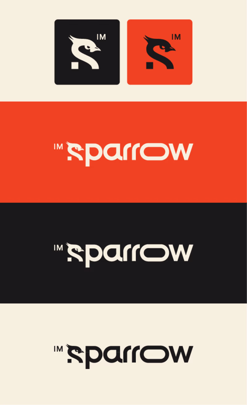
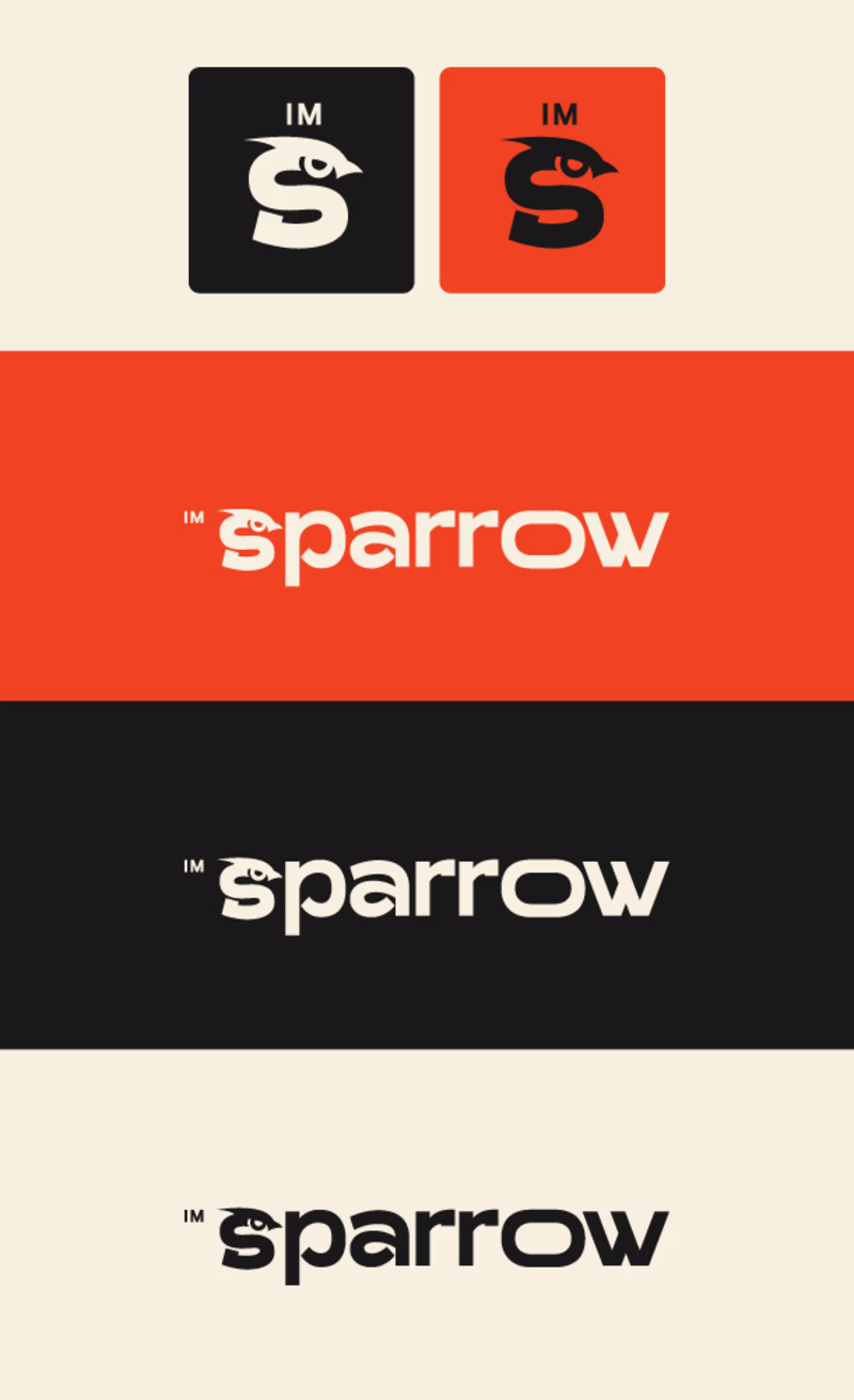
Taste Test
Guys please help me decide which version is better. I'm working on my own branding "imsparrow" and can't decide. Which do you think looks better?
46 voted
66%
24 voted
34%
70 votes
Closed
v1
V2 is more visually appealing and easier to understand!
Thanks!
the v2 i better in my oppinion , becasue the font of the text is more clear and attractive than the v1
Thanks!
V1 has a bit more movement that is happening with the text that draws your eyes to it!
Thanks!
The v2 is more better i think
Thanks!
Yes that's true, thanks!
The V2 looks better.
Thanks!
You're welcome!
V1 - I like the way you created the "R"
Thanks!
V2 feels complete
the whitespace in the V1 makes it feel something is missing
Great concept in between Michal
none. you still got to decide which is the hero element in the full logo - composed of the wordmark (sparrow) + and the mark (the S-shaped Sparrow illustration). Currently I see the emphasis on the "O" letter and also the "S-shaped" bird.
From the 2 versions, I would keep the...
Thanks for the advice! I will take it into consideration 🧠
Im going with V2 since its easier to read in a quick glance. If you look fast to the first version you read ''parrow''
Great work on both versions! I personally prefer V2 — the cleaner icon style and the updated typography feel more modern and polished. The bold, sans-serif letterforms really make the sparrow motif stand out. Best of luck with your branding!
I prefer Vs 2
I go with V1, looks more professional
V2, readability is everything. V1 is cool, and if it were for a T-shirt or something i could see it, for a logo - V2 99.44%
V1 for me, simpler and interestingly beautiful with the used font, excellent job by the way! 💯 🔥
V1 for Sure if its CALM BRAND
V2 for QUICK AND STRATEGY BRAND
V2 is better 👍
i would vote for V1
The network for creativity
Join 1.25M professional creatives like you
Connect with clients, get discovered, and run your business 100% commission-free
Creatives on Contra have earned over $150M and we are just getting started
Related posts
I like your creativity
Well done 👍
The concept that didnt make it through the selection process but majority of the brand language, imagery and the visual identity system were adopted and harmonized with the selected one to create one unity and expand the entire design system.
The logo features a modern, intelligent logomark built around a three-phased star symbolizing curiosity, signal throught the noise, and transformation. Constructed from sharp vertical lines with varying stroke weights, it creates a subtle optical illusion that reflects the brand’s core idea of clarity emerging from complexity. The three phases are conceptually tied to the brand name - Ctrl, Shift, and the final outcome: taste. This is paired with a confident, taste-led wordmark blending script and serif typography to spark intrigue and character.
The overall identity is editorial, bold, and creative-first slightly irreverent yet refined. It is opinionated rather than instructional, community-driven and culture-forward, designed to feel like a living platform rather than a one-off campaign.
The visual system combines pitch-black foundations with shades of grey, accented by subtle color tints, glowy gradients, grainy 3D elements, visual distortions, and futuristic AI-generated imagery, creating a rich, expressive language for rooms filled with artists, technologists, and builders.
You can see full project here
You can see the final selected direction.
Thanks for the feedback in advance, much appreciate your support.
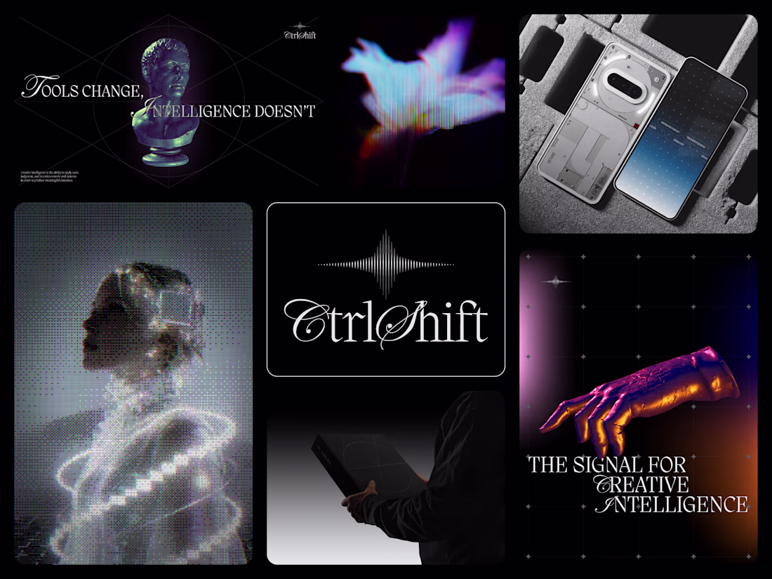
wow, the visual identity is absolutely flawless. this work is fire! 🔥
Trending
Claude
Claude has entered the design space. How are you using Claude Design?
Contra University
Learn from expert creatives how to earn more using next-gen AI tools.
MagicPath
The canvas is infinite, and exploration is becoming the workflow. How are you using MagicPath?
creativeaiflow
Creative AI workflows are evolving. What tools do you use, and what are their strengths and weaknesses?
freelancerlife
Freelancer life is wins, pivots, and everything in between. What’s yours right now?