The network for creativity
Join 1.25M professional creatives like you
Connect with clients, get discovered, and run your business 100% commission-free
Creatives on Contra have earned over $150M and we are just getting started
Back to feedPost
Taste Test

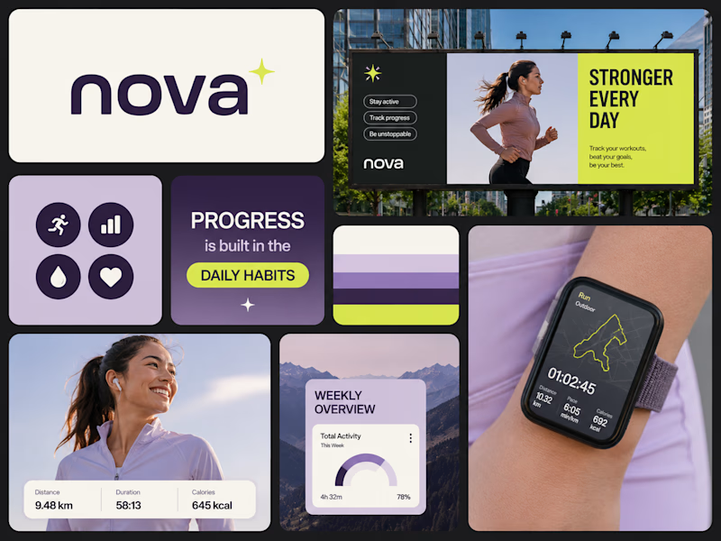
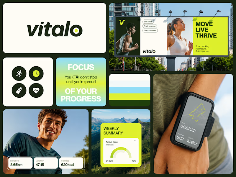
I’ve designed two branding concepts, and I’d love your feedback. Which one do you think stands out more?


22 voted
50%
22 voted
50%
44 votes
Closed

I prefer Option 1—the stronger contrast and cleaner visual hierarchy make the brand feel more distinctive, memorable, and premium at first glance.
Thanks for the feedback! I agree that Option 1 has a stronger visual impact.

Thank you! Really appreciate it. The color palette was one of my favorite parts to explore for this brand.

Superb execution!
Thank you for the feedback..

clean work
Thank you

It’s interesting to see how different ideas can show your brand. I think the one with brighter colors stands out more I mean option 2. Great job on both designs.
Thanks for taking the time to share your thoughts.

Amazing execution 👏🏻
Thank you for the feedback..

Option 1, feels cooler and soothing to eye, specifically Cloud Purple tone makes it more premium.
Thank you for the feedback..

I found #2 more energetic, both great 👍
Thank you for your feedback..

i think option 2 looks better. due to the yellow color making the theme looks lively
though the purple makes it look elegant
Thank you! 😊 I really appreciate your perspective.

Thank you for your feedback..

option 1 is better
Thank you for your feedback..


Superb work, option 2
Thank you
A pleasure

I see more people voted for design 2 but that is very wrong decision because that does not have any impact for the reason you are developing those designs. I can clearly see why 1st version is the best one being personal development expert.
Thank you. I really appreciate your perspective. Option 1 was designed to create a stronger strategic impact, while Option 2 appeals more through its vibrant energy. It's great to see how different audiences respond to each approach.

honestly, i feel the left one with pop colors goes well with the fitness theme...the purple shades are not so 'fitting'.
Thanks for the feedback!

I personally like the calm & sober theme of first concept, I'll go with it!

Thank you so much! I really appreciate that observation.

Vitalo's name has more warmth to it phonetically, and the darker green reads more premium wellness than nova+'s brighter lime. Both bento grids are clean though, that layout choice was the right call for a fitness app either way.
Thanks for the feedback and taking the time to share your thoughts.

Both directions are strong, but I’d love to know what inspired each concept. Curious to see which one the community connects with more! 👀
Thank you! 👀 That’s actually the fun part of exploring multiple directions. I’m curious too to see which concept people naturally connect with more!

I’d go with Option 1 — the visual hierarchy feels cleaner, and the purple palette gives it a more polished and cohesive look. ✨
The network for creativity
Join 1.25M professional creatives like you
Connect with clients, get discovered, and run your business 100% commission-free
Creatives on Contra have earned over $150M and we are just getting started

Challenges
View all


Related posts

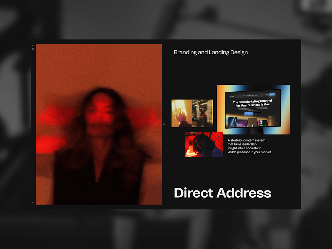
Direct Address makes thought leadership video for B2B companies. Their whole argument is that your best marketing asset is the person who founded the thing, and most companies bury them behind a brand voice.
So the mark is a spotlight. Not a camera, not a play button — those describe the equipment. A spotlight describes the effect: you point it at one person and everyone looks.
Two cones meeting at a point, one half carrying a full-spectrum gradient, one solid. Color system named after directors, because the product is direction rather than footage. Then the landing page carrying all of it.

The line about the mark being a spotlight instead of a camera reframes the whole pitch. Do most founders resist being on camera at first, or does that argument get them comfortable fast?

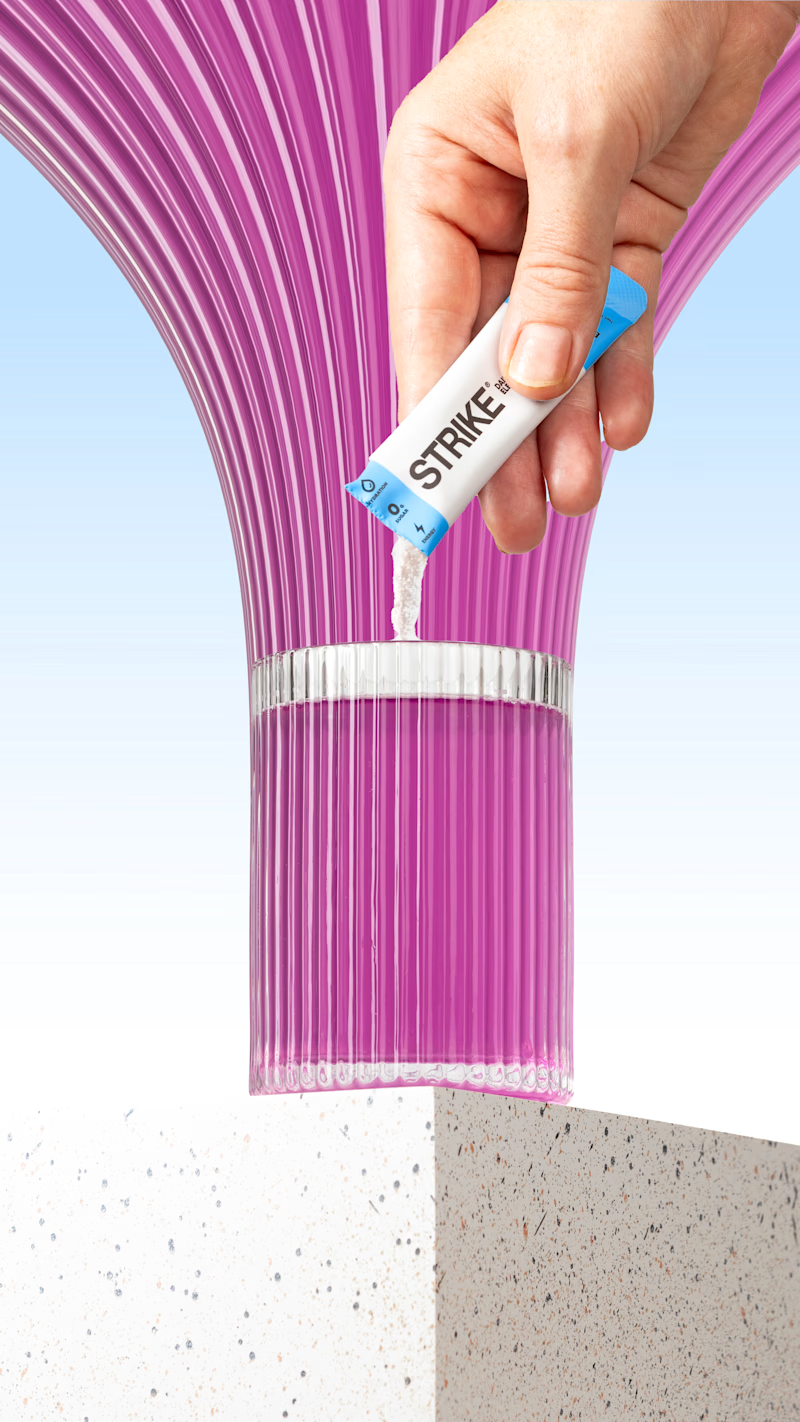
I tried the pixel-stretching trend on some packaging work recently, and I still can’t decide which version works better.
5 voted
29%
12 voted
71%
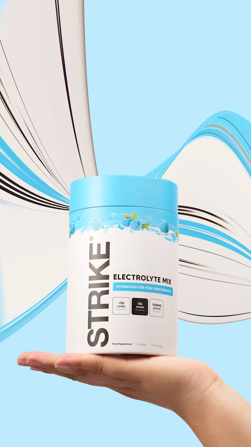
17 votes
Closed


the pink sachet looks so good. i pick sachet

New website for Beer Zombies Brewing Co. 🍺🧟♂️
Designed to be bold, vibrant, and disruptive. This was a fun build because the BZ brand already has such a strong visual identity and personality. Oversized typography, aggressive motion, interactive effects, and a healthy dose of zombie aesthetics. 🤘
www.beerzombies.com

The oversized type and aggressive motion fit the beer-brand attitude perfectly, especially how the green palette carries from the hero into the product details.