Direct Address: Brand Identity and Landing Page

Jeihun Alizadeh


About Direct Address
Direct Address makes thought leadership video for B2B companies. The pitch is uncomfortable and correct: your best marketing asset is the person who founded the thing, and most companies bury them behind a brand voice.
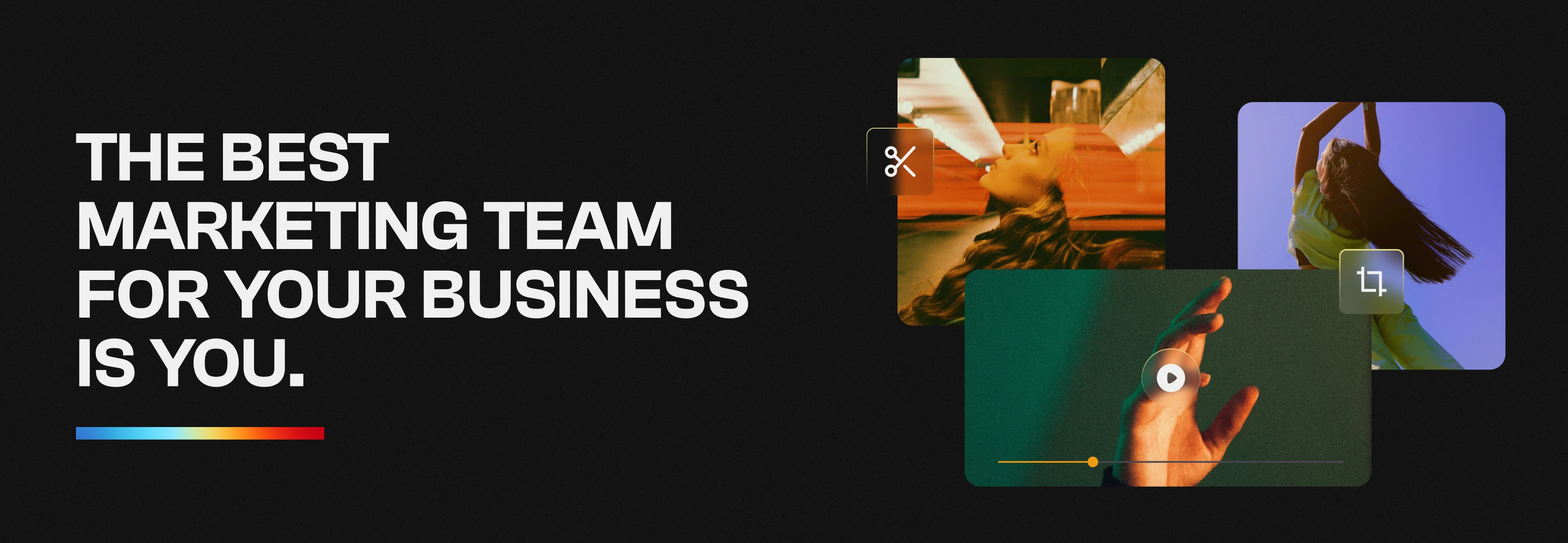
The best marketing team for your business is you.
That gave the identity one job. Look like a company that makes founders worth watching — without looking like a film studio, an agency, or a SaaS product.
THE MARK
We built the system around a spotlight.
Not a camera, not a play button, not a speech bubble. Those describe the equipment. A spotlight describes the effect: you point it at one person and everyone looks. That's the entire product.
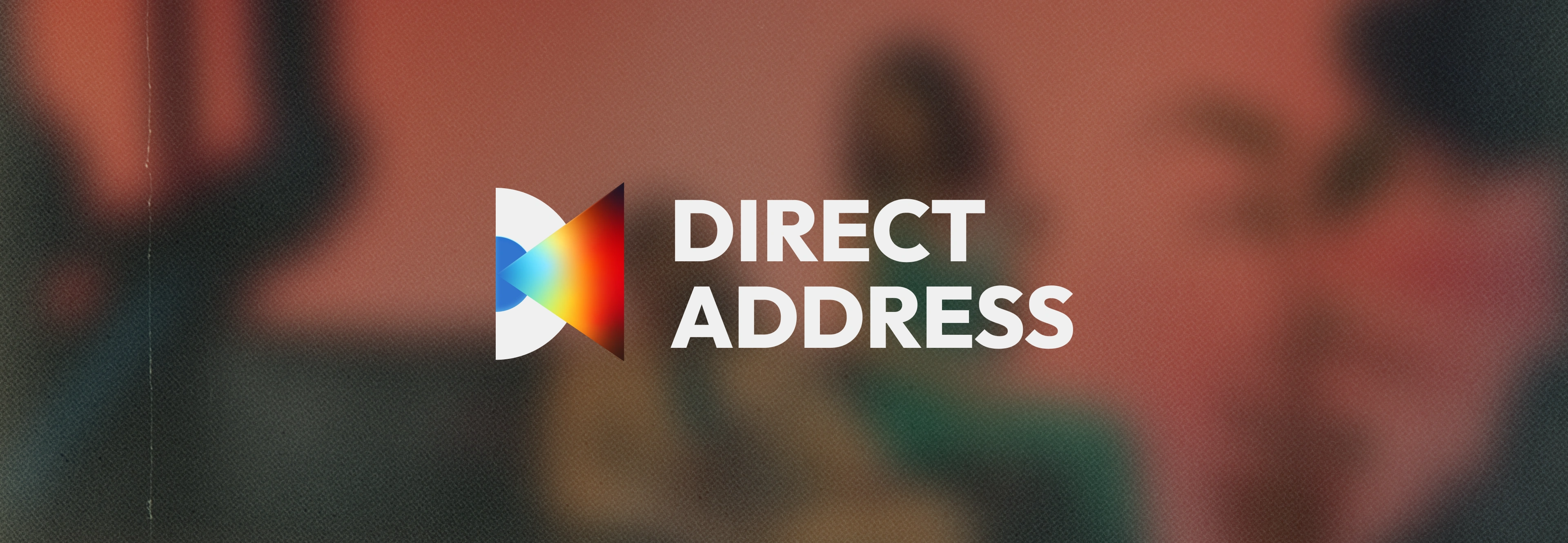
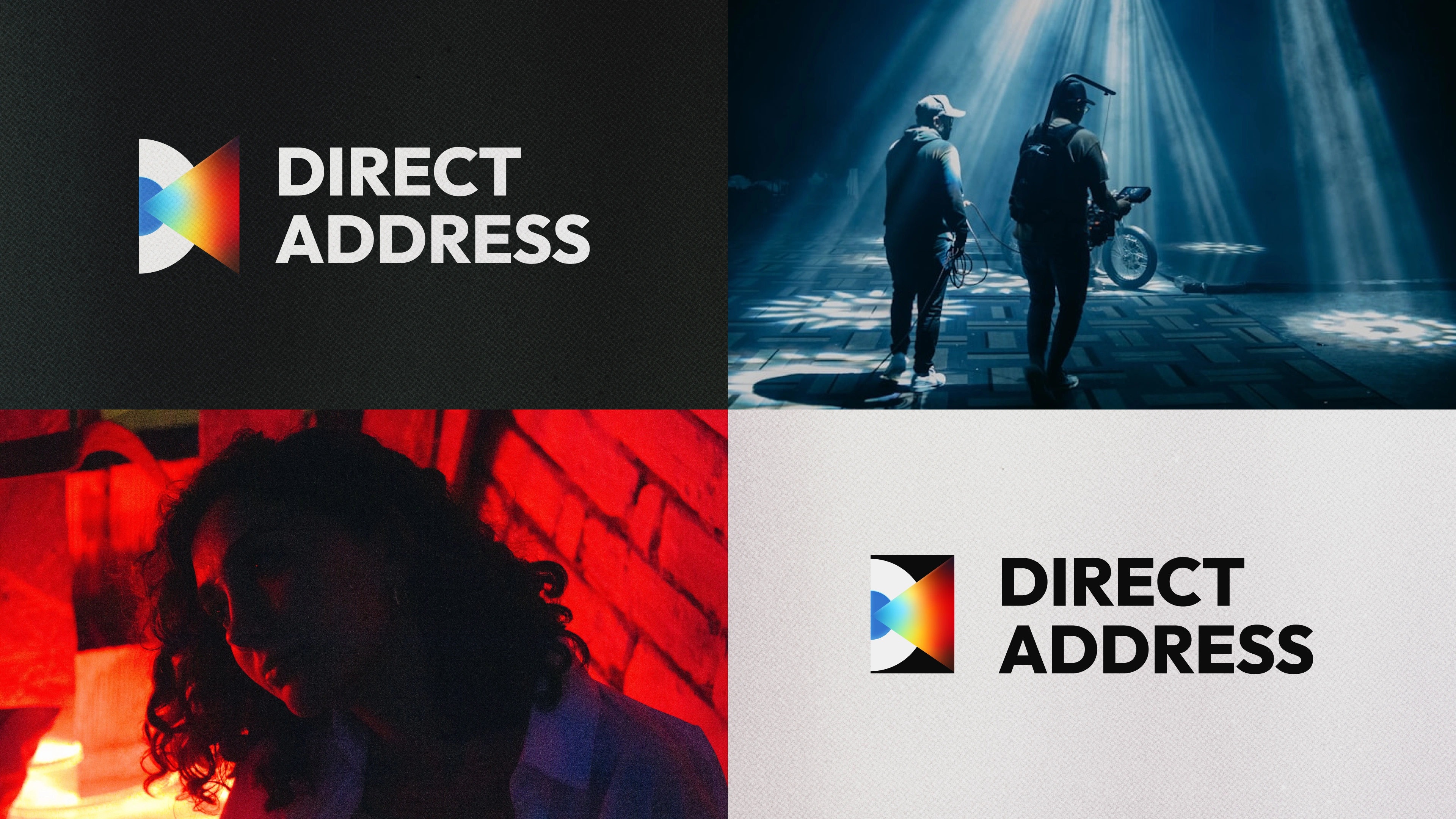
The mark is two cones meeting at a single point — a beam and what it lands on, mirrored. One half carries a full-spectrum gradient running blue through orange into red. The other stays solid. So the form reads two ways depending on which side you follow: light going out, attention coming back.
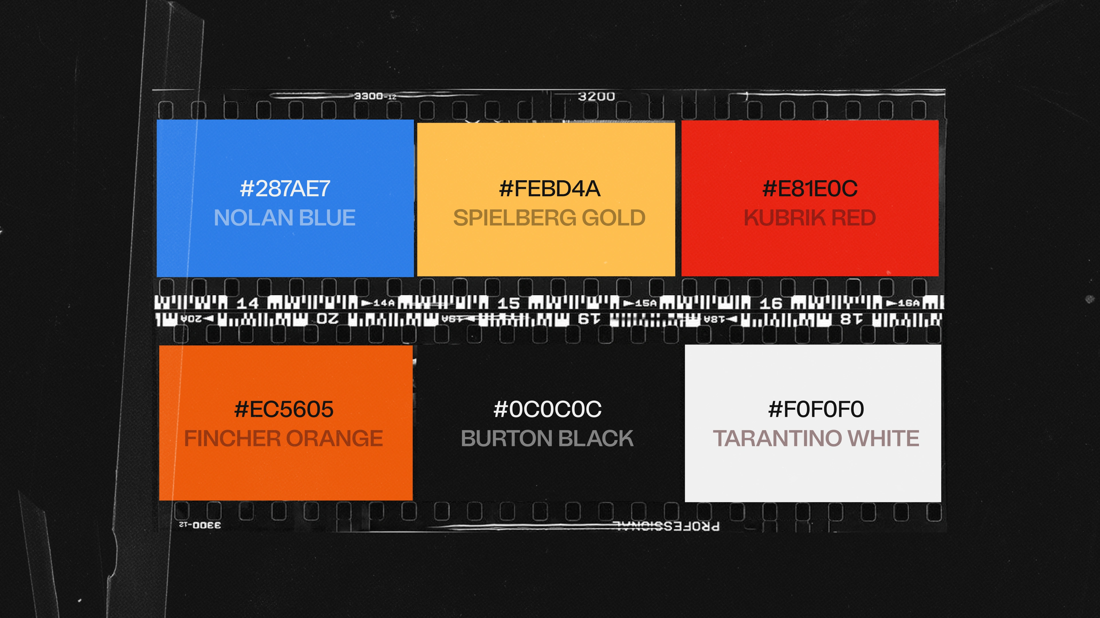
It was one of several directions we put in front of the client. It was the one she chose, and once it was locked the rest of the system fell into place quickly — the gradient became the colour logic, and the solid half set the rule for how the mark behaves on dark backgrounds.
The wordmark sits beside it in a heavy sans, stacked over two lines, tight. The brief for type was legibility at speed: this brand lives in social crops, video end cards and a long scroll, so anything with personality in the letterforms had to survive being small.
HOW WE COLLABORATED
Fifty-seven comment threads, almost all of them one line long.
The client reviewed in real time rather than in scheduled rounds. Feedback arrived in the shape people actually think in:
"too curly" "distinctive" "not a fan" "My fav typeface of the lot" "I LOVE THIS WEBSITE. Favourite out of all of them"
And when something was off, it was specific:
"like it, but the hero is too big — and the video is too large, the thumbnails are too large IMO" "I feel this use of gradients does impact legibility" "these buttons need to stand out more"
We didn't present three directions and wait a week. We put everything up and let her eliminate. The identity converged by subtraction, in the file.
She'd been precise about references from the start — clean layouts with interest built in, strong typography, and an explicit no to scroll hijacking and anything too generic. Having that on day one is why the first round landed close.
The whole project ran without a single call.
Direct Address - Slogan
Direct Address - Logo Types
Direct Address - Color Palette
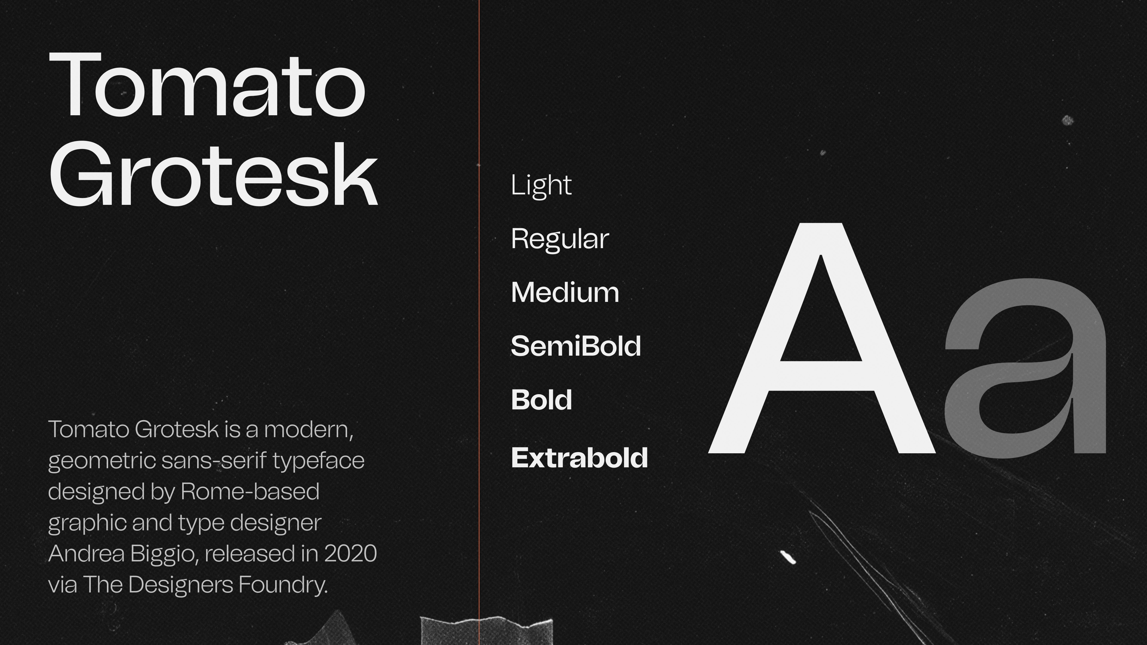
Direct Address - Font
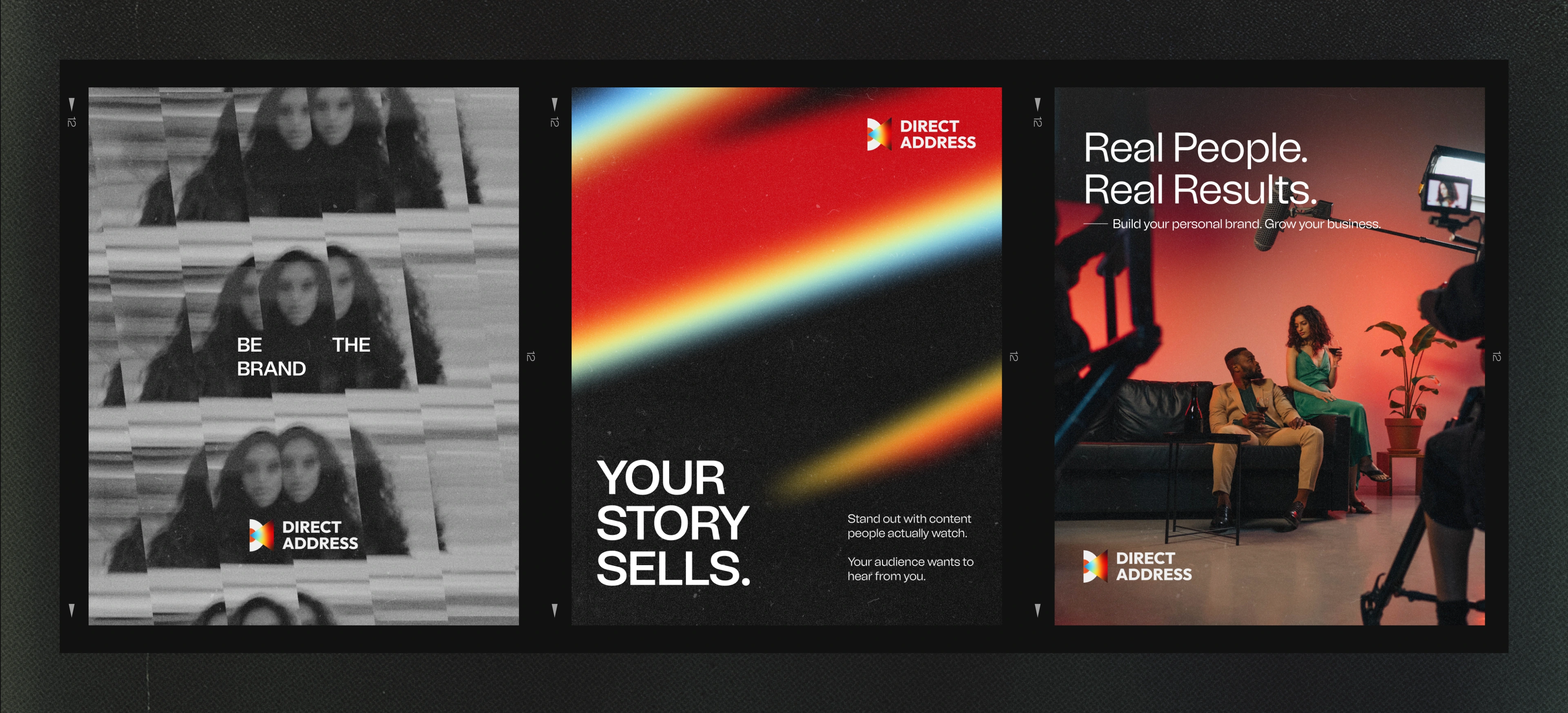
Direct Address - Social posts
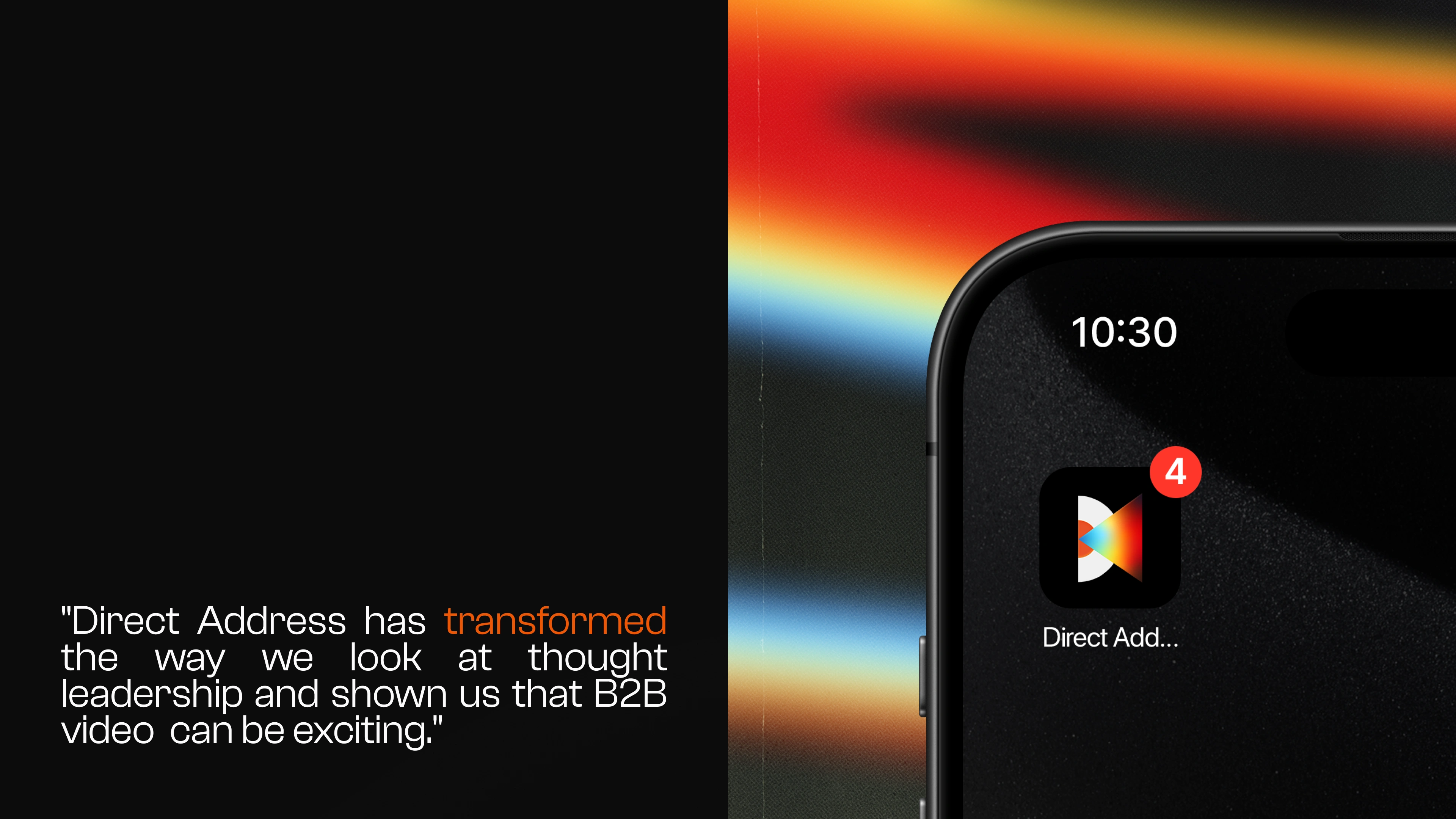
Direct Address - Quote from client and app icon
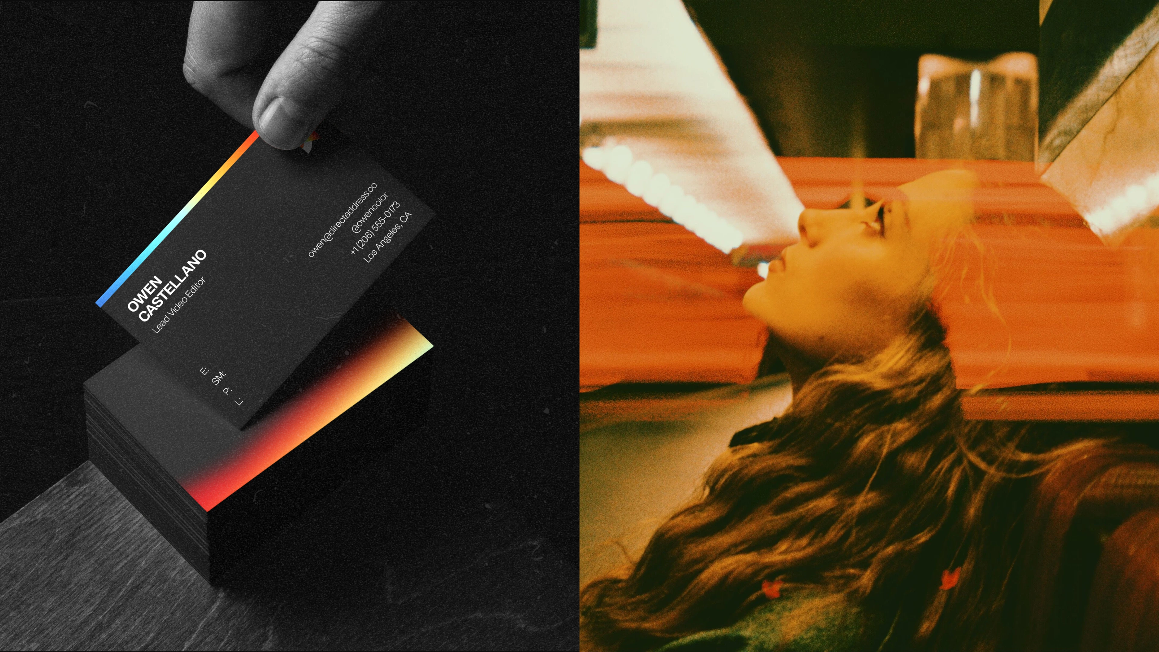
Direct Address - Business card

Direct Address - Slogan
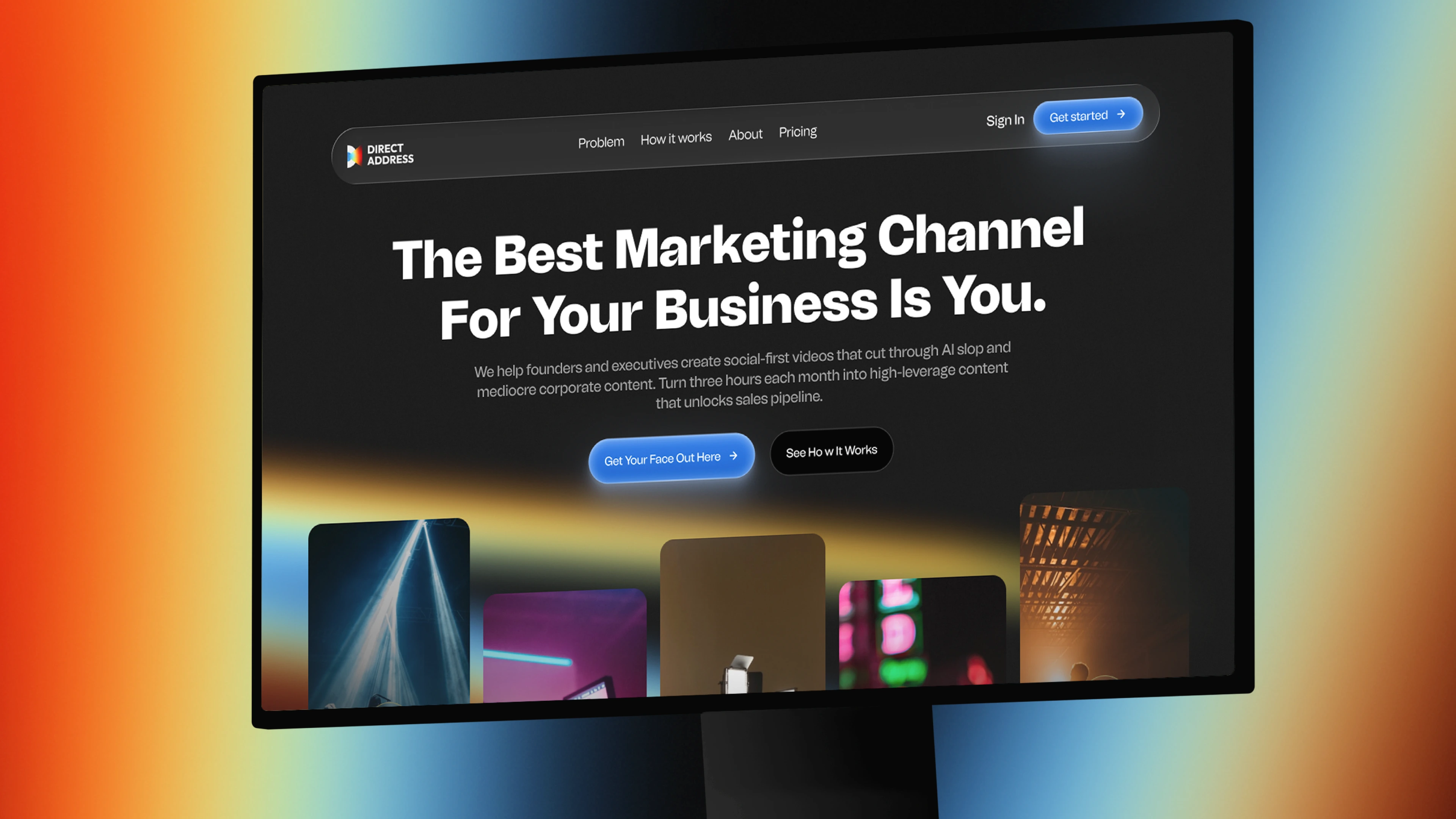
Direct Address - Hero section

Direct Address - Landing Page
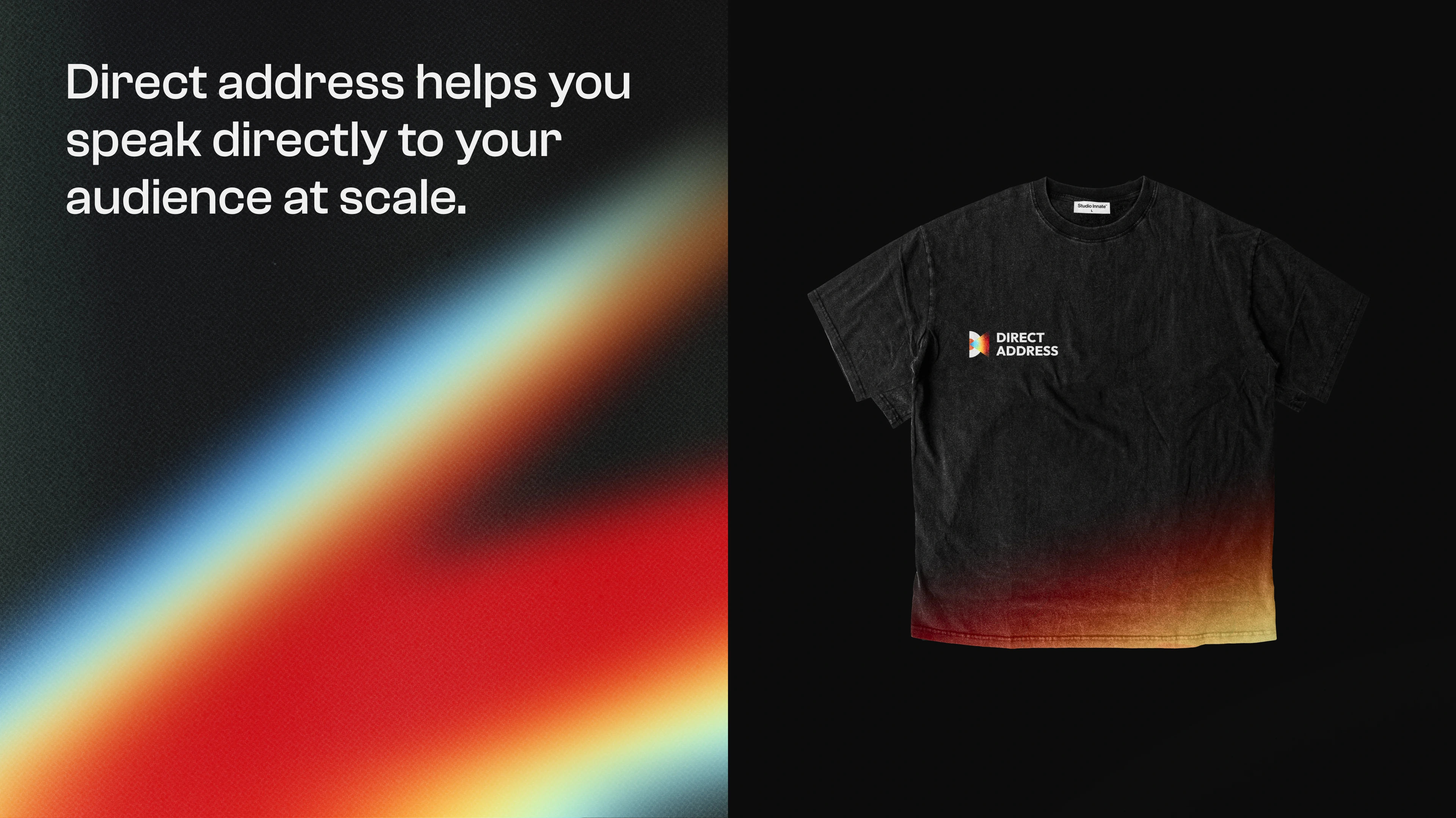
Direct Address - Merch T-Shirt
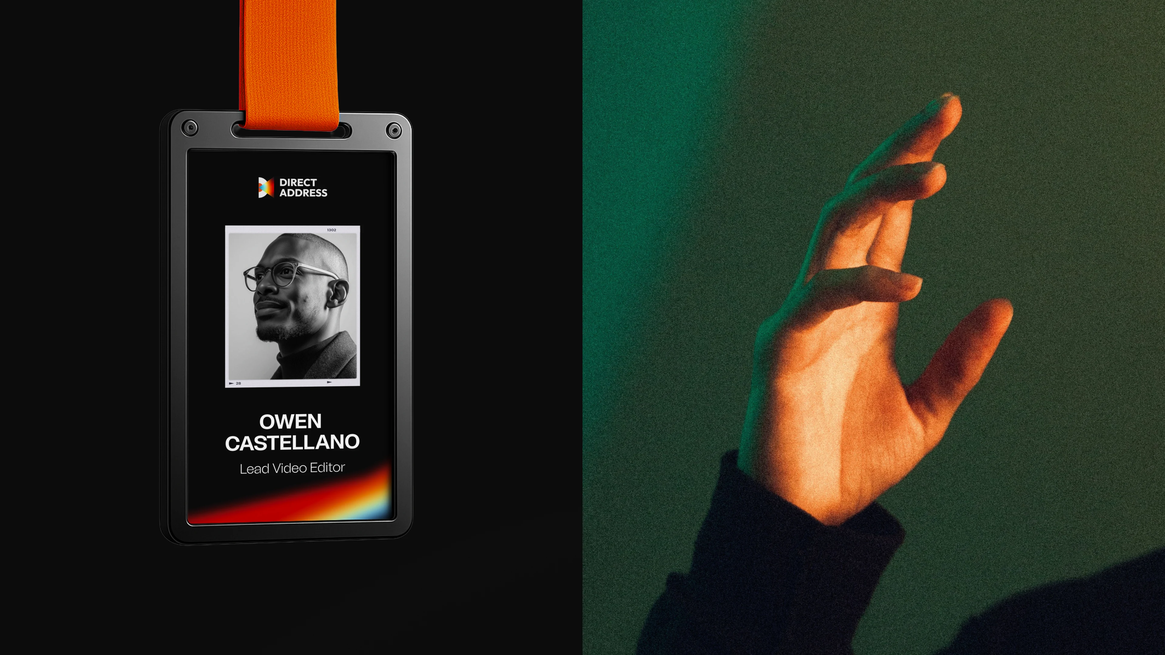
Direct Address - ID
Like this project
Posted Sep 14, 2026
Brand identity and landing page design for Direct Address, a B2B video studio that turns founders into their own marketing channel.