The network for creativity
Join 1.25M professional creatives like you
Connect with clients, get discovered, and run your business 100% commission-free
Creatives on Contra have earned over $150M and we are just getting started
Back to feedPost

New website for Beer Zombies Brewing Co. 🍺🧟♂️
Designed to be bold, vibrant, and disruptive. This was a fun build because the BZ brand already has such a strong visual identity and personality. Oversized typography, aggressive motion, interactive effects, and a healthy dose of zombie aesthetics. 🤘
www.beerzombies.com


The oversized type and aggressive motion fit the beer-brand attitude perfectly, especially how the green palette carries from the hero into the product details.


the green beer page looks so good

Creative Design :)

This is a great example of a website actually matching the personality of the brand. The oversized typography, motion, and interactive effects make it feel bold and memorable rather than just looking like another brewery website. Really fun execution!

love it Zack, so much personality and vibe in this one! 🙌


Yoo Zack this is fiiire!! 🔥

Great Job, Zack!

"Craft till death" as the hero line is such a good match for the brand's energy. When a client already has personality this strong going in, does that make the build easier or does it actually add pressure to not water it down?

This looks awesome! 🥰

clean and bold design... great job!

The "Craft Till Death" energy comes through in every detail. Oversized type + zombie brand identity is such a natural fit, and the motion makes the whole thing feel alive. Great work on this one.

Love the vibe! So creative🔥

Amazing!

thats a goated job there man
well done


Everything about the website is top-notch 👏👏👏👏

Zombie branding could've gone campy so easily, but the green and grunge type here actually reads premium craft beer first and gimmick second. Curious how the taproom crowd has been reacting to the site, is it pulling in the type of customer BZ was hoping for?

Super clean work!

Locations and Our Story sit right next to Our Beers in the nav, so a site this loud still answers the two boring questions a taproom actually gets asked.


The personality of the brand comes through really well. The bold typography and motion choices fit the rebellious vibe perfectly.

Cooked! Love the art direction

it's good

Amazing work!


the tattoo on the arm pulling the tap says zombie too. great detail

The typography fits the brand ridiculously well. Going this aggressive could easily hurt usability, but here it actually makes the whole experience feel more intentional. Great example of designing around the brand instead of forcing it into a safe web layout.

This deserves more than just liking, this deserves to be featured! 🏆 Aggressive motion, bold type hierarchy, and zombie aesthetics make for a ridiculously fun build.
The network for creativity
Join 1.25M professional creatives like you
Connect with clients, get discovered, and run your business 100% commission-free
Creatives on Contra have earned over $150M and we are just getting started

Challenges
View all


Related posts


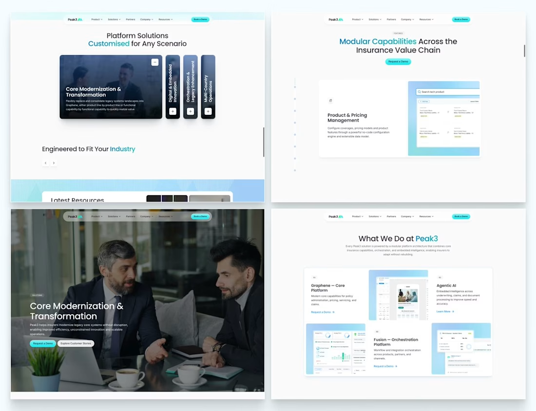
Our Peak3 website build covered 17 page templates and six CMS collections. At that scale, the questions about publishing deserve as much attention as the finished pages.
A blog post, a whitepaper and a careers entry need different information. Making them editable is only part of the design problem. The person adding the next entry also needs to understand what is missing and what happens when they publish it.
Here’s a hypothetical review I’d run before a CMS handoff: create a whitepaper entry, add the title and cover, then leave out the download file.
Does the editor flag the missing file? Can someone preview what the visitor will see? If the entry can still be published, does it create a download button that leads nowhere?
I’d use that test to decide which fields must be required and which incomplete states need an explanation.

Beautifully executed work


Another exciting project wrapped up! ✨
This time, we worked on Olympian by Design – a premium one-on-one coaching brand focused on personal transformation and high performance.
Our goal was to create more than just a beautiful website. We wanted the entire client journey to feel connected – from the first landing page visit to purchasing the program and going through the coaching experience.
We designed three custom pages from scratch, built them in Kajabi, created a branded member area, set up the coaching program, and refreshed the app with new onboarding screens.
All wrapped in a bold, dark, luxury-inspired design.
Because great design shouldn't stop at checkout. It should follow the client through the entire experience.

Great project

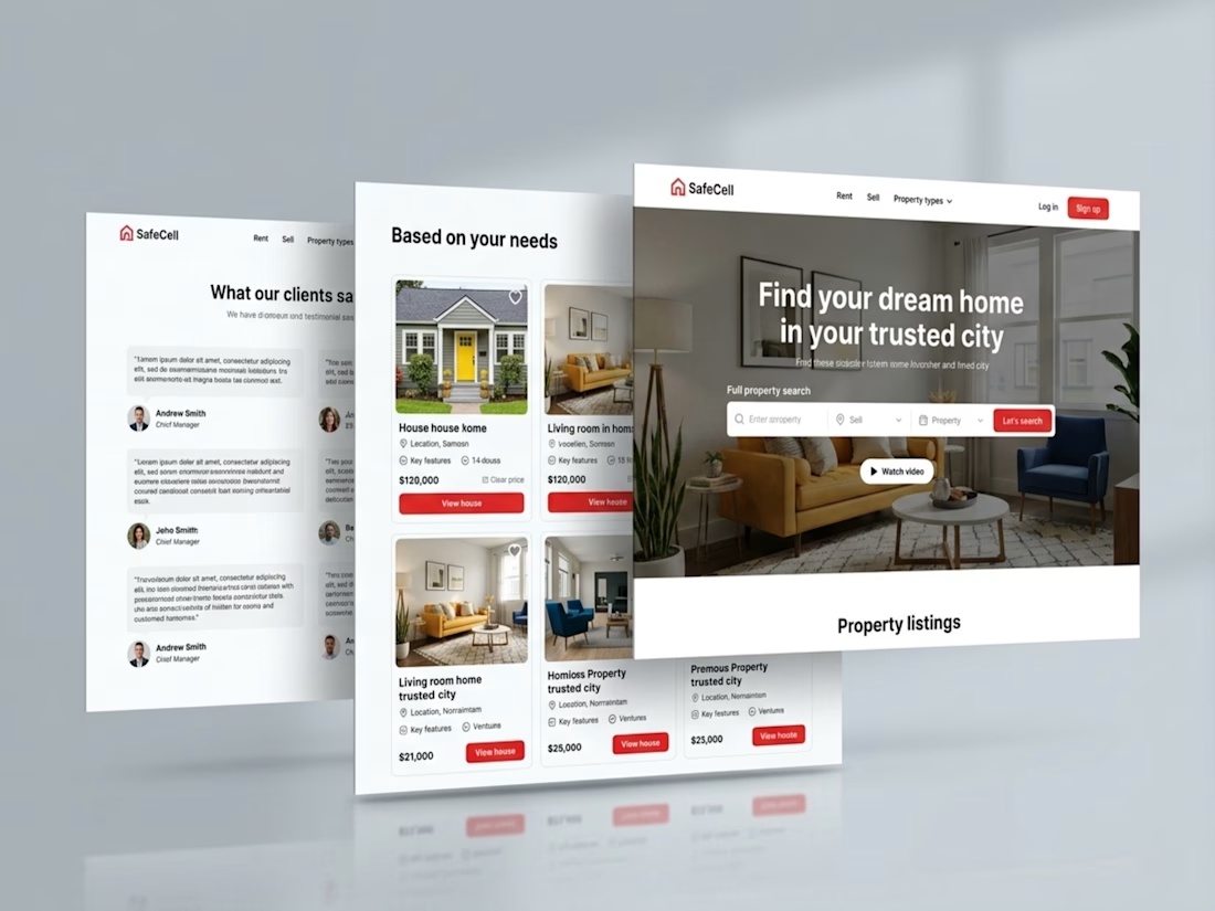
Kajabi Real Estate Website Design & Development
Designed and developed a professional real estate website using Kajabi to help the client present their brand, showcase their services, and create a better experience for potential clients.
The focus was on creating a clean, modern design with clear page layouts, intuitive navigation, and responsive sections that work across devices. I organized the website content to make information easier to explore and incorporated clear calls to action to guide visitors toward the next step.
The finished website gives the client a more polished online presence, communicates their services more clearly, and provides visitors with a smoother browsing experience.
#Kajabi #KajabiWebsite #KajabiDesign #KajabiDevelopment #KajabiRealEstate #RealEstateWebsite #RealEstateWebsiteDesign #RealEstateWebDesign #PropertyWebsite #RealEstateBusiness #RealEstateBranding #PropertyInvestment #RealEstateCoaching #RealEstateMarketing #ResponsiveWebDesign #WebsiteDevelopment #RealEstateLandingPage #RealEstateLeadGeneration #PropertyWebsiteDesign #BusinessWebsite


Impressive Work

