
Shazzad ideapeel
I build Webflow and Framer sites that convert, for B2B SaaS
- $5k+
- Earned
- 4x
- Hired
- 24
- Followers

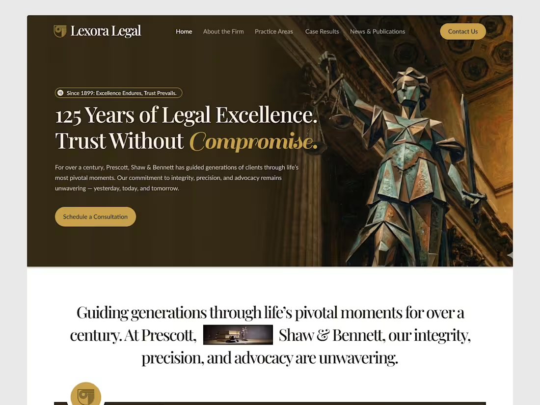
Designed this law firm website concept focused on one thing: trust at first glance.
When someone lands on a legal site, they’re not browsing — they’re evaluating risk.
So the design prioritizes:
• strong authority visuals
• calm, confident typography
• clear service hierarchy
• immediate consultation path
No flashy trends.
Just credibility and clarity.
Built in Figma → ready for Webflow.
1
106

A quick look at this visual identity project.
1
94
Hey everyone,
Just launched a new Webflow template called Hirepilot, built for HR teams and recruiting platforms.
The goal was to keep it clean and product-focused with sections for candidate pipelines, AI-driven hiring workflows, and demo conversions.
Would love to hear your thoughts or feedback from the community.
Appreciate the support here.
Check the comment for the link to check it out.
8
3
304
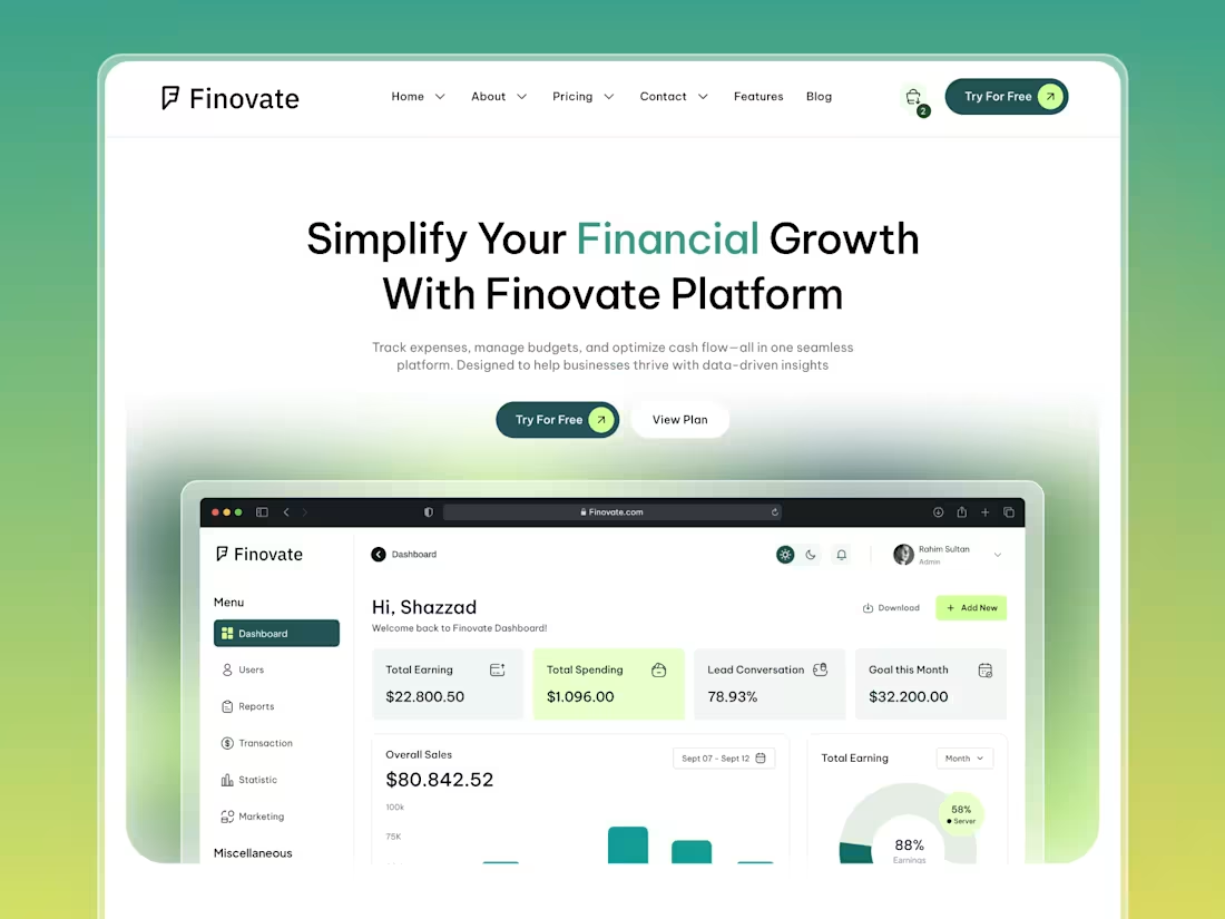
High converting landing page for SAAS AI & tech company.
Design + Motion + Development = $3300 flat. 10 working days.
1
4
111
Saas Header Design | ideapeel
1
55
High converting landing page for SAAS AI & tech company.
Design + Motion + Development = $2300 flat. 7 working days.
1
78
Saas Header Design ✨
4
2
77
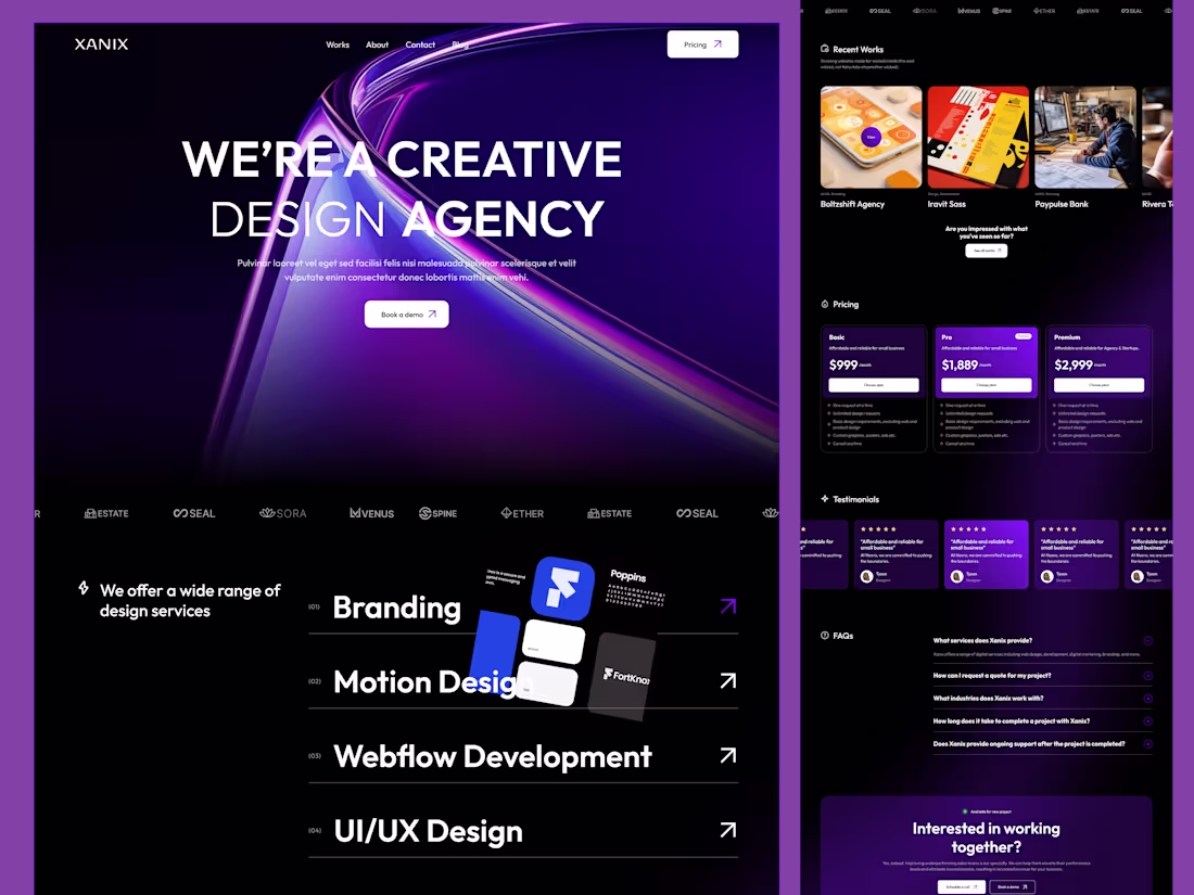
Webflow Agency Template Homepage | Xanix
2
3
94
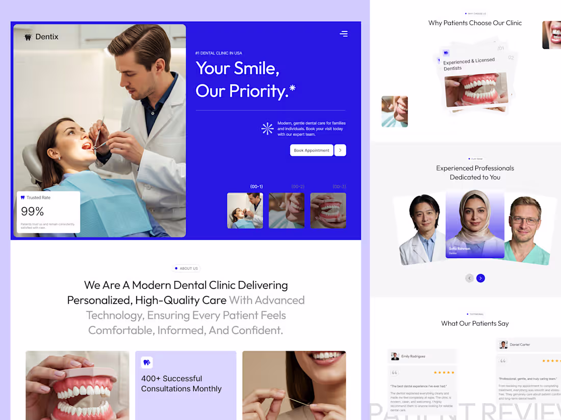
Working on a New @Webflow Dental Template
Homepage Preview:
5
2
95
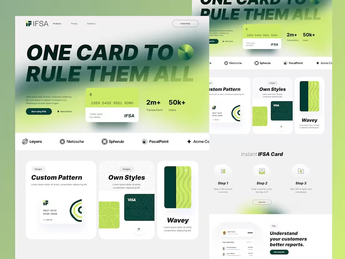
Just shared IFSA a free fintech landing page UI kit in Figma.
Built this for founders and product teams who want to move fast without starting from scratch.
In 2026, more startups will launch with lean teams and tight timelines. Having solid, ready-to-use design systems will matter more than ever.
IFSA is part of my growing library of templates focused on helping builders ship faster.
Hope it helps someone here. 🚀
https://contra.com/products/1QURCZ53-ifsa-modern-fintech-landing-page-free-figma-template
5
302
Let me walk you through one UX decision we made on this crypto SaaS dashboard.
When someone opens a finance product like this, they are not exploring.
They are checking.
Am I up or down.
How much do I have.
Do I need to act right now.
That is why the first thing you see is not charts or transactions.
It is the current balance and portfolio overview.
Once users understand their position, everything else becomes supportive.
The chart shows movement, not pressure.
Transactions feel reassuring, not overwhelming.
This is a small UX choice, but it changes behavior.
People feel in control faster.
And when people feel in control, they trust the product.
That is how I think about UX.
Not how it looks, but how quickly it helps someone feel oriented.
15
249
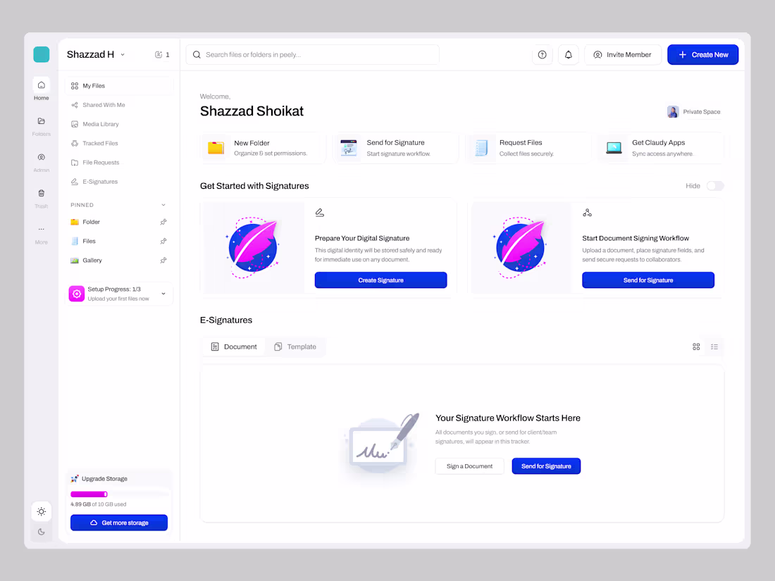
Digital Signature Features for Your SaaS Platform
0
160
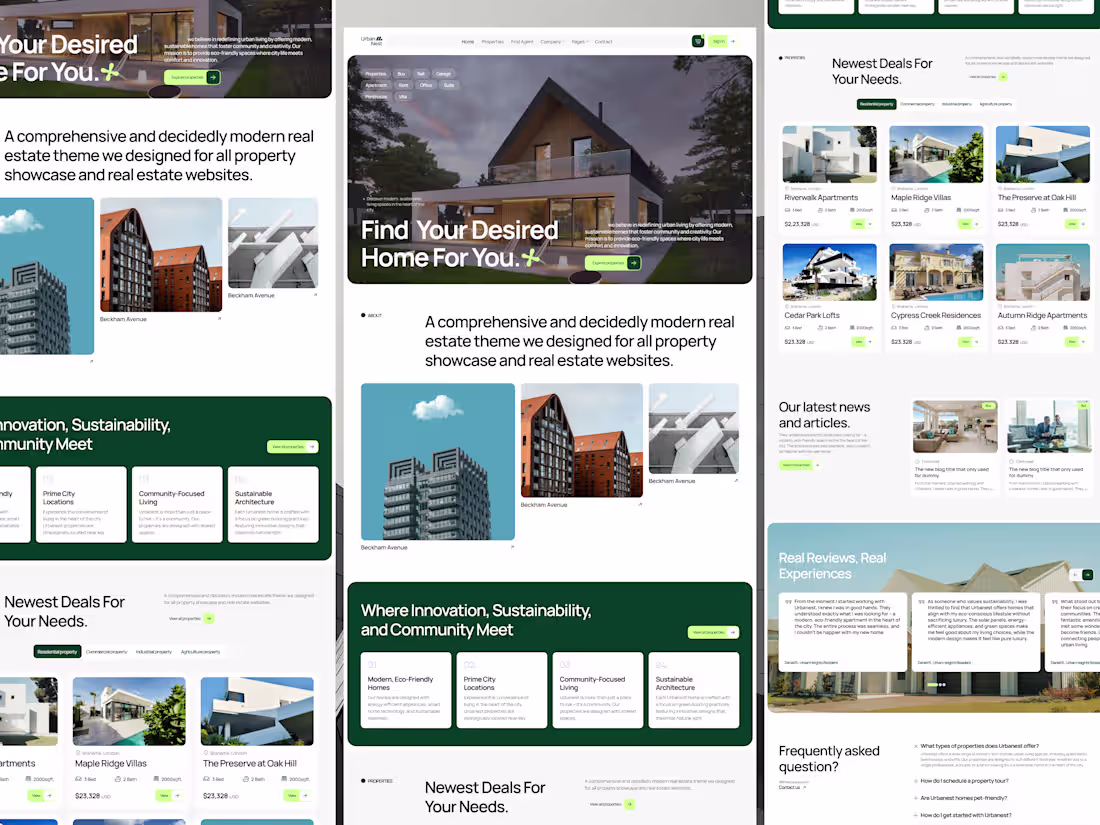
Webflow Real Estate Template Design, how is it?
2
2
218
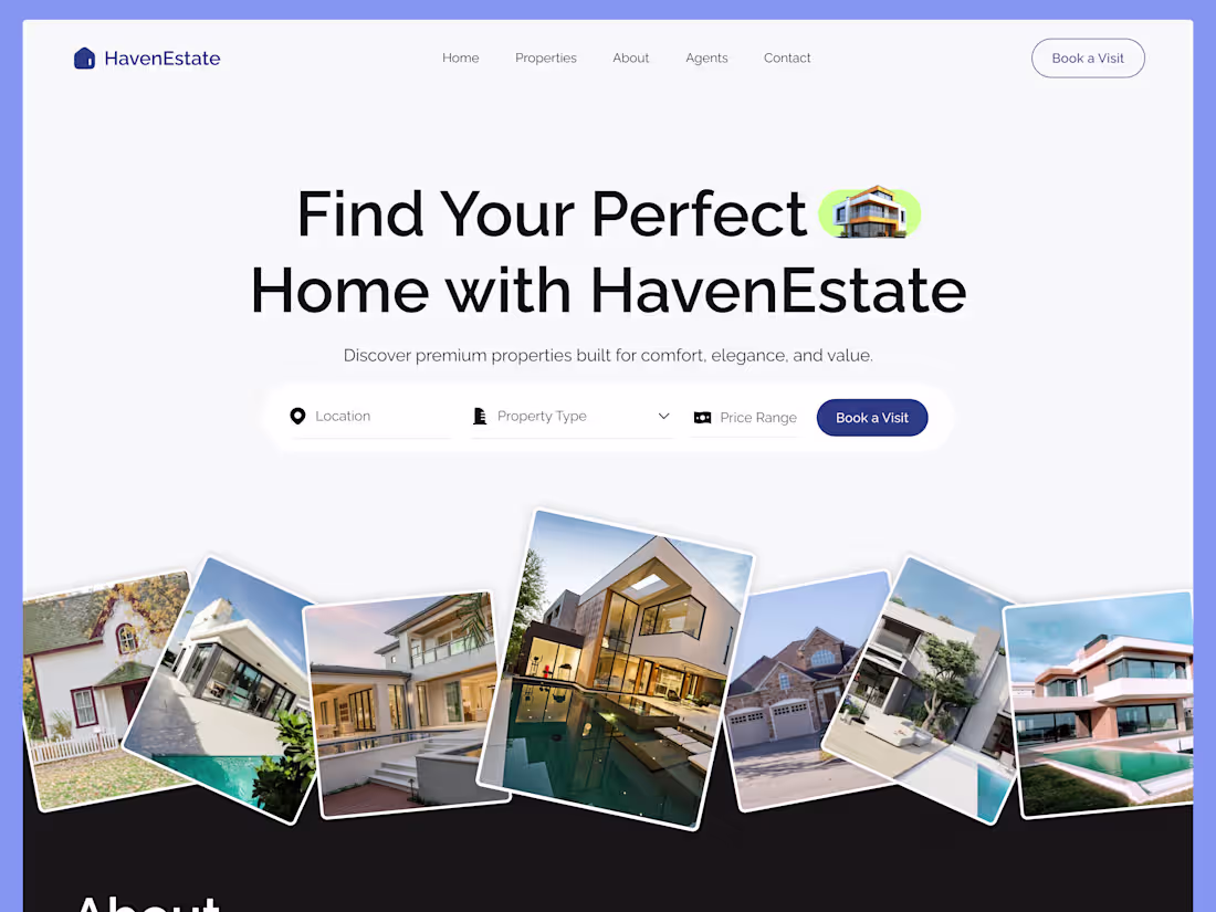
Design that feels like home — even before you move in.
1
193
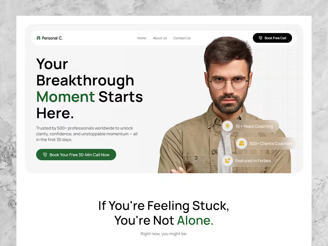
Because sometimes, the first breakthrough is clicking 'Book Call'
0
156
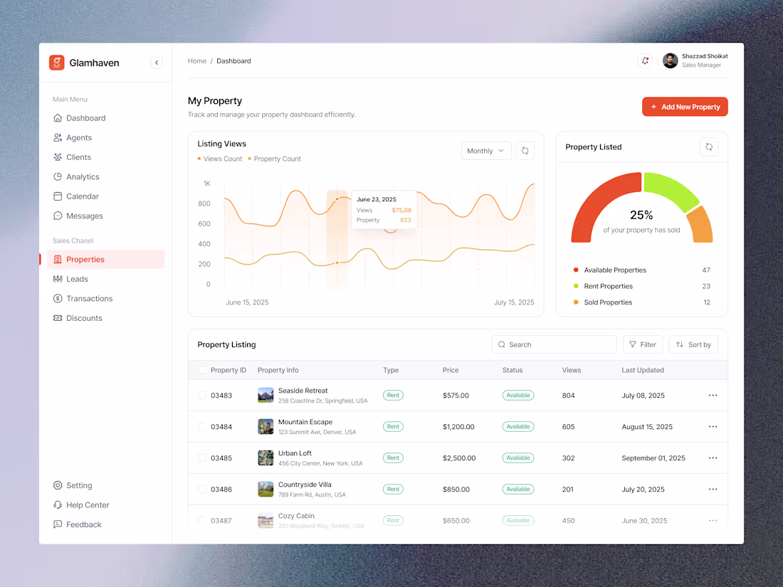
Just launched a new dashboard screen for Glamhaven — a clean, focused property management tool 🏡
Built to help real estate professionals track listings, performance, and growth without the clutter.
Design goal → make complex data feel calm and actionable. Love creating dashboards that balance analytics with emotion 💡
#UIDesign #DashboardDesign #DesignCommunity #MadeInContra
10
181
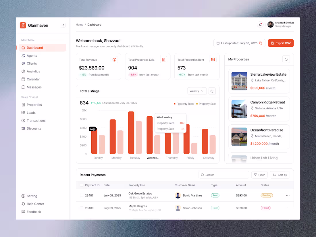
Built for clarity, not clutter.
The Glamhaven Dashboard helps real estate pros see what matters — revenue, listings, and transactions — all in one clean view.
Great design doesn’t just look good; it feels like progress.
#UIDesign #DashboardDesign #ProductDesign #ContraCommunity
0
128