The network for creativity
Join 1.25M professional creatives like you
Connect with clients, get discovered, and run your business 100% commission-free
Creatives on Contra have earned over $150M and we are just getting started
Back to feedPost

A closer look at the identity we designed for the Rylo rebrand.
I teamed up with @hunterthompson to shape the logo, typography, icon system, colour palette, and full visual identity.
Rylo came to us with a strong foundation, but the existing identity felt a little to clinical and lacked the personality to match the product.
So we rebuilt the logo and icon system around Rylo's core purpose: a letterform, an audio waveform, and two opposing shapes representing communication, all in one simple, distinctive mark.
That mark became the engine of the system, driving the wave patterns, graphic language, motion, and supporting assets into one cohesive identity.
One of those projects where a single idea grows into an entire visual language. Loved every minute.
Huge congrats to Rylo on raising $100M and making communication more accessible for those who need it most


Very cool and playful brand design, I love it!
thank you


Awesome

Nice work!


this feels so warm, not corporate at all


Love the choice of colors here, and how you implemented them. Nice work!
thank you

I have always been a fan of your work Alex. Whereever i see your work, stoping and observing it is a must!
Thanks. dude. Always appreciate the support.

That logo mark is just perfection. Those curves are a chefs kiss.
🙌 Thanks Reda

The presentation is excellent.

Awesome 🔥


World class
Cheers dude!

So clean! Loved the orange on it.

I love the colors.

The smartest move here is making the mark generative, so the waveform logic drives the patterns and motion instead of sitting as a static logo on an unrelated system. That is the line between a logo and an identity that keeps producing new assets on its own.

Looks amazing! 💯

Really impressive how you turned one core idea into an entire visual language. The way the logo, waveform, typography, and motion all connect feels incredibly cohesive. 🔥 Great work!
The network for creativity
Join 1.25M professional creatives like you
Connect with clients, get discovered, and run your business 100% commission-free
Creatives on Contra have earned over $150M and we are just getting started
Trending
retrofuturism
Share your favorite designs from the past exploring the distant future. Or your own take on the aesthetic 🚀
halftone
Dots. Texture. Grain. Let's see your designs using the halftone technique.

Midjourney
Creatives are showing off what they're making with Midjourney.
colorgrade
Video editors sound off: How do you enhance the mood of your video in color grading?
Related posts

A quick look at the Bright Logistics identity in motion.
The goal was to build more than a logo. We created a visual system that could move comfortably across social, apparel, digital touchpoints, photography, and everything the brand might need as it grows.
Simple enough to stay recognizable. Flexible enough to keep things interesting.
One of my favorite parts of branding is seeing all the individual pieces start to feel like one world.


Just smooth Animation..🔥

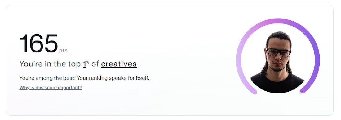
Contra just told me I'm in the top 1% of creatives on the platform.
Cool badge. Doesn't build anything on its own.
What actually moved the needle wasn't chasing the score — it was going back through old proposals and noticing I was writing to sound impressive instead of answering the actual technical problem in the brief. Once I started solving the thing nobody explicitly asked but clearly needed, everything got sharper. The ranking followed, not the other way around.
Currently building in Framer — SaaS, real estate, and brand sites with real interaction design. If your brief has a hard technical problem buried in it, that's usually where I do my best work.



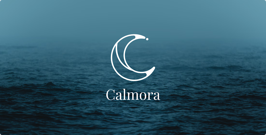
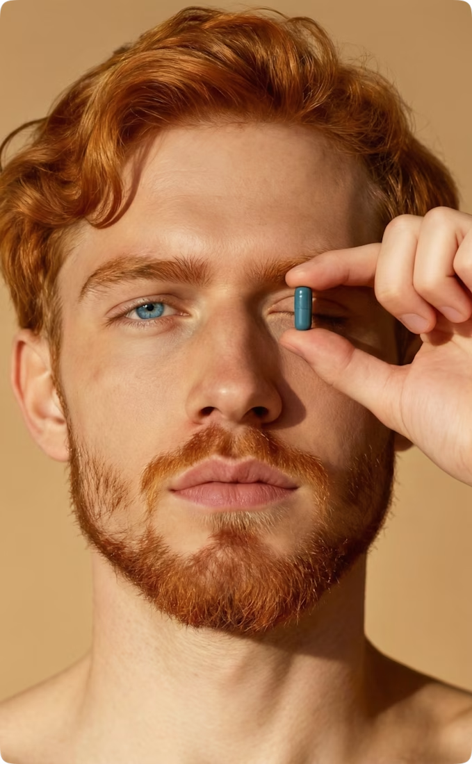
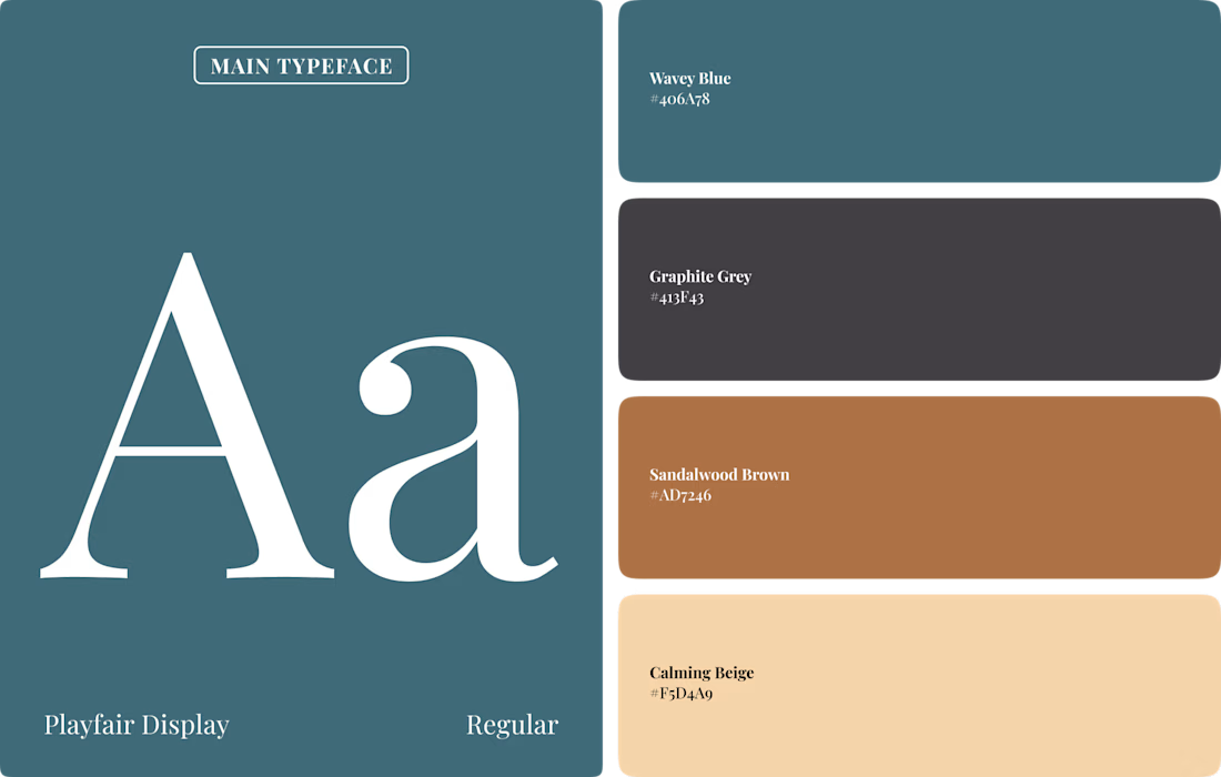
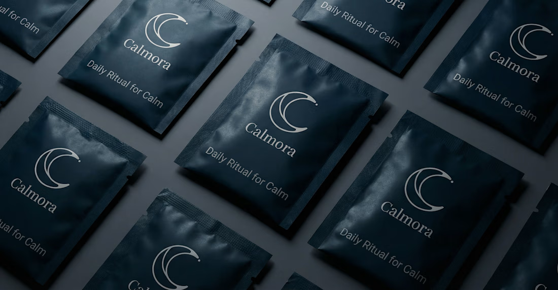
Calmora: A men's supplement brand inspired by calming water & moonlight, complemented by natural, woody tones for a grounded look and feel.
I really enjoyed working on this branding project! 🙌