The network for creativity
Join 1.25M professional creatives like you
Connect with clients, get discovered, and run your business 100% commission-free
Creatives on Contra have earned over $150M and we are just getting started
Back to feedPost
Just wrapped a brand identity project for a luxury residential development in Buckhead, Atlanta.
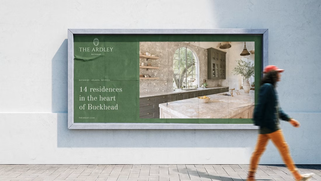
The Ardley is a 14-unit boutique condo in Chastain Park, one of Atlanta's most established neighborhoods. The brief: bring the brand to life for an investor presentation, with no existing identity and a pre-construction property.
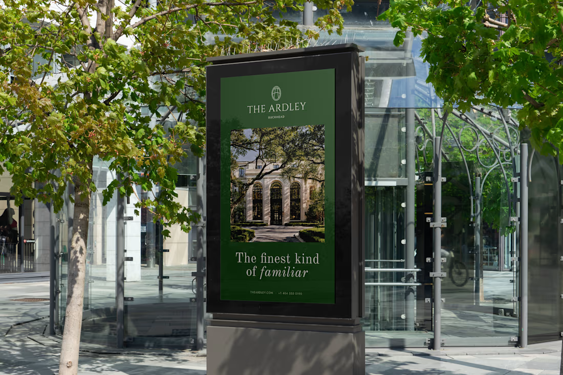
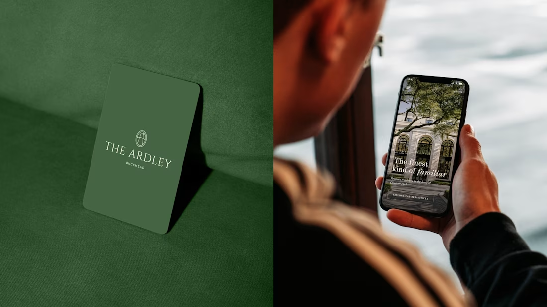
I built everything from scratch: wordmark, monogram, color palette inspired by the mature trees and understated prestige of the neighborhood, typography system, OOH mockups, and interior touchpoints.
Project done through Gerbz Agency.
Check it out

You made the brand 'The Ardley' feel premium!

Thank you :)
You're welcome!

Awesome work. Turning a pre-construction concept into a cohesive brand is no easy task, and this came together beautifully.
Thank you!

This is sweet design
Thanks!

The restraint fits a 14-unit luxury property well, especially for an investor-facing presentation where the brand still has to feel credible. How did you balance Buckhead character with a more timeless premium look?

Spot on with the font and the color pairing to bring that premium feel.
Thanks!

Elodie amazing work 🫠
Thank you!

i love how clean you've made the ardley's visual identity while keeping a sense of personality embedded in it! refined, polished, but still friendly. awesome work!
Thank you!

Pulling the palette from the mature trees in Chastain Park instead of defaulting to gold and marble for luxury real estate is a smart call, that green feels specific to the neighborhood rather than generic prestige. The OOH bus shelter ad translates it well too.

Such a beautiful, rich color. It fits the city's vibe perfectly. ✨

Love it! Great work


This is beautiful
Thank you 😊

Excellent work!
Thank you!


Absolutely beautiful.
Thanks!

It really is giving luxury and i absolutely love when luxury is communicated through some colours rather then black and white
Thank you! 😊

Looks perfect!
Thanks!

Amazing
Thanks!

Thank you!

Amazing work
Thanks!

The color palette instantly communicates "established" rather than "flashy." Feels like the kind of branding that ages well.
Thank you 😊

oh, how cool! are you based in the Atlanta area? i'm based here!
No, but Amber from Gerbz Agency is!

That looks so premium
Thanks 😊

amazing!!
Thank you!

love the brading preview looks nice
thank you 😊

One of the best designs I’ve seen today. Really solid work 👏 This editorial layout sets an ultra-premium tone that would translate perfectly to a live site hero section.
Wow! Thank you so much 😊

Cool!


Love the final result! Was there a specific goal you had in mind?

Really captures that luxury feel!

Congratulations


Nice design

The network for creativity
Join 1.25M professional creatives like you
Connect with clients, get discovered, and run your business 100% commission-free
Creatives on Contra have earned over $150M and we are just getting started





Related posts


My first biggest project was developing a Framer website for https://libertinelondon.com
Charged $2.5k for development
they provided the design


congrats

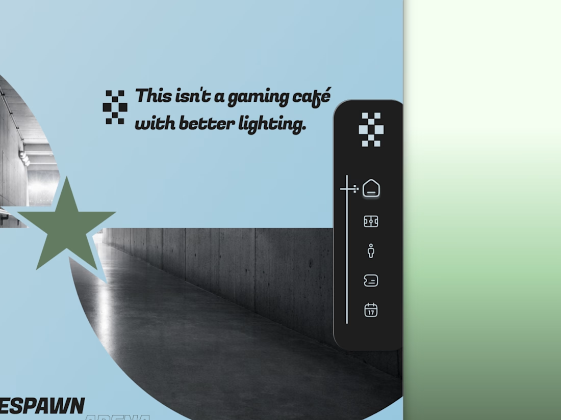
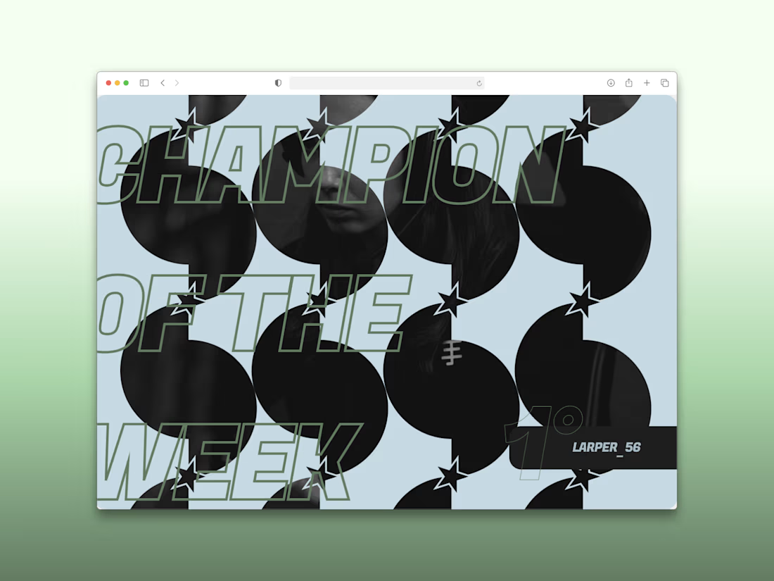
Every esports brand reaches for neon and a mascot.
RESPAWN ARENA reaches for a scoreboard.
Case study on the stadium-grade identity — typography, system, the whole build — dropping soon.


New case study: motion product film for a mobile streaming app. Some shots filmed on camera, some AI generated, the rest built in After Effects
Check it out


This is only high end

