The network for creativity
Join 1.25M professional creatives like you
Connect with clients, get discovered, and run your business 100% commission-free
Creatives on Contra have earned over $150M and we are just getting started
Back to feedPost

Good branding isn’t just about how a logo looks. It’s about what it represents.
Sharing one of our recent projects: NEXU, a fintech brand identity built around connection, trust, and opportunity.
The idea was to create a visual identity that makes finance feel more human and approachable. The symbol brings together the gesture of reaching out and the strength of a bridge, representing the connection between people, capital, and opportunity.
From the logo concept to the broader visual identity, every detail was designed to communicate confidence, clarity, and progress.
It’s always rewarding to see how a simple visual idea can tell a much bigger story.
Would love to hear what you think!
Check it out
#BrandIdentity #LogoDesign #Fintech #BrandDesign #ContraCommunity


finance feeling human is the hard part, glad someone is trying it
Absolutely! Finance doesn’t have to feel cold or complicated. The goal is to make it feel relatable while building trust. Glad that came through in the concept!
The network for creativity
Join 1.25M professional creatives like you
Connect with clients, get discovered, and run your business 100% commission-free
Creatives on Contra have earned over $150M and we are just getting started











Related posts

Pulse Athletics... Branding & App design✨
Check it out
#app #sport #productdesign #uiuxdesign #uidesigner #uxdesigner #pulse #branding #brandidentity #brandstrategy #brandguidelines #logo #homepage

That's really stunning app design🔥🔥🔥
Great job Ziva🎉🎉🎉

Today I’m sharing something a bit different from packaging. This is the brand identity I designed for ALVA Industries, a Norwegian company developing electric motor technology.
I wanted it to feel modern and clear, but not too cold or impersonal. It’s a technical field, of course, but I think there’s still room for some character.
What do you think?
Incredible branding kit 🔥🔥🔥🔥
Great job Roberto❤️❤️

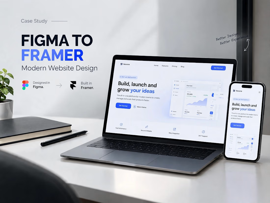
A modern SaaS website concept designed in Figma, featuring clean layouts, intuitive navigation, consistent visuals, and a user-friendly experience across different screen sizes.