The network for creativity
Join 1.25M professional creatives like you
Connect with clients, get discovered, and run your business 100% commission-free
Creatives on Contra have earned over $150M and we are just getting started
Back to feedPost
Toadrinks - Brand Identity
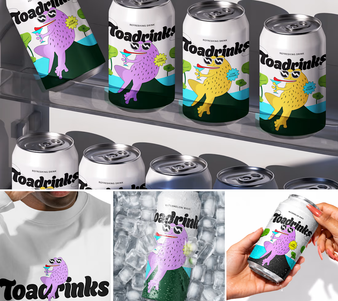
Excited to share TOADRINKS, a conceptual gut-friendly soda brand made for a lighter, more enjoyable way to sip. Built around playful personality, bold flavours, and a character-led visual world, the brand aims to make better-for-you choices feel fun rather than functional.
I'd love to hear your thoughts in comments!



Love the toad!

Thank you! 🐸 So glad you liked the little toad!

The branding is on point and giving the drink a character is a right way of placing the product in the market.
Thank you! 😊 I wanted the character to become a recognizable part of the brand rather than just an element on the packaging. Really glad that came through!

I think the illustration here has mainly enhanced this branding. What do you think?
Thank you! 🙌 Absolutely the illustrations were a big part of giving the brand its personality and making the visual system feel more distinctive.
Where did you get the idea or inspiration for this illustration? Or is it AI-generated?
Haha, definitely not AI-generated! 😄 The illustration was created from scratch. The idea was to build a character with enough personality to become an ownable part of the brand, rather than just using a generic mascot.

Nice work
Thank you so much! 🙌

Thank you so much! 🙌

Nice Illustration
Thank you so much! ✨

Thank you! 🙌 That was exactly the intention making the gut-friendly positioning feel playful and approachable rather than overly health-focused. Really glad that came through!

The usual failure mode for character-led functional drinks is reading as a kids' beverage on shelf, and the deep green base is what keeps this on the adult side of that line for me. Did the flavour colour system come before or after the toad?
Thank you! 🙌 The toad came first! I wanted to establish the character and personality first, then build the flavour colours around it so the system could stay playful without losing the more grown-up feel.

too good..💯
Thank you so much! 🙌

so cool really
Thank you so much! 😊

Really like the mascot-led packaging!
Thank you so much! 🙌 The mascot was definitely one of my favorite parts to build out! 🐸

I am really liking the funny direction here. The toad Mascot led approach makes the brand feel playful yet approachable
Thank you so much ☺️ exactly that is the primary goal to keep it quirky yet approachable!

Love this branding!
Thank you so much ✨

Absolutely amazing work, well done!
Thank you so much! 🙌

Great concept
Thank youuu✨

Thank youuu✨

Soo good 😍
Thank you so much 🙌

Beauty


it so visually apealing
Thank you✨


Love the playful direction. The character-led branding makes the concept feel really fun and memorable.
Thank you so much!😊

superb
Thank you!😊

Character-led packaging is the right call for a gut-friendly soda, it turns "good for you" into something people want on the counter instead of hiding in the fridge.
Exactly! 🙌 The idea was to make the “good for you” part feel fun and desirable rather than overly clinical. Glad that came through!

Great attention to detail! 😊
Thank you so much✨

Such a fun and memorable character-led identity, Snekha! The multi-SKU color shifts for each flavor are incredibly crisp and shelf-ready. Love this joyful branding!
Thank you so much, Lara! So glad you liked the character-led approach and the multi-SKU color variations 🙌
The network for creativity
Join 1.25M professional creatives like you
Connect with clients, get discovered, and run your business 100% commission-free
Creatives on Contra have earned over $150M and we are just getting started











Related posts


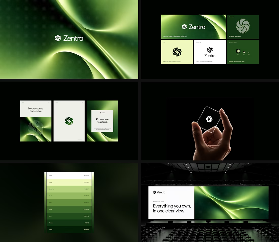

Clean and confident work! The green gradient with the mark feels very modern for fintech - trustworthy but not boring. The app screens look really polished. Curious how you landed on this mark, does it represent growth / movement?

A natural and premium packaging concept inspired by the purity of wildflower honey and the beauty of nature. The design combines warm honey tones, textured paper, bold typography, and a clean label layout to create an authentic, handcrafted feel.

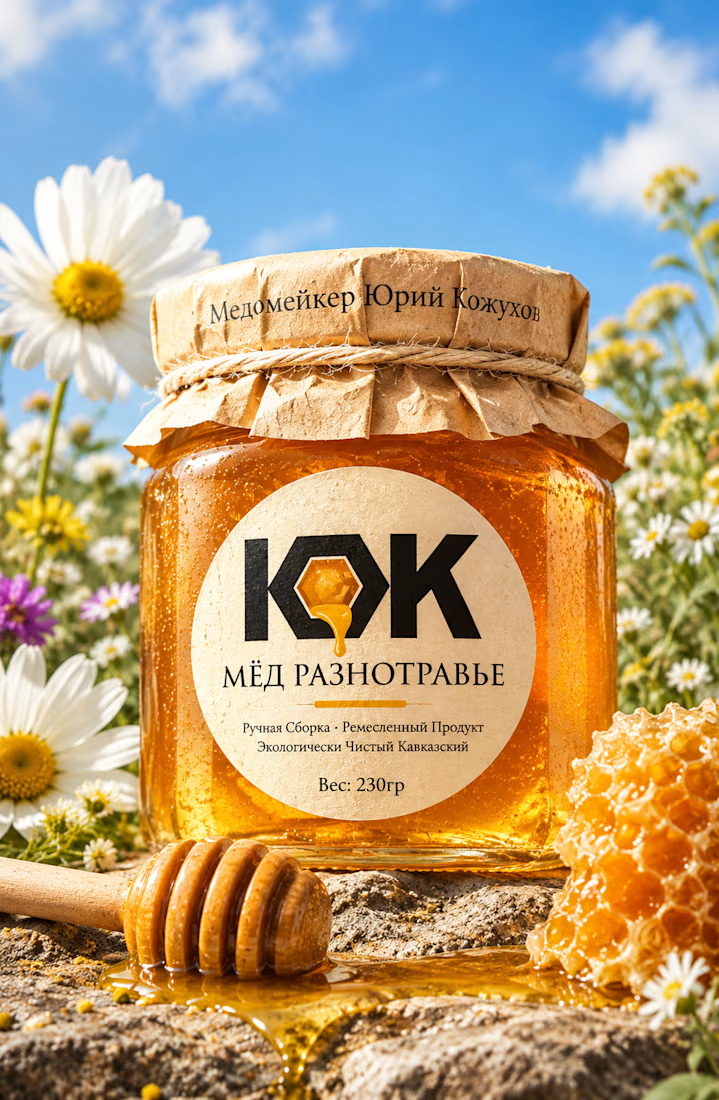

The honey drop sitting inside the O of the wordmark is a delightful detail, Umar. Textured paper plus that bold type really sells the handcrafted feel. This would stand out beautifully on a shelf.

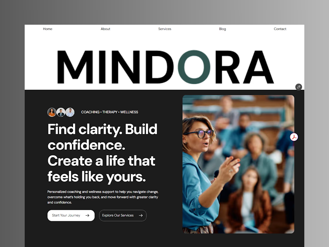
Introducing Mindora — a Life Coaching & Wellness Framer Template.
I designed Mindora for life coaches, wellness professionals, and personal growth brands looking for a calm, modern, and welcoming online presence.
Inspired by clarity, confidence, and meaningful growth, Mindora features a thoughtful layout, dedicated service sections, a blog for sharing valuable insights, and a clean visual style designed to help brands connect with their audience.
Built with Framer, it's a customizable starting point for creating a professional coaching or wellness website.
Explore Mindora and bring your next website idea to life.
Kindly check it out the template: https://www.framer.com/marketplace/templates/mindora-life-coach/

Great work