The network for creativity
Join 1.25M professional creatives like you
Connect with clients, get discovered, and run your business 100% commission-free
Creatives on Contra have earned over $150M and we are just getting started
Back to feedPost

Amazing 🔥🔥🔥

When does a hand-drawn logo make sense for a brand?
In this case, a Barcelona-based creative studio founded by a team with decades of combined experience approached me wanting a hand-drawn identity that would feel unexpected for a team like them, a way to signal creativity and...


nice job!

Hand-drawn marks work when the brand sells a human touch. For a creative studio the wobble is the message. I would keep it hand-drawn if the studio is small and personal. Clean geometry wins only when they want to look bigger than they are.


The unexpected look is exactly why this works so well. A lot of creative studios try to look super polished, but this hand-drawn style makes them stand out and feels way more authentic.

Chantal's POSO case is such a great example of when hand-drawn wins, Israel. Three illustration variants sharing one wordmark keeps the human touch while staying a system. The Barcelona studio story proves craft can outdo polish.

Amazing!

great work
The network for creativity
Join 1.25M professional creatives like you
Connect with clients, get discovered, and run your business 100% commission-free
Creatives on Contra have earned over $150M and we are just getting started



Related posts


Amazing design!

Ovéa — care with character.
One skincare identity across bottles, jars and tubes. I designed the wordmark, pink-and-cobalt packaging system, campaign applications and digital mockups, then brought the collection into motion.
A consistent visual language, with room for each product to feel individual.
View the full case study. Building a skincare brand? Let’s talk about your identity and packaging.

Love the colour direction and the visual language. Everything feels so well thought out. The overall look is beautiful.

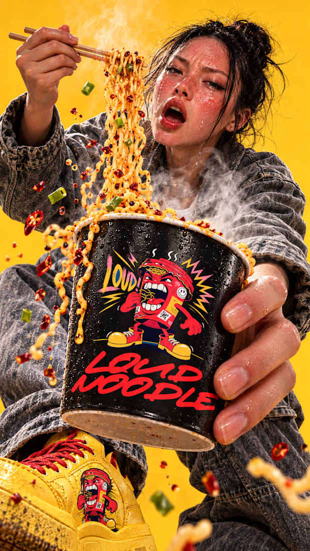
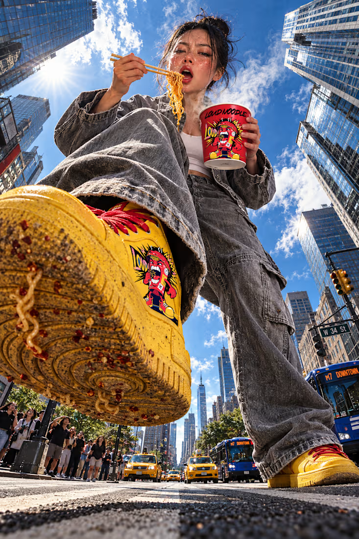
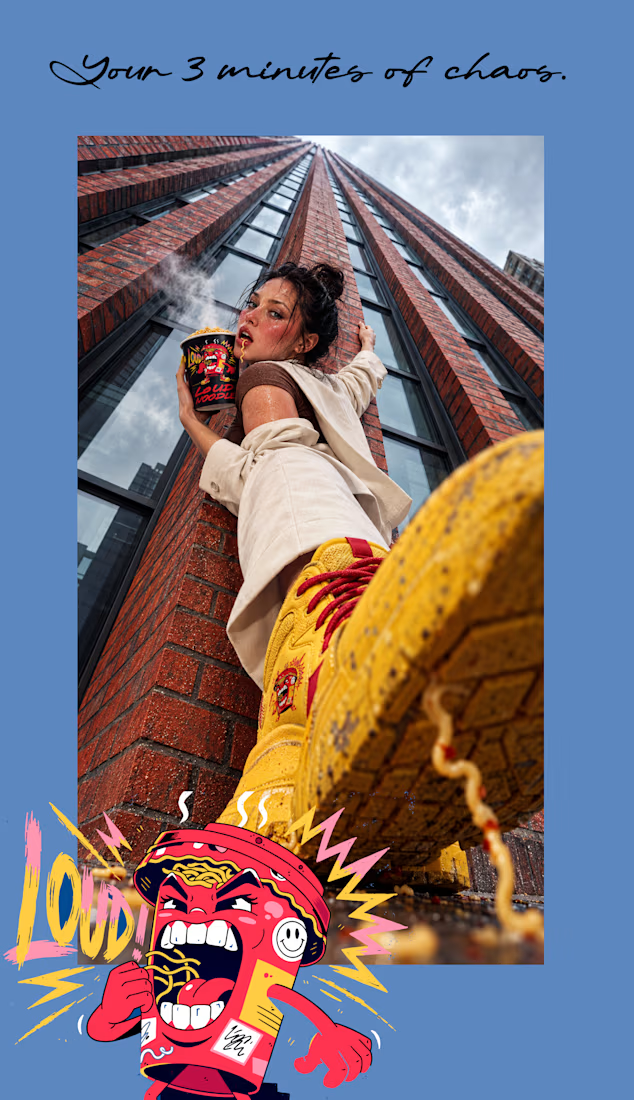
Ever cried at your own dinner and still gone back for another bite?
That’s the whole idea behind LOUD NOODLE.
Case study dropping soon. 🔥