
Visumind Creative
Branding · Design · UI/UX & Development · Video Content · AI
- 5
- Followers


Optigrow — SaaS Brand Identity
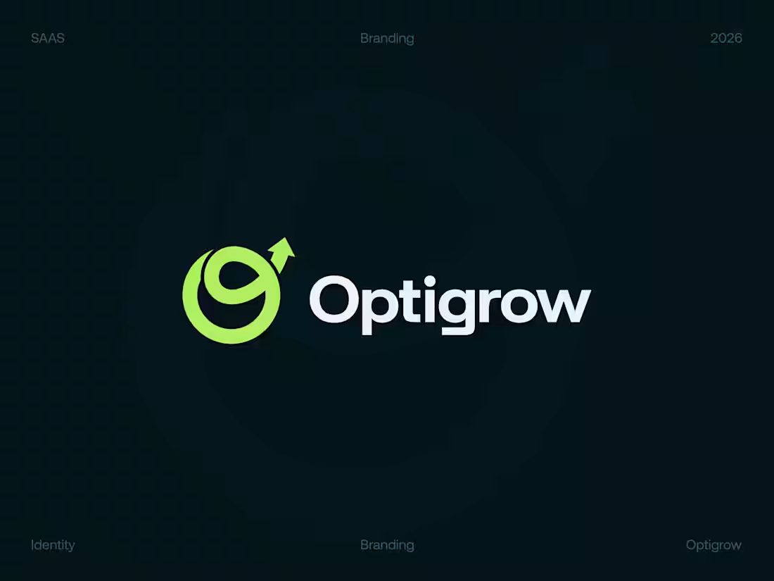
Less Complexity. More Momentum. Meet Optigrow.
What should a brand built for growth look like?
- Not complicated.
- Not predictable.
- And definitely not forgettable.
That was the direction behind Optigrow.
We explored a visual identity around a simple idea: moving businesses forward through smarter systems and automation.
The G-inspired symbol creates a sense of movement and continuous progress, while the vibrant color system gives the brand a recognizable presence in the digital space. It needs an identity that can grow with it.
Optigrow — Built for Growth. Designed for Clarity.
🏀 Full Design Showcase – Better View on Dribbble.
✅ https://dribbble.com/shots/27874481-Optigrow-A-Modern-Identity-for-Scalable-Technology
(https://dribbble.com/shots/27874481-Optigrow-A-Modern-Identity-for-Scalable-Technology)________________________
🚀 Building a SaaS or technology brand?
We help businesses create:
Brand Identity | SaaS Websites | UI/UX | Dashboards | Development
📩 DM Visumind.
Let's build something recognizable.
2
56
Skincare E-commerce Website · UI/UX · Responsive Design
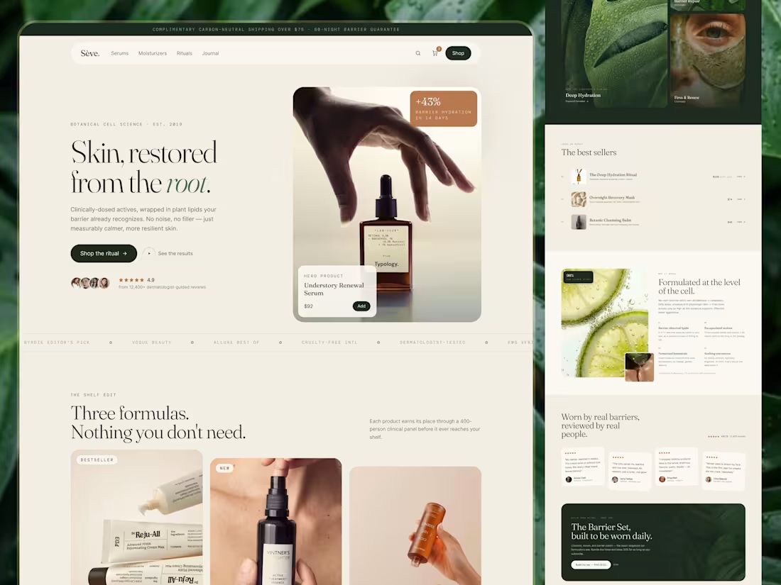
Skincare shopping can quickly become overwhelming. With multiple products, ingredient lists, reviews, and routines to consider, customers need more than attractive product photography. They need a clear way to explore their options.
For Sēve., the design direction focuses on creating a calm, editorial shopping experience that makes skincare discovery feel more considered.
Design focus:
- Responsive website design
- Product and category discovery
- Ingredient-focused content sections
- Best-selling product presentation
- Customer review and trust sections
- Clear navigation and shopping CTAs
- Consistent visual hierarchy across screen sizes
Visual direction
Warm neutrals and deep green create a calm, premium atmosphere. Editorial typography and carefully structured content keep the interface refined without making it feel difficult to navigate.
Project goal
Create a responsive skincare e-commerce experience that balances visual appeal with clear product discovery and a more confident shopping journey.
Services
UI/UX Design · E-commerce Website Design · Responsive Web Design · Digital Experience Design
🏀 Full Design Showcase – Better View on Dribbble.
✅ https://dribbble.com/shots/27835463-Skincare-E-commerce-Website-UI-UX-Responsive-Design
Building something similar?
Visumind Creative works with growing brands on E-commerce, Websites, UI/UX, Brand Identity, and Development.
Contact us to discuss your next project or request a free website/UX audit.
6
6
301
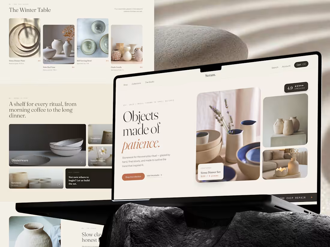
Not everything worth buying should be bought in a hurry. That idea shaped the Seram. e-commerce experience. Built around small-batch stoneware, craftsmanship, and everyday rituals, the website was designed to feel more like a quiet studio than a busy online store.
The experience brings together:
→ Seasonal collections
→ Curated product discovery
→ Craft and studio storytelling
→ Practical product details
→ Customer reviews
→ Clear shopping paths
The visual system stays warm, editorial, and restrained so the objects remain the focus. Because when something is made with patience, the digital experience should give people a reason to slow down and appreciate it.
Seram.
Objects made of patience. (https://dribbble.com/shots/27764216-Stoneware-E-commerce-Product-Website-UI-UX)
4
8
595