The network for creativity
Join 1.25M professional creatives like you
Connect with clients, get discovered, and run your business 100% commission-free
Creatives on Contra have earned over $150M and we are just getting started
Back to feedPost
MORROW | Brand Identity & Art Direction
MORROW is a self-directed homeware brand concept built around a slower approach to living. Thoughtful objects, natural materials and a sense of permanence, brought together through a brand designed to feel as considered as the pieces it represents.
The visual direction combines deep greens, warm browns and soft ivory, balancing rustic character with understated luxury. The goal was to create an identity that feels collected rather than overly polished, with a quiet sense of permanence running through every detail.
From the visual identity to the overall art direction, I developed the branding from start to finish, building a cohesive visual world around the idea of slow-made living.
MORROW. Design made to stay.


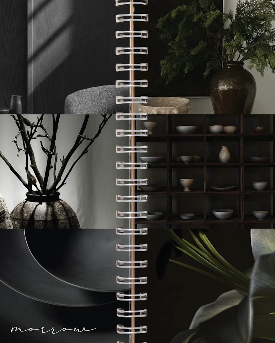
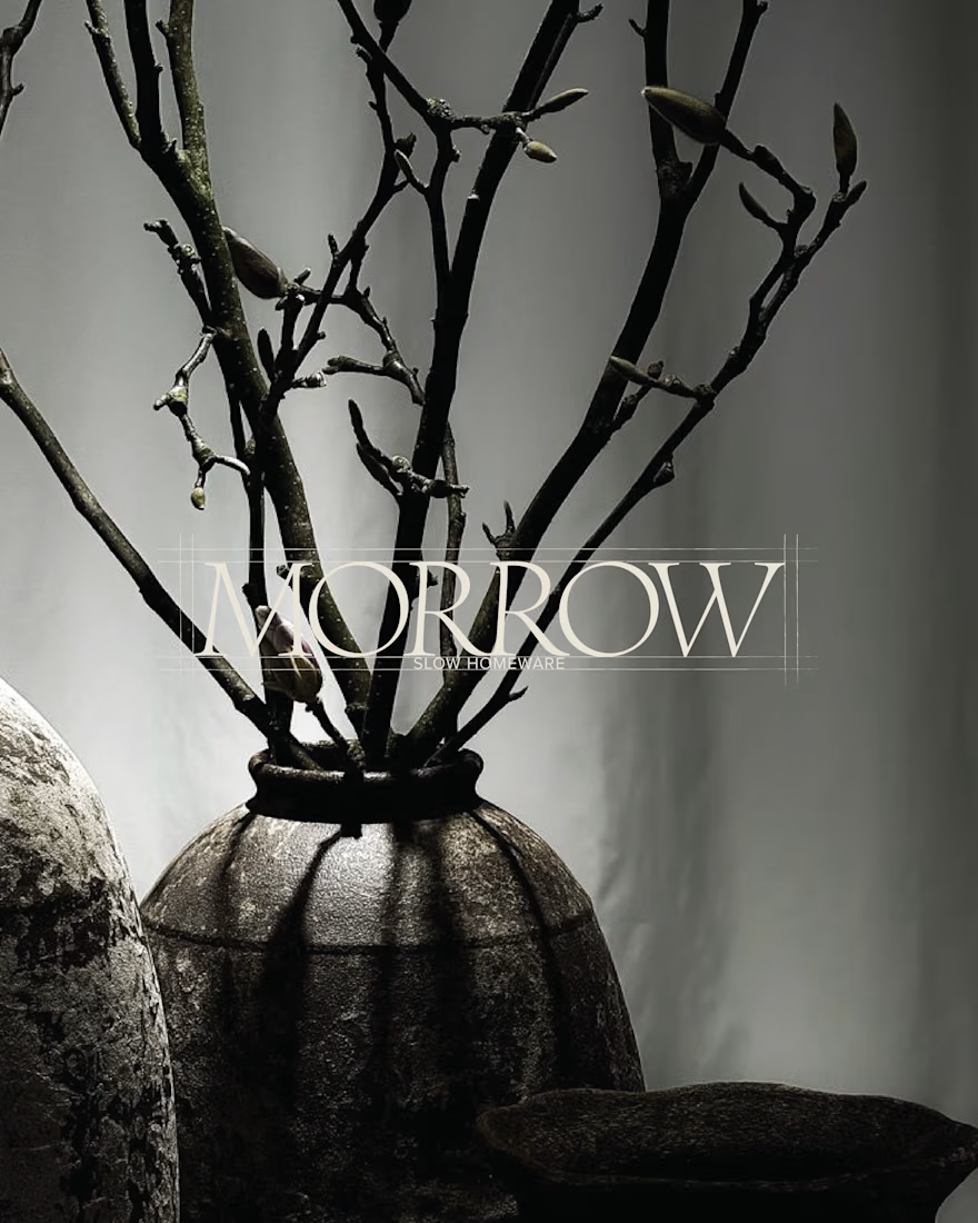
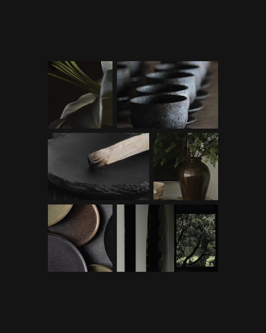
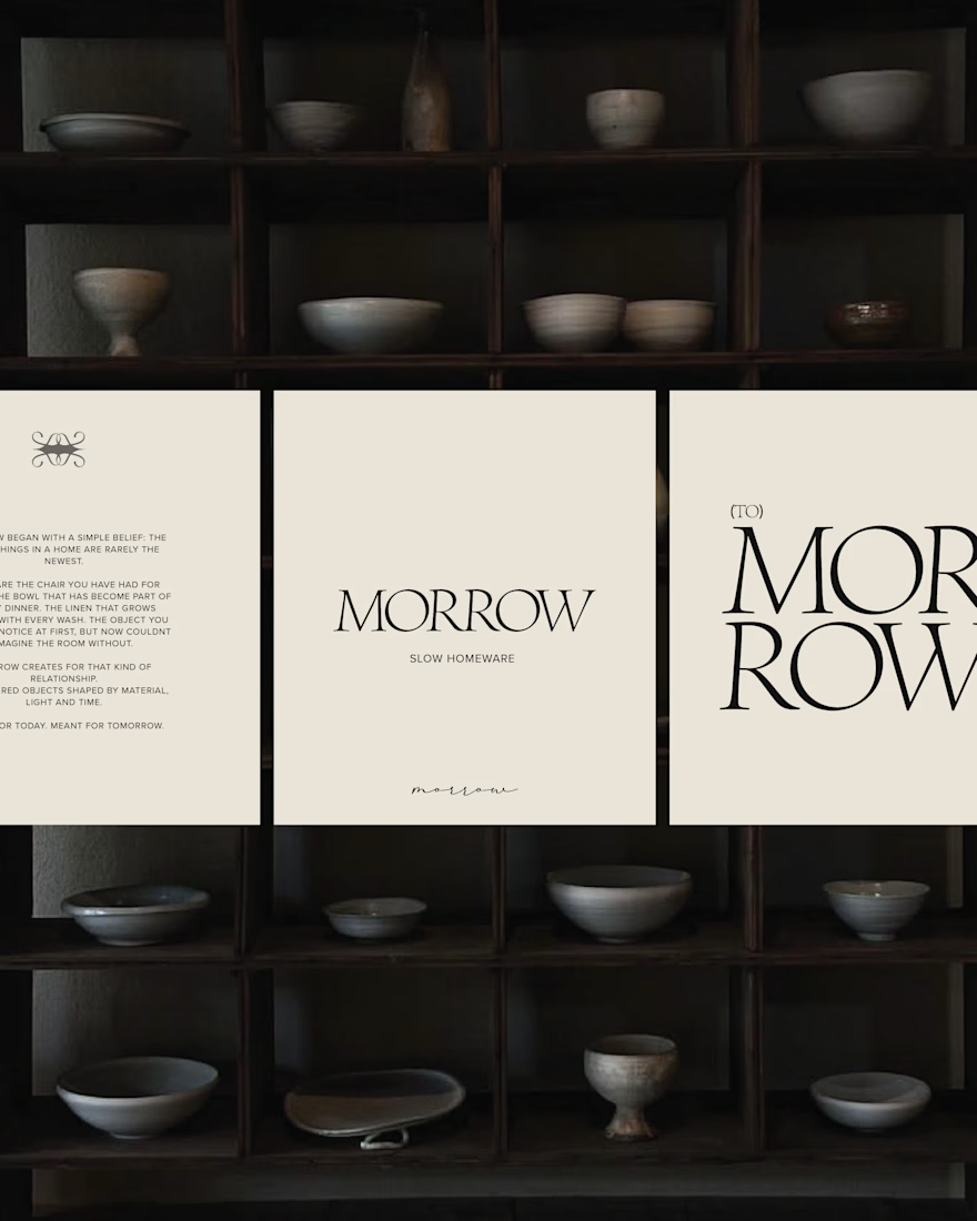

A calm and luxurious feel.

Four images, and I can already feel the story behind the brand! That's what I call successful branding. Well done, May!

Great job May🔥🔥

Thats really cool

Branches in a dark ceramic vase, a pale serif MORROW over the shadows and a cream sheet with the wordmark stacked big make slow-made living feel like a mood you can step into. Contrarian note: a slow-living brand wants to feel unhurried, but the board is almost all black and...

I actually love that observation, especially because this is only the first part of the identity direction. The “slow” in MORROW is more about slow-made than slow living: human-made objects, carefully curated materials and an intentional approach to making rather than...

absolutely feels thoughtful in nature, i love the stacked logo as well as the grid system detailing around the text in the second image.


Amazing work🔥👏👏

Love this concept May! MORROW - slower approach to living with thoughtful objects and natural materials. The name itself feels calm and permanent. Brand identity looks so considered and minimal, perfectly matching the homeware philosophy. Beautiful art direction!

Love the muted palette on Morrow


Amazing work

The earthy palette and understated luxury feel like a great fit for this concept. Really nice direction!

Beautifully executed brand identity! The earthy palette, thoughtful typography, and refined visual direction create a timeless, premium feel.

"Design made to stay" is such a strong tagline. It perfectly ties together the focus on natural materials and a sense of permanence. This whole identity feels incredibly cohesive.

Beautiful balance between simplicity and brand personality.


Nice concepts

This is amazing! 🔥

Aiming for "collected rather than overly polished" is a tricky balance with a palette this restrained. How did you settle the serif's weight, given the light cut over those dark branches could easily tip into feeling fragile?
I wanted the serif to retain that softer, more refined quality without becoming overly delicate. The darker imagery and heavier visual elements around it give the lighter type enough contrast and weight, so I found that keeping the serif relatively light actually helped maintain...
That logic holds up. Heavy imagery already supplies the weight, so a lighter serif gets to be the quiet counterpoint instead of competing. Did you try a heavier cut in the layouts before landing on this one?
I did consider a heavier weight of the typeface, but I didn't explore it across different layouts. I already had a clear vision for MORROW's art direction and the visual world I wanted to build around it. The softer cut felt like the right fit for that direction, especially against the darker, more atmospheric imagery.

Good!

The name alone feels calm. Really nice how the identity matches that slow living mood without trying too hard.


Big congrat


Beautiful work, May!

Rustic without feeling rough😍

Beautiful art direction!
The network for creativity
Join 1.25M professional creatives like you
Connect with clients, get discovered, and run your business 100% commission-free
Creatives on Contra have earned over $150M and we are just getting started











Related posts


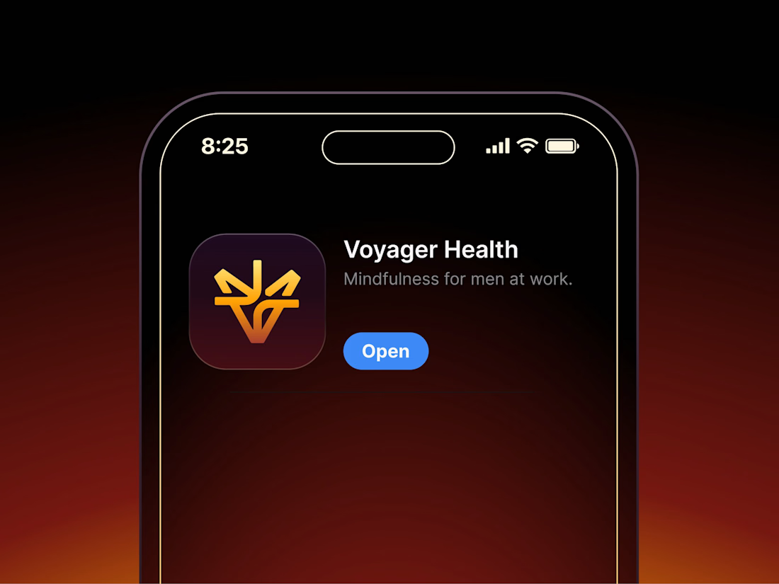

Aryna, that golden symbol pops so nicely against the plum background ✨

It’s been a minute since my last post here on Contra.
While my main focus usually lives in photo editing and digital design, I was digging through the archive recently and thought it’d be fun to share a couple of branding projects from the past:
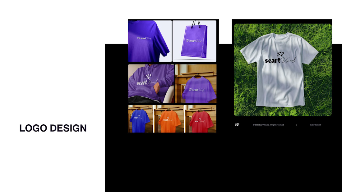
Slide 1: Seart Visuals apparel & merchandise branding (1 year ago)
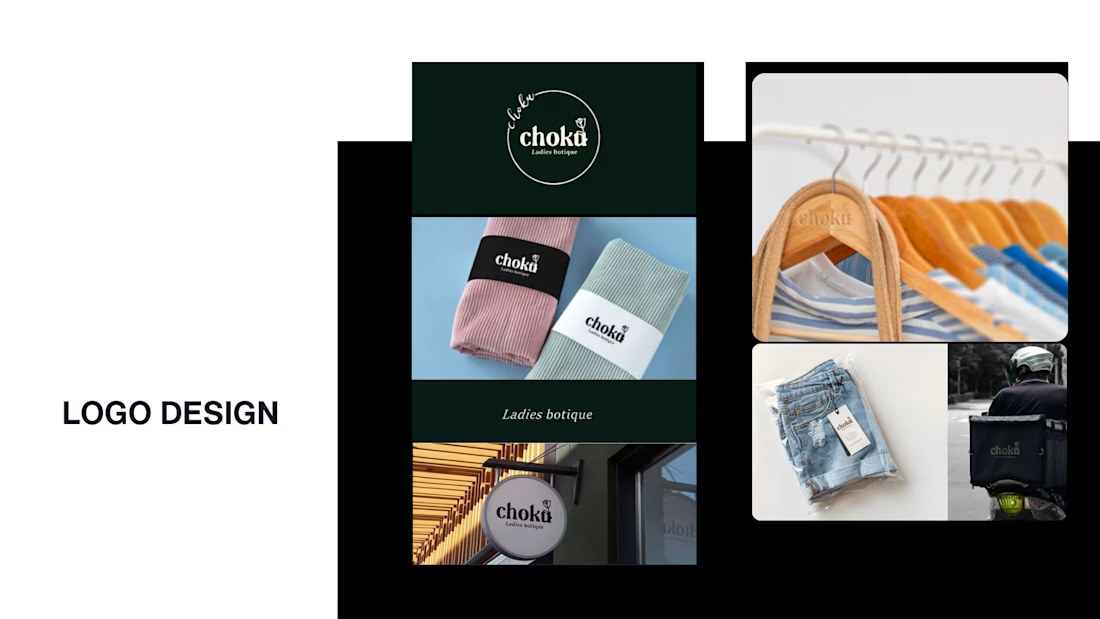
Slide 2: Choku Ladies Boutique identity and mockups (2 years ago)
Brand identity isn't my everyday lane, but tackling projects like these taught me a lot about visual consistency across different mediums. I’d love to hear your thoughts or see any feedback from fellow designers. Great to connect with the community again.

That's really great typography logo design❤️❤️

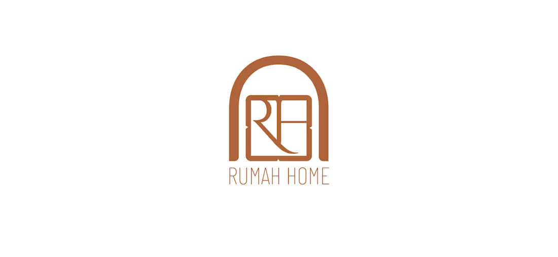
Made these 2 concepts for a furniture shop, Rumah Home, a boutique store specialising in Indonesian-inspired furniture and homewares. “Rumah” means “house” in Indonesian, so the idea was to make the name itself feel like home.
Concept 1: An arched doorway frames an interlocked R and H, with sharp geometric details softened by a rounded shape. The olive and terracotta tones nod to Indonesian timber, clay and handcrafted pieces.
Concept 2: The letters turn into furniture: a bedside table, a seat and a lamp. Fine linework keeps it modern, and the handwritten “home” adds warmth.


Beautiful concept! The arched doorway idea is so clever - it instantly makes the word "Rumah" feel like a home. Concept 1 feels more premium and clean to me, the arch with the monogram is very memorable. Great storytelling behind the logo.