The network for creativity
Join 1.25M professional creatives like you
Connect with clients, get discovered, and run your business 100% commission-free
Creatives on Contra have earned over $150M and we are just getting started
Back to feedPost
Avoiding the obvious is one of the hardest parts of branding.
If the project is connected to the music industry, the first solution that comes to mind is almost always a note or an instrument.
Everyone understands the category immediately, yes.
But they probably won’t remember the brand.
That symbol won’t tell you if the brand is about discipline, energy, intimacy, underground culture, technical precision, experimentation, or mass entertainment.
A symbol becomes interesting when it’s transformed, reduced, connected with other elements, and brought into a visual system built around a specific problem.
The work becomes interesting when you’re not simply representing the most obvious symbol, but interpreting the experience.
A typographic composition that suggests rhythm.
A grid that feels like timing.
Empty space that makes you feel pause.
A visual system that behaves like a composition, instead of simply showing a note.
When design is too literal, it leaves you at the first level and becomes intellectually thin.
Good branding goes deeper and becomes memorable.
This is great
Agreed!
Very strong execution here. The design feels intentional, polished, and investor-ready.
100% 😊
Agree that’s why the design process matters so much. It helps uncover ideas that actually resonate with people instead of always defaulting to the most familiar or commonly used icons (where authenticity fades).
The network for creativity
Join 1.25M professional creatives like you
Connect with clients, get discovered, and run your business 100% commission-free
Creatives on Contra have earned over $150M and we are just getting started
Related posts
Hi everyone! 👋
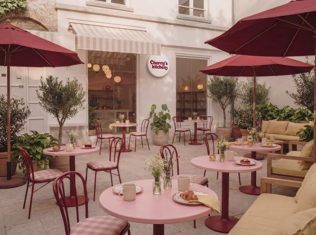
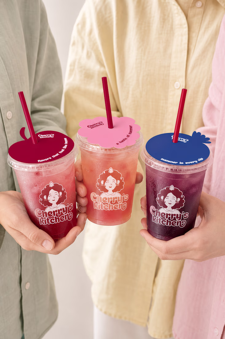
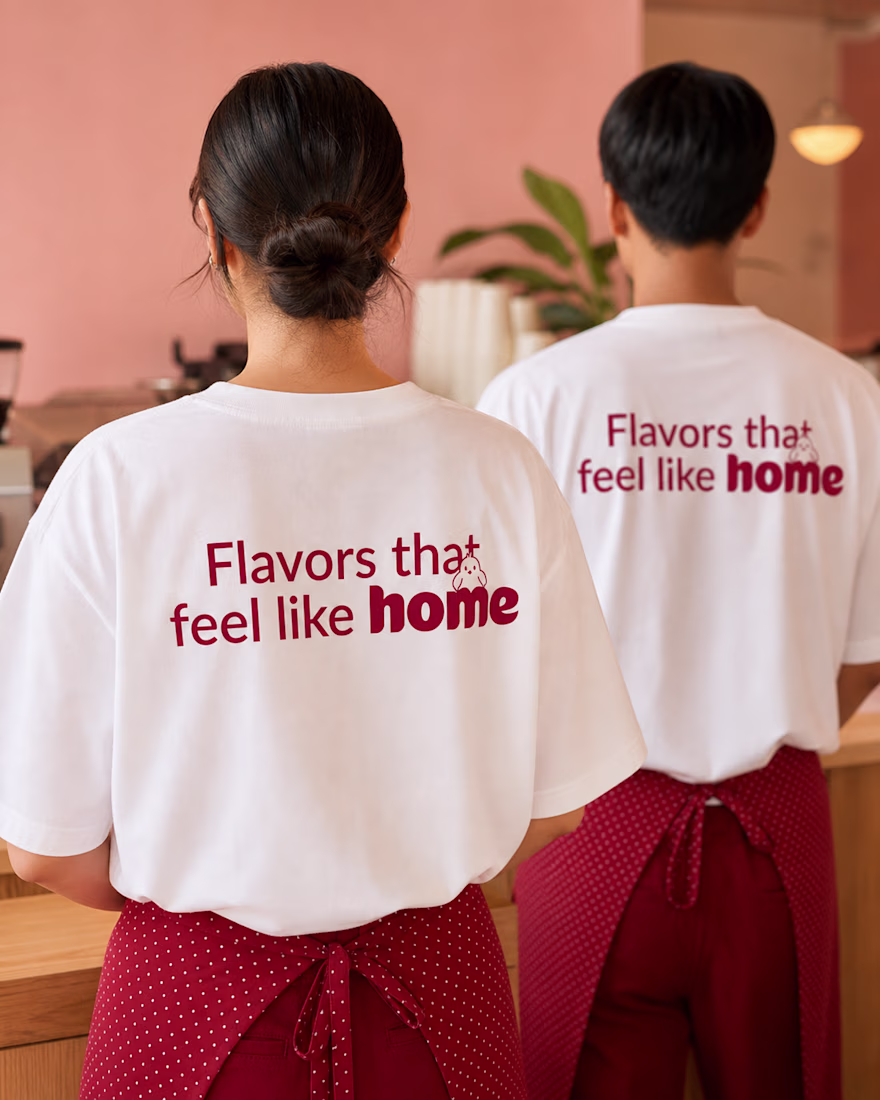
For the #envatochallenge, I wanted to explore Envato in as many ways as possible, from stock assets and fonts to AI image generation, video creation, animation, mockups, and even the music for this video. To do that, I created Cherry's kitchen — a cozy café brand inspired by warm summer afternoons, homemade cherry desserts, and family gatherings.
Throughout the project, I used Envato as my main creative toolkit while bringing everything together in Figma. I designed the mascot, visual identity, packaging, café interiors, animations, and brand guidelines. And honestly... I just couldn't stop exploring. Every time I finished one part of the project, I found another way to bring the brand to life.
One of my favorite parts of the process was deciding what truly belonged in the brand identity. I explored different concepts and made the creative decision, choosing what to keep, what to refine, and what to leave behind.
Check out the process video below! I'd love to hear your thoughts on the project 🍒😍
love seeing your process for this!
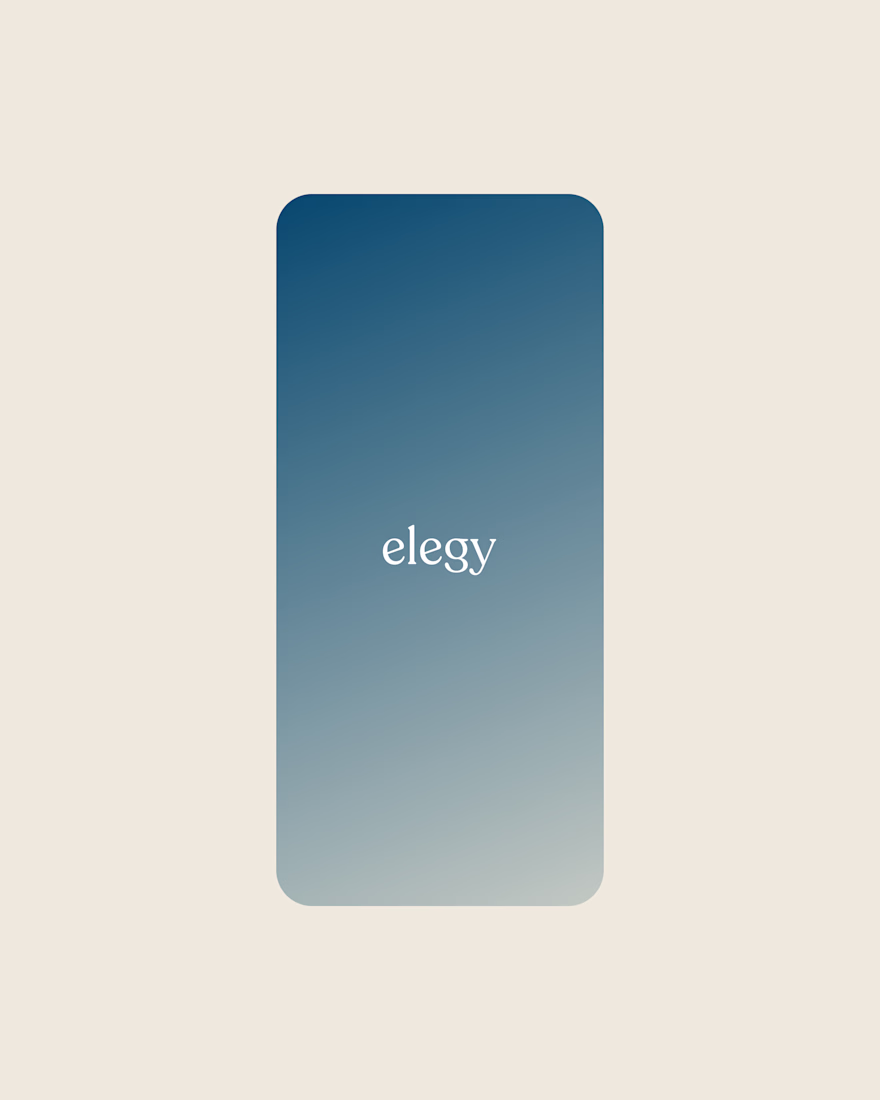
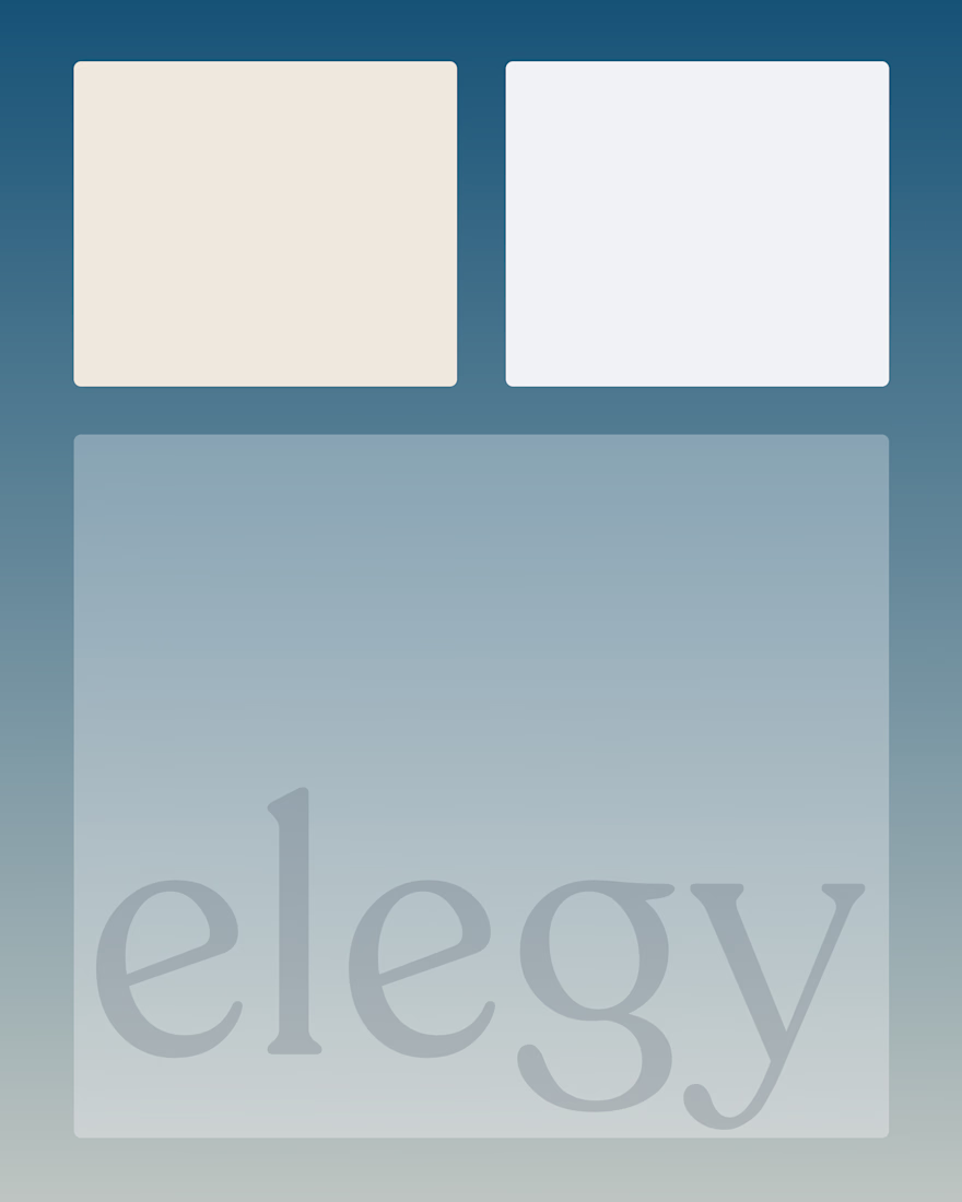
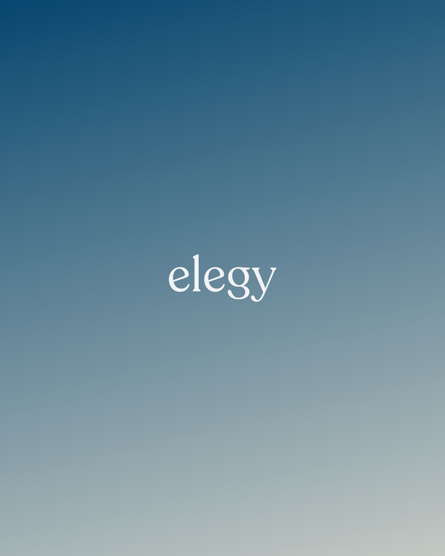
Recently shipped brand work for Elegy, a platform that helps families navigate the financial side of loss.
I designed the brand identity and user experience, partnering with an NYC-based product studio to bring the product to life from concept to launch.
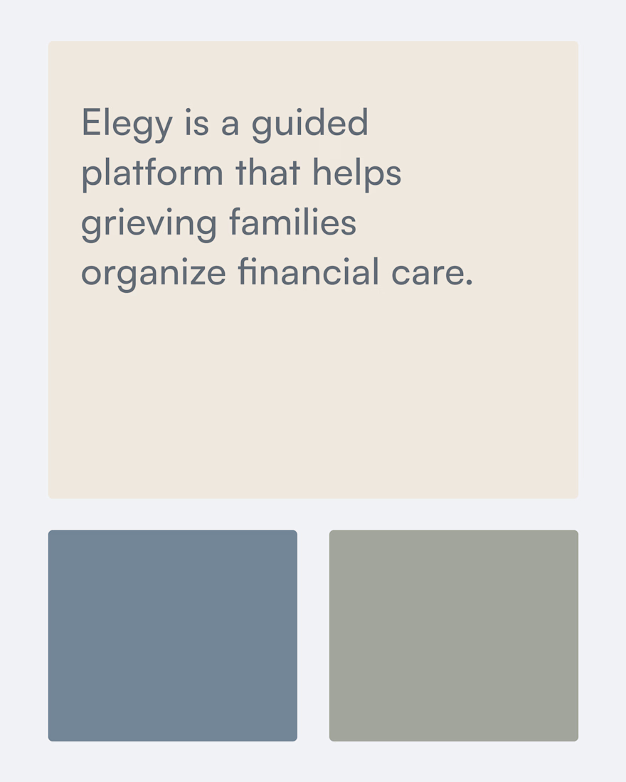
Grief tech is such an underexplored space and the calm, muted palette really fits the subject matter. What was the trickiest part of designing UX for something this emotionally sensitive?
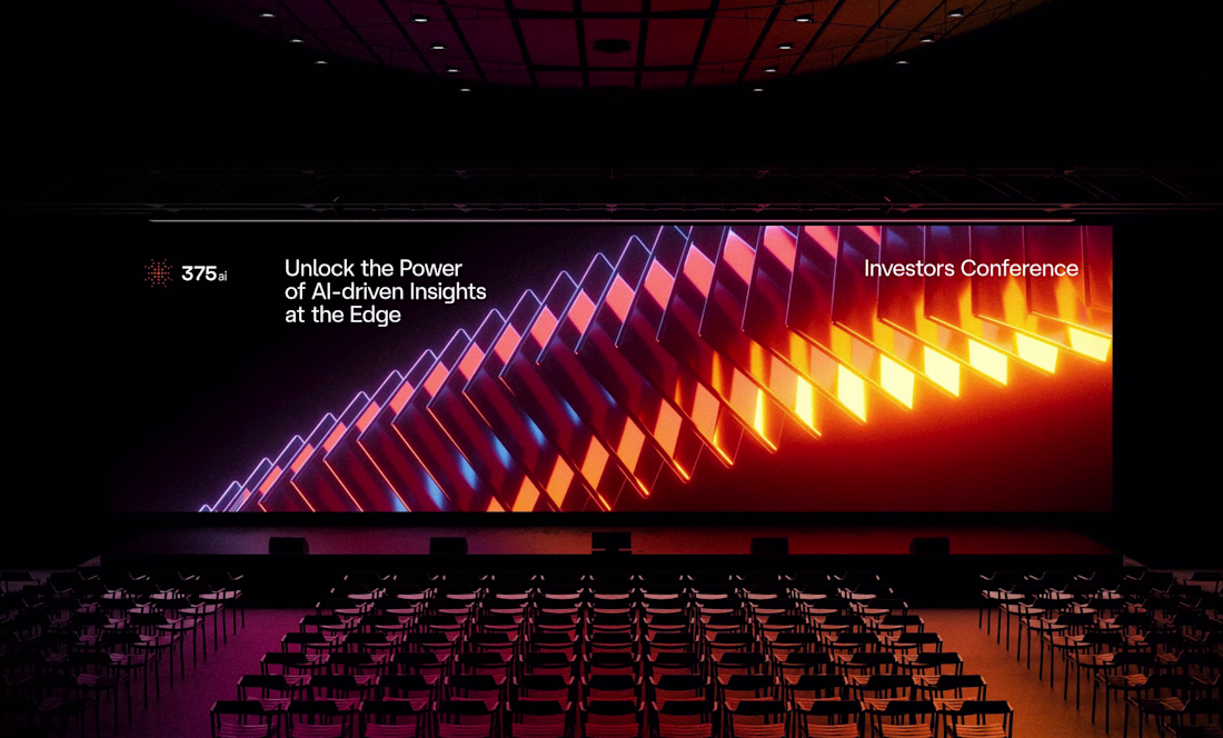
I've shared some 375ai work this week already, but there's one part of this project I keep coming back to: watching the same logomark hold up everywhere.
When I was designing it, I was mostly worried about the small stuff, whether the mark would still read as an app icon or a favicon. Then a few months later it's 20 meters wide behind a speaker at an investors conference, and somehow it still feels like the same brand.
The video shows how the mark is built, next to the actual lidar scans the product makes. That's where the dot pattern came from in the first place, so it never felt like decoration to me.
Curious how other designers approach this: do you start from the smallest size a logo has to survive at, or design the big version first and scale down?
Saw this on behance few days ago and can't help but comment here again... You did a great job
Trending
Claude
Claude has entered the design space. How are you using Claude Design?
Contra University
Learn from expert creatives how to earn more using next-gen AI tools.
creativeaiflow
Creative AI workflows are evolving. What tools do you use, and what are their strengths and weaknesses?
freelancerlife
Freelancer life is wins, pivots, and everything in between. What’s yours right now?