
Nick Zoutendijk
Branding, Product & Web Design that stand out.


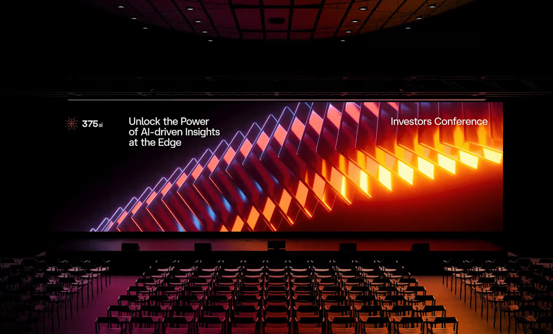
I've shared some 375ai work this week already, but there's one part of this project I keep coming back to: watching the same logomark hold up everywhere.
When I was designing it, I was mostly worried about the small stuff, whether the mark would still read as an app icon or a favicon. Then a few months later it's 20 meters wide behind a speaker at an investors conference, and somehow it still feels like the same brand.
The video shows how the mark is built, next to the actual lidar scans the product makes. That's where the dot pattern came from in the first place, so it never felt like decoration to me.
Curious how other designers approach this: do you start from the smallest size a logo has to survive at, or design the big version first and scale down?
6
20
791
GenLayer is a brand for thinking machines. So the identity had to think too.
Instead of a static pattern I built a fluid animation system: lines that continuously flow into one another, the way AI evolves through new thoughts and ideas. One system, endless moments, the same waves that breathe on the website also carry a conference wall or a product reveal.
That's my bar for an AI-driven brand style: not "does it look techy," but "does it behave like the product."
Curious how other designers handle this: when your identity is animated or generative, how do you keep it recognizable without freezing it into a template?
7
27
4.8K
Shipped the 375ai website. This one was mostly a motion challenge.
375ai's whole pitch is real-time: thousands of sensors reading streets and shelves, turning the physical world into structured data. Hard to sell that with a static page. So most of my time went into the animation layer. The radar mark actually sweeps. Data blocks load in sequence, like a feed. Stats count up on scroll. Nothing in there is decoration, every movement maps to something the product does.
Then the unglamorous part: getting it built without wrecking performance. I spec'd every state and easing curve for the devs and we went back and forth until it held up on a mid-range phone, not just my monitor. A couple of animations I liked didn't survive that. Fine by me. A janky animation is worse than no animation.
Full case is on my profile. 🔥
Honest question for the web folks here: how do you spec motion in handoff? It's still the messiest part of my process.
#webdesign #motiondesign #uianimation
1
5
126
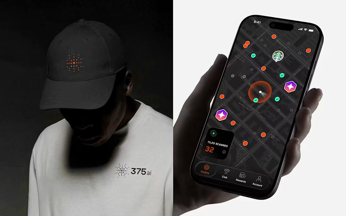
The 375ai logomark is a radar. Not a metaphor, the actual product: their devices scan millions of cars and objects in real time, so the identity simply names that behaviour.
From there everything pulls in the same direction. A custom typeface tuned for engineering seriousness but warm enough to live alongside consumers. 3D renders that bring the hardware to life. Motion that mirrors the real-time data stream underneath.
Full case is on my profile. Question for the other brand designers here: when you brand deeply technical products, do you reach for abstraction, or point straight at the thing?
3
7
570