The network for creativity
Join 1.25M professional creatives like you
Connect with clients, get discovered, and run your business 100% commission-free
Creatives on Contra have earned over $150M and we are just getting started
Back to feedPost
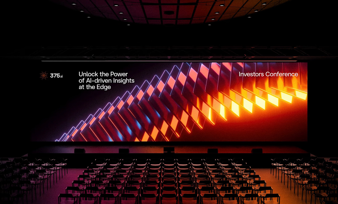
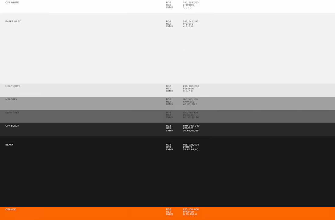
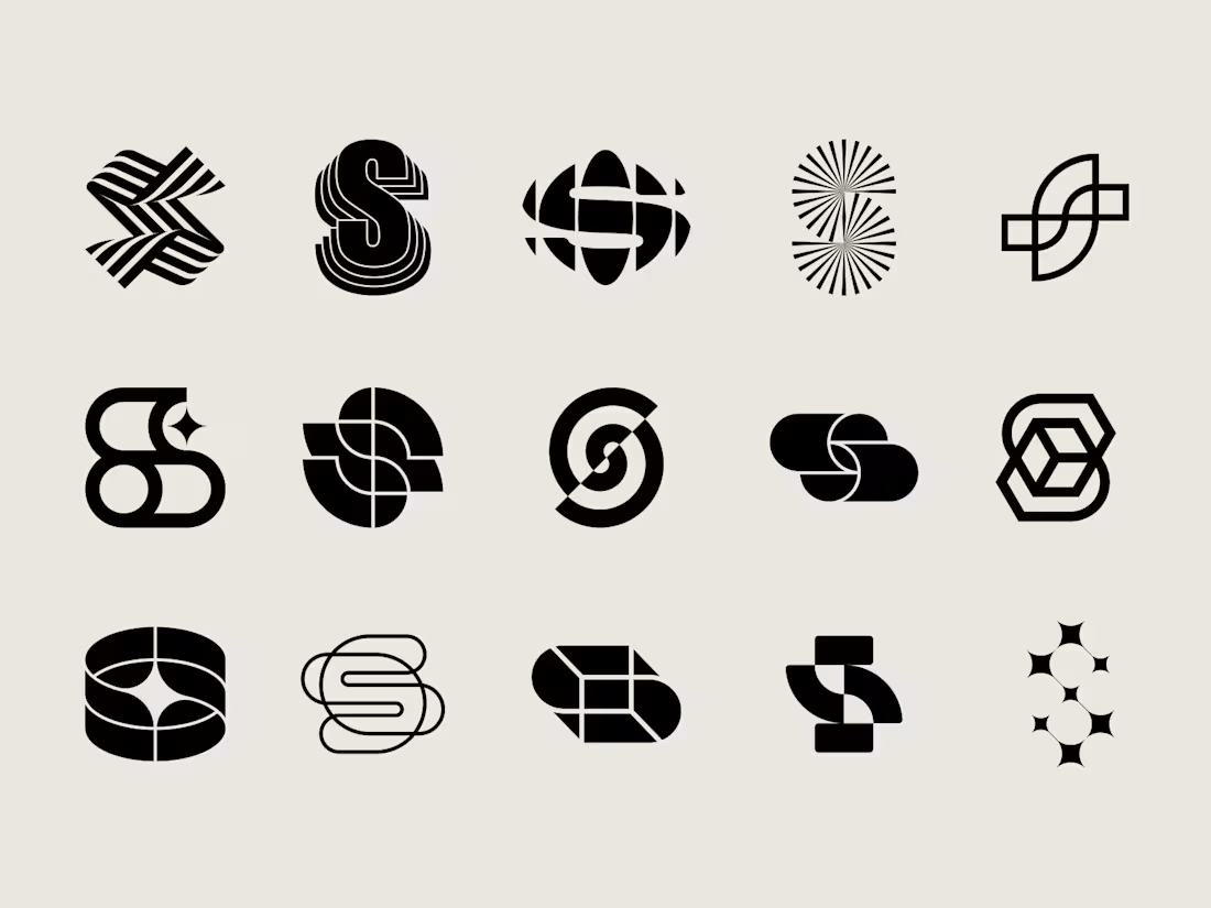
I've shared some 375ai work this week already, but there's one part of this project I keep coming back to: watching the same logomark hold up everywhere.
When I was designing it, I was mostly worried about the small stuff, whether the mark would still read as an app icon or a favicon. Then a few months later it's 20 meters wide behind a speaker at an investors conference, and somehow it still feels like the same brand.
The video shows how the mark is built, next to the actual lidar scans the product makes. That's where the dot pattern came from in the first place, so it never felt like decoration to me.
Curious how other designers approach this: do you start from the smallest size a logo has to survive at, or design the big version first and scale down?



Awesome work!

The part about worrying whether it reads as an app icon first is such an underrated design constraint. Did you stress test the mark at favicon size early on, or was that a later refinement pass?


Love how the lidar dot pattern holds up from favicon to that huge conference backdrop. Really smart system.

Yes that was great to discover, that it works across all touchpoints!

Saw this on behance few days ago and can't help but comment here again... You did a great job
Appreciate that a lot! ♥️
The network for creativity
Join 1.25M professional creatives like you
Connect with clients, get discovered, and run your business 100% commission-free
Creatives on Contra have earned over $150M and we are just getting started










Related posts

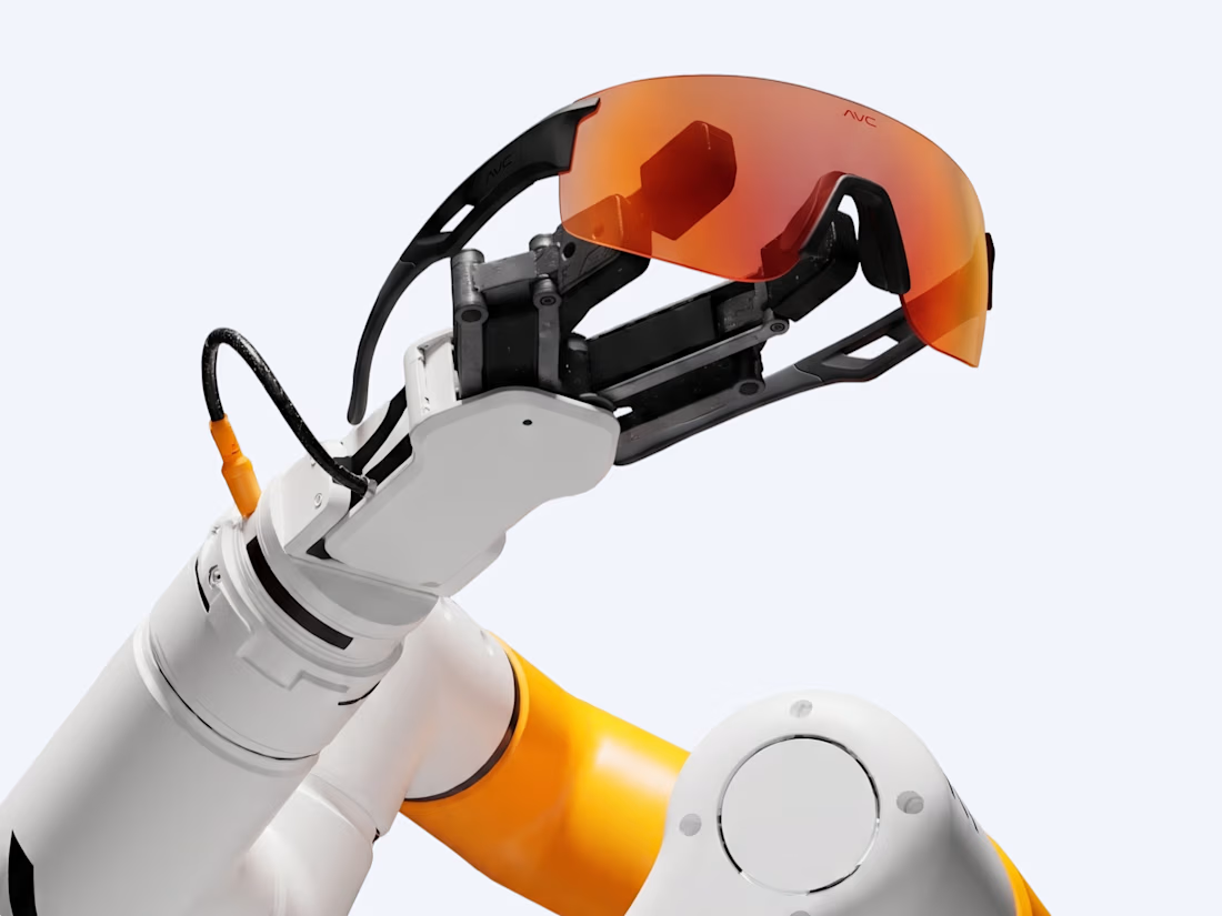
A personal brand concept exploring the future of AI-powered performance eyewear.
I wanted to create something that blends sports, technology, and futuristic aesthetics into one cohesive visual identity.
From the eyewear design and product visuals to art direction, 3D renders, and motion every detail was developed to give AVC its own distinctive character.
Not just another pair of sports glasses. A vision of what next-generation wearable technology could look like.
More explorations coming soon.


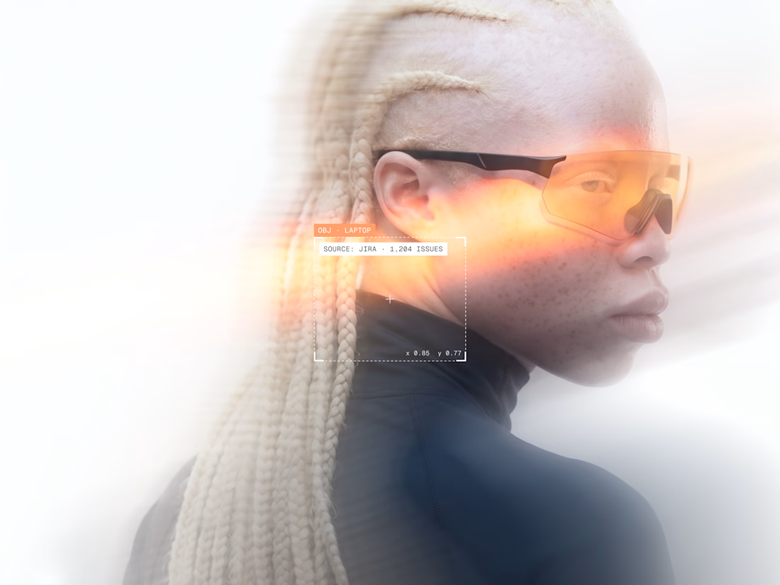
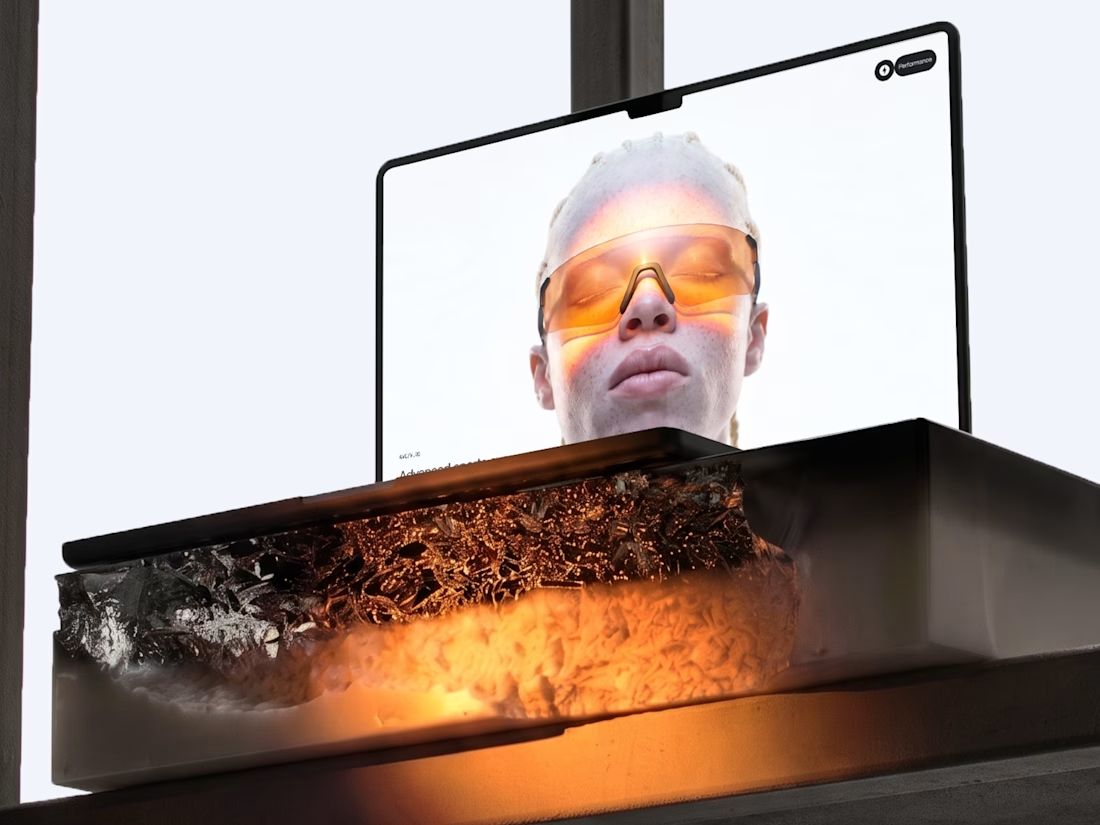

Blending sports and tech into eyewear is a tough positioning, but the system holds together — the renders, art direction, and product visuals all speak the same visual language rather than competing. Where the execution lands next will be in the packaging and retail touches; if...


Creating content for: Ben & Jerry’s! 🍦
One of the 'coolest' gigs I’ve done.
I captured the photos and video for Ben & Jerry’s Free Cone Day in the Netherlands. The content was used in their global marketing campaigns and reached millions of people.
Check out the use case here
