The network for creativity
Join 1.25M professional creatives like you
Connect with clients, get discovered, and run your business 100% commission-free
Creatives on Contra have earned over $150M and we are just getting started
Back to feedPost

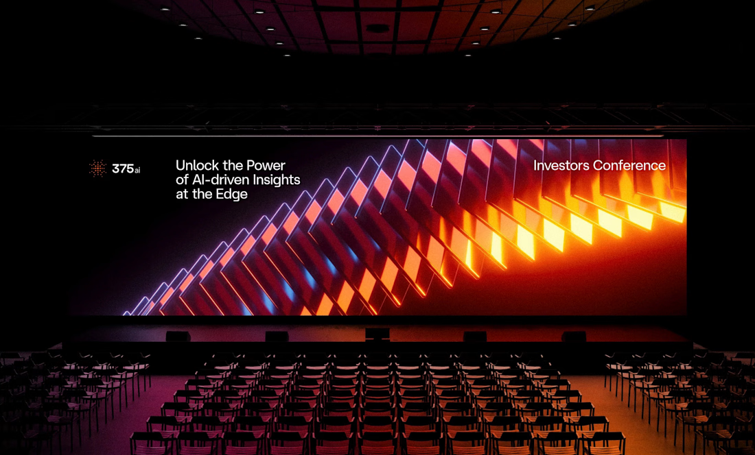
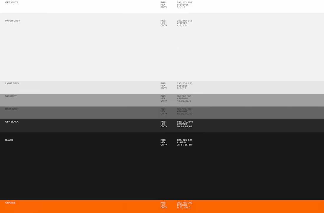
I've shared some 375ai work this week already, but there's one part of this project I keep coming back to: watching the same logomark hold up everywhere.
When I was designing it, I was mostly worried about the small stuff, whether the mark would still read as an app icon or a favicon. Then a few months later it's 20 meters wide behind a speaker at an investors conference, and somehow it still feels like the same brand.
The video shows how the mark is built, next to the actual lidar scans the product makes. That's where the dot pattern came from in the first place, so it never felt like decoration to me.
Curious how other designers approach this: do you start from the smallest size a logo has to survive at, or design the big version first and scale down?



The part about worrying whether it reads as an app icon first is such an underrated design constraint. Did you stress test the mark at favicon size early on, or was that a later refinement pass?

Awesome work!
The network for creativity
Join 1.25M professional creatives like you
Connect with clients, get discovered, and run your business 100% commission-free
Creatives on Contra have earned over $150M and we are just getting started
Related posts

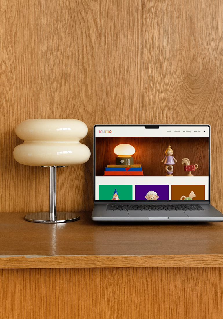
For this challenge, I created KUMO, a playful toy brand from scratch 🧸✨
I designed the toy characters, developed the branding, created custom mockups, and designed a website to bring the whole world together. I used Envato throughout the creative process for visuals, assets, experimentation, and refinement, while Suno helped me create the background music 🎵
From the toys to the website, I wanted every detail to feel playful, cohesive, and part of the same nostalgic world.



so cool!!

Nice work

Logo for a green hydrogen company. A logo is only the beginning.
For Rand Hydrogen, we designed a visual identity that works across the website, investor deck, and physical applications in the real world — including containers and tanks.
The goal was to create a logo system that feels strong in every environment, from digital to industrial.
Read the full case study on @Contra: contra.com/p/rand-hydrogen
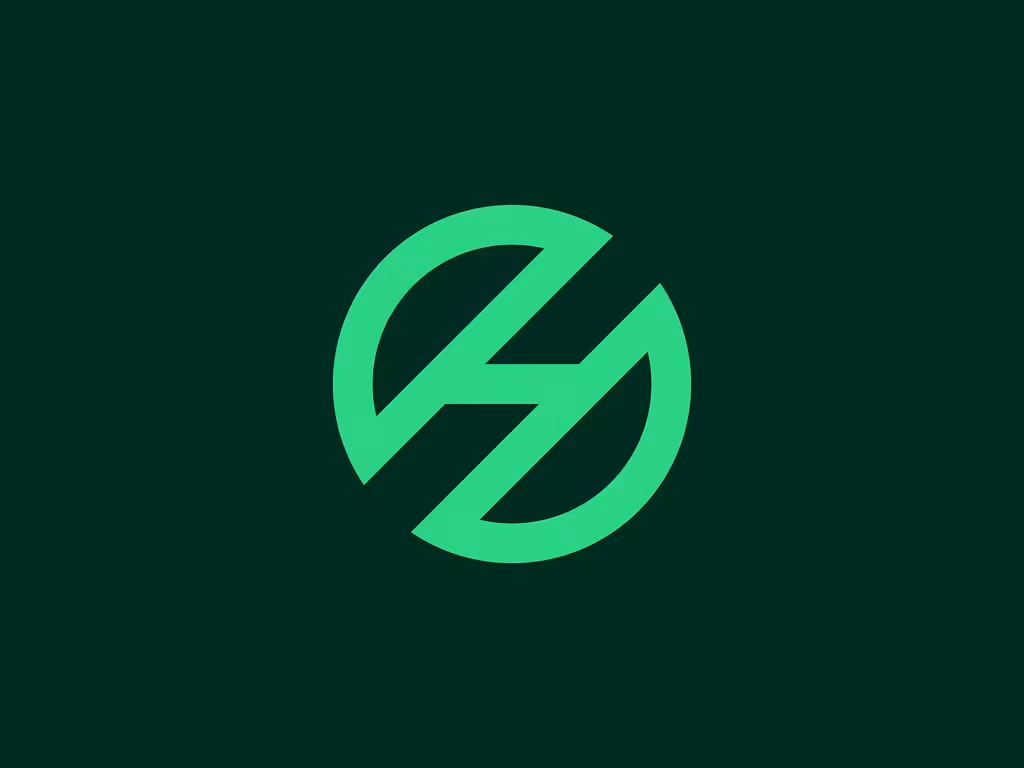
The negative space cut through the mark reads as both a droplet and a lightning bolt depending on how you look at it, smart for an energy brand. Was getting it to hold up on physical tanks and containers the hardest part, or did the digital applications give you more trouble?







Trending

Claude
Claude has entered the design space. How are you using Claude Design?

Contra University
Learn from expert creatives how to earn more using next-gen AI tools.
creativeaiflow
Creative AI workflows are evolving. What tools do you use, and what are their strengths and weaknesses?
freelancerlife
Freelancer life is wins, pivots, and everything in between. What’s yours right now?