The network for creativity
Join 1.25M professional creatives like you
Connect with clients, get discovered, and run your business 100% commission-free
Creatives on Contra have earned over $150M and we are just getting started
Back to feedPost
Logo for a green hydrogen company. A logo is only the beginning.
For Rand Hydrogen, we designed a visual identity that works across the website, investor deck, and physical applications in the real world — including containers and tanks.
The goal was to create a logo system that feels strong in every environment, from digital to industrial.
Read the full case study on @Contra: contra.com/p/rand-hydrogen
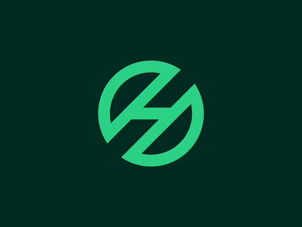

The negative space cut through the mark reads as both a droplet and a lightning bolt depending on how you look at it, smart for an energy brand. Was getting it to hold up on physical tanks and containers the hardest part, or did the digital applications give you more trouble?

Thank you, Maty! To be honest, print and digital applications each come with their own design challenges. When applying a brand across different touchpoints and formats, it’s important to have solid brand foundations so the team clearly understands how to use the brand...
That makes sense, brand foundations first so the application choices become obvious rather than arbitrary. Do you usually build a full guidelines doc before touching the physical applications, or figure that out in parallel as the tank and container mockups come together?

TOP 🔥
Thank you Celia

Nice one
The network for creativity
Join 1.25M professional creatives like you
Connect with clients, get discovered, and run your business 100% commission-free
Creatives on Contra have earned over $150M and we are just getting started
Related posts

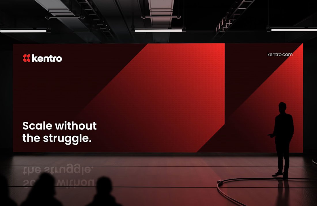
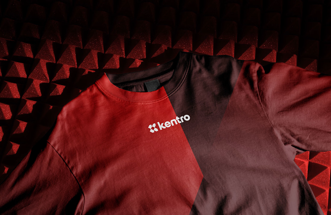
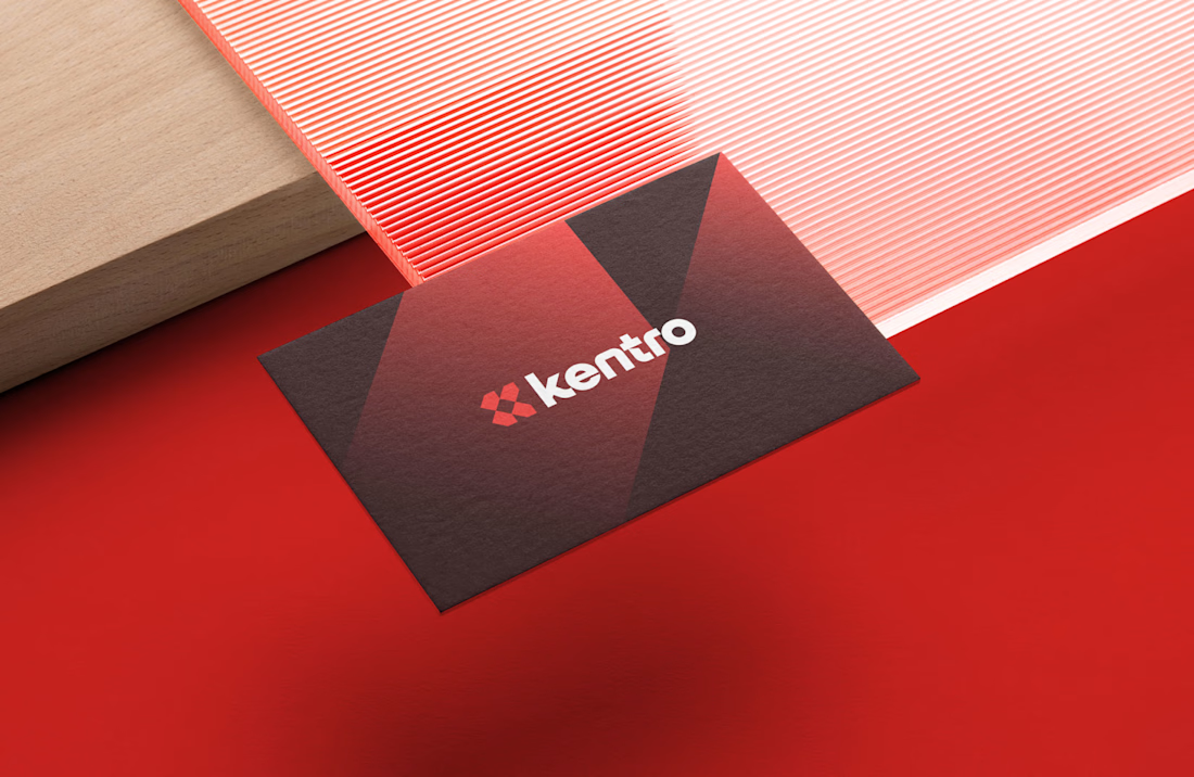
Kentro — Unlock growth with intelligent automation.
The logomark combines the letter K with forward-facing arrows, creating a clean geometric symbol that represents growth, progress, and continuous acceleration. The goal was to build an identity that feels modern, intelligent, and confident, reflecting how automation helps businesses move faster and scale with purpose.
Simple in form, memorable in execution, and designed to perform across every touchpoint.
What was the first thing you noticed in the mark: the "K" or the arrows? 👀
Nice balance between visuals and explanation.

A playful logo reveal created for the Bark Punk brand.
Designed a bold and memorable logo for an alternative bar, focusing ona distinctive visual identity that reflects the venue's unique personality and atmosphere.


This logo is absolutely insane - bold, energetic, and instantly memorable. The color, shape, and wild character work perfectly together.


Portugal's FA shipped a new logo mid world cup.
by the end of the week: it will never appear on the shirt. institutional use only. players keep the old crest.
an identity is proven by the surfaces it's allowed on. exempt the highest-stakes one and you've admitted the brand can't carry you.
b2b runs the same retreat quietly. new site ships, sales keeps the old deck "until the quarter closes," product waits for the redesign. two brands in market, and the old one owns every surface where money changes hands.


That line about the sales team quietly keeping the old deck 'until the quarter closes' is such a brilliant, overlooked observation. It’s so true—we often talk about branding at a high level, but the real test is always in those small, practical corners where revenue actually...







Trending

Claude
Claude has entered the design space. How are you using Claude Design?

Contra University
Learn from expert creatives how to earn more using next-gen AI tools.
fifaworldcup2026
The World Cup is here and the whole world's watching. How are you designing for the world stage?
creativeaiflow
Creative AI workflows are evolving. What tools do you use, and what are their strengths and weaknesses?
freelancerlife
Freelancer life is wins, pivots, and everything in between. What’s yours right now?