The network for creativity
Join 1.25M professional creatives like you
Connect with clients, get discovered, and run your business 100% commission-free
Creatives on Contra have earned over $150M and we are just getting started
Back to feedPost
I had the honor of being part of the brand creation back when it was called Valhalla and operated only as an açaí shop. Over time, the business grew and became a well-known burger restaurant in the region.
However, there was an important problem: people had difficulty pronouncing and remembering the old name. To preserve the essence and legacy of Valhalla, Legado Burger was born.
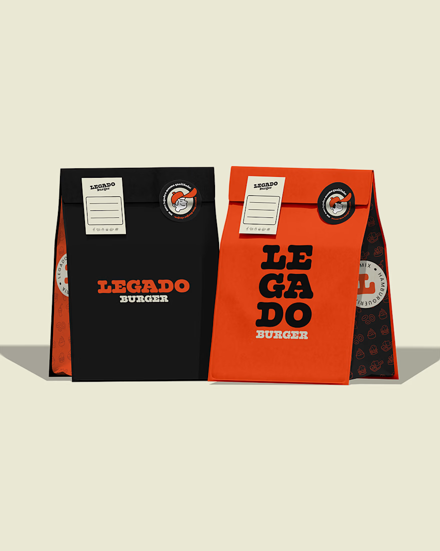
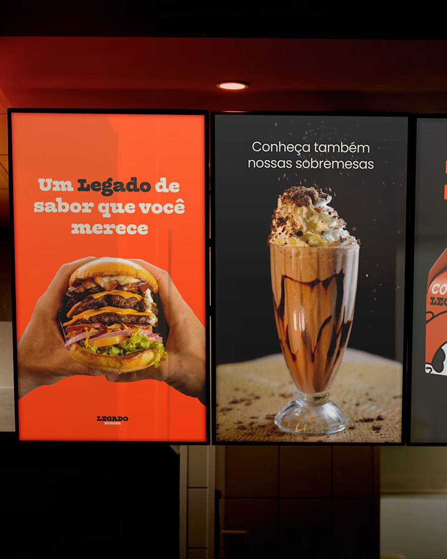
Visually, the changes were also significant. The purple and yellow palette was replaced by black and orange, creating a warmer, more vibrant atmosphere connected to the burger universe. The typography became more rounded, reinforcing the brand’s personality.
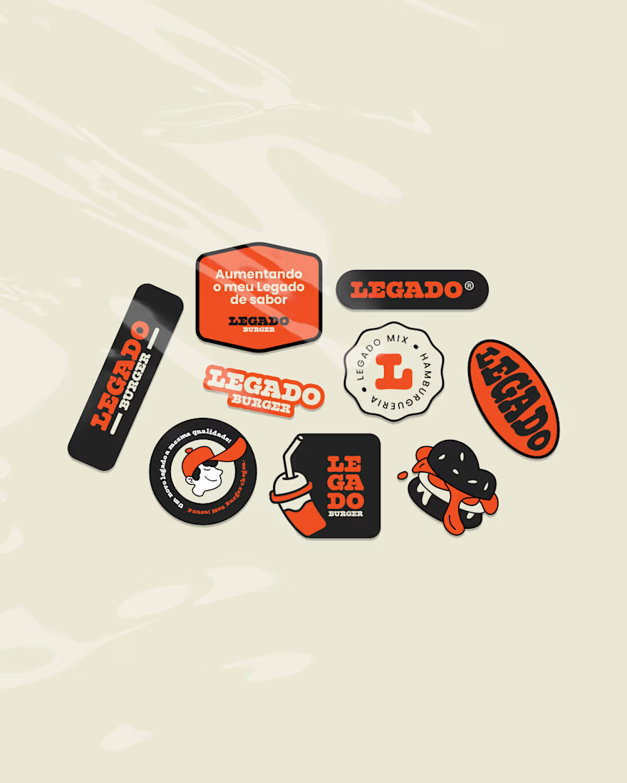
In addition, the project gained several custom illustrations and the presence of the mascot Léo, helping strengthen the identity and connection with the audience.
🔥 Full project: https://contra.com/p/F7QsUElk-legado-burger?r=othiagotaos


🔥 🔥 🔥

Love this!
Thanks brow!

Amazing work!
Thank you! 😊

This has got character! Loved the colors and overall system. Super responsive.
Thanks a lot for that feedback, bro. Makes you want to order a burger from there, right? hehe
Absolutely! 💯
Hehe Thanks! 🚀

Great work!
Thank You!
You're welcome!

Really like the thinking behind this. The new identity feels way more memorable and connected to the actual experience of the brand. The orange + black works so well here too 👏
That's great feedback, thank you so much!

Smart rename. The Valhalla → Legado move is the kind of brand surgery most agencies fumble — they’d redesign the logo and miss the pronunciation problem entirely. The black/orange swap also reframes the category from mythic-cold to appetite-warm, which is the right semiotic call...
vyudu.com
Vyudu Inc | Luxury Design & Brand Management for Fashion, Beauty, & Tech startups
We manage your digital brand to help you launch attractive websites, apps, content, and ad campaigns to generate online sales.
Thank you for the feedback. The old logo is also available at this link here: https://www.behance.net/gallery/180043293/Valhalla-Mix-Visual-Identity

Appetizing with those visuals & colors, so I guess mission accomplished! 🙂👍
Nice! hehe

the stickers looks so cool🙌
My client's customers loved it.


You absolutely crushed it. I think you really nailed it throughout, from the video to the packaging to the stickers. It's all so cohesive, but yet each is very interesting on its own. Absolutely amazing work.
We call it well-aligned teamwork with attention to detail for the client. Thank you, bro!

Wow very good
The network for creativity
Join 1.25M professional creatives like you
Connect with clients, get discovered, and run your business 100% commission-free
Creatives on Contra have earned over $150M and we are just getting started











Related posts

Most early-stage brands play it safe and disappear after a while. For Drylendar, I did the opposite.
3 weeks from brief to full identity: logo, illustration system, app visuals, collectible cards and even merch.
AI makes things cheaper. Personality makes brands memorable.
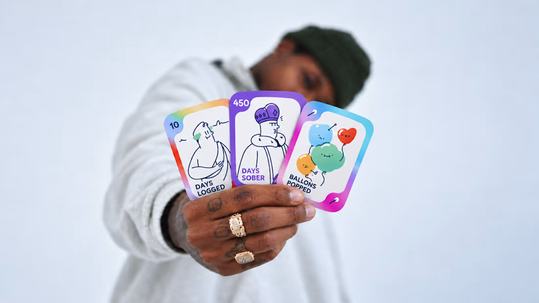
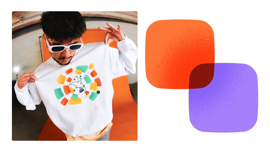
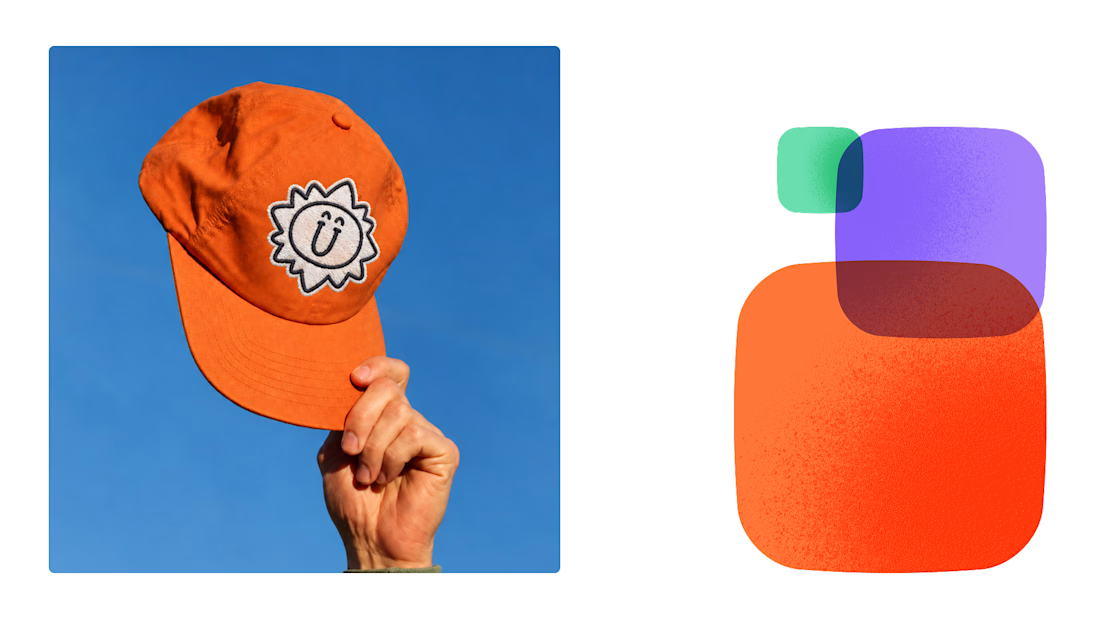
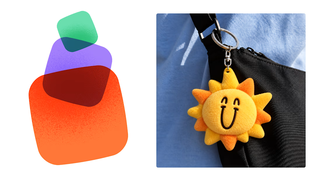

This is exactly what branding should be! 🔥 3 weeks for full identity, merch, cards - you really built personality, not just a logo. Love the Drylendar vibe. AI makes it cheap, but this makes it memorable - so true!

A little peek at the brand work we did for Elio Mortgage.
A warm, approachable identity full of warm vibrant colors paired with soft sun rising inspired gradients, inner glows and custom illustrations & more. Loved this direction!
Full case study coming soon, from process to final identity.
Plenty of logo explorations to share too!


That color palette takes the whole identity to a different level!! I loove it.

Brand Expressions -- Olivir



Thats so crazy!!!!!! Seeing this I feel we humans are still far better than AI