
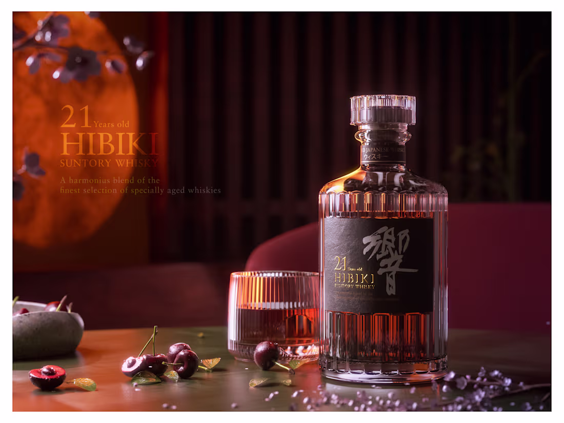
Hibiki Suntory Whisky 21 Years Old - 3D Render
0
3
1
5
6
168
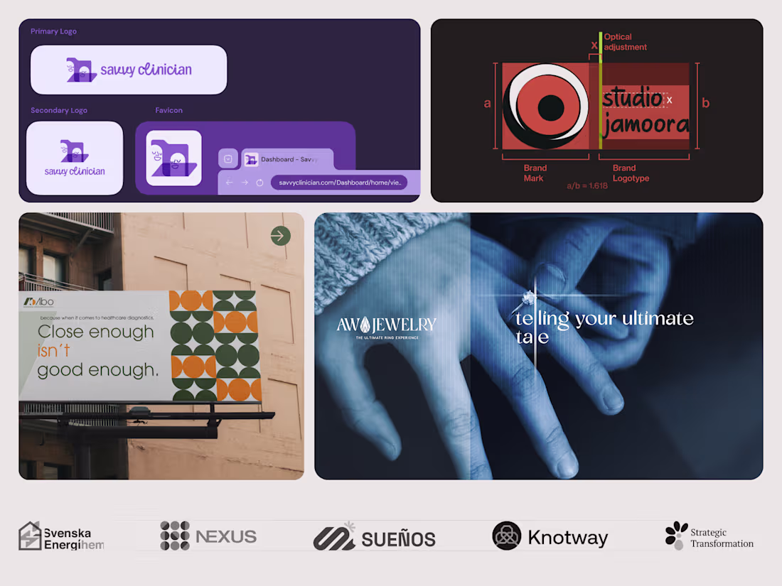
A logo that works in one place isn't a brand. It's a starting point.
This is a snapshot of how we think about brand systems at Studio Jamoora. Every project here was built so the identity holds across contexts. Not just looks good once.
Savvy Clinician needed to work as a full logo, a stacked mark, a favicon, and inside the product UI. Four contexts, one voice. The system was designed for all of them from the start.
Our own identity is built on a golden ratio relationship between the brand mark and logotype. Not decoration. When your mark has to work from a browser tab to a billboard, the proportions need to be intentional from day one.
ABO's verbal identity came first. "Close enough isn't good enough." The geometric pattern system, the rigid structure, the precise repetition. All of it followed from that single line. In healthcare diagnostics, precision isn't a value proposition. It's the whole point.
AW Jewelry needed emotional weight. "Telling your ultimate tale" shaped the typography, the photography, the way the logo sits over real hands. The visuals came from what the brand needed to say.
Brand systems mean every touchpoint already knows what it's doing. The logo isn't carrying the whole load alone.
2
6
288
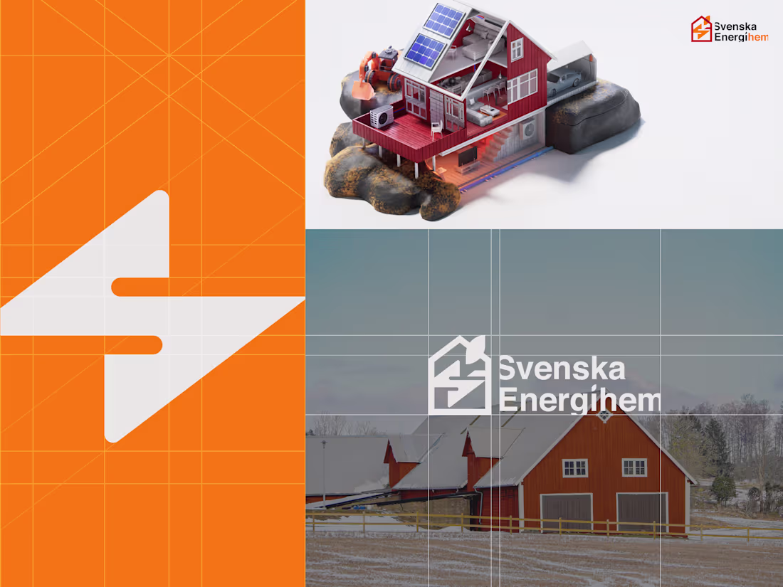
A Swedish energy company rooted in something every Swede recognizes - the red-painted homes.
Svenska Energihem is a Swedish sustainable energy solutions company.
We designed their brand identity with a logo inspired by the traditional red-painted homes you see across Sweden. Also created 3D graphics to bring their services to life on their website.
2
152
1
2
8
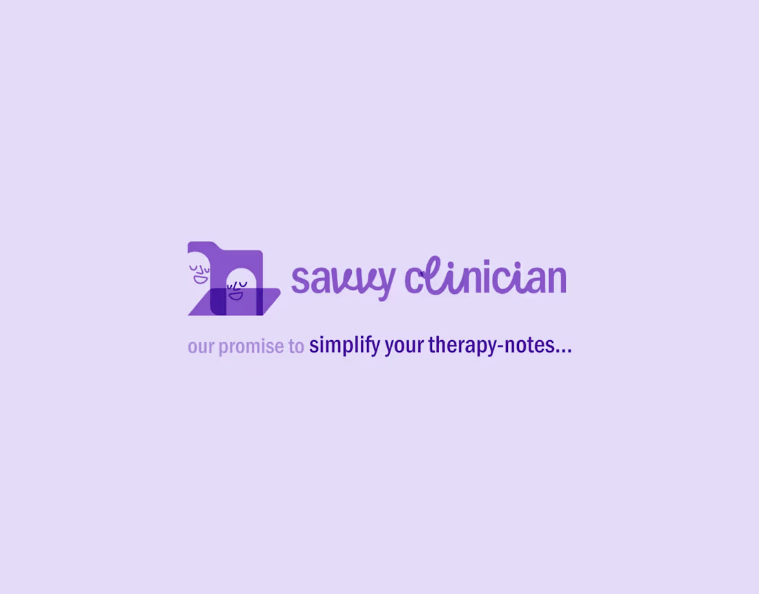
Savvy Clinician - Brand Identity and UX/UI Design
1
4
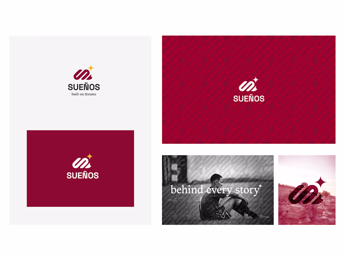
Brand and visual identity for a media and partnership strategy firm representing professional soccer players.
The brand was shaped to connect with young dreamers, capturing the journey from the very first goal to the rise that follows. Suenos is built on dreams.
2
176
1
2
6
Brand moves. Consistency is what keeps it recognisable.
2
89
Liftin' Workout App Animation Project
2
5
3D Printed a Crocs. No reason, just pure exploration.
Made with Houdini and Cinema 4D, rendered in Octane.
Thoughts? 🧠
3
215
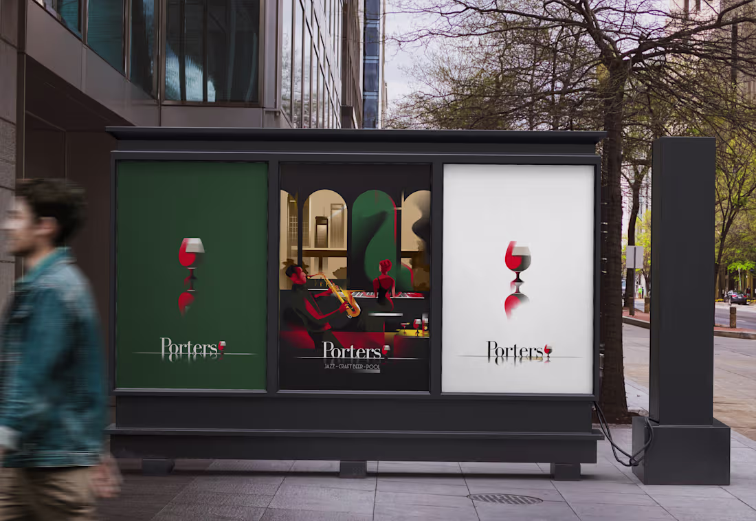
Porters Jazz Bar
1
5