The network for creativity
Join 1.25M professional creatives like you
Connect with clients, get discovered, and run your business 100% commission-free
Creatives on Contra have earned over $150M and we are just getting started
Back to feedPost
Currently building a new identity for an AI + fintech company in Dubai.
Still early, but this is one of the directions we’ve been exploring for the brand.
The idea was to avoid the usual “AI company” visual language and build something that feels more established, precise, and quietly futuristic.
We’ve been playing with geometry, light, and a much more restrained visual system around the mark.
Still developing this one, so I’m curious:
Would you push this direction further, or keep it this restrained?

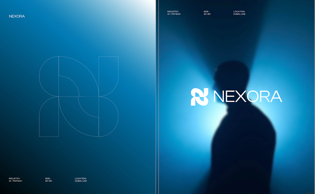

Honestly the logo presentation is impressive

Thank you so much.
You are most welcome Shazzad. was this an actual project?
Yes! This is an actual client project we’re currently working on for an AI + fintech company in Dubai. Still developing the full identity, so I’ll be sharing more as it comes together.

Incredible work bro. Keep it up.
Appreciate it bro! More from this project coming soon 🙌

The blue colour choice is spot on!
Thank you! We explored a few directions, but this blue ended up giving us the balance of trust, technology, and that more premium feel we were after.

I'd keep the mark this restrained and push the environment instead. The quiet geometry is what makes it read fintech rather than another AI startup, and in my experience that's the part still holding up a year later once the category's visual trends have moved on. The lighting...
Really good point, especially on letting the environment absorb the drama while the mark stays durable. That separation between what should feel timeless and what can evolve with the visual language is something we’ve been thinking about too. Appreciate the thoughtful take.

This is amazing!!
Thank you Celia! Really appreciate it 🙌

Love the freshness of ideation and implementation, that's how a premium design should look like 🧑🎤
Appreciate that! “Premium without overdoing it” has been one of the things we’ve been trying to protect throughout this direction, so glad that came through.

Love the color palette, it feels premium and intentional.
Thank you! We wanted the palette to feel technological without immediately falling into the typical AI/fintech visual language. Glad it’s reading that way.

The blue gradient and blurred imagery give it a really distinctive, premium feel. 🔥
Appreciate it! The blurred imagery ended up being a big part of giving the system some atmosphere while keeping the identity itself restrained.

The restraint is what actually sells "established" here, that silhouette with the mark peeking through reads more like a trust brand than another gradient-blob AI startup. I'd keep it right where it is rather than pushing further. Has the client reacted well to leaning away from...
This is exactly the tension we’ve been working through. We want it to feel forward-looking without relying on the visual shortcuts that immediately scream “AI startup.” Keeping the mark quieter and letting the environment create the atmosphere feels like the stronger direction. Really appreciate this take.

beautiful presentation here!
Thank you! Really appreciate that 🙌


push it further tbh, more minimal could hit even harder
Interesting, I can see that. We’ve been debating how far to strip it back without losing the character. Might have to explore an even more minimal direction and see which one holds up better.

Excellent job! 🔥
Thank you! Appreciate it 🙌

Keep it restrained. Nexora already reads established and quietly futuristic, and that calm is exactly what makes a fintech feel safe with your money. Pushing it louder would just pull it back toward the usual AI-company look you are trying to avoid. The silhouette plus soft glow is plenty of drama.
That’s exactly the tension we’ve been thinking about. The more we push it, the easier it is to lose that sense of calm and trust. I like your point about letting the silhouette and lighting carry the drama instead of asking the identity itself to do too much.


Good work👏🔥🔥
Thank you! Really appreciate it 🙌

Good idea and honestly your logo design is feels modern professional design I like it ❤️❤️
Thank you Mostafa! Really appreciate that. We wanted the mark to feel modern without overcomplicating it, so glad that came through 🙌


I’d keep the core identity restrained and test how far the system can stretch through motion, lighting, and composition. That gives the brand room to feel futuristic without making the logo do all the work.
Exactly. I’m leaning toward that separation too. Keep the core identity disciplined, then let motion, lighting, and composition give the system more range. Appreciate the thoughtful take.

Clean and memorable. The icon mark is absolute perfection.
Thank you! Really glad the mark stood out to you 🙌

I like how restrained this is. It feels confident without leaning on the usual futuristic or AI visual cues. The geometry and light keep it precise, but still give the mark room to breathe. I’d keep the identity quiet and let the more expressive moments come through in motion or...
Really like how you framed this. Keeping the identity quiet while letting motion and other applications become more expressive gives us a lot more room to build the system without overworking the mark.

Really like the atmosphere here. The blurred imagery and minimal mark give it a strong futuristic feel.
Appreciate that! The contrast between the minimal mark and more atmospheric imagery was a big part of the direction, so glad that came through.

the logo just have to be easy to identify without doing a lot
this is nice
Exactly. We wanted the mark to be recognizable without asking it to carry the entire personality of the brand. Appreciate it!

This restraint feels like the right counterpoint to the usual AI visual noise. The geometry and light treatment sound promising—I'd keep the system quiet and let the mark’s precision carry the futuristic feeling.
That counterpoint to the usual AI visual noise is exactly what we were aiming for. The more feedback I’m seeing, the more I think the restraint is actually one of the direction’s strongest qualities.

color is just ummmm
Haha appreciate it 😄 The blue has definitely become one of my favorite parts of this direction too.

This deserves more than just liking, this deserves to be featured! 🏆 Moving away from cliché AI visual tropes to build an established, precise brand system looks phenomenal.
Really appreciate that! We deliberately wanted to move away from the usual AI visual shortcuts, so it’s great to hear that the more established and precise feeling is coming through.

Amazing work
Thank you! Appreciate it 🙌

Love the logo !!
Thank you! Really glad you like the mark 🙌

avoiding the usual AI company look is the right call, most of them end up with the same glowing gradient. established and precise is exactly what you want when it's someone's money
Exactly. Especially in fintech, we felt trust and precision needed to come before trying to make everything look aggressively futuristic. The challenge has been making it feel forward-looking without falling into those familiar AI visual tropes.

Amazing.

Very Impressive Work 🔥 💯

Lovely

The UI is visually appealing while keeping everything clean and easy to use. Good job!
The network for creativity
Join 1.25M professional creatives like you
Connect with clients, get discovered, and run your business 100% commission-free
Creatives on Contra have earned over $150M and we are just getting started











Related posts

A little peek at the brand work we did for Elio Mortgage.
A warm, approachable identity full of warm vibrant colors paired with soft sun rising inspired gradients, inner glows and custom illustrations & more. Loved this direction!
Full case study coming soon, from process to final identity.
Plenty of logo explorations to share too!


That color palette takes the whole identity to a different level!! I loove it.

Brand Expressions -- Olivir


Thats so crazy!!!!!! Seeing this I feel we humans are still far better than AI

Figma Football
An unofficial football concept inspired by Figma and its visual language.
The ball was created using a custom 3D generator I built in ChatGPT, with animated interface icons and graphics developed with Claude.
Part design experiment, part exploration of how custom AI-powered tools can become part of the creative process.

The interface icons translate surprisingly well into a football identity.