Man my latest update through my website desgin i did a lot of animation with framer and procreate also i added some coolest sections and manifest the neo brutalism UI/UX
1
2
90
📱 What the App Is
It’s an driven editorial / fashion content app — something like a digital magazine mixed with content creation tools and Neo brutalism knowledge
Tool used stitch
App link https://air-uk-editorial-archive-162591464657.europe-west2.run.app/
🧭 Navigation & Sections
Bottom bar = navigation between:
Home
Archive
Profile
Categories
💡 Overall Purpose
This app is designed to:
Help creators build digital magazines
Use to generate text + visuals with neo brutalism
Showcase content in a modern editorial style
📰 Editorial Feed (right screen)
Looks like a fashion magazine layout
Includes:
Featured articles
Quality portraits
Headlines and categories
Example content:
Fashion trends
Featured creatives
Visual storytelling
17
94
4.8K
Simple minimalist web app
8
340

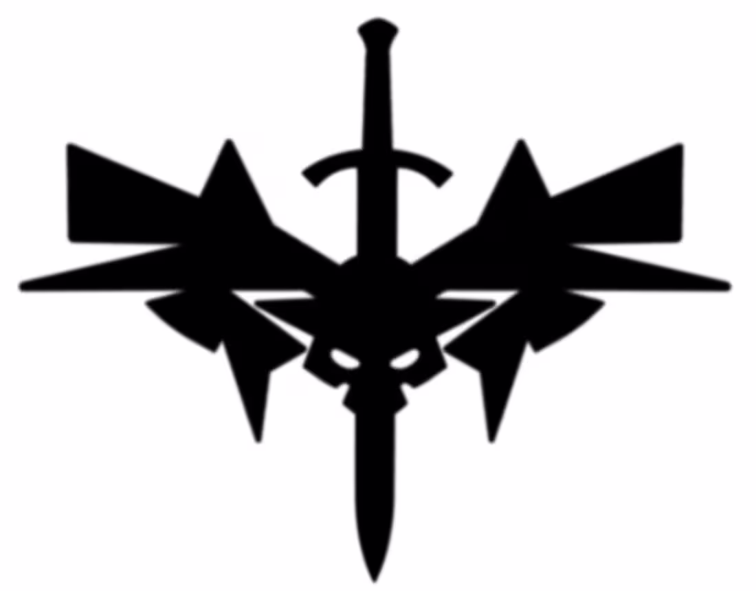
A symmetrical logo design that i did with Adobe Illustrator
4
218
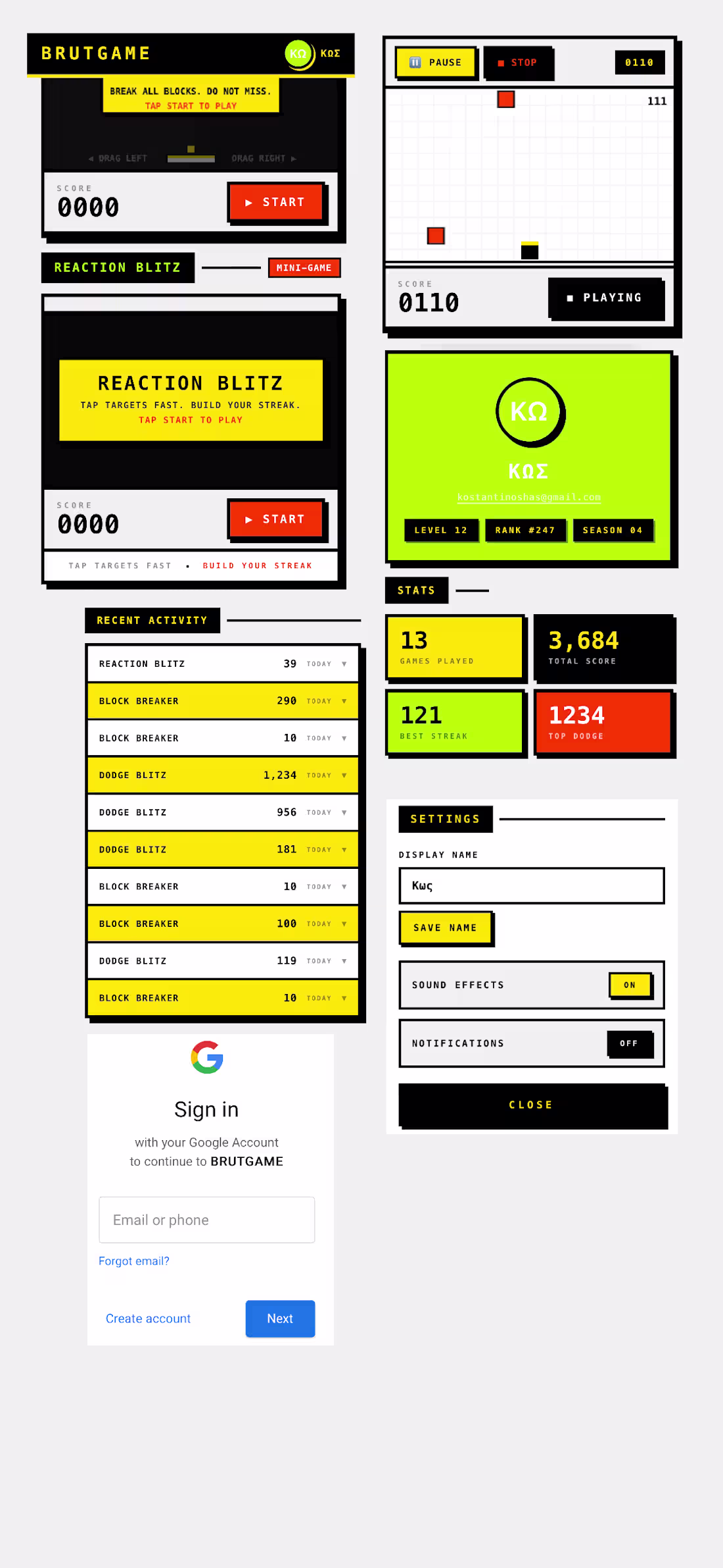
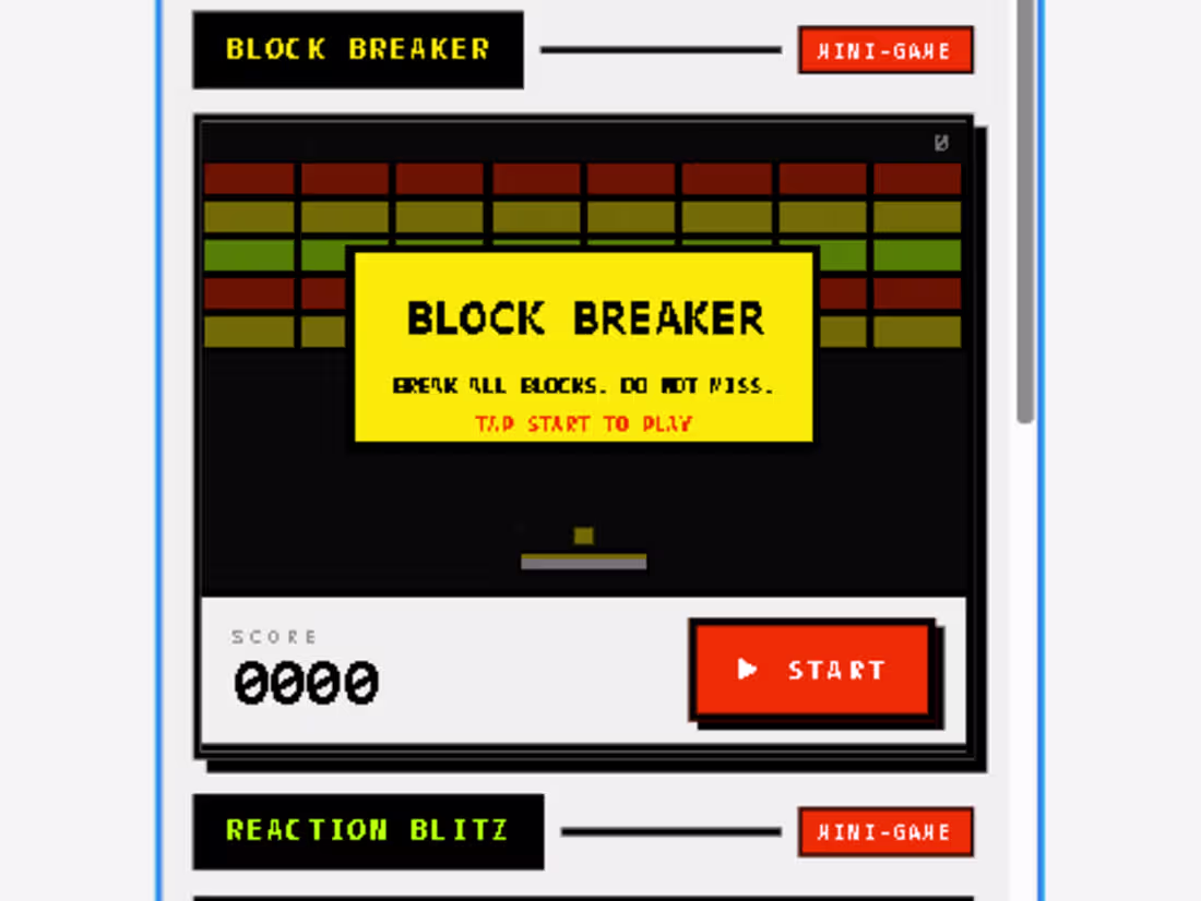
BRUTGAME – Full Project Review
made this prototype app with magicpath
🧠 1. Core Concept
BRUTGAME is a minimal arcade-style mobile game platform focused on:
Fast reaction-based gameplay
Short “mini-games” (e.g. Reaction Blitz, Block Breaker, Dodge Blitz)
Score chasing & streak building
👉 The concept is essentially:
“Quick dopamine-driven micro-games with competitive scoring.”
This fits perfectly into:
Casual mobile gaming
Hyper-casual market (like Flappy Bird or Stack)
🎯 2. Gameplay Breakdown
🔹 Game Modes
Reaction Blitz
Tap targets quickly
Focus: speed + accuracy
Block Breaker
Classic arcade mechanic (Breakout-style)
Dodge Blitz
Avoid obstacles
Focus: reflex + timing
👉 This variety keeps engagement without complexity.
🔹 Core Loop
Tap Start
Play a short session (10–60 seconds)
Get score
Improve streak / beat record
Repeat
✔️ Strong loop → addictive potential
🎨 3. Visual Design Analysis
🟡 Color System
Primary: Neon Yellow / Lime Green
Secondary: Black / White / Light Grey
Accent: Orange (CTA buttons)
👉 This gives:
High contrast
Retro arcade feel
Instant readability
🧱 UI Style
Bold rectangular blocks
Thick borders
Pixel/retro influence
Grid-based layout
👉 Feels like:
Arcade cabinet UI
Brutalist + retro hybrid
🔠 Typography
Monospaced / pixel-inspired
All caps
Tight spacing
✔️ Works well for:
Score emphasis
Game feel
❗ Slight issue:
Can feel aggressive if overused
🧩 4. UX & Structure
🏠 Home Screen
Game title + instructions
Clear CTA (START)
Simple onboarding
✔️ Very clean
✔️ No confusion
🎮 Game Screen
Minimal distractions
Score always visible
Pause / Stop controls
✔️ Great for focus
✔️ Good feedback loop
📊 Stats System
Games played
Total score
Best streak
Top dodge
👉 This adds:
Progression
Motivation
📜 Activity Feed
Shows recent sessions
Daily tagging (“today”)
👉 Smart feature → creates habit loop
⚙️ Settings
Display name
Sound toggle
Notifications
✔️ Simple, no clutter
✔️ Matches casual game expectations
3
241
I did my prototype using magic path mini fun Neo brutalism game app
2
212
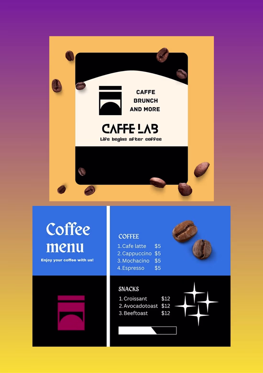
From a logo to a branding menu
5
231
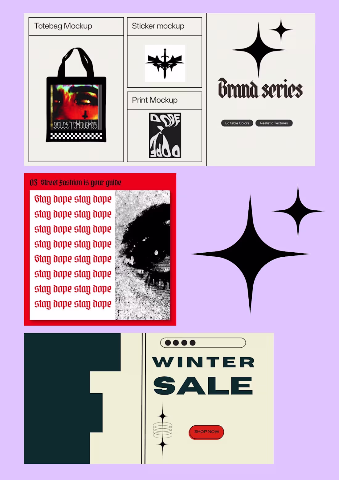
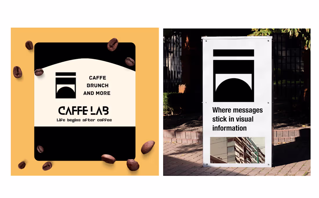
How to maintain brutalism through blogging pages store
Full project overview
link (https://www.behance.net/gallery/246756617/Brutalist-Identity-for-Streetwear)
3
187
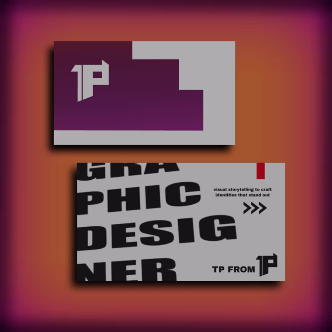
This project represents an exploration of modern branding through simplicity, contrast, and custom visual systems.
From the logo to the gradient and mockup, every element was designed to work together as a cohesive identity.
full project overview link (https://www.behance.net/gallery/246696119/TP-Branding-Custom-Business-Card-Gradient-Identity)
4
189
How a shape can transform into a visual logo style
Full project overview Link (https://www.behance.net/gallery/246634003/Minimal-Brand-Identity-from-Simple-Shapes)
1
157
LogoDesgin
1
2
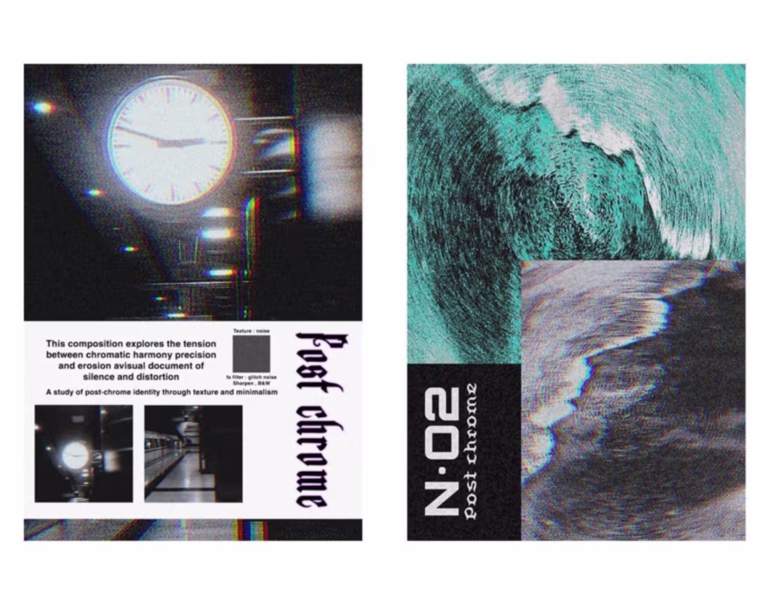
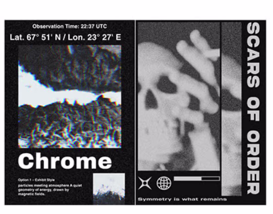
Post Chrome – Visual Study
2
5
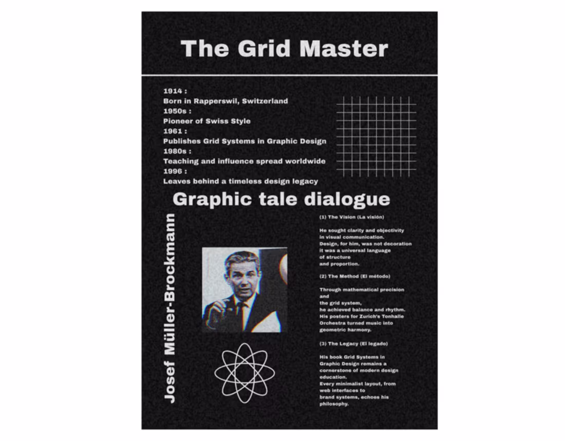
Josef müller brockmann
1
3
Ski mask noir sketch
1
3
Logo design
1
0
Echoes of Symmetry
1
5
Street photo Athens pt2
1
0
Cover portfolio
1
7
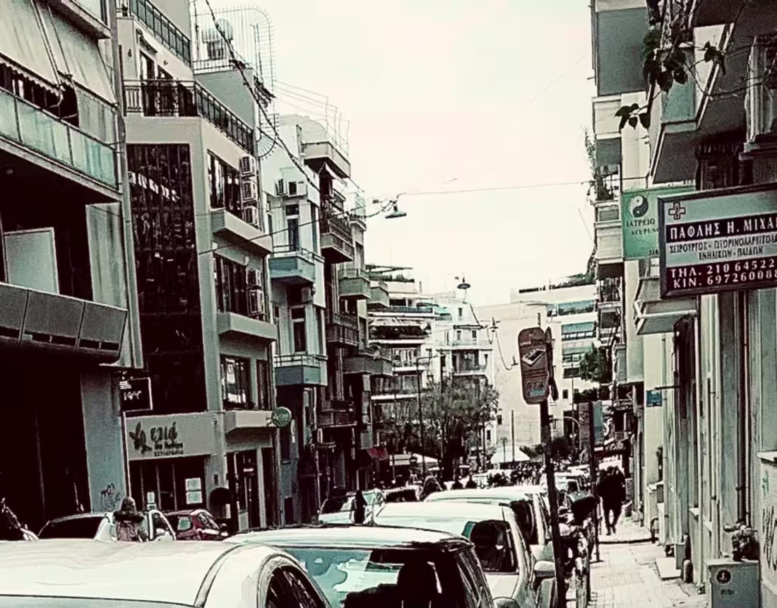
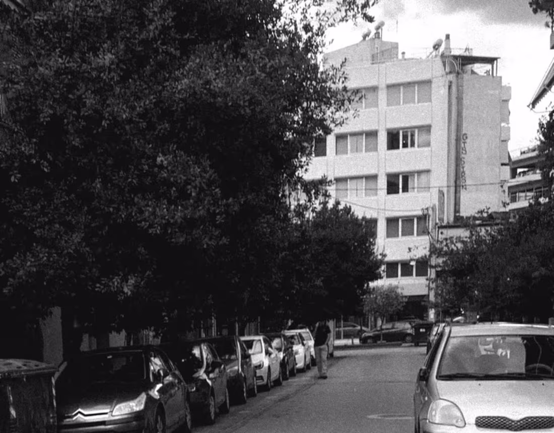
Street photo ATHENS DUST
1
1
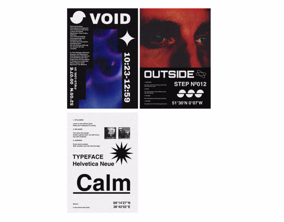
Exploration of Space
2
4
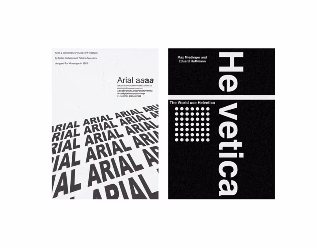
Typeface
1
4
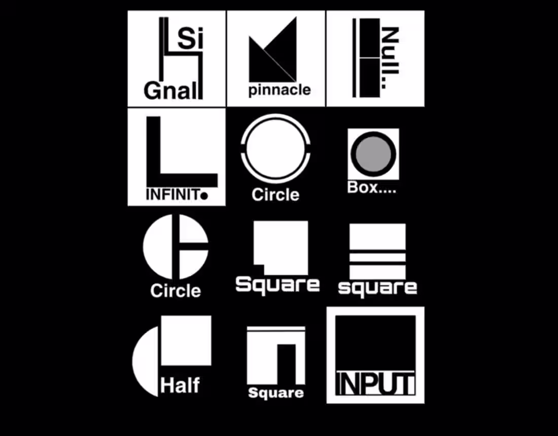
Logo icons 3
0
1
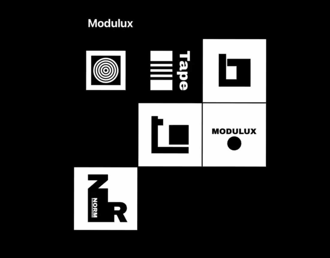
MODULUX logo
1
3
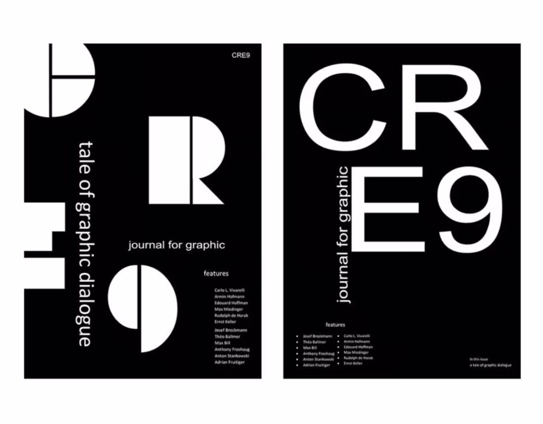
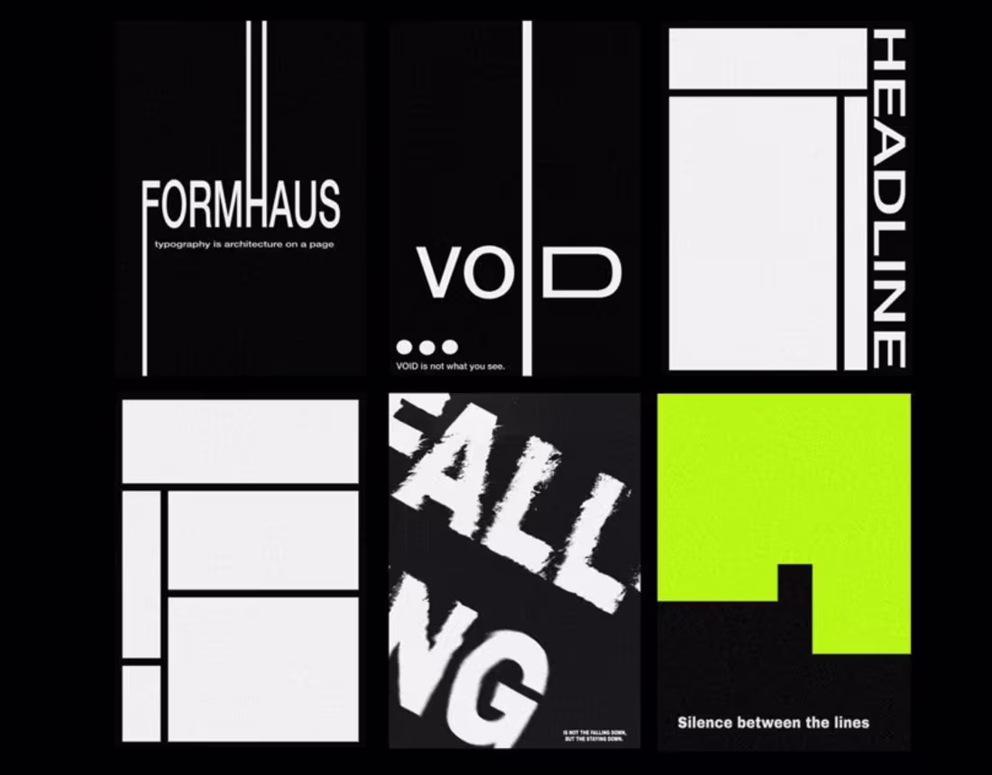
Cre9 Typographic Identity
1
3
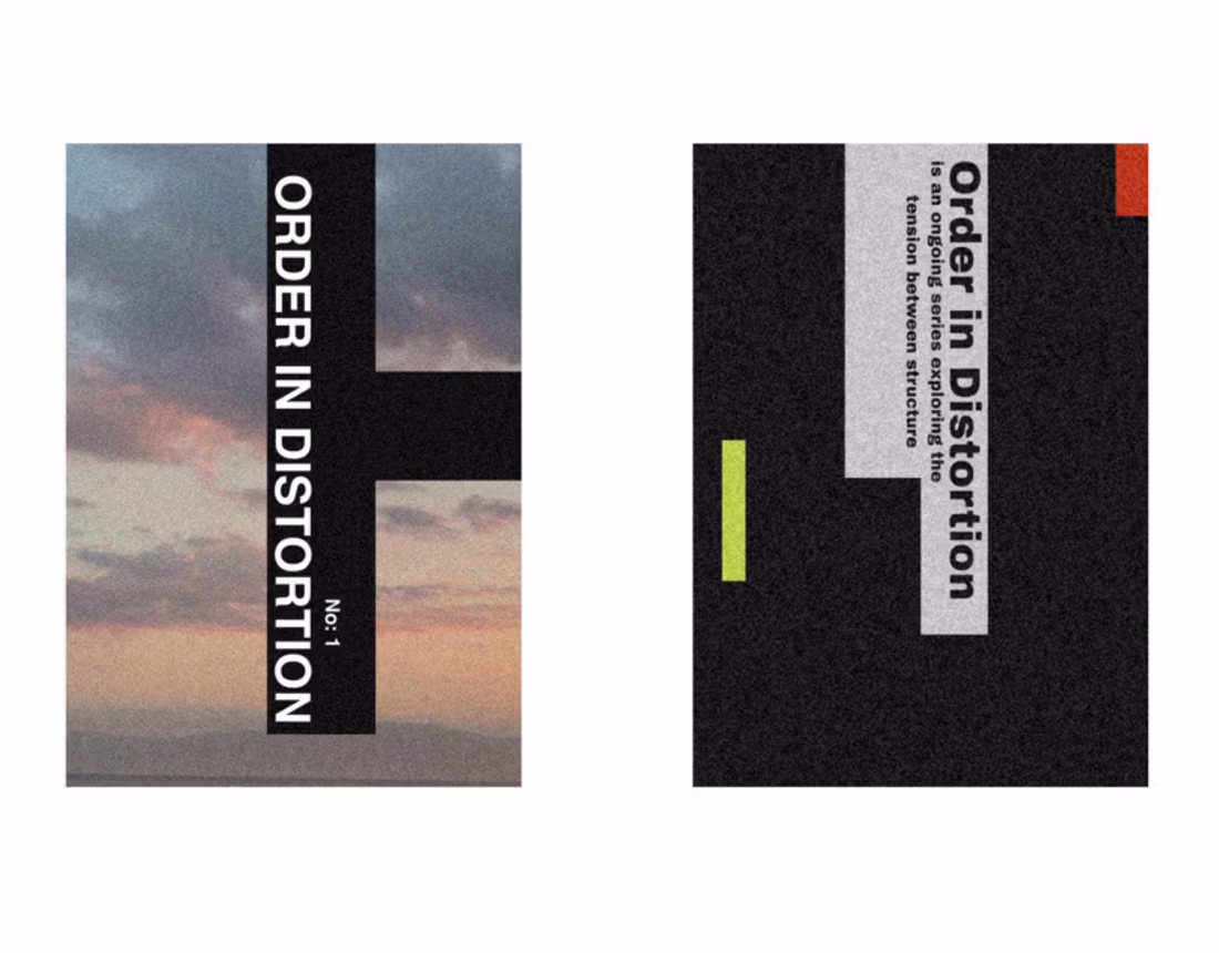
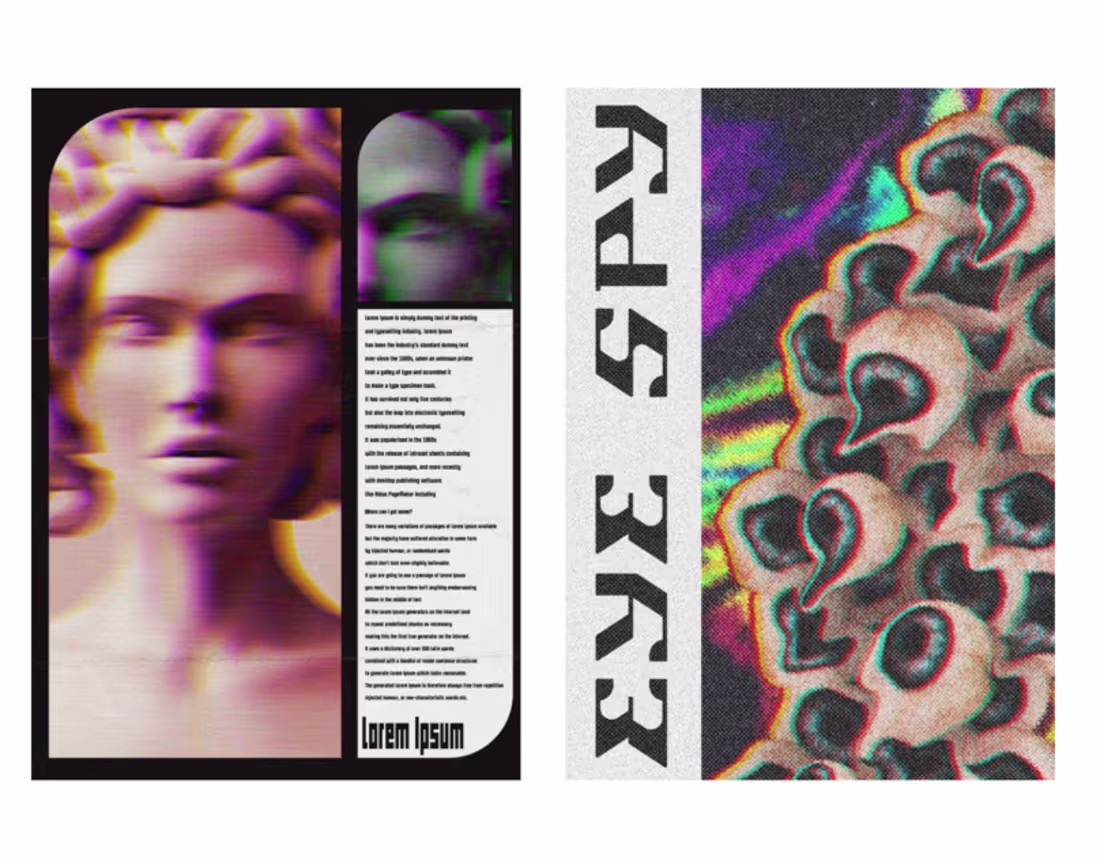
Order in Distortion
1
2
Logo modernism
2
3
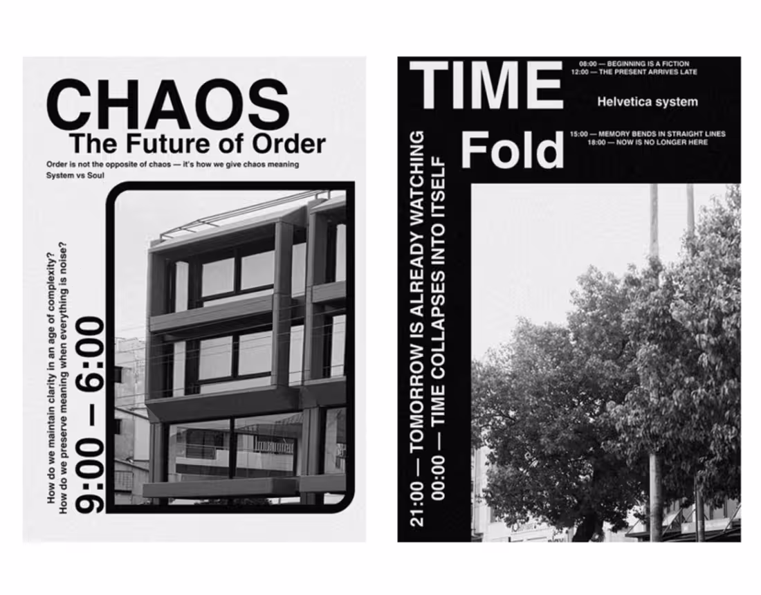
30 days design
1
6
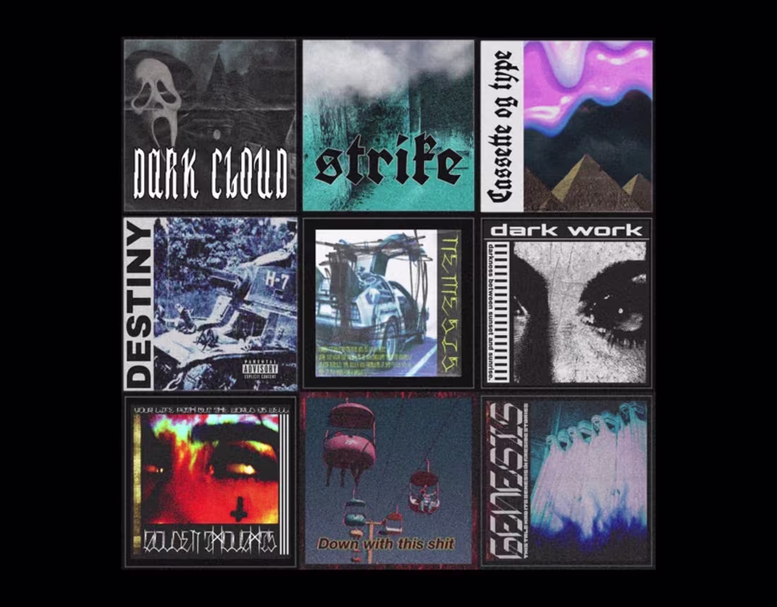
Brutal Ideology
1
6
Brutalist Visual Exploration
1
1