MODULUX logo
Constantine Has

MODULUX in Minimal Logo Systems
🖤 Introduction
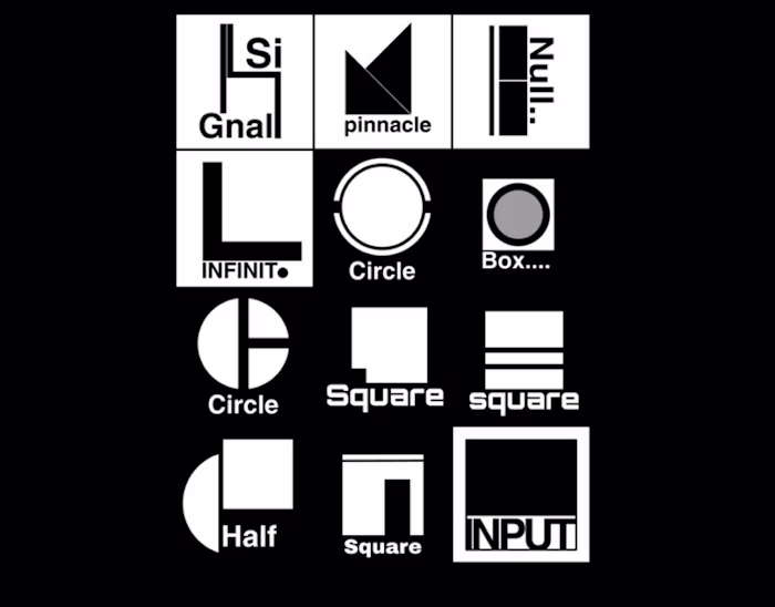
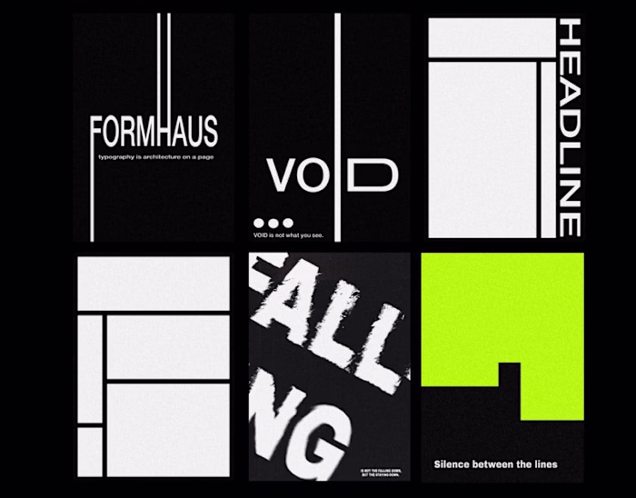
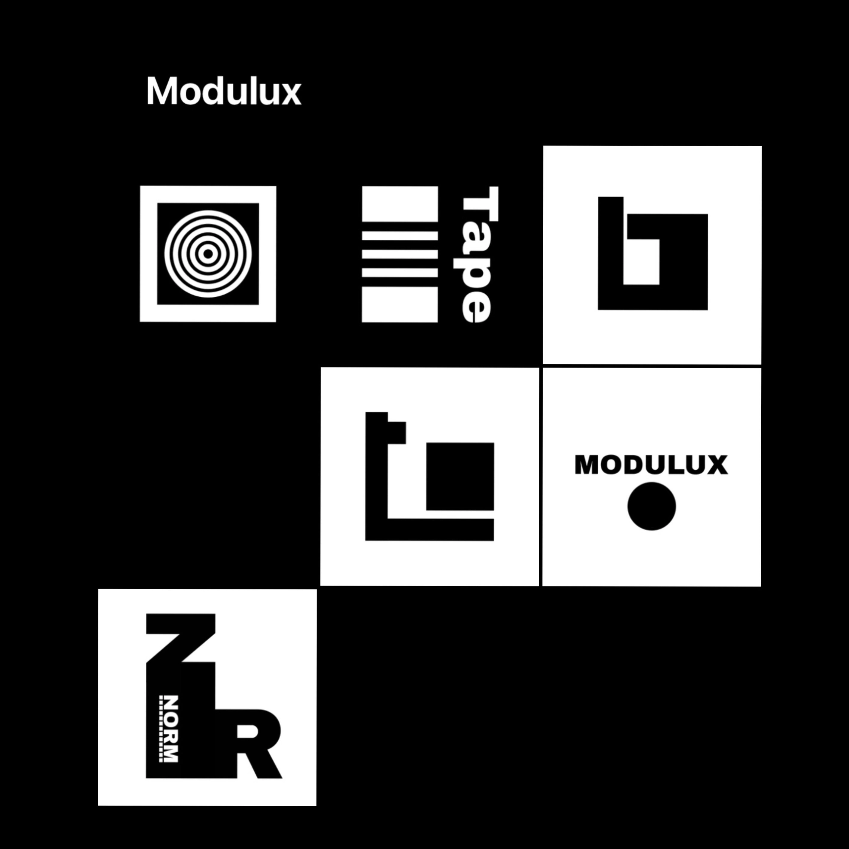
MODULUX is a visual exploration of minimalist logo marks driven by geometry, symmetry, and structural abstraction. This project focuses on reducing forms to their most essential expression — stripping away the decorative to reveal the core of visual identity.
Each logo was designed to challenge the boundary between letterform and symbol, between abstraction and function.
🎯 Approach
This series is rooted in a love for form, logic, and spatial harmony. Influenced by the clarity of Swiss design, the repetition of modular grids, and the visual power of contrast, each mark was built to:
Work in monochrome
Scale seamlessly across formats
Suggest meaning without being literal
The project lives between branding and visual research — a modular toolkit of ideas that could evolve into dynamic identity systems.
🧱 Design Language
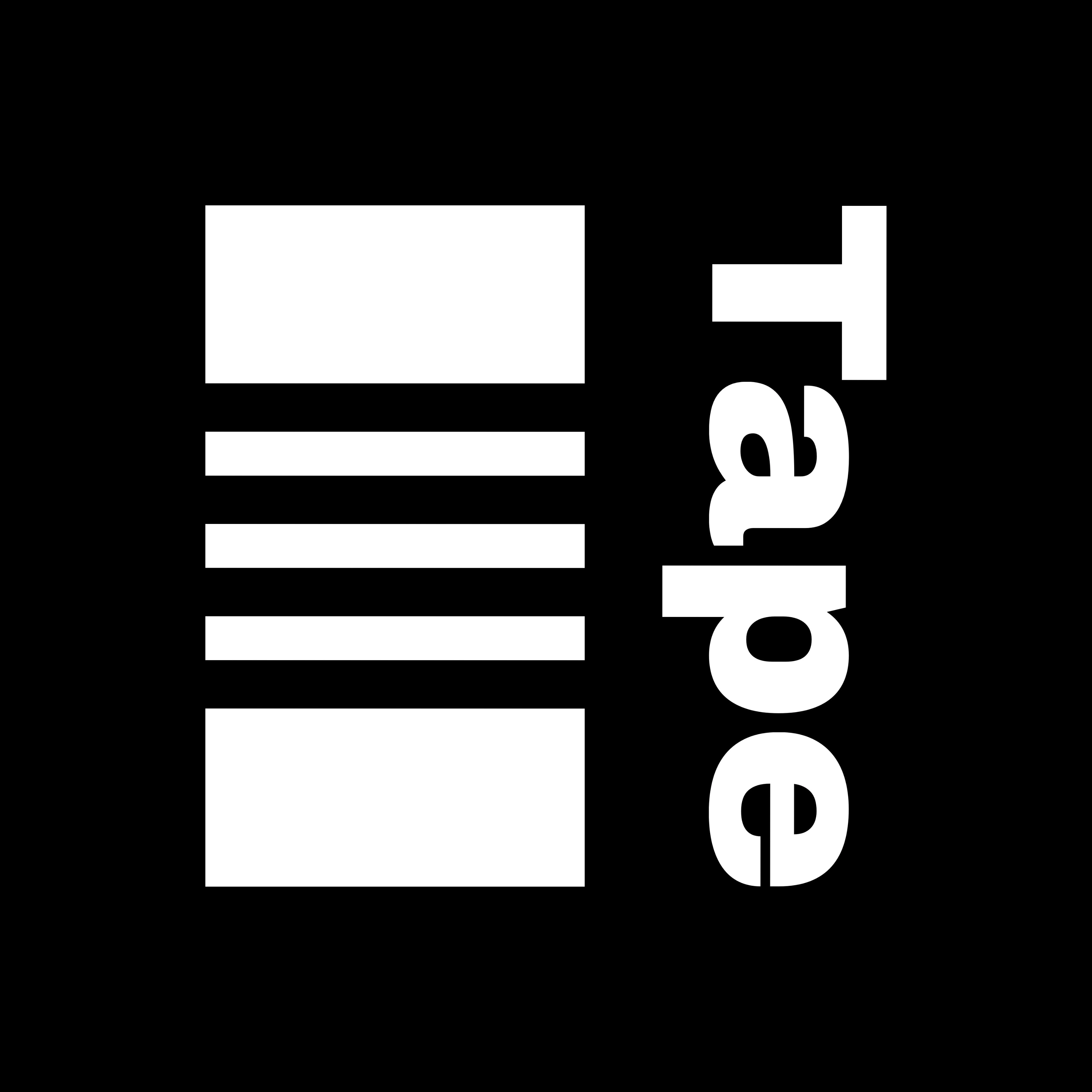
Black & white only
Strict grid alignment
Typography used as a structural element
Symbols crafted for both standalone and lockup applications
🧰 Tools Used
Adobe Illustrator
Paper & pencil (initial sketches)
Grid overlays
Optical balance adjustments (no auto-alignment)
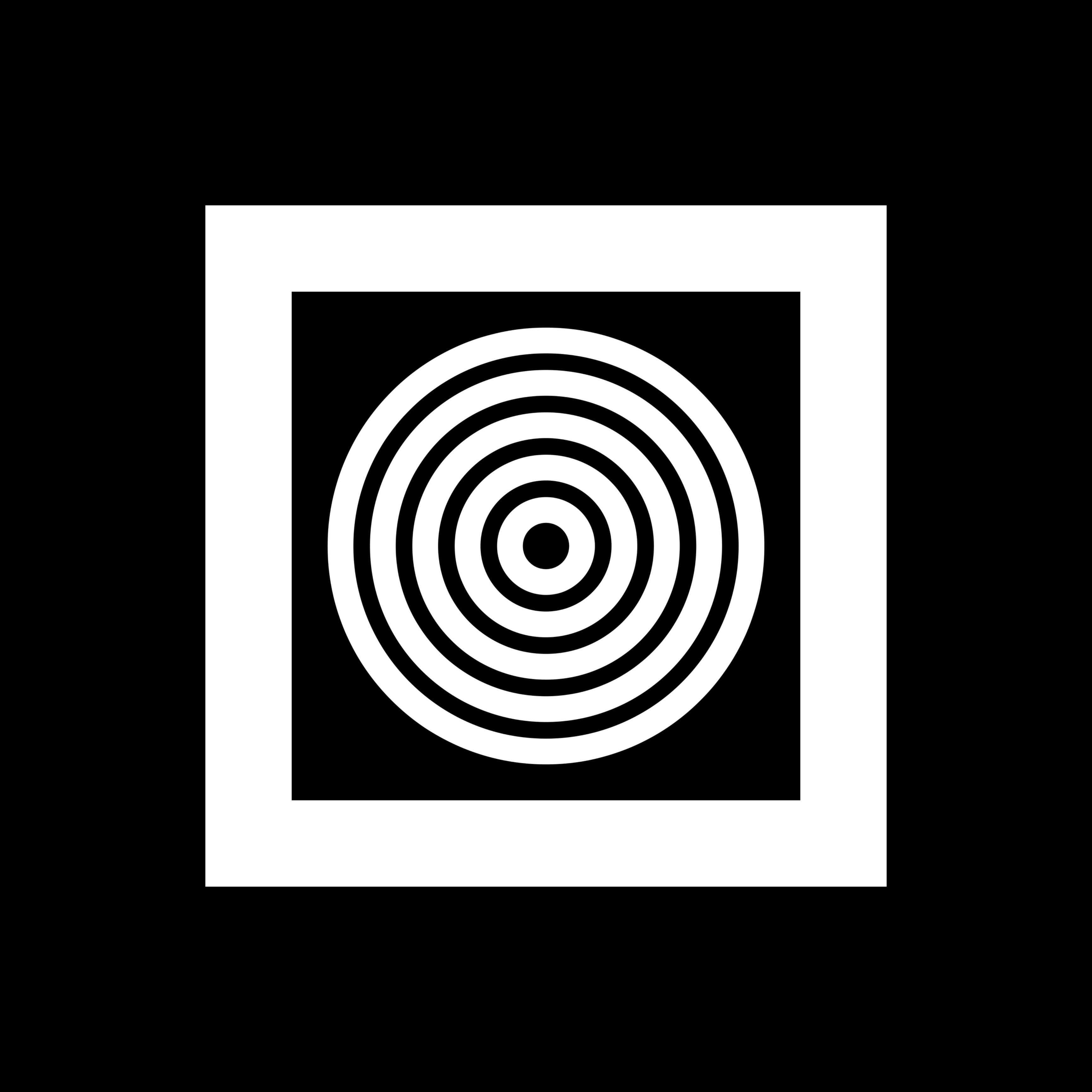
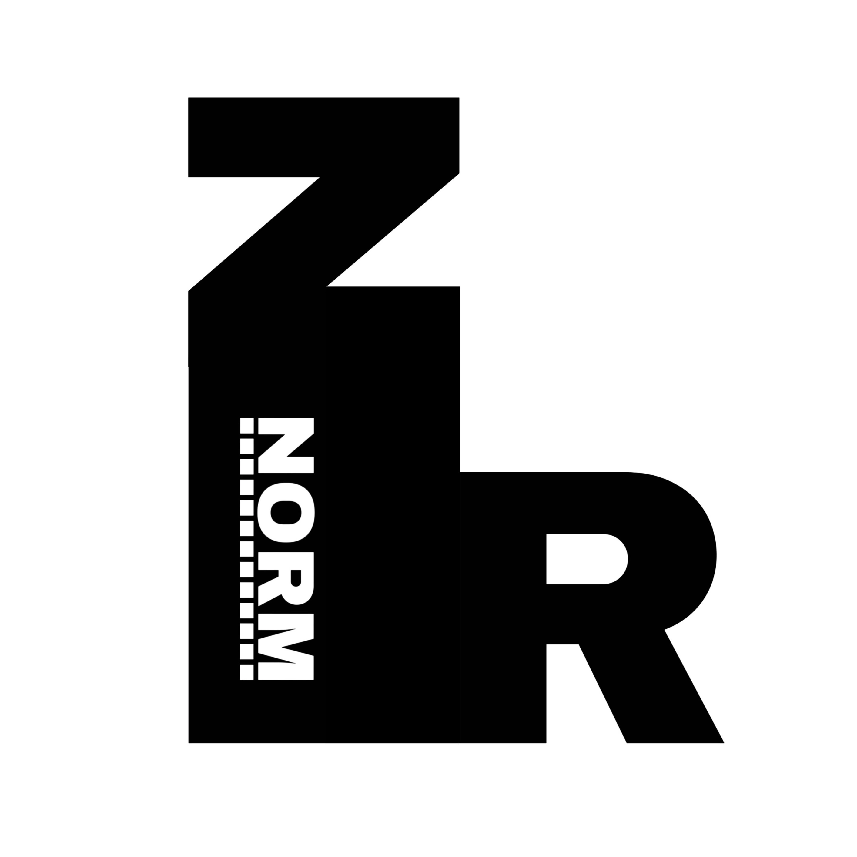
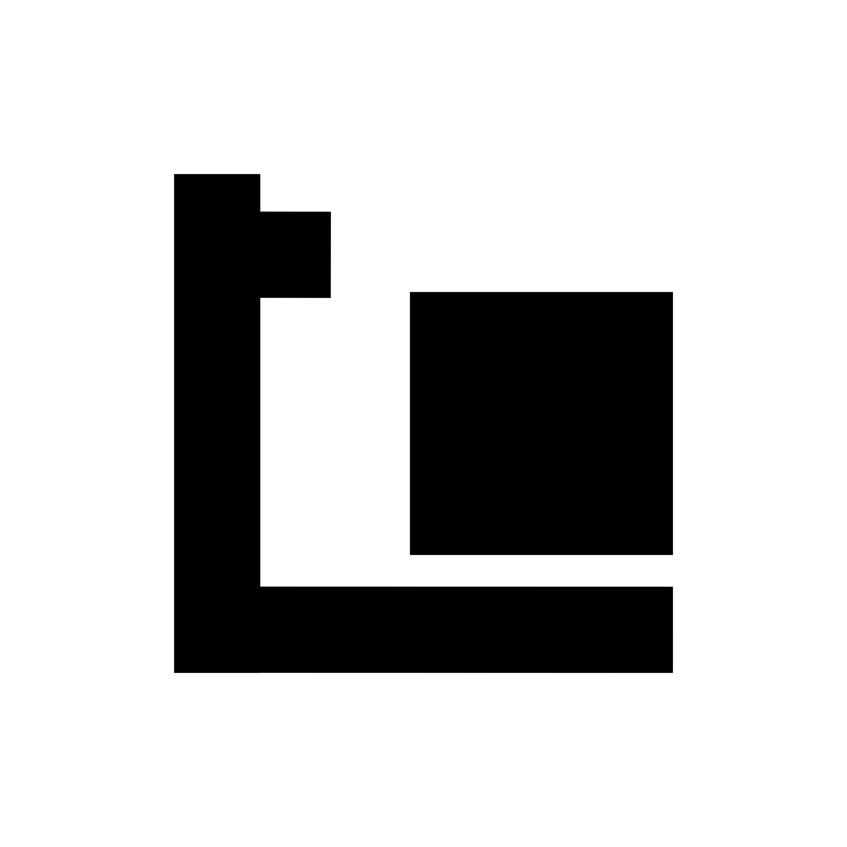
📸 Visual Showcase
(Insert logo images with clean white or black backgrounds. Consider showing them in mockups: signage, packaging, mobile apps, stamps.)
✍️ Reflection
MODULUX is a personal archive of visual reduction — a collection that values quiet strength, intentional design, and sharp identity thinking. These logos are not just marks, but invitations: to build, scale, and brand with clarity.
🙌 Appreciate & Connect
Enjoyed the project? Hit appreciate 💙, leave a comment, or follow for more minimal experiments
Like this project
Posted Mar 27, 2026
Likes
1
Views
3