30 days design
Constantine Has
Visual 30 days challenge in Swiss-Style Graphic Experiments
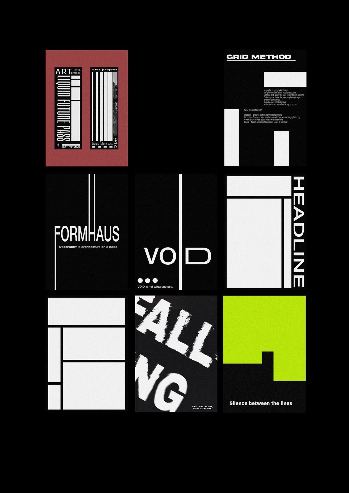
In an age of algorithmic chaos and visual clutter, the return to grid-based order feels revolutionary. This project — a personal 30-day design challenge — explores the power of Swiss modernism through a minimalist, disciplined lens. The visuals, composed of nine striking compositions, channel the core principles of the International Typographic Style while infusing them with contemporary nuance.
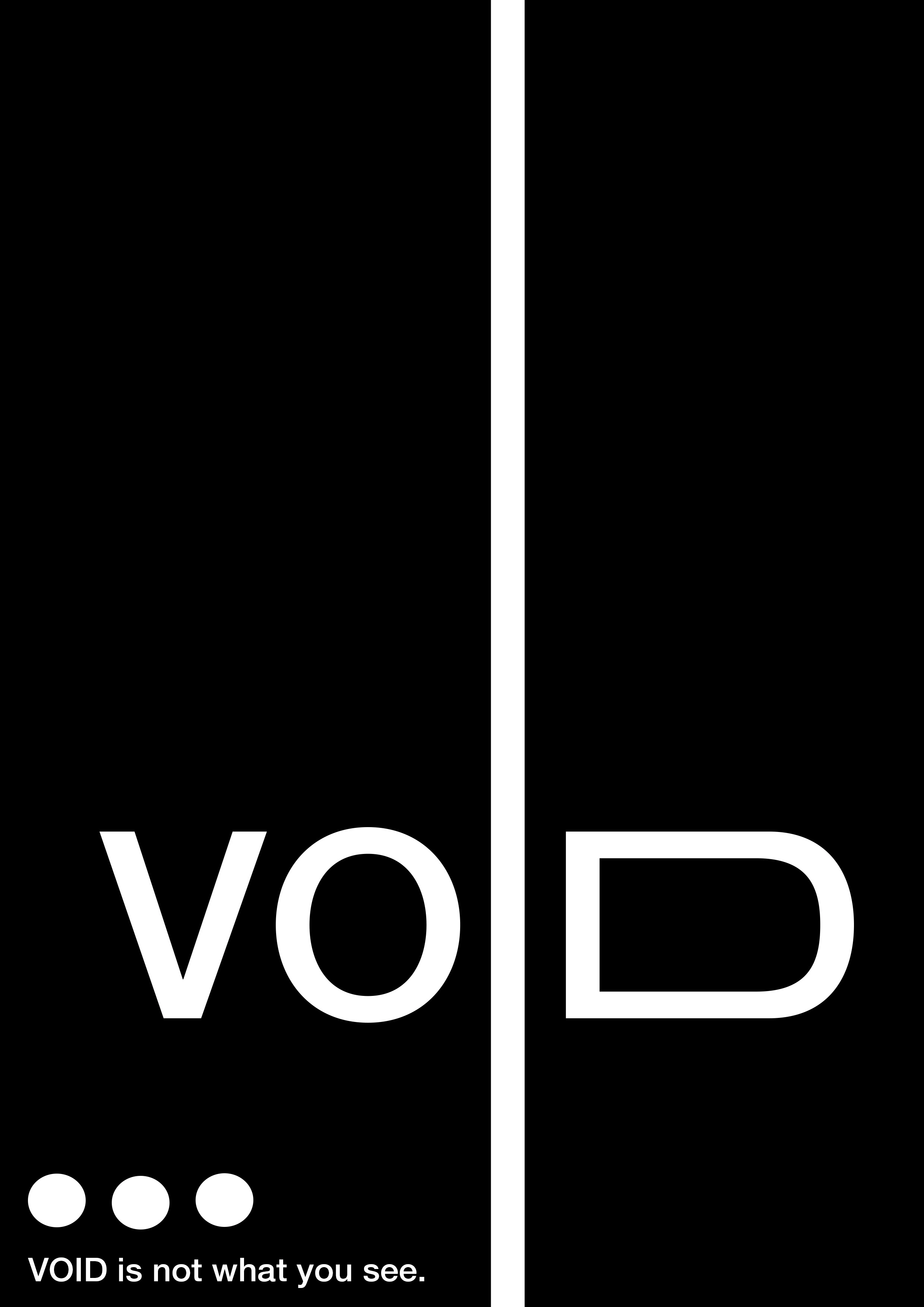
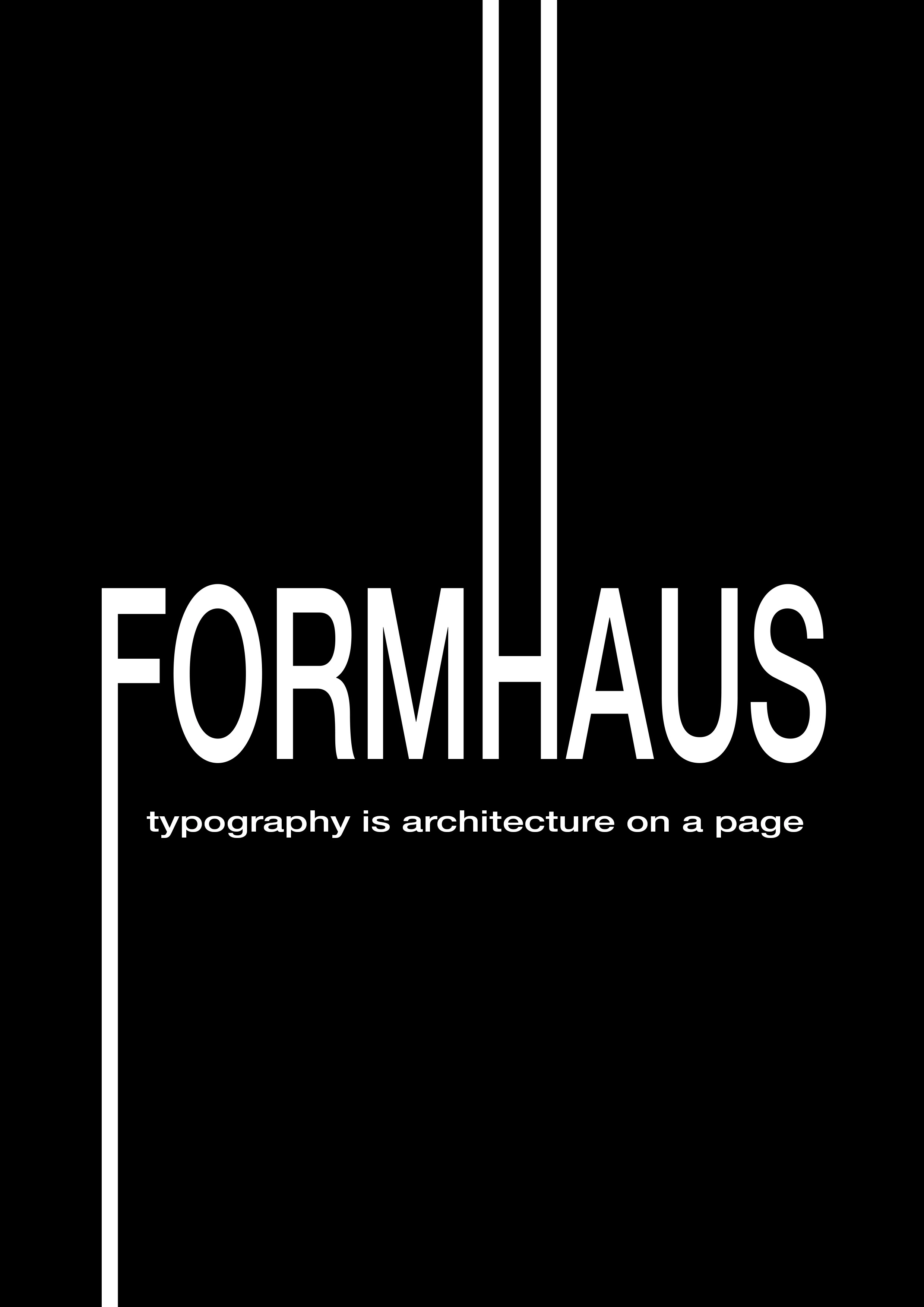
FORMHAUS & VOID — Typography as Architecture
At the center of this collection are two anchor pieces:
"FORMHAUS" declares: “Typography is architecture on a page.”
"VOID" answers: “VOID is not what you see.”
These aren’t mere posters. They’re philosophical inquiries into the space between form and absence. Using vertical line division and stark asymmetry, both pieces evoke a feeling of architectural rhythm. The grid is no longer invisible — it becomes a protagonist.
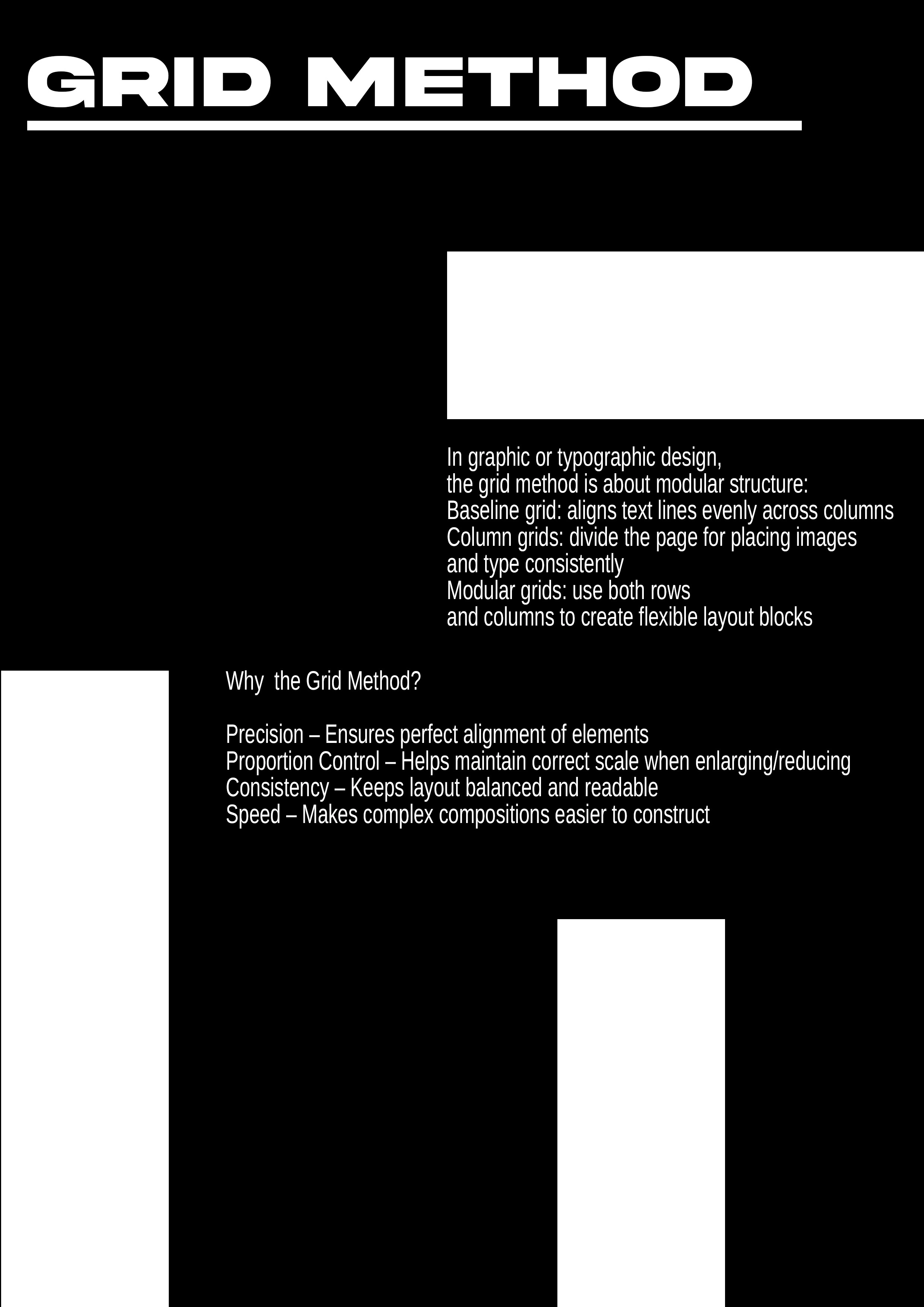
The Grid as Method and Message
“Grid Method” offers a literal and conceptual guide, breaking down why the grid matters:
Precision. Control. System. Simplicity.
This panel uses the modular grid as both layout and symbol, visually echoing the textual content. The alignment is surgical, the balance — deliberate. This is Josef Müller-Brockmann’s DNA reborn in pixels.
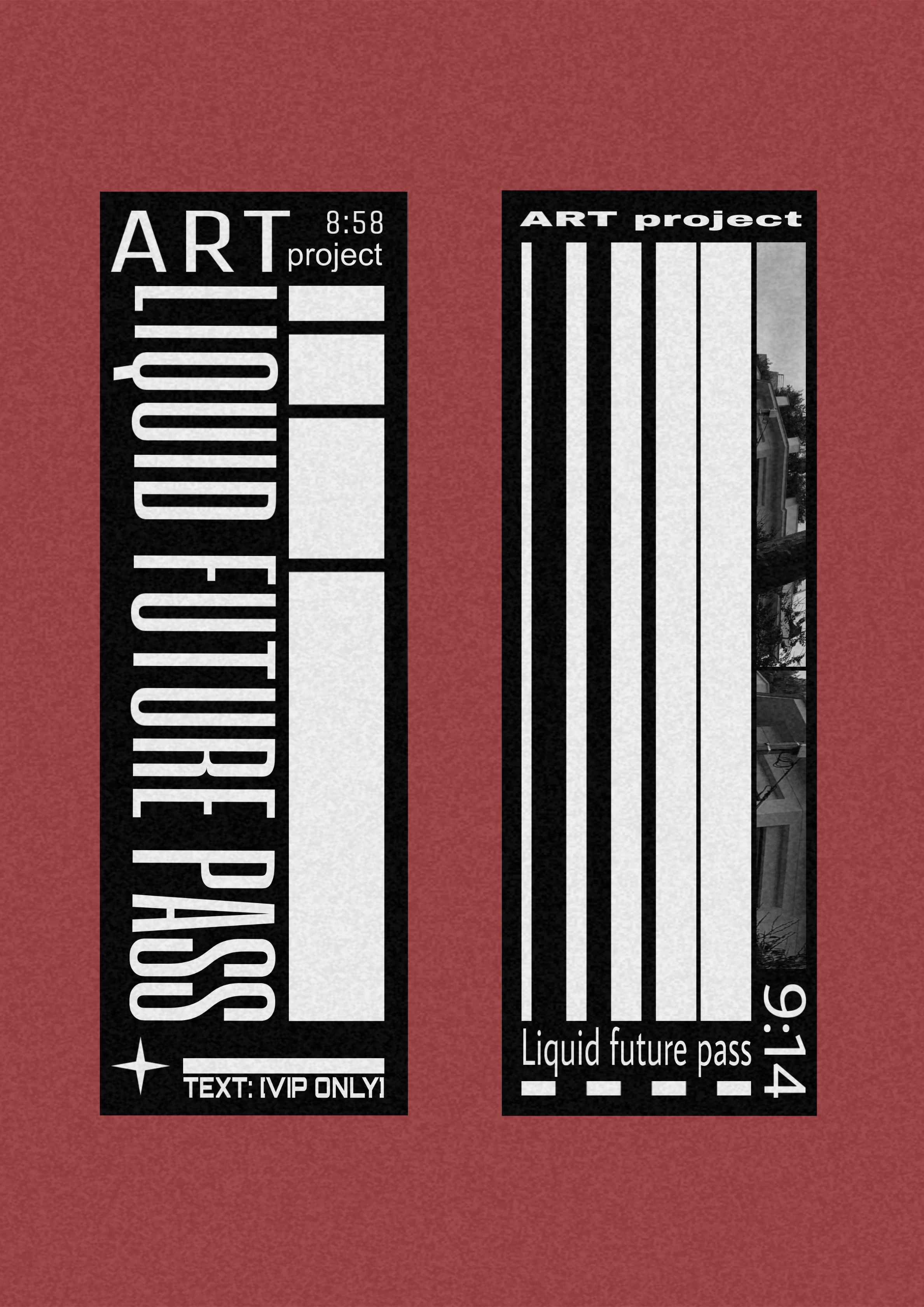
Liquid Future Pass & High-Line — Editorial Brutalism
Borrowing from ticket design and editorial fragments, these panels mix tight vertical constraint with layered content. One piece plays with monospaced alignment and barcode rhythm, while the other introduces color blocking and brutalist texture, reminding us that modernism can bleed, too.
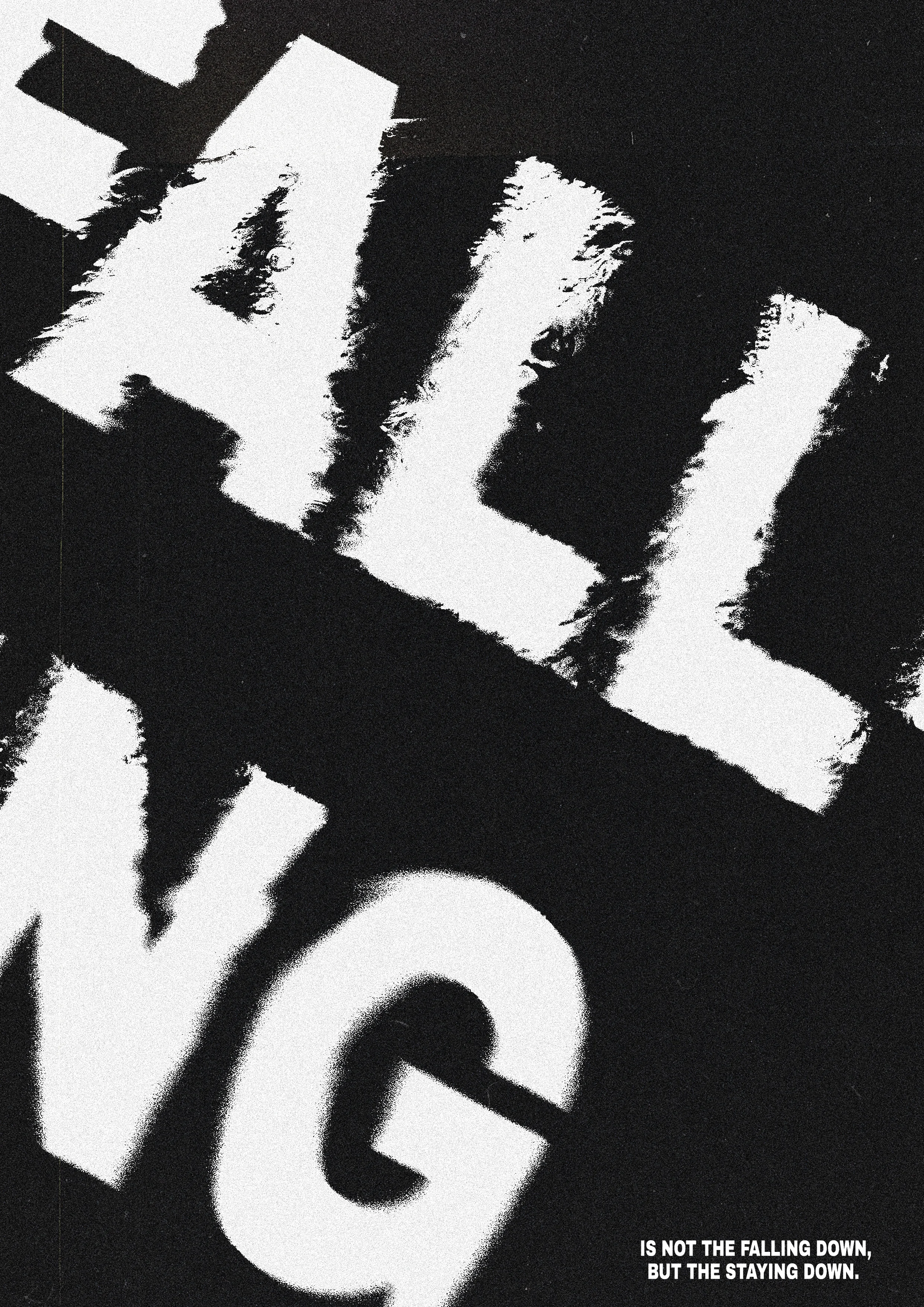
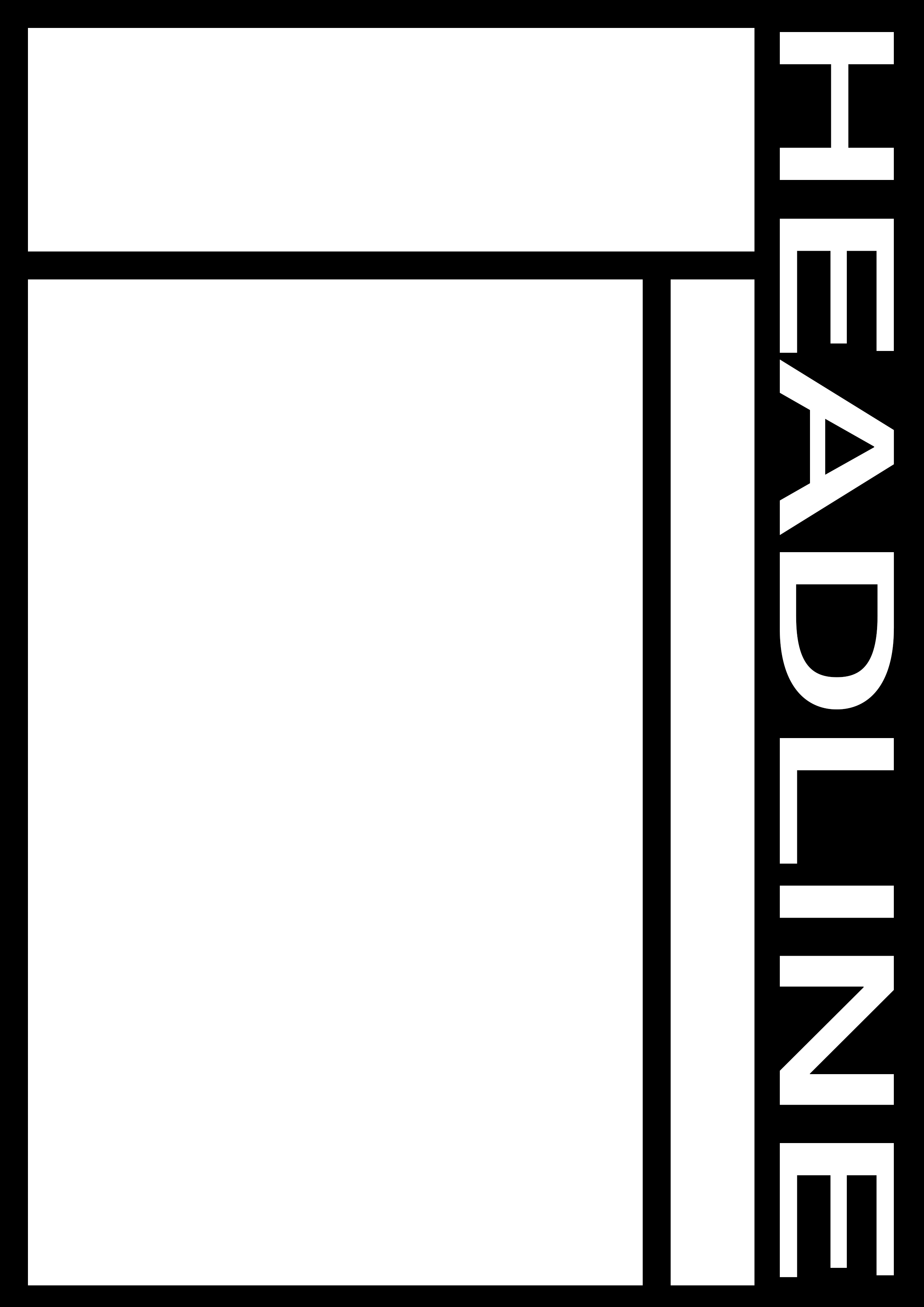
Headline & Falling — Breaking the System from Within
On one side, "HEADLINE" is clean and authoritarian — a column of sans-serif logic. On the other, "FALLING" disrupts the calm: distressed typography bursts through the grid, suggesting collapse, conflict, or emotion breaking the rationalist framework.
This duality captures the tension between control and chaos, a recurring theme in post-modern Swiss experimentation.
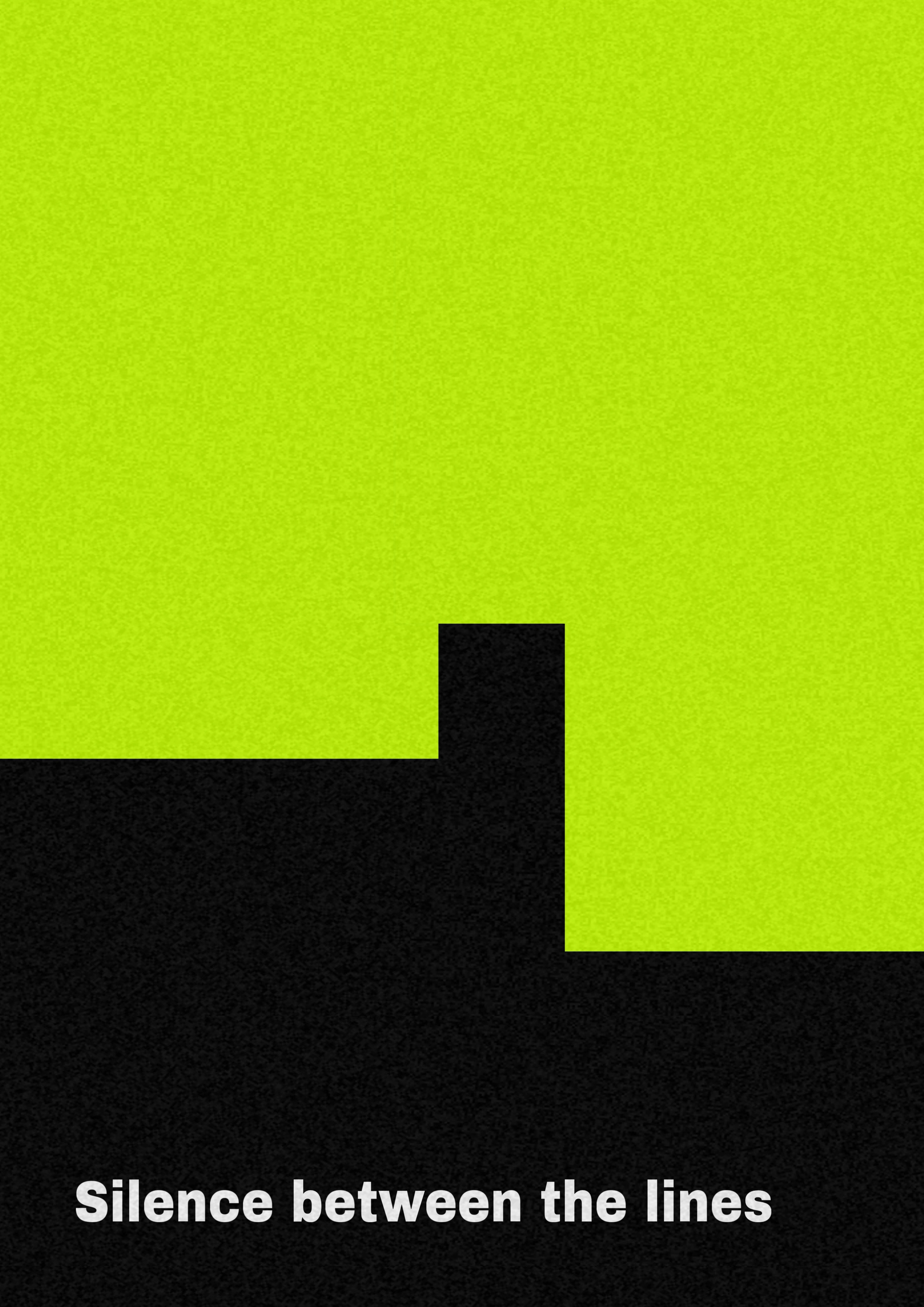
Silence Between the Lines — The Power of Negative Space
Perhaps the most poetic piece is the neon-tinted panel at bottom right:
“Silence Between the Lines.”
It’s minimalist, cryptic, and haunting. A single fluorescent green block disrupts a black void. Text is minimal, but implication runs deep.
This is where Swiss style becomes not just a method, but a mood.
“Design is not decoration — it is meaning made visible.”
This visual essay proves that constraint breeds creativity, and that a return to fundamentals can feel radical again.
Like this project
Posted Mar 27, 2026
Likes
1
Views
6