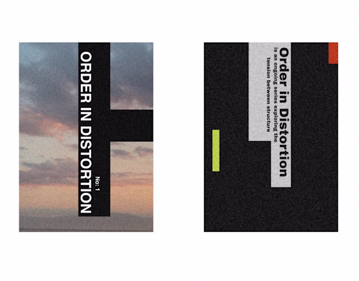
Typeface
Constantine Has
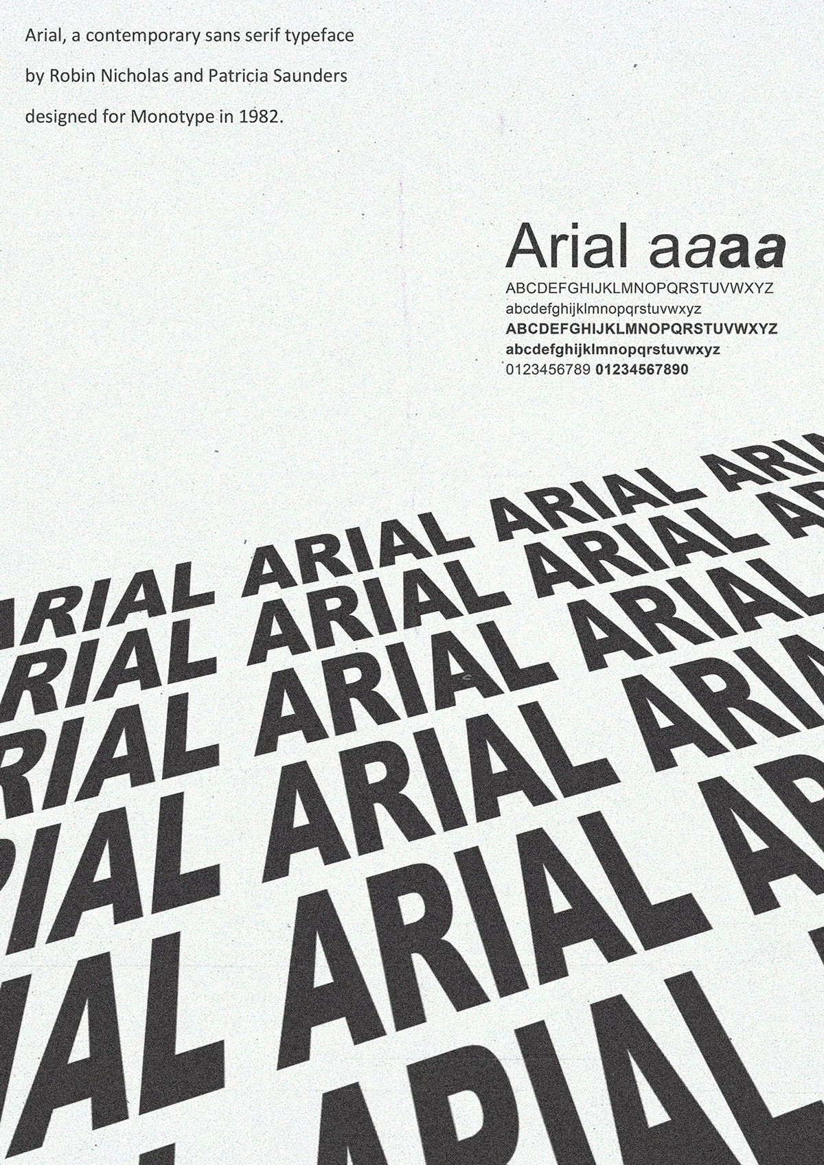
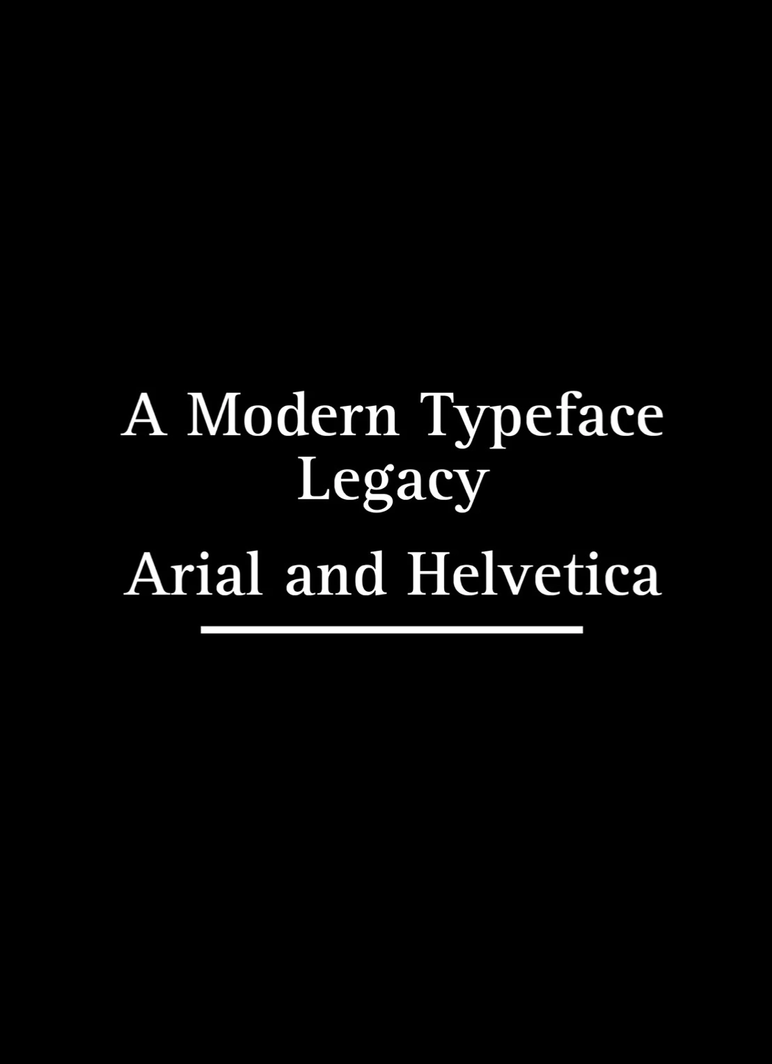
Arial: A Modern Typeface Legacy
Overview storyline
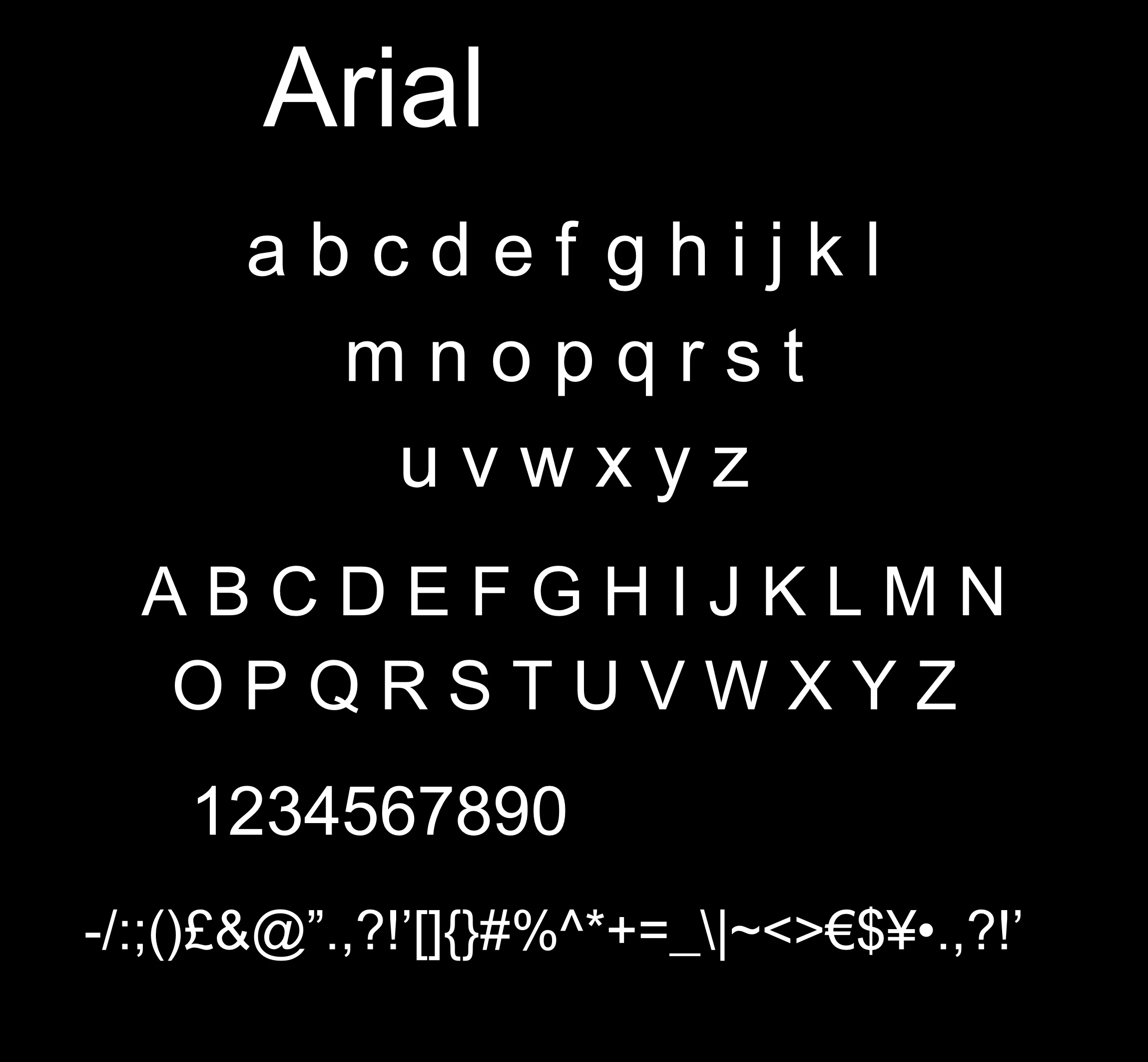
This poster is a typographic tribute to Arial, one of the most iconic sans-serif typefaces of the digital era. Originally designed in 1982 by Robin Nicholas and Patricia Saunders for Monotype, Arial has become a staple in both print and digital mediums for its clean, modern, and highly legible form.
This piece celebrates Arial’s enduring influence in the world of design, typography, and visual communication through a bold yet minimalist visual exploration.
Design Intent
The design leverages repetition and perspective to amplify Arial’s visual strength. The bold black typography set against a soft gray background draws attention to the geometric clarity and uniformity of the letterforms. The layout guides the viewer’s eye from the subtle, informational top to the dynamic, expanding "Arial" text field below.
Typography Features
The poster highlights:
Uppercase & lowercase sets
Weight variations
Numerals
Simple geometric structure
Clean stroke width
Arial is known for its modernist roots, taking cues from earlier grotesque sans-serifs while maintaining unique detailing that allows it to stand apart from Helvetica.
Visual Style & Composition
Minimalist color palette: Monochrome shades enhance readability and emphasize form.
Typographic layering: Repetition in bold caps shows the versatility and strength of the typeface at various scales.
Grid system: A subtle underlying structure ensures balanced composition despite the dynamic visual flow.
Why Arial?
Arial is often overlooked by designers due to its ubiquity, but this poster invites a second look. Behind its simplicity lies a legacy of usability, versatility, and resilience in an ever-evolving design landscape. Whether used in digital UI, corporate branding, or everyday documentation, Arial delivers clarity with elegance.
Final Thoughts
This piece is not just a type study—it’s a reminder that even the most familiar fonts can tell powerful visual stories. Sometimes, greatness lies not in novelty but in timeless function and form.
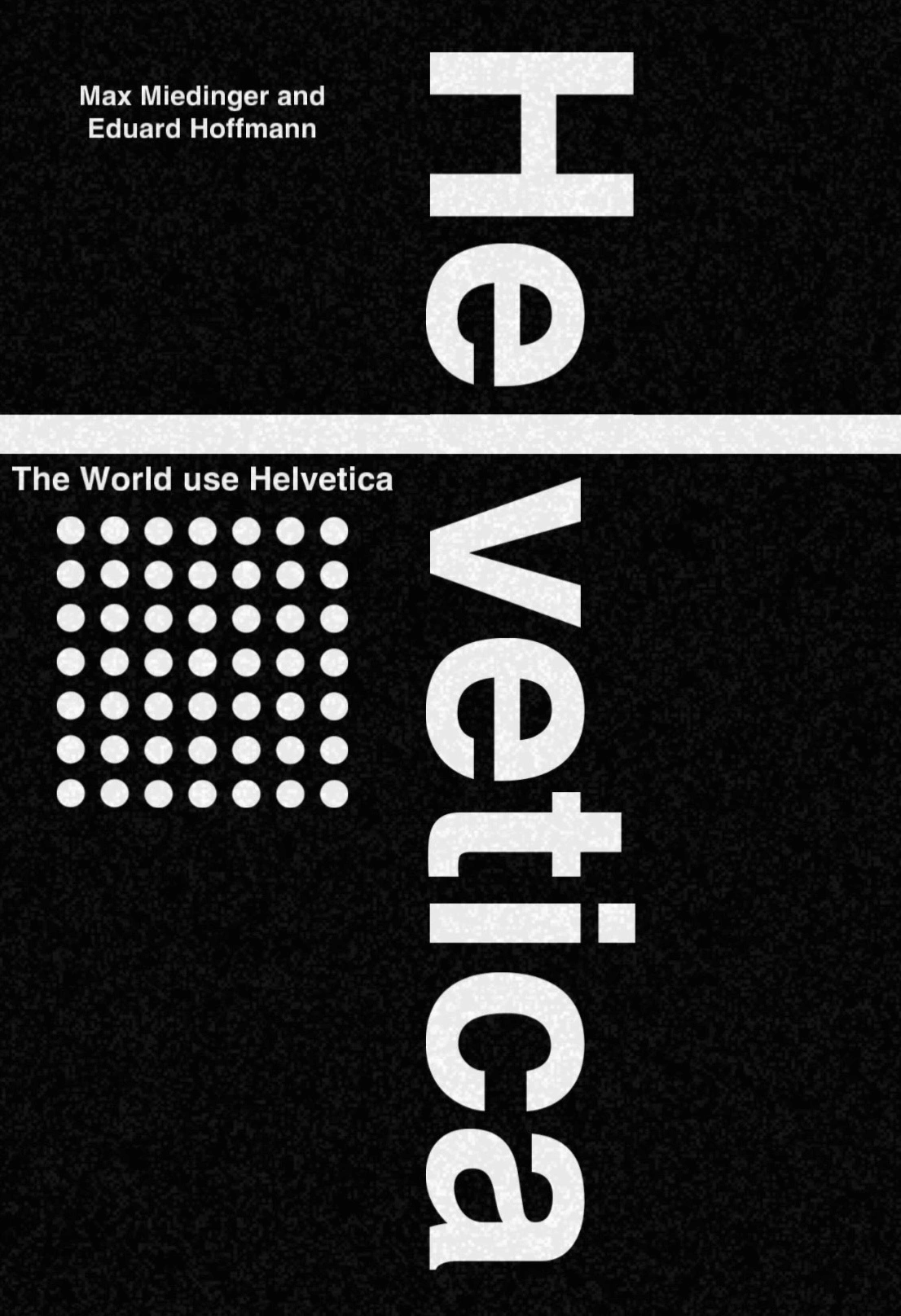
Helvetica: The Typeface That Defined an Era
Introduction
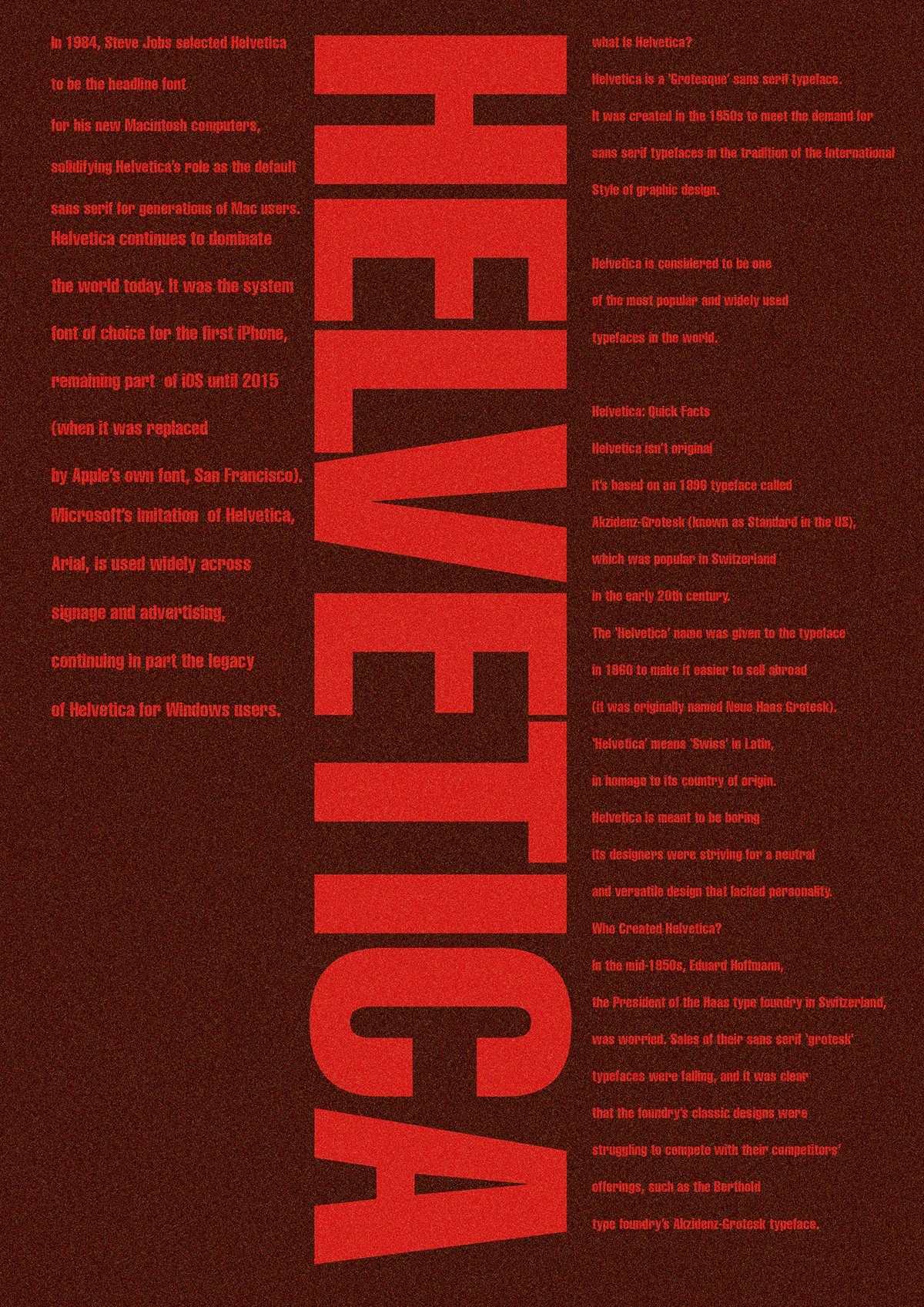
This is a visual exploration of Helvetica, one of the most influential and widely used typefaces in modern history. Designed in the 1950s to meet the demand for clean, functional type, Helvetica became the backbone of the International Typographic Style—and later, the digital design revolution.
With a bold red-on-black aesthetic and vertically scaled type, this layout reflects the dominance and authority Helvetica holds in both print and screen-based design.
Concept & Design Direction
The composition embraces the neutral strength of Helvetica while layering in historical and cultural context. The massive vertical "HELVETICA" type treatment anchors the design, asserting the font’s ubiquitous presence. The surrounding body text is laid out like an editorial spread—merging design with storytelling.
This piece is meant to evoke a museum placard, an educational artifact, and a design statement all in one.
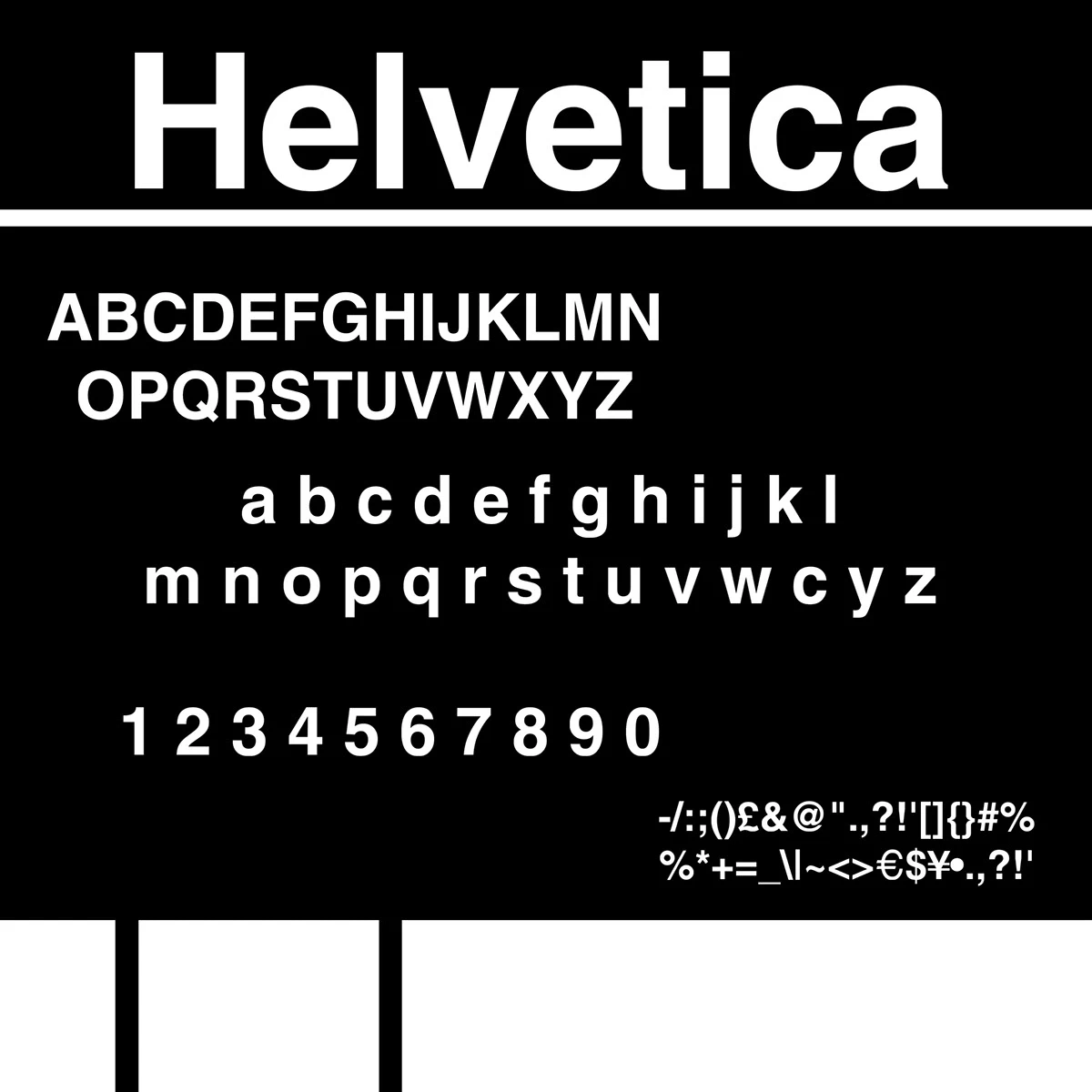
Typography Breakdown
Typeface: Helvetica (Grotesque sans serif)
Color Scheme: Deep red on textured black for high contrast and emotional intensity
Style: International Typographic Style / Brutalist
Structure: Asymmetrical grid system with heavy text blocks and vertical type orientation
Helvetica’s Legacy
Chosen by Steve Jobs as the default typeface for the original Macintosh.
System font for iOS until 2015.
Helvetica's influence can be seen in Microsoft’s Arial, Apple's San Francisco, and countless signage systems worldwide.
Created to be neutral and universal—a typeface without personality so it could adapt to any message.
Quick Historical Facts
Based on Akzidenz-Grotesk (1896).
Originally named Neue Haas Grotesk.
Renamed "Helvetica" to increase international appeal.
"Helvetica" = Swiss in Latin.
Designed by Eduard Hoffmann and Max Miedinger in Switzerland.
Design Statement
Helvetica’s strength lies in its neutrality. It doesn’t try to dominate the message—it becomes the message. In this poster, I wanted to pay tribute to the dual nature of Helvetica: both invisible and ever-present, bland yet iconic, silent yet bold.
Tools Used
🖥️ Adobe Photoshop
🧱 Custom texture overlays
👉 Follow for more graphic design explorations. And dm me also if you want to create you a project
Enjoyed the project? Hit appreciate 💖
, leave a comment, or follow for more
Like this project
Posted Mar 27, 2026
Likes
1
Views
4