
Shubham Dhawan
UX-first design partner for AI, SaaS, Fintech, and B2B
- 5.00
- Rating
- 13
- Followers
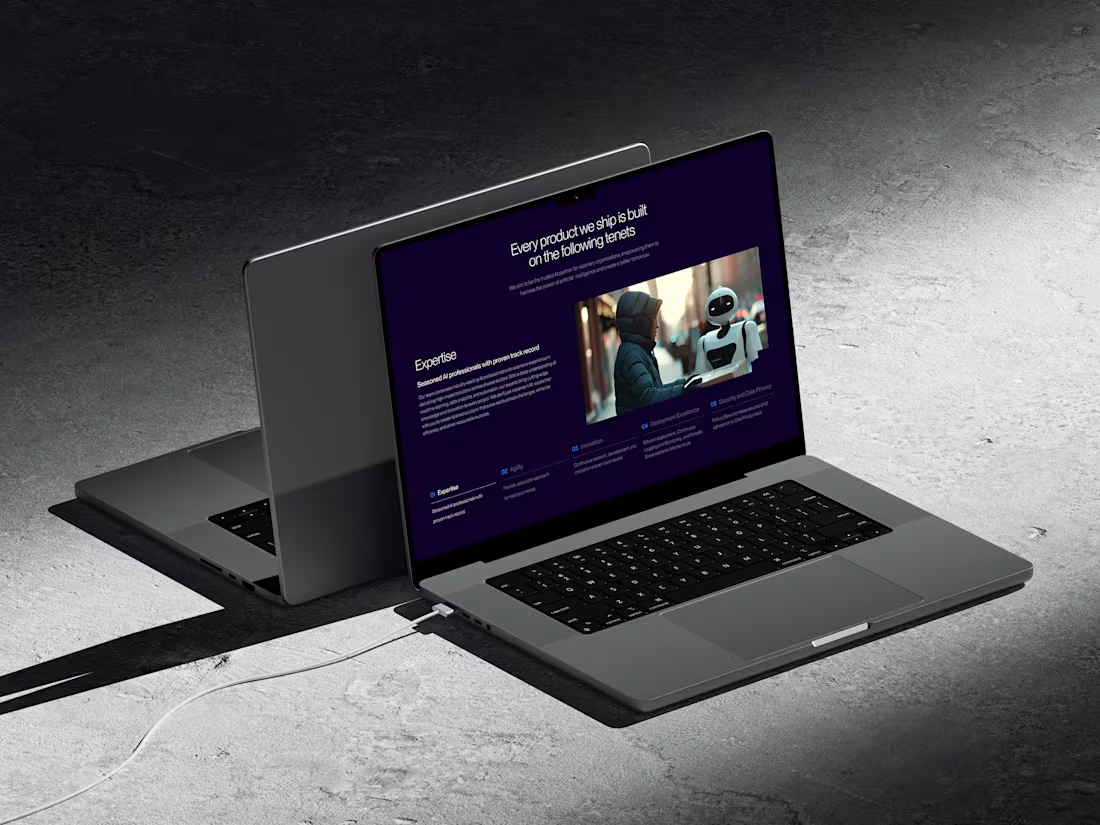
Hey folks 👋
Sharing a small peek at one of the internal product pages we designed, this section highlights the core principles the team works by.
We kept the layout minimal and the tone calm so the content stays front and center.
The dark theme helped give everything a more focused, grounded feel, especially paired with imagery that shows the human side of AI.
0
40
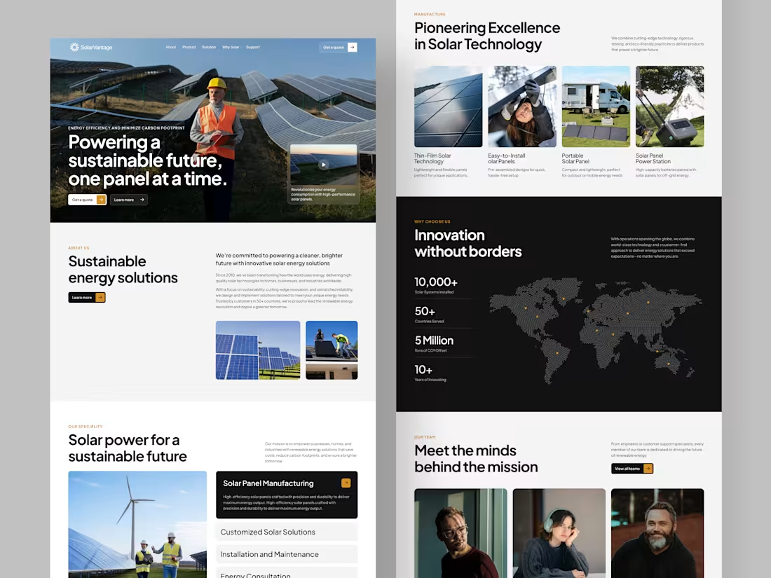
Hey folks 👋
Here’s a quick look at a website we recently designed. The idea was something that reflects the brand’s focus on sustainability and innovation without feeling too corporate.
We used a mix of strong visuals, clean type, and simple layouts to help explain their tech, their mission, and the impact they’re creating across different regions.
The goal was to make the site feel trustworthy and easy to navigate, especially for people exploring solar for the first time.
0
36
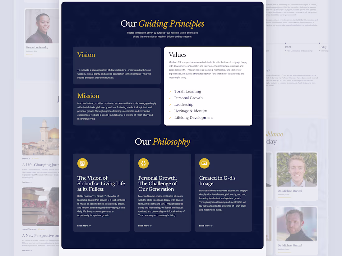
Hey folks 👋
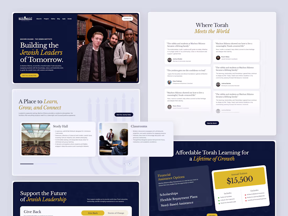
Here’s another part of the Machon Shlomo project : the section where we highlight their guiding principles, values, and philosophy.
The goal here was to keep things clear and respectful while still making the content feel approachable. We used a calm palette, clean structure, and gentle emphasis to help their message come through without distractions. Really happy with how this part turned out.
1
52
Hey folks 👋
Here’s a recent project we worked on for Machon Shlomo, a yeshiva focused on helping students learn, grow, and build strong Jewish leadership for the future.
We highlighted their study spaces, student life, alumni stories, and financial assistance options in a way that feels open, approachable, and easy to navigate.
The idea was to create a digital experience that reflects the values of the institution: 'ne together'.
2
5
67
Hey folks 👋
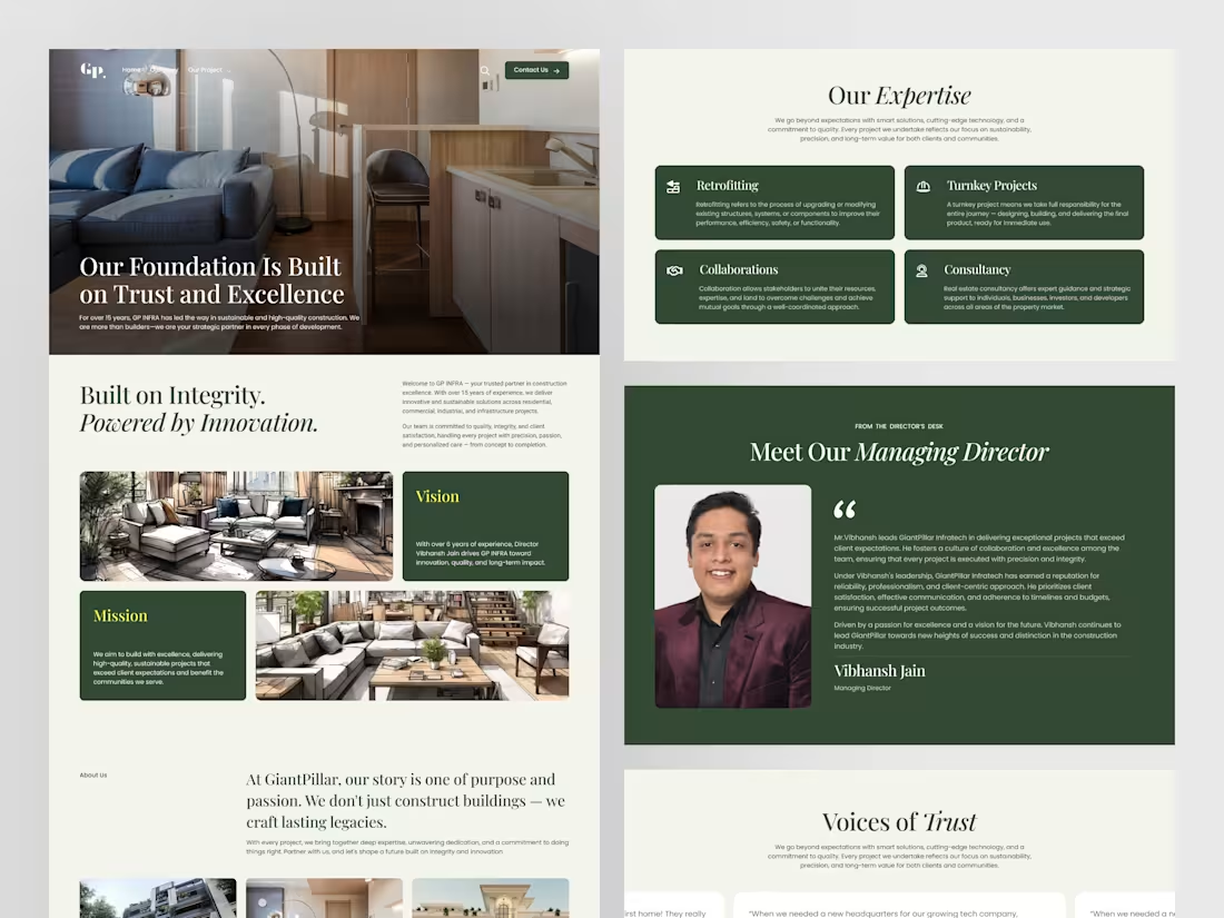
Here’s a look at a project we recently worked on for GiantPillar, a construction company that doesn’t just build structures, but focuses on long-term impact.
The goal for the website redesign was to give their story the space it deserves.
1
2
32
Hey folks 👋
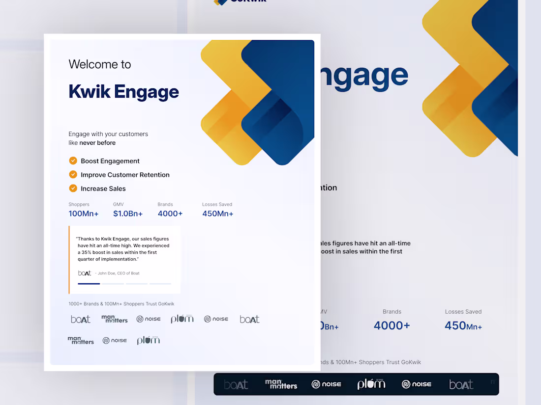
Here’s a quick peek at a small but meaningful refresh we worked on for Kwik Engage. The goal was simple: make the first-touch experience feel less heavy and more approachable.
We cleaned up the layout, tightened the spacing, and gave the visuals a softer tone so users can get through the onboarding without feeling rushed or overwhelmed.
1
1
30
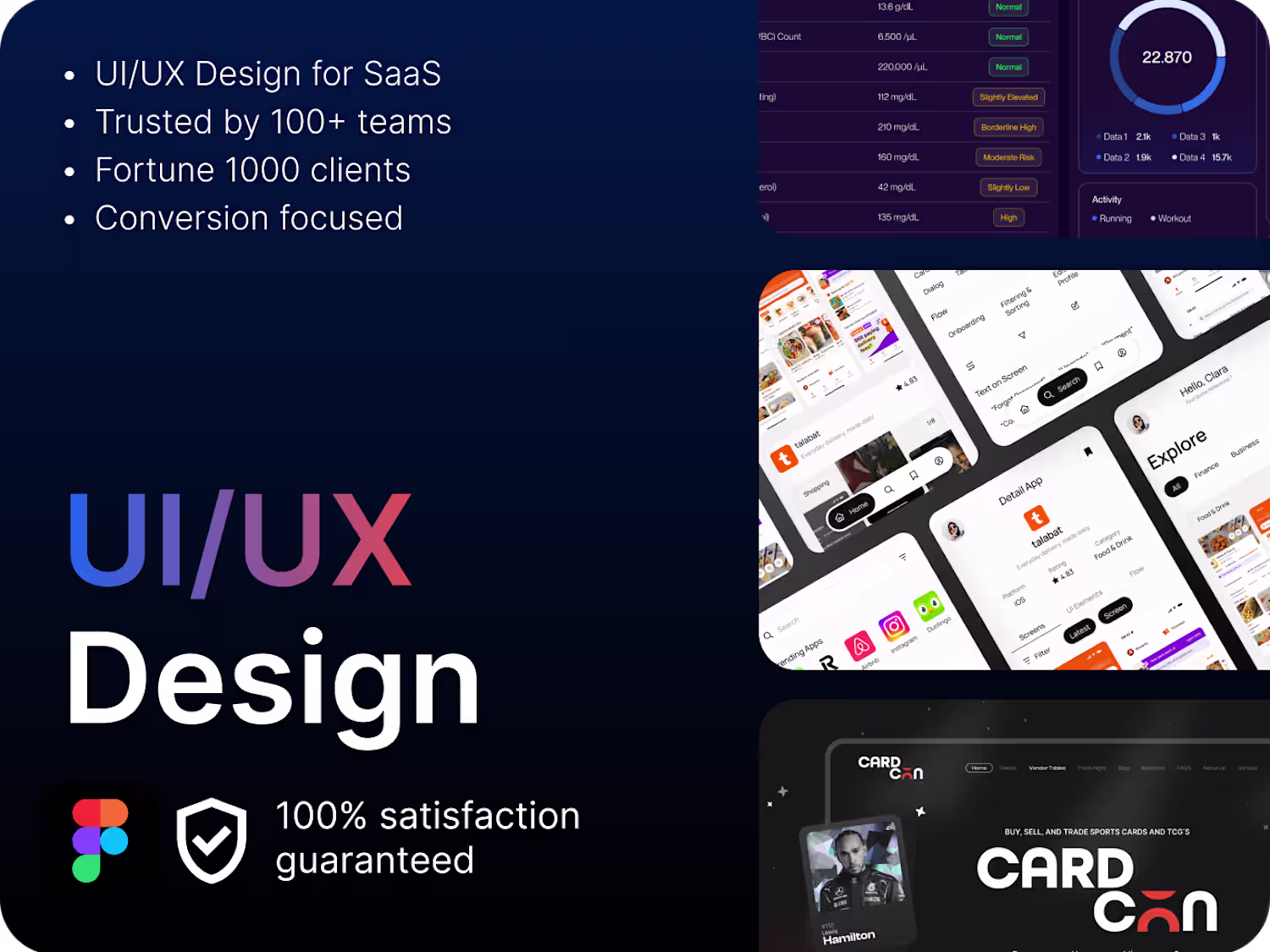
Hey folks,
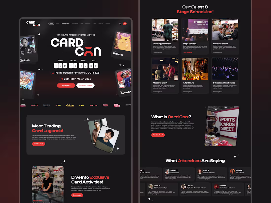
We’ve been working on the new website for CardCon, and this one felt refreshingly different from our usual projects.
It’s an event for trading card lovers. For people who genuinely care about the hobby, the collectibles, the meetups, the community. We tried to keep the site warm, energetic, and easy to navigate… the kind of place that feels inclusive.
Overall, really happy with how it turned out.
1
50
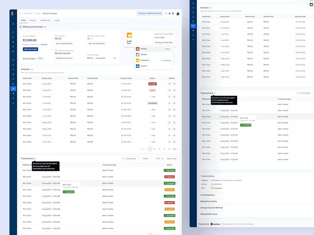
Hey folks! 👋
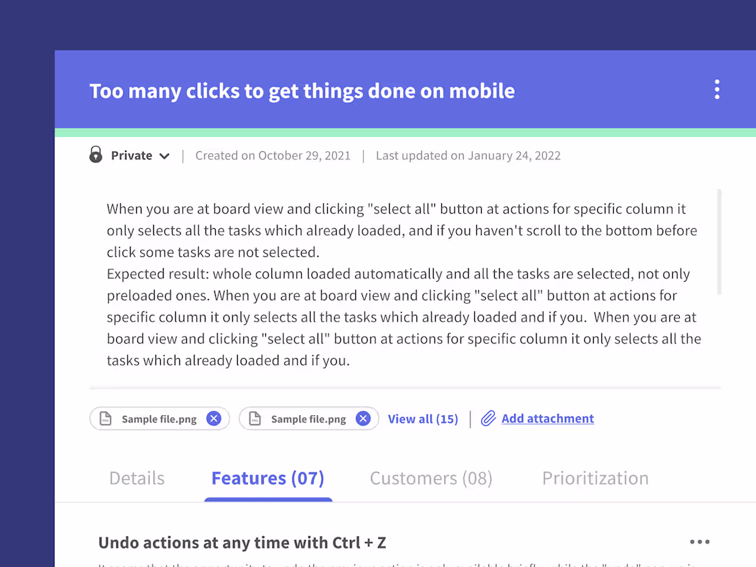
Sharing a quick peek into a billing & account dashboard we designed recently for a SaaS client.
We focused on making the whole flow feel lighter and more intuitive. The goal was simply to make billing- not painful.
Honestly, dashboards like these may not be flashy but they just feel right
Always fun turning chaos into clarity. 🙌
3
3
58
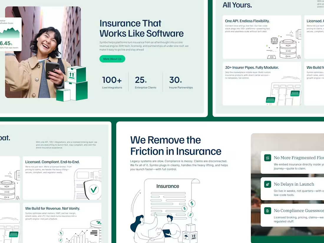
Recently worked on this web design concept for a modern insurance aggregator
Had a lot of fun building this design - happy colorful vibes!
1
90
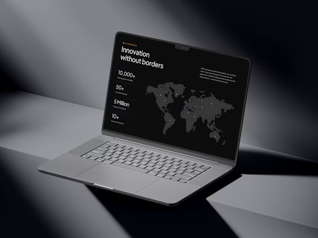
Web design work for one of our solar energy based clients in the US
1
1
94
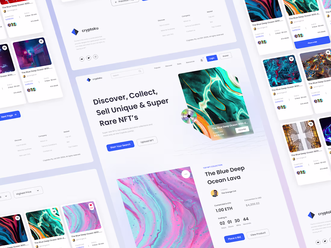
Designing Card Con’s Digital Experience
0
31
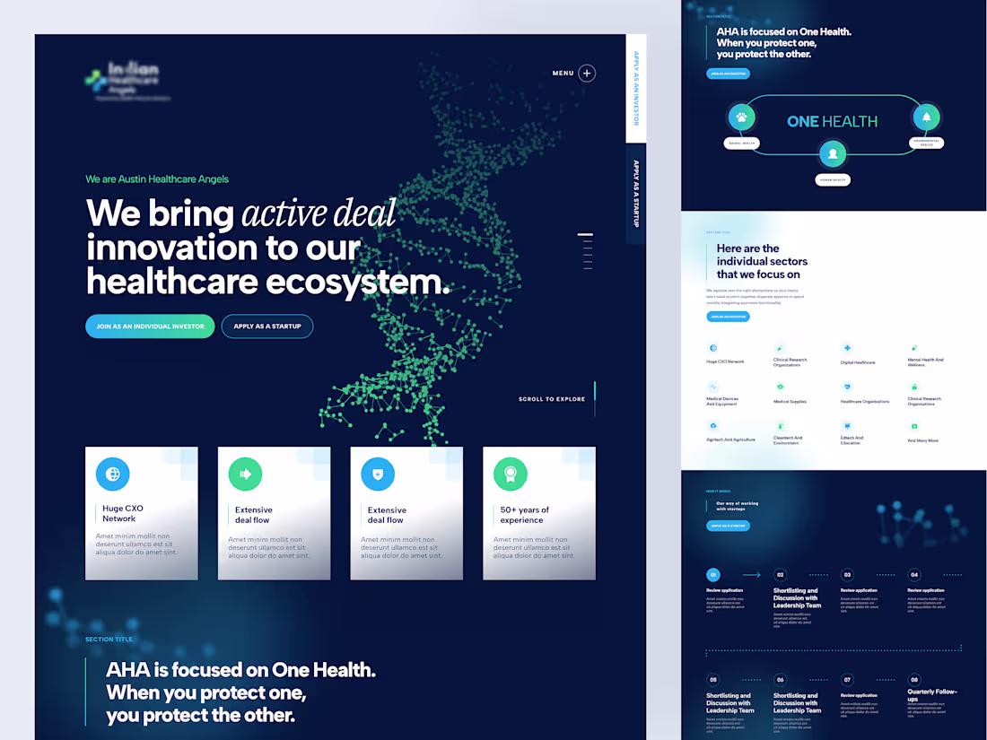
Angel Investing Platform × Coloristy
0
102
FamSham × Coloristy
0
13
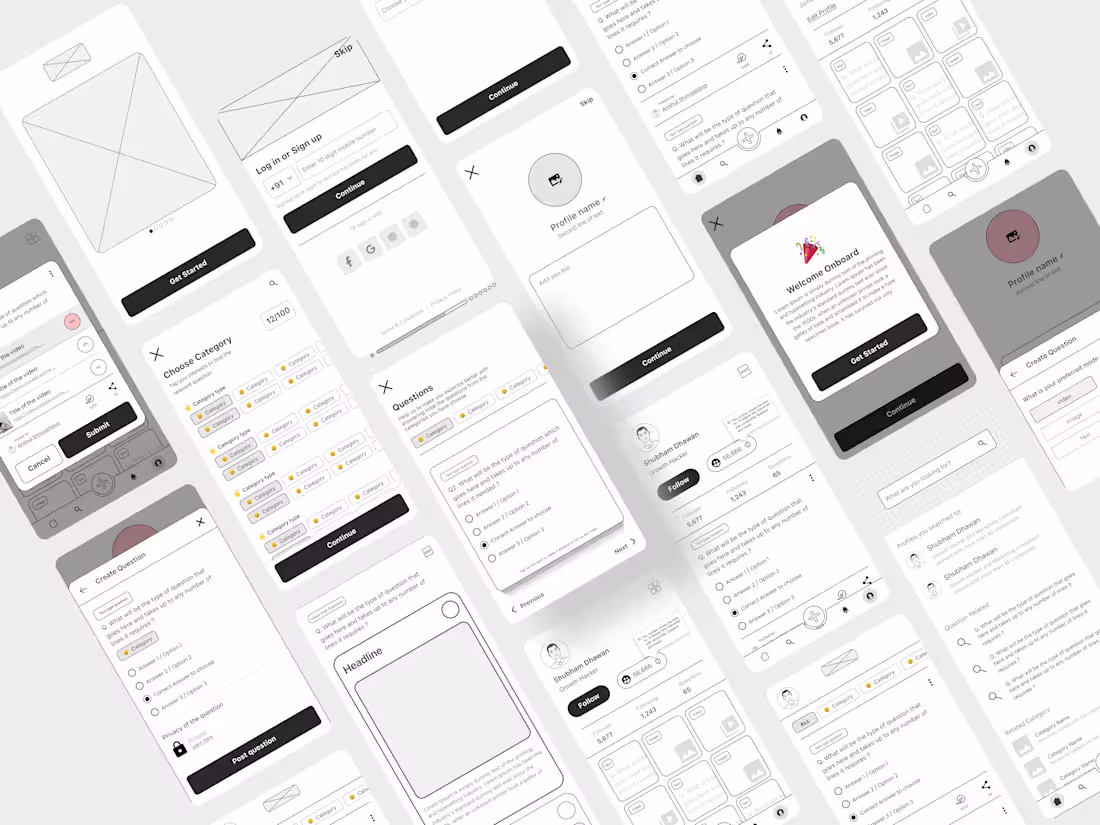
Zeda Product UX and UI Design
0
16