Shubham Dhawan
UX-first design partner for AI, SaaS, Fintech, and B2B
- 5.00
- Rating
- 13
- Followers

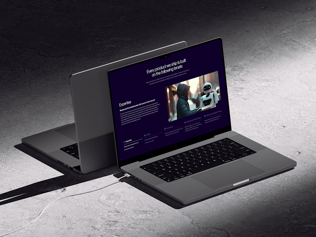
Hey folks 👋
Sharing a small peek at one of the internal product pages we designed, this section highlights the core principles the team works by.
We kept the layout minimal and the tone calm so the content stays front and center.
The dark theme helped give everything a more...
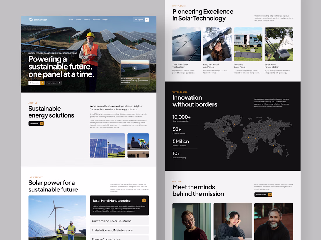
Hey folks 👋
Here’s a quick look at a website we recently designed. The idea was something that reflects the brand’s focus on sustainability and innovation without feeling too corporate.
We used a mix of strong visuals, clean type, and simple layouts to help explain their tech,...
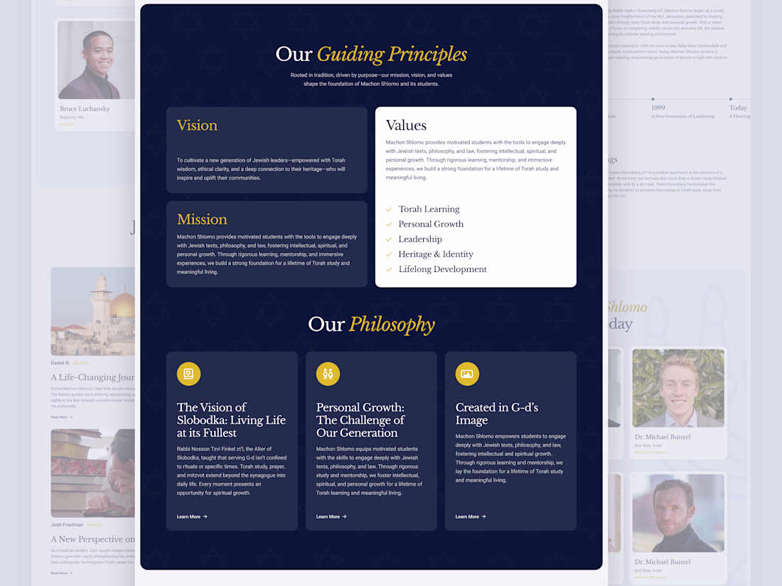
Hey folks 👋
Here’s another part of the Machon Shlomo project : the section where we highlight their guiding principles, values, and philosophy.
The goal here was to keep things clear and respectful while still making the content feel approachable. We used a calm palette, clean...
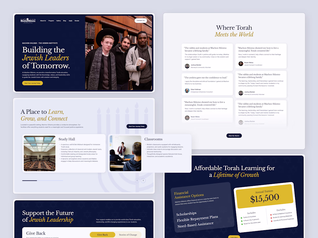
Hey folks 👋
Here’s a recent project we worked on for Machon Shlomo, a yeshiva focused on helping students learn, grow, and build strong Jewish leadership for the future.
We highlighted their study spaces, student life, alumni stories, and financial assistance options in a way...
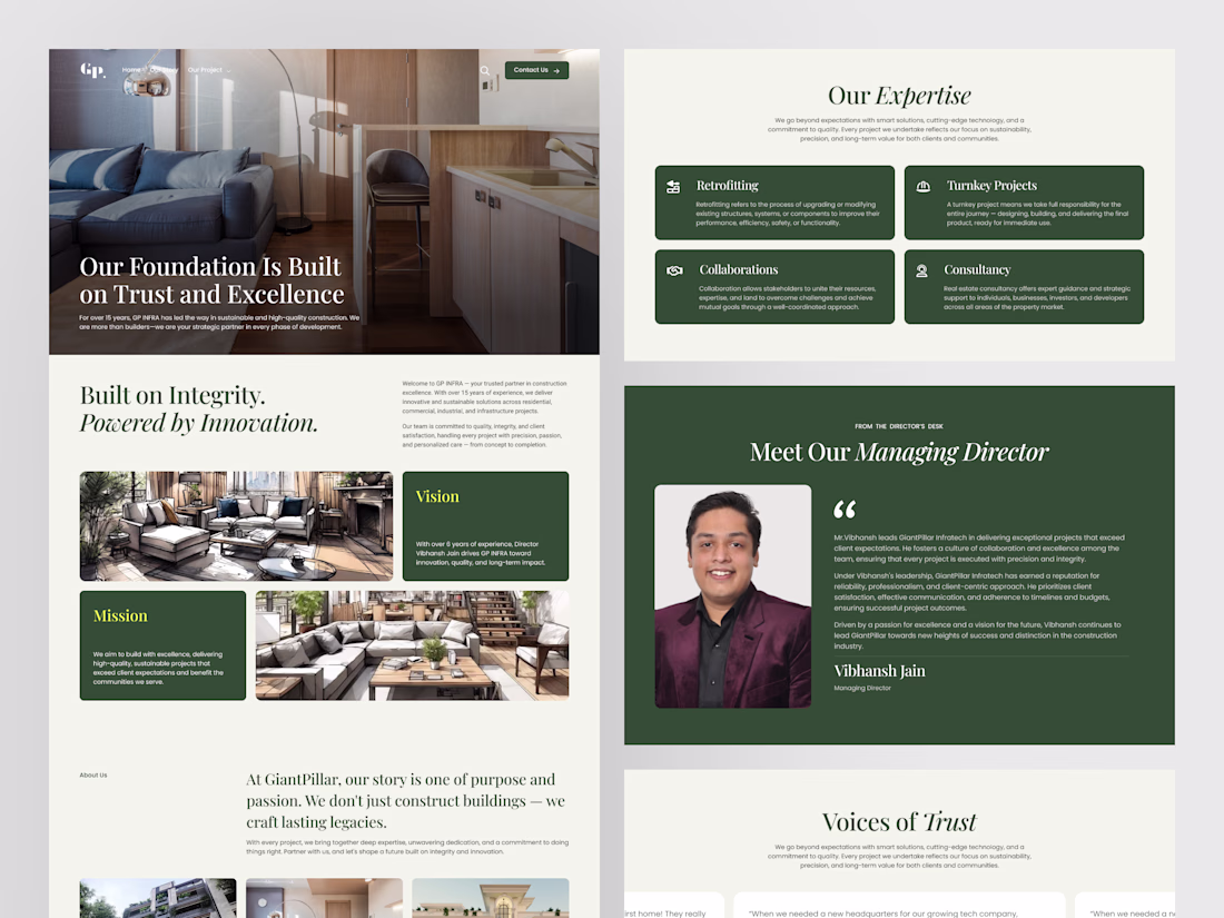
Hey folks 👋
Here’s a look at a project we recently worked on for GiantPillar, a construction company that doesn’t just build structures, but focuses on long-term impact.
The goal for the website redesign was to give their story the space it deserves.