Florist Heaven | Case Study
Naram Ziady
Florist Heaven
What Seems To Be The Problem Here Florist?
Florist Maya: Well Officer, there doesn’t seem to be a a curated platform for florists and plant enthusiasts to discover and showcase a diverse range of floral creations.
Officer Brady: Ok, so you’re telling me there are no options out there at all?
Maya: Well, the ones available lack a cohesive and user-friendly interface, and that hinders the florist’s market reach, and it definitely turns customers off with its old looking user interface and terrible user experience!!
Brady: Okay, I understand, I have a person in mind that can help! Let me contact Naram, he’s a cool product designer.
Ring…. Ring… Ring…
Brady: Hello! Naram?! I have something for you to design, a Florist platform, yeh seems like they have it tough, Maya needs you asap!
Naram: Sure thing, I guess I can create something with some intuitive navigation, visually appealing interface, and innovative features. Something like a thriving ecosystem of florists to expand their client base and gain recognition. That sound good?
Brady: Well, you took the words right out of my mouth, how’s that sound Maya?
Maya: That’s EXACTLY IT, let’s roll with that!
The Part Where Naram Meets Some Florists
Naram: Okay, thank you for coming Emily, so as you know, I am building a florist ecosystem platform, but before I jump in, I need to understand what is needed to build it, your wants, needs, hopes and dreams, anything really. Let’s jump in…..
Emily: Okayyy, listen, I like really hate it when I come to use a platform and it’s asking me a million questions, like can’t I just post something and then write about it later, I have like a 100 plants I need to add to a platform and they don’t make it easy at all
Naram: Okay, so a fast way of adding multiple plants without making you sit down and write about each and everyone.
Emily: Yeh, also, when I sell a plant, they keep asking me a million questions on how to take care of it, like does it look like I’m google? Just look it up for yourselves, I love y’all but I don’t have time to reply to every one of your messages about this stuff.
Naram: Okay, so care instructions and guidance built into the platform. Hmm maybe the focus can be enhancing the app’s educational content and user support features.
Emily: yeh that sounds great, oh also, look when they come to buy a plant, they start asking about a different pot, if I can cut this and that, but then when I explain the extra prices they leave, can that just be there from the start?
Naram: Okay so no unexpected fees, everything is transparent and an easy checkout process. Sounds good, anything else?
Emily: Yeh and I just wanna build myself up, show some cool stuff, my best flowers and stuff that I took extra care, that’s it
Naram: Okay thank you for coming today!
What you just read was a completely made up scenario, based on real scenarios, I just made it a bit more entertaining and smaller :)
DESIGN PHASE
Persona: Emily
User Journey: Emily
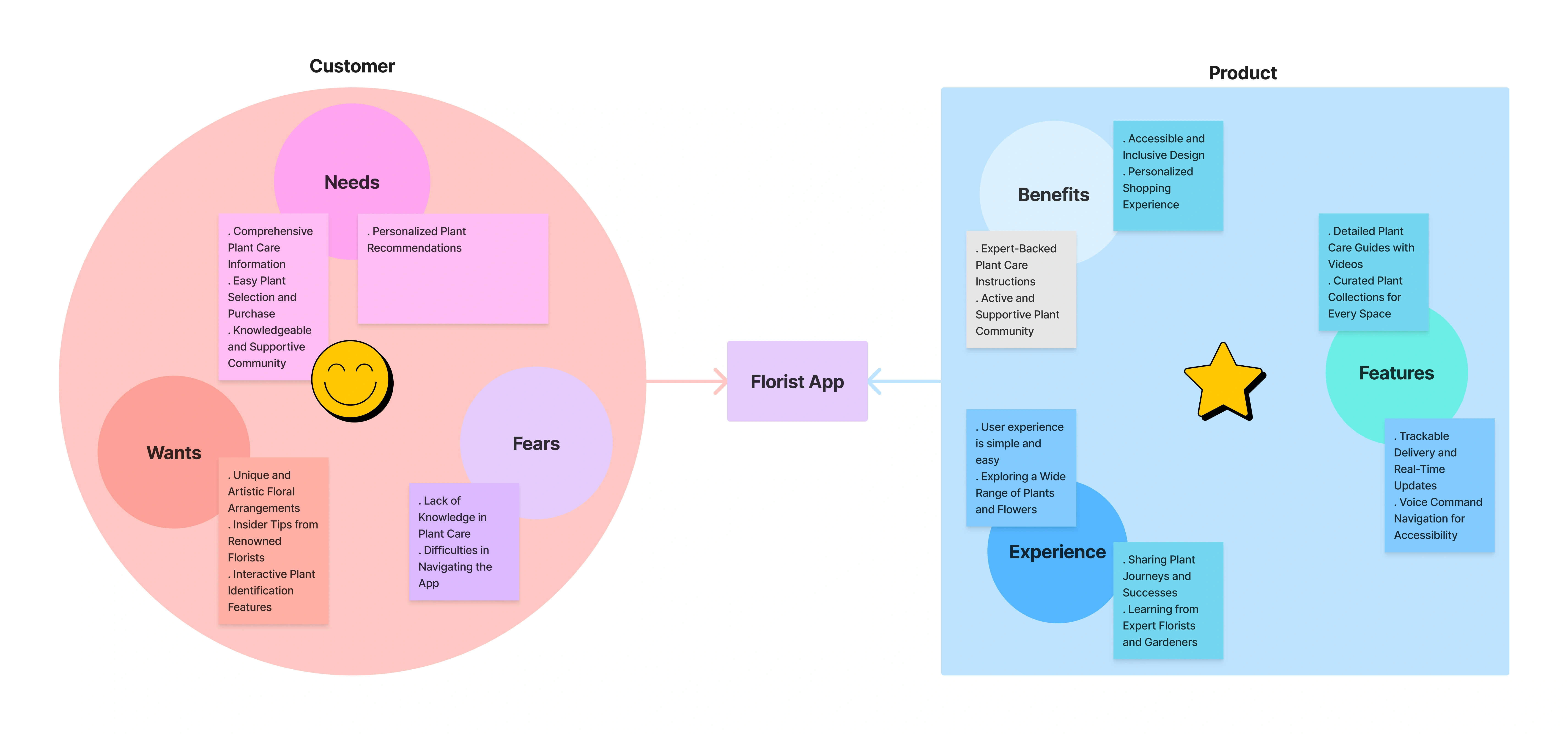
Value Proposition Canvas
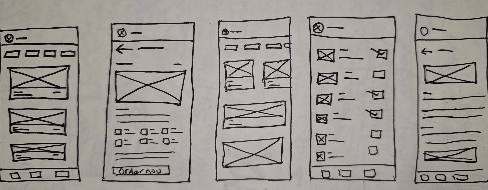
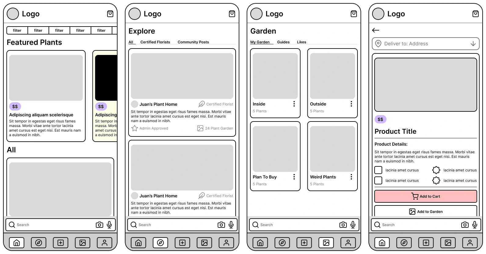
Paper Wireframes:
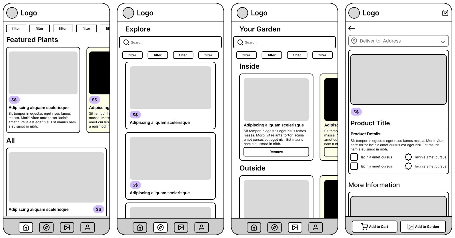
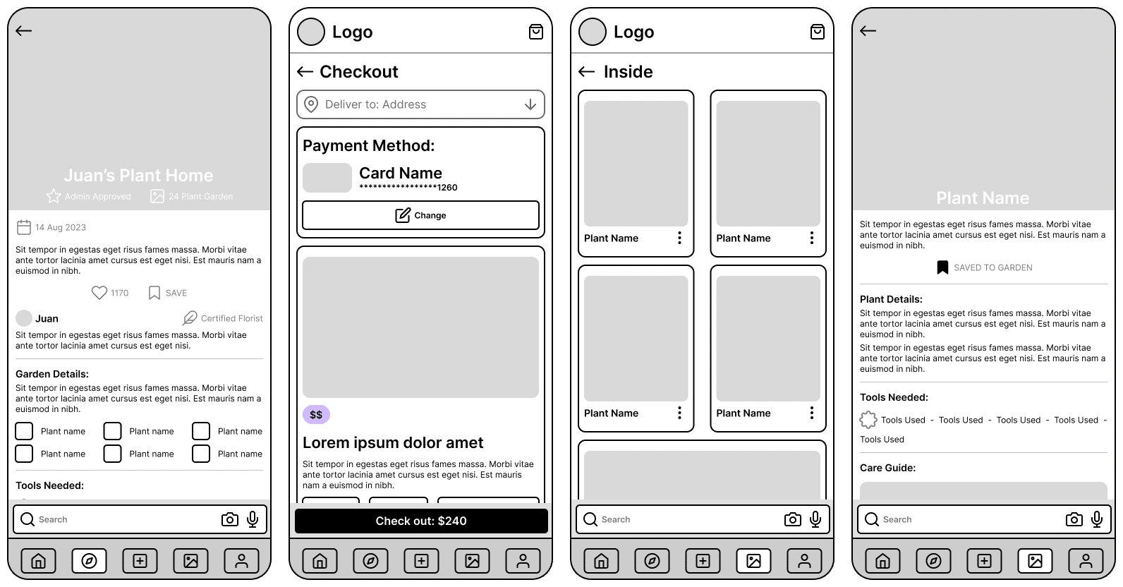
Digital Wireframes:
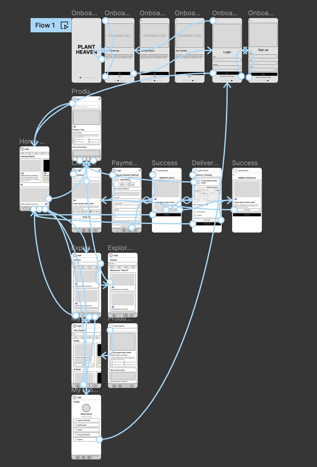
Low Fidelity Prototype:
The Part Where I Did Some Testing
So I got a couple of people to test my Low-Fidelity prototype
Tech Wizard
Casual Person in their 20s
Plant Enthusiast with an unhealthy obsession with plants
Someone who asks me how to turn on the TV everyday
Casual Person in their 40s
The Results
4/5 Users noted that the Explore Page added no value to the app other than a search bar. “So the difference is I can search now? Doesn’t seem very different from home”
How did I solve it?
Changed the main purpose of the app from store to a companion app. The decision was influenced by other factors but the main one was that all users showcased more interest in learning how to take care of plants rather than shop for them
4/5 Users did not like being redirected to the cart screen after adding an item to cart and wanted easier access to the cart screen. “I said add to cart not take me to cart”.
How did I solve it?
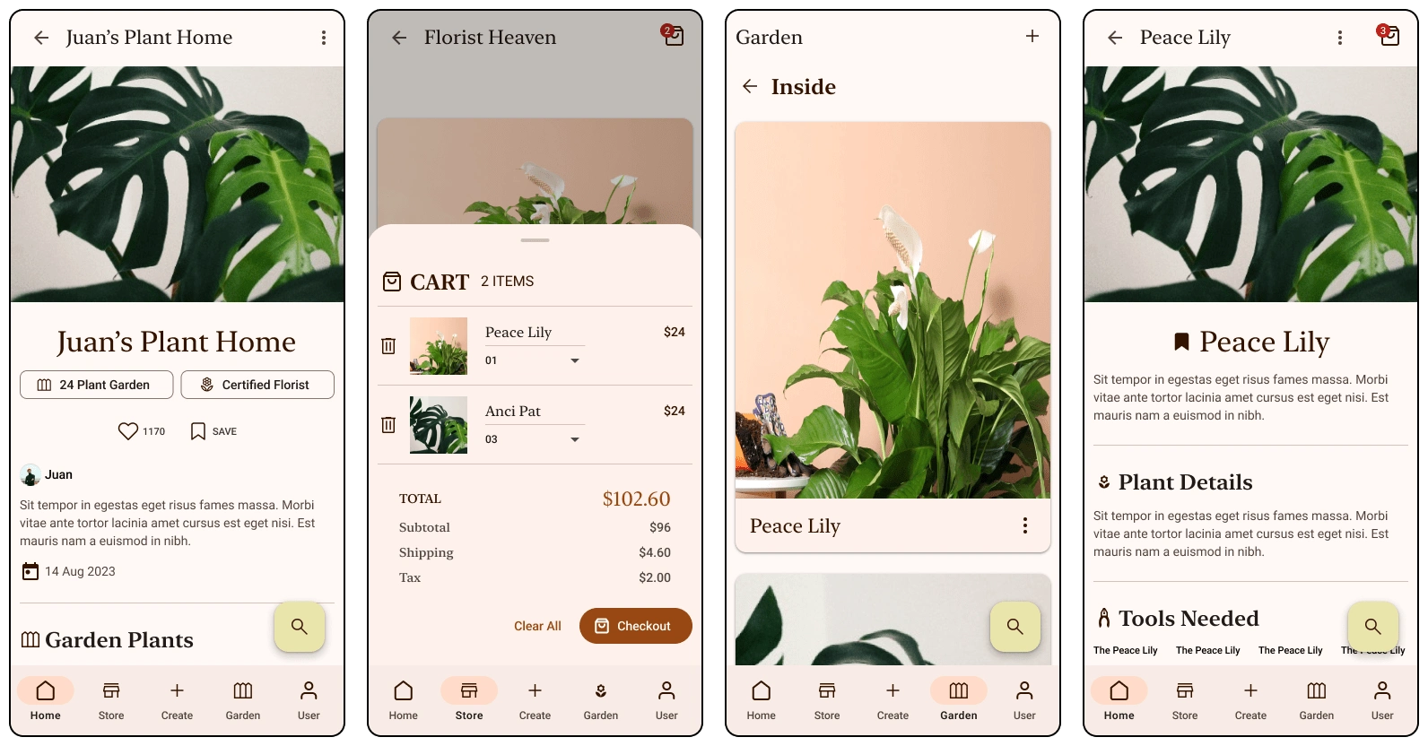
Cart is now a bottom sheet, it pops up when you add something, and you can just swipe it down.
5/5 Users expressed their dislike to the garden screen, having the remove button easily clickable as well as the general layout was too confusing and did not feel very customizable. “This is my garden right? Why can’t I edit the picture of MY Garden”
How did I solve it?
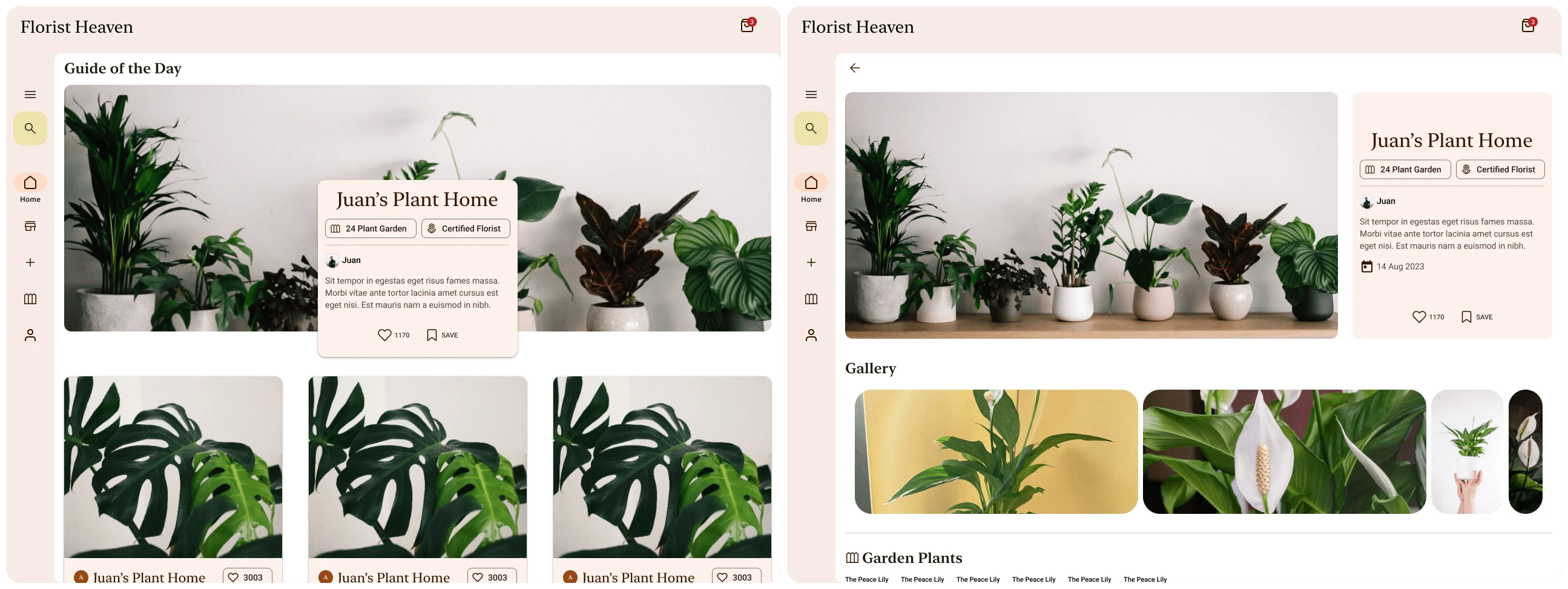
Garden screen now provides customizable lists and images, it also displays the guides that users saved.
4/5 Users wanted a clearer and better display of the caring instructions. “I just want to see how to water my plant, I don’t want to read everything to know that one thing”
How did I solve it?
ICONS!!! There are sections now that are highlighted with icons that show users information they need without having to read through the whole guide. Simple, fast, and saves ALOT of time.
DESIGN ITERATION
After Implementing Feedback:
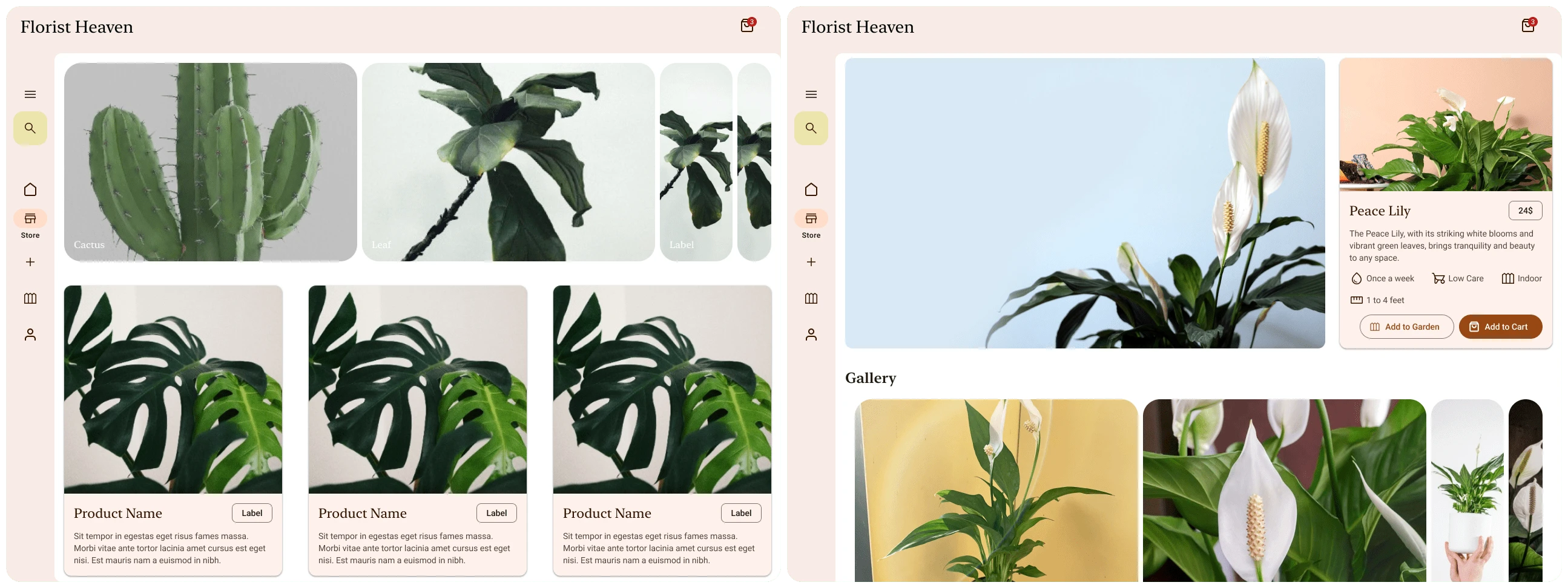
Polished Designs:
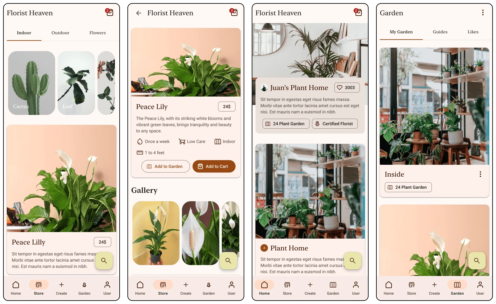
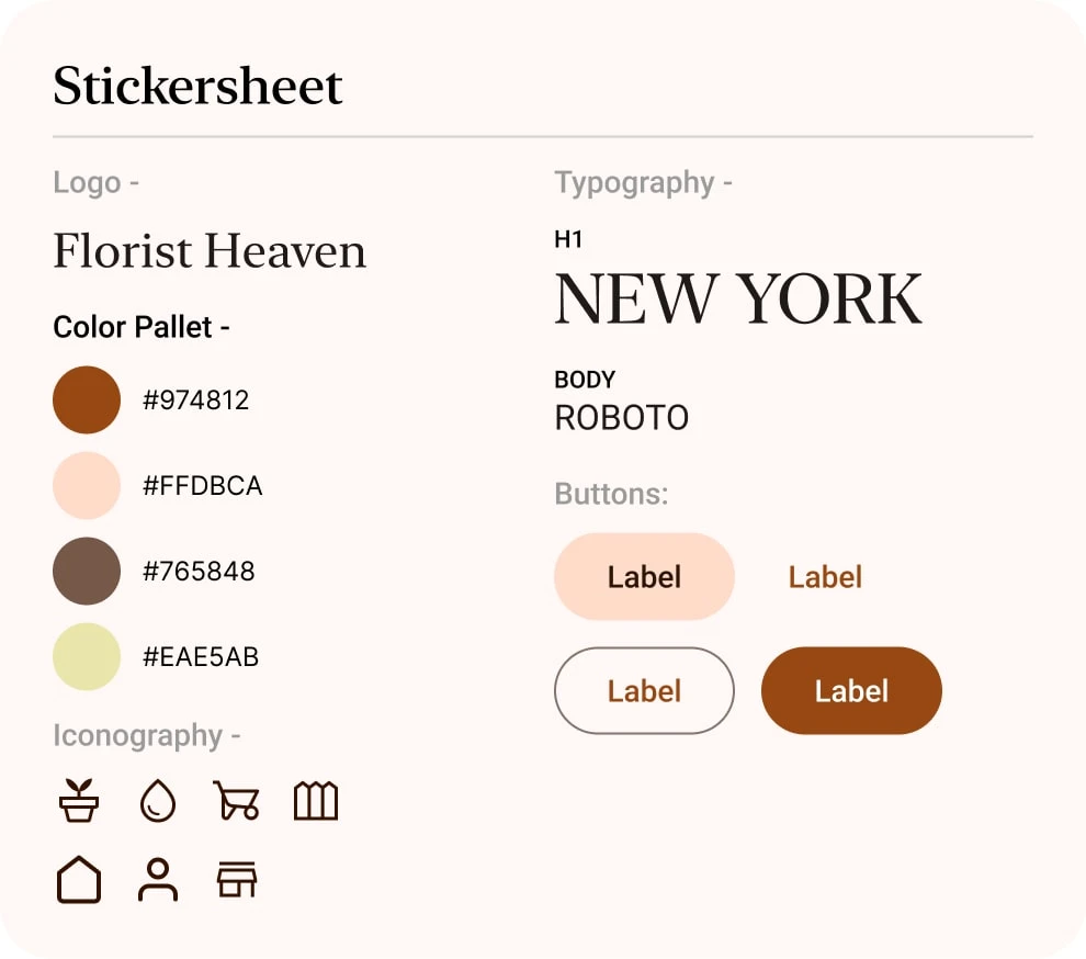
Sticker sheet:
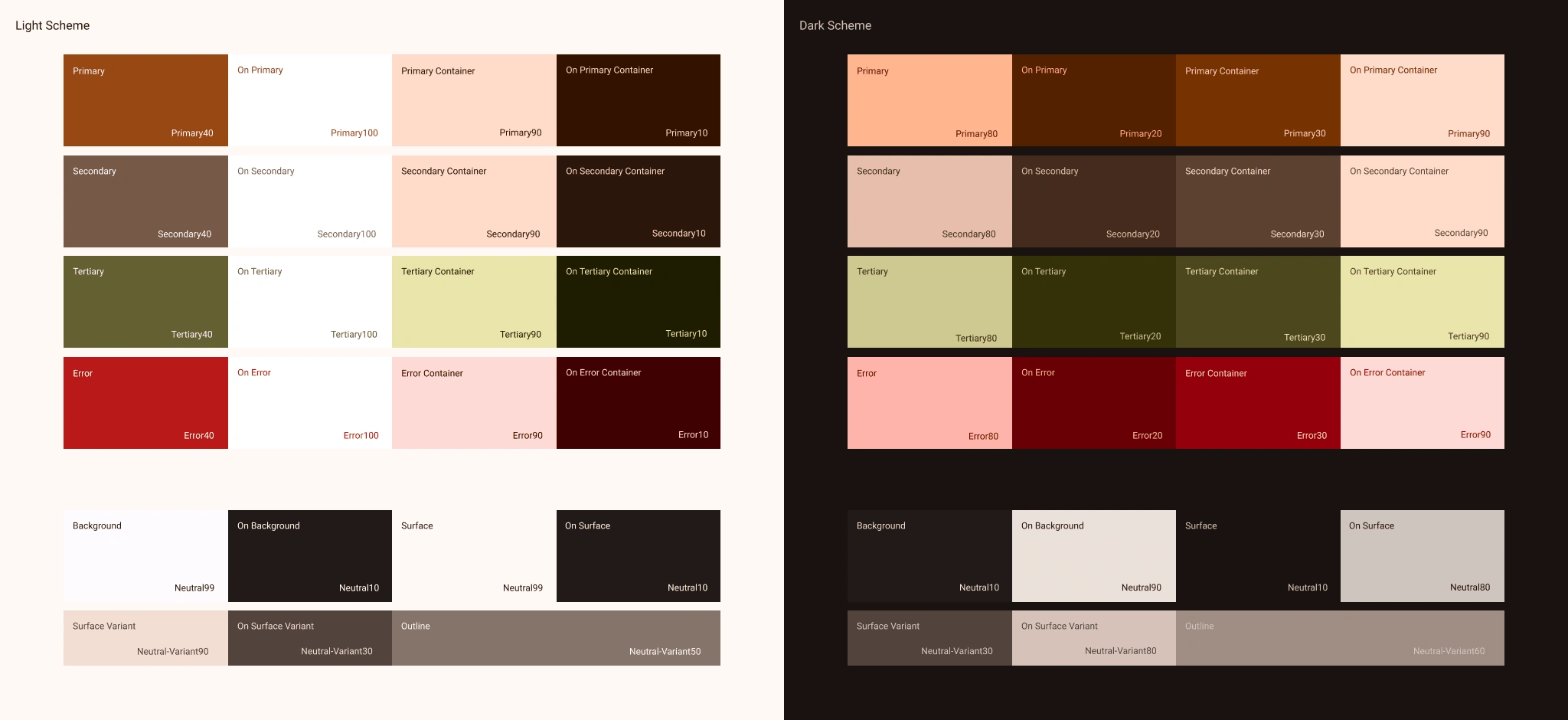
Color in Detail:
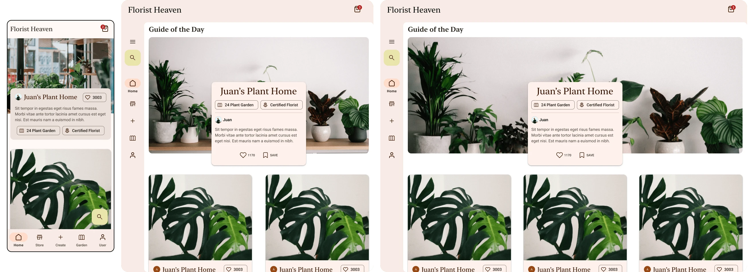
Responsiveness:
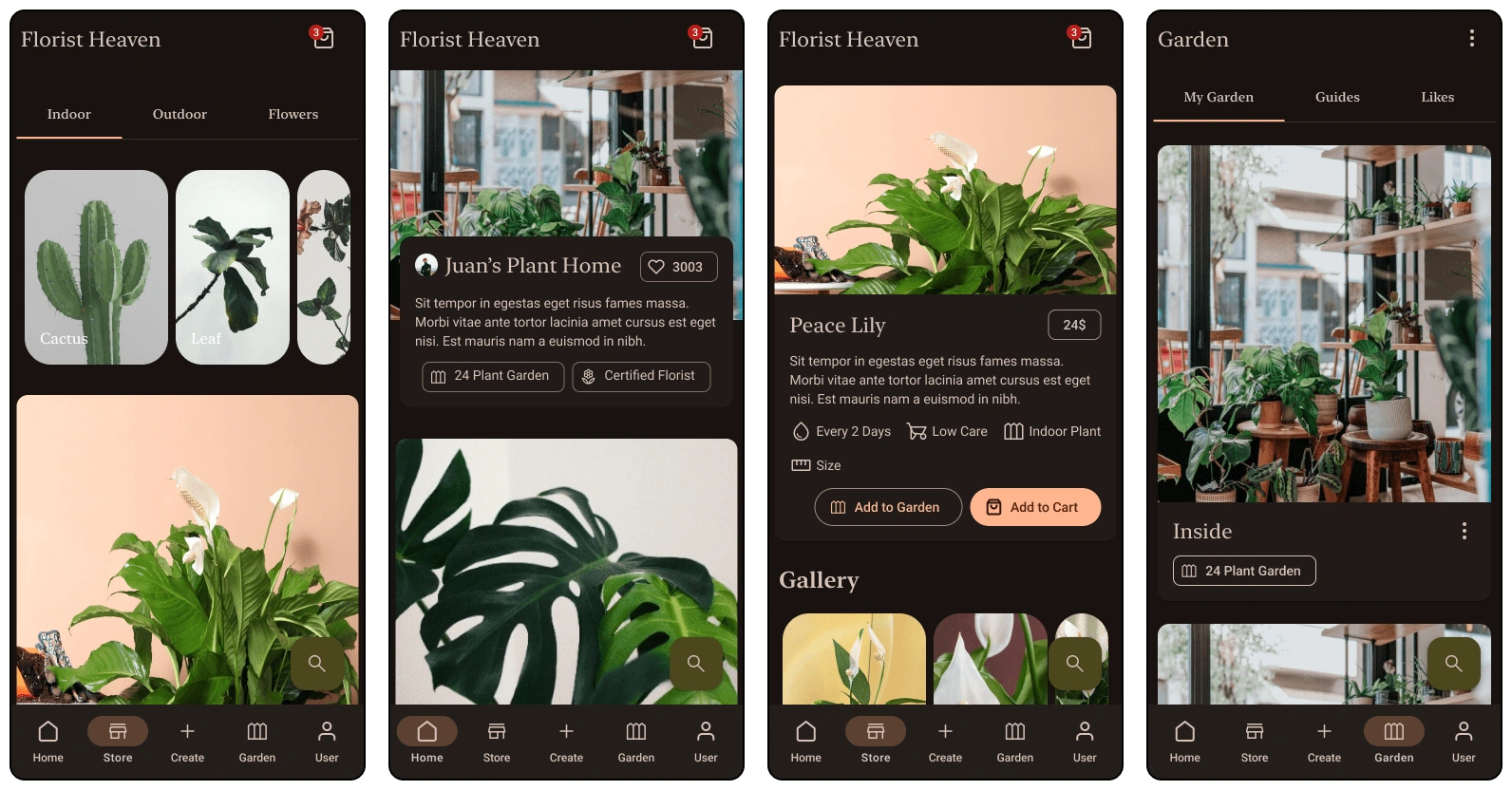
Dark Mode:
As with everything, Dark mode is extremely popular amongst users and thanks to material design, dark mode is easier to design than before.
The Looking Back Part
This project was fun, learned a lot about design systems, and it definitely broke me. Diving into yet another field that you have never even heard of, to design something that will shape professional’s lives is STRESSFUL! You need to learn everything there is in an extremely short amount of time, obviously with a bigger project and more budget you can take your time and learn more, but for me, I only had a couple of months! Despite that, it was awesome, and this is the reason I chose this field, because I like learning about everything there is, a never ending curiosity that is being satisfied, one project at a time.
THANK YOU FOR READING
Wow you really made it this far, you might actually be interested in me? You should definitely CONTACT ME
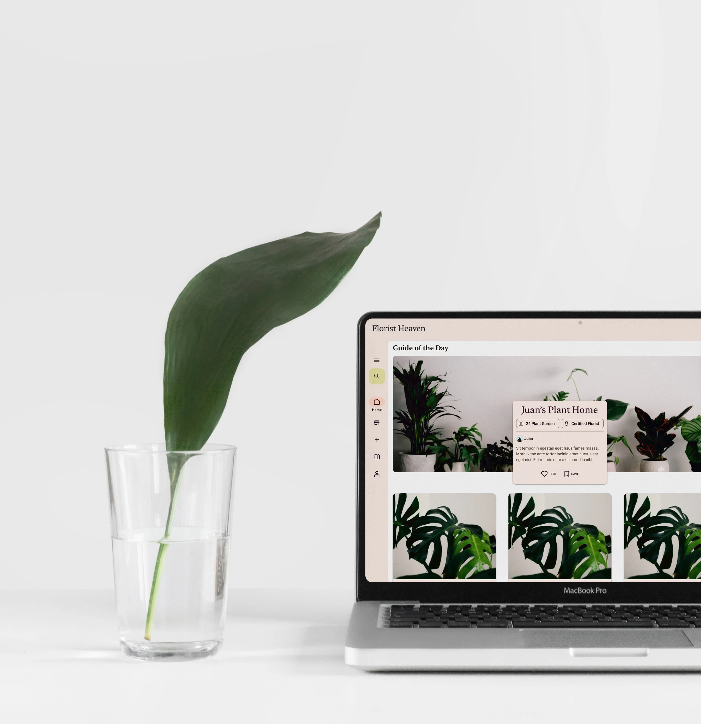
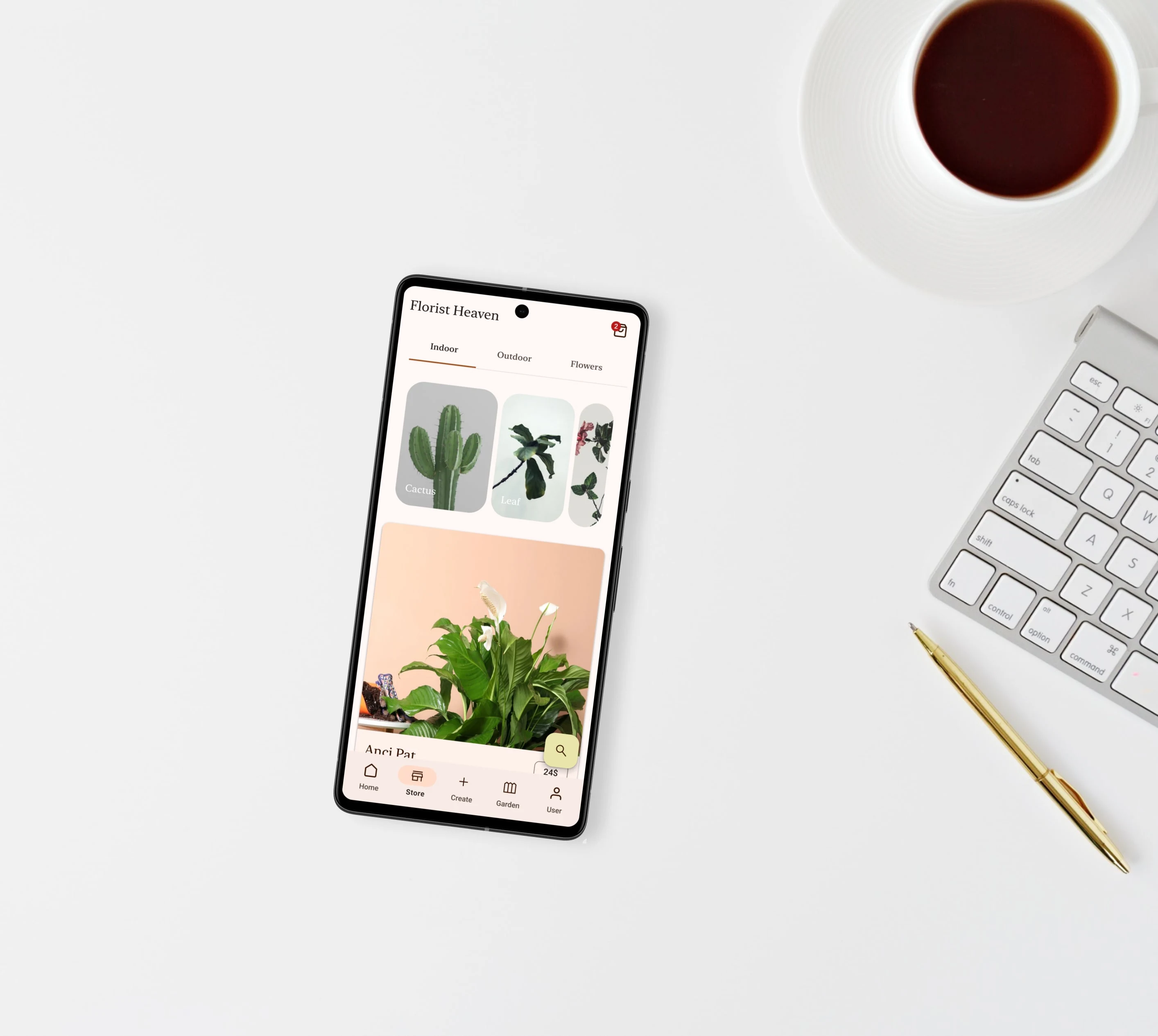
Mockups:
Like this project
Posted Sep 6, 2023
A testament to design excellence. Explore the case study and see how meticulous design choices transform every interaction into a botanical masterpiece.